
Why iconography and illustration must behave like components
In a modular brand system, icons and illustrations are not “decorations”; they are functional assets that must scale across products, campaigns, UI surfaces, documentation, and motion. Treating them as reusable components means they are designed with explicit rules, predictable variants, and a library structure that supports fast assembly without visual drift.
Reusable components have three properties: (1) consistent construction (how they are drawn), (2) predictable behavior (how they adapt to size, context, and state), and (3) reliable retrieval (how teams find and apply them). Iconography and illustration styles often fail on (2) and (3): an icon looks fine at 24px but collapses at 16px; an illustration works on a hero banner but becomes illegible in onboarding; assets are stored as random SVGs with inconsistent naming. This chapter focuses on building icon and illustration systems that behave like components: spec-driven, variant-aware, and library-ready.
Iconography as a system: define the “drawing grammar”
An icon set is a language. If the grammar changes from icon to icon—stroke widths vary, corners fluctuate, perspective shifts—users perceive inconsistency and teams lose trust in the library. The goal is to define a small set of construction rules that can generate many icons without re-deciding fundamentals each time.
Core parameters to standardize
- Stroke vs. filled vs. duotone: Decide the primary icon style(s) you support. If you support multiple, define them as explicit variants, not ad-hoc exceptions.
- Stroke thickness and alignment: Specify stroke weight per size tier (e.g., 16/20/24/32). Clarify whether strokes are centered, inside, or outside paths (SVG typically centers). Define how stroke scales (usually not scaling with transforms in UI exports).
- Corner radius logic: Establish corner radii for outer shapes and inner cutouts. A common rule is “outer corners rounder than inner corners,” but your system must be explicit.
- Cap and join style: Round vs. square caps, miter vs. round joins. These choices strongly affect perceived friendliness and sharpness.
- Geometric primitives: Define preferred primitives (circles, 45° angles, consistent diagonals). Limit arbitrary angles unless the system supports them.
- Optical corrections: Specify when to cheat geometry for visual balance (e.g., slightly thicker verticals, overshoot for circles, aligning to pixel grid at small sizes).
- Negative space rules: Minimum gap sizes and cutout widths to preserve legibility at small sizes.
- Detail budget: Maximum number of internal elements or intersections per icon at each size tier.
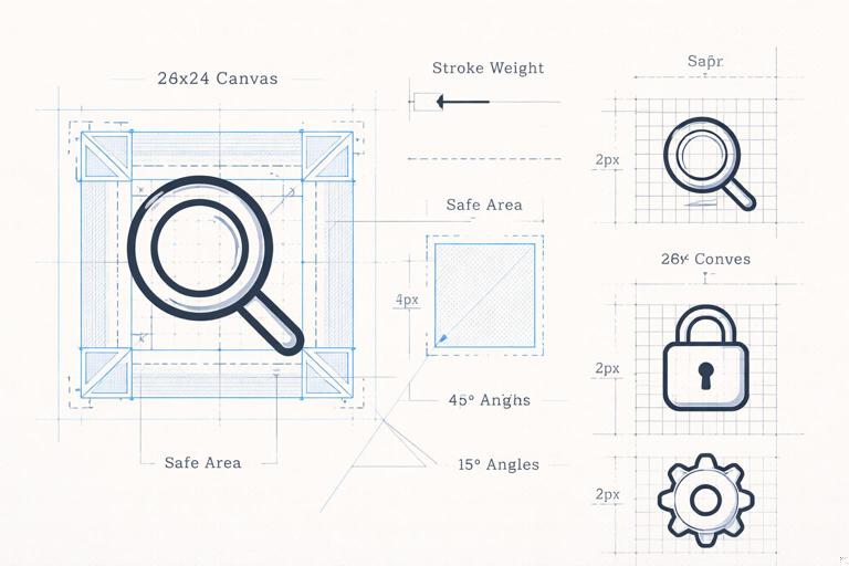
Practical example: a “construction recipe”
Instead of describing style in vague terms (“clean, modern”), write a recipe that a new designer can follow:
- Canvas: 24×24 for primary UI icons; safe area inset 2px.
- Stroke: 1.75px at 24px; round caps; round joins.
- Corner radius: 2px for outer corners; 1px for inner corners.
- Angles: 0°, 45°, 90° only.
- Minimum gap: 2px between parallel strokes; minimum cutout: 2.5px.
- Optical: circles overshoot by 0.5px beyond safe area when needed; align key edges to whole pixels.
This recipe becomes the basis for component-like consistency: every icon is produced from the same constraints.
- Listen to the audio with the screen off.
- Earn a certificate upon completion.
- Over 5000 courses for you to explore!

Download the app
Icon families and variants: design once, reuse everywhere
Reusable components require predictable variants. For icons, variants are not only “outlined vs filled”; they also include size tiers, states, and contextual adaptations. The system should define which variants exist and when to use them.
Common icon variants to support
- Size tiers: 16, 20, 24, 32 (or your product’s needs). Each tier may require different stroke weights and simplified details.
- Style variants: Outline, solid, duotone. If duotone exists, define which parts are secondary and how contrast is handled.
- State variants: Default, active/selected, disabled, error/warning/success. Often state is applied via color, but some systems also adjust fill or add badges.
- Directional variants: Left/right versions for arrows, chevrons, “back,” “next.” Define mirroring rules and exceptions (e.g., “upload” vs “download” should not be mirrored).
- Localized variants: Icons with cultural meaning (mailbox, calendar, currency) may need region-specific alternatives. Treat these as explicit variants with a selection rule.
Step-by-step: build a size-tiered icon component set
Step 1: Choose a “master” size tier. Start with the size most used in UI (commonly 24px). Design the full set at this tier first to establish consistency.
Step 2: Define downscaling rules. Decide what changes when moving to 20px and 16px. Typical rules: reduce stroke weight, remove small interior details, increase negative space, simplify intersections.
Step 3: Create tier-specific templates. Provide a template file per tier with grid, safe area, baseline, and example shapes. This prevents designers from guessing.
Step 4: Produce a pilot subset. Build 20–30 icons that cover diverse shapes (circles, diagonals, complex symbols). Use them to validate legibility and consistency.
Step 5: Document exceptions. Some icons will need optical tweaks (e.g., “bell,” “gear”). Record these as known exceptions so future additions follow the same logic.
Step 6: Export and test in context. Place icons in real UI components (buttons, tabs, lists). Verify alignment, perceived weight, and clarity at typical viewing distances.
Icon naming, metadata, and retrieval: make the library usable
A reusable component is only reusable if people can find it. Icon libraries fail when naming is inconsistent (“trash,” “delete,” “bin”), when synonyms proliferate, or when icons are not tagged by meaning and usage.
Naming conventions that scale
- Prefer semantic names over visual descriptions: “search” instead of “magnifier.” This helps when the visual metaphor changes but the function remains.
- Use consistent part ordering:
category/name/variant/sizeorname.variant.size. Pick one and enforce it. - Include direction and state explicitly:
chevron.left,chevron.right,notification.badge. - Avoid duplicates by defining canonical terms: Maintain a small glossary: “delete” is canonical; “trash” is a synonym tag, not a separate icon name.
Metadata and tagging
Beyond names, add metadata to support search and governance:
- Keywords: synonyms, related actions, domain terms.
- Usage notes: “Use for destructive actions,” “Not for navigation,” “Avoid in marketing.”
- Accessibility notes: recommended labels for UI (e.g., aria-label suggestions) and when to hide decorative icons.
- Status: draft, approved, deprecated.
- Owner: who maintains the icon set.
Illustration styles as modular systems (not one-off artwork)
Illustrations are often treated as bespoke art, which makes them hard to scale. A modular illustration system defines reusable parts (characters, objects, scenes), consistent rendering rules (line, color, shading), and composition patterns that allow teams to assemble new illustrations quickly while maintaining a coherent style.
Define the illustration “rendering model”
To behave like components, illustrations need a rendering model that is as explicit as an icon recipe. Key decisions include:
- Line presence: no line, monoline, variable line, or outline + fill. If line exists, define thickness and how it scales.
- Shading approach: flat, two-tone, soft gradient, textured shading. If gradients exist, define directionality and intensity limits.
- Lighting rules: consistent light source (e.g., top-left), shadow softness, and whether shadows are allowed at all.
- Color usage: limited palette vs broad palette; rules for accent color frequency (e.g., “one accent per scene”).
- Texture and noise: allowed textures, grain size, and where it can appear (background only vs everywhere).
- Perspective and depth: flat 2D, isometric, simple perspective. Mixing these breaks cohesion quickly.
- Character proportions: head-to-body ratio, limb thickness, facial detail level.
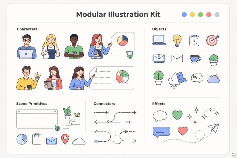
Modular illustration components: what to standardize
- Scene primitives: backgrounds, containers, panels, clouds, abstract shapes.
- Object library: devices, tools, UI windows, charts, icons embedded within illustrations.
- Character kit (if applicable): heads, hairstyles, torsos, poses, hands, clothing, accessories.
- Connectors: arrows, lines, dotted paths, callouts, badges.
- Effects: sparkles, highlights, motion lines—define when and how they appear.
When these are standardized, new illustrations become assemblies of approved parts rather than reinventions.
Step-by-step: build a reusable illustration kit
Step 1: Identify the primary use cases. List where illustrations appear: onboarding screens, empty states, blog headers, event banners, help center diagrams. Each use case has constraints (size, density, legibility). Do not design a single style that tries to do everything; instead, define a core style plus controlled variants if needed (e.g., “product UI illustration” vs “editorial illustration”).
Step 2: Create a style sheet with measurable rules. Include examples and numeric constraints. For instance: “Outline thickness 3px at 1000px artboard; corner radius 24px; shadow offset 12px at 20% opacity; no more than 6 colors per scene; gradients only for background blobs.”
Step 3: Design a base scene template. Provide a few composition templates: centered hero, left-text/right-illustration, stacked mobile onboarding, small empty-state tile. Each template should define safe areas and typical focal points so illustrations don’t fight UI content.
Step 4: Build a component inventory. Start with 30–50 objects that recur across your domain (e.g., for a finance product: card, receipt, chart, shield, lock, storefront, invoice). For each object, define variants (front view, angled view, small/large) and constraints (no micro-details below a certain size).
Step 5: If characters exist, build a character system. Create a small set of base bodies and poses that can be recombined. Standardize: skin tone approach (inclusive range), facial detail level, hand style, and clothing shapes. Provide rules for diversity without creating a combinatorial explosion (e.g., 6 hairstyles × 6 outfits × 8 poses can become unmanageable). Prefer curated sets.
Step 6: Define “do and don’t” examples. Show side-by-side: correct shadow softness vs too harsh; correct line weight vs too thin; correct color count vs rainbow scenes; correct perspective vs accidental 3D.
Step 7: Package as a library with symbols/components. In your design tool, convert objects and characters into components with variants (pose, direction, colorway). Provide a clear folder structure: Illustration/Objects, Illustration/Characters, Illustration/Scenes, Illustration/Effects.
Step 8: Establish an assembly workflow. Document how a designer should build a new illustration: choose a template, place scene primitives, add objects/characters, apply shading rules, run a checklist, export.
Consistency checks: quality gates for icons and illustrations
Component-like reuse requires quality gates that catch drift early. These checks should be simple enough to run during production and strict enough to prevent gradual style erosion.
Icon checklist (practical)
- Stroke weight matches tier spec; no accidental scaling.
- Caps and joins match the system.
- Key edges align to pixel grid at target size; no blurry strokes.
- Minimum gaps respected; interior details not collapsing at 16px.
- Visual weight consistent compared to neighboring icons (test in a row).
- Metaphor matches meaning; no ambiguous symbols.
- Naming follows convention; tags added; usage notes included.
Illustration checklist (practical)
- Color count within limits; accent color used intentionally.
- Lighting and shadows consistent with the style sheet.
- Line thickness and corner radii consistent across elements.
- Perspective consistent (flat vs isometric); no mixed depth cues.
- Detail density appropriate for the target size (especially empty states).
- Components used from the kit where possible; new components added back to the library with proper naming.
Bridging icons and illustrations: shared motifs and interoperability
Icons and illustrations often coexist in the same product surface: an empty state might include an illustration and a set of actionable icons; a marketing page might use icons as feature bullets and an illustration as a hero. To avoid a “two different brands” feeling, define shared motifs that connect them.
Ways to create cohesion without forcing identical styles
- Shared geometry: If icons rely on 45° angles and rounded corners, echo those angles and radii in illustration objects and UI windows.
- Shared stroke logic (when applicable): If illustrations have outlines, align their line caps/joins with icon caps/joins.
- Shared metaphor set: Use the same object metaphors across both (e.g., the same “shield” shape for security).
- Shared accent behavior: If icons use a single accent color for emphasis, illustrations can use that same accent sparingly to guide attention.
The goal is not to make illustrations look like giant icons, but to ensure they feel like they belong to the same system.
Governance: adding new icons and illustrations without breaking the system
Reusable component libraries need a contribution model. Without governance, teams will create near-duplicates, introduce inconsistent metaphors, and bypass the library under deadline pressure.
Define an intake and review flow
- Request template: meaning, context, size, platform, and any existing similar assets.
- Design pass: create in the correct template; include size-tier variants if required.
- Review: check against style recipe and checklists; verify naming and metadata.
- Approval and publishing: add to library, update changelog, mark deprecated assets if replaced.
Deprecation rules
When an icon or illustration is replaced, deprecate rather than delete. Provide a mapping: “old name → new name,” and a timeframe for removal if needed. This prevents broken references in products and keeps the library trustworthy.
Practical mini-case: designing a coherent “Security” set
Imagine you need assets for a security feature across UI and onboarding. You might need icons for “lock,” “shield,” “key,” “2FA,” and an illustration for an onboarding screen.
Icon set approach
- Choose metaphors: lock = authentication, shield = protection, key = access, phone + code = 2FA.
- Apply construction recipe: same stroke, same corner logic, same angles.
- Test at 16px: simplify the key teeth; reduce inner lock details; ensure shield interior doesn’t collapse.
- Name semantically:
security.lock,security.shield,security.key,security.2fa.
Illustration approach
- Use the same shield silhouette as the icon (scaled and detailed appropriately) to create motif continuity.
- Assemble from kit: a device object, a shield object, a character pose (optional), and a callout badge.
- Apply rendering model: consistent shadow softness, limited palette, one accent highlight on the shield.
- Export variants: large onboarding, small empty state (simplified, fewer elements).
This mini-case shows component thinking: shared metaphors, shared motifs, and predictable variants across asset types.

Library packaging and handoff: formats and implementation considerations
To keep icons and illustrations reusable across teams, package them in formats that match real workflows.
Icons: practical packaging
- SVG as source of truth: clean paths, consistent viewBox, no unnecessary groups, strokes expanded only if your pipeline requires it.
- Component wrappers: provide ready-to-use components for product teams (e.g., a generic
Iconcomponent that takes name, size, and state). - Alignment and bounding boxes: ensure consistent viewBox and optical centering so icons align in buttons and lists.
Illustrations: practical packaging
- Editable source files: keep a master library where objects are components/symbols.
- Export presets: define standard exports (PNG for marketing, SVG for web where appropriate, optimized raster for email).
- Performance constraints: avoid overly complex SVGs for large illustrations; consider raster exports when necessary.
Packaging is part of reusability: if assets are hard to implement, teams will recreate them.


