
Why extension is different from “more assets”
Extending a modular brand system for sub-brands, campaigns, and product UI is not primarily a production task (making more templates, more icons, more screens). It is a design and decision task: you are defining how far the system can stretch while still feeling like one family. In practice, extension work answers three questions: (1) what must remain invariant so the parent brand is always recognizable, (2) what is allowed to vary to create meaningful differentiation, and (3) how teams choose variations without inventing new rules each time.
Because earlier chapters already established the system’s foundations, this chapter focuses on extension mechanics: how to create “controlled variation” layers, how to allocate differentiation across sub-brands vs campaigns vs UI surfaces, and how to operationalize those decisions so designers and product teams can execute quickly without fragmenting the system.
Extension layers: parent brand, variants, and local expression
A scalable approach is to think in layers rather than separate systems. You keep a stable parent layer, then add variant layers for sub-brands or campaigns, and finally allow local expression within guardrails for specific touchpoints (e.g., a product onboarding flow vs a paid social ad).
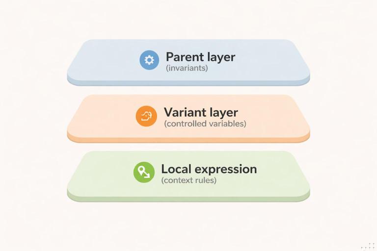
- Parent layer (invariants): elements that should remain consistent across everything. These are the “recognition anchors.” Examples might include a core wordmark lockup behavior, a primary typeface, a signature motion cadence, or a specific compositional habit (e.g., generous whitespace and left-aligned hierarchy). The key is that these anchors are few and strong.
- Variant layer (controlled variables): a limited set of parameters that can change to create differentiation. A sub-brand might get a distinct accent color and imagery treatment; a campaign might get a temporary pattern and headline voice; a product UI might get a functional density mode and component theming.
- Local expression (contextual choices): decisions that are allowed to vary because the medium demands it (e.g., accessibility contrast adjustments, platform UI conventions, responsive layout changes). These should be framed as “context rules,” not new brand rules.
This layered model prevents a common failure mode: treating every new initiative as a reason to create a parallel identity. Instead, you define a small “variation budget” and spend it intentionally.
Extending for sub-brands: differentiation without divorce
Sub-brands typically exist for one of three reasons: (1) different audience segment, (2) different offering category, or (3) different business model/experience (e.g., enterprise vs consumer). The extension challenge is to make the sub-brand legible as distinct while still clearly belonging to the parent.
- Listen to the audio with the screen off.
- Earn a certificate upon completion.
- Over 5000 courses for you to explore!

Download the app
Choose a sub-brand architecture and map it to system behavior
Before designing, decide which relationship model you are supporting. You do not need to name the model formally in the documentation, but you do need to define its behavior.
- Endorsed relationship: sub-brand has its own name/mark but is visibly endorsed by the parent. System behavior: parent anchors remain strong; sub-brand gets a dedicated variant set (e.g., accent palette + imagery style) and a fixed endorsement lockup rule.
- Branded house extension: sub-brand is primarily a descriptor under the parent. System behavior: minimal variation; differentiation comes from messaging, product UI theming, and secondary graphic elements rather than a separate identity.
- Portfolio relationship: sub-brand is more independent. System behavior: you still define shared anchors (e.g., motion, illustration, or layout habits) to avoid total fragmentation, but you allow larger variance in mark and palette.
Define a “sub-brand differentiation matrix”
Create a matrix that specifies where differentiation is allowed and how strong it can be. This prevents sub-brands from competing on the same levers and accidentally looking unrelated.
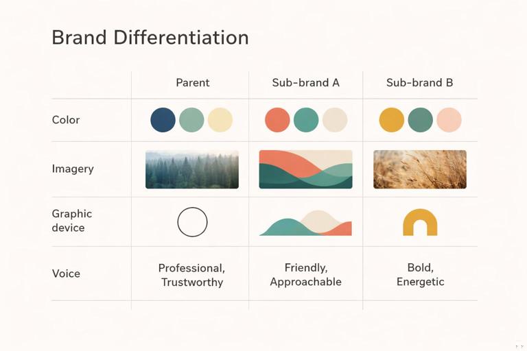
Example matrix (conceptual):
- Color: each sub-brand gets one accent color family; parent primary remains present in navigation, footers, or endorsement elements.
- Imagery: sub-brand A uses documentary photography; sub-brand B uses studio product photography; both share the same cropping rules and lighting temperature range.
- Graphic device: sub-brand A uses a rounded container motif; sub-brand B uses a diagonal cut motif; both use the same spacing rhythm and corner radii constraints.
- Voice: sub-brand A is instructional; sub-brand B is aspirational; both share the same headline length guidance and CTA structure.
The matrix should be short and enforceable. If you need more than 5–7 differentiation levers, the system is likely too permissive.
Practical step-by-step: creating a sub-brand variant kit
Use this workflow when adding a new sub-brand to an existing modular system.
- Step 1: Identify the recognition anchors that must stay. Write a one-page “must remain” list (e.g., logo endorsement behavior, primary typeface usage in headlines, baseline motion feel, core UI component shapes). Keep it explicit so teams don’t negotiate it later.
- Step 2: Allocate the variation budget. Choose 2–3 primary levers (e.g., accent color + imagery + secondary graphic device). Avoid changing everything at once.
- Step 3: Build a minimal variant palette and test contrast. Define the sub-brand accent(s) and how they appear alongside parent colors. Validate accessibility for UI contexts and legibility for marketing contexts (e.g., small mobile ads).
- Step 4: Define the sub-brand “hero composition.” Create 2–3 canonical layouts (e.g., website hero, product landing hero, social post). These become the visual shorthand for the sub-brand.
- Step 5: Create an endorsement lockup rule set. Specify placement, spacing, and when endorsement is required (e.g., always on first-touch marketing; optional inside authenticated product UI). Provide examples for horizontal, stacked, and small-format cases.
- Step 6: Produce a starter asset pack. Include a small set of templates, imagery examples, and component themes that demonstrate the variant. The goal is to enable immediate production without improvisation.
- Step 7: Run a “family resemblance” review. Place sub-brand outputs next to parent outputs in a single board: homepage, email header, app screen, ad. Check if the shared anchors are doing their job. If not, reduce variation or strengthen anchors.
Extending for campaigns: temporary energy without permanent drift
Campaigns are time-bound and often channel-heavy (paid social, landing pages, email, events). The risk is that campaign urgency encourages rule-breaking: new fonts, new illustration styles, new layout habits. The system-friendly approach is to treat campaigns as “overlays” that sit on top of the parent brand and can be removed cleanly after the campaign ends.
Campaign overlays: what can change safely
Campaign differentiation should be high-impact but low-structural. In other words, you want elements that create a distinct feel without rewriting the system’s underlying grammar.
- Safe to vary: headline messaging patterns, temporary graphic motifs (patterns, frames, stickers), limited accent colors, photography subject matter, and short-lived motion accents (e.g., a campaign-specific transition).
- Be cautious with: typography changes, core logo behavior, fundamental layout logic, and UI component shapes. If a campaign needs these to change, it may actually be a sub-brand or product initiative rather than a campaign.
Campaign “kit of parts” vs “one-off key art”
Campaigns often start with key art. Key art is useful, but it can trap you into a single composition that doesn’t scale across formats. Instead, translate key art into a kit of parts: a small set of reusable elements with rules for recombination.
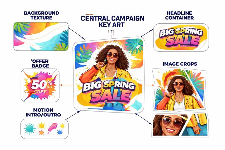
Example: a campaign launches with a bold typographic poster. Convert it into components: (1) a background texture, (2) a headline container style, (3) a badge shape for offers, (4) a set of image crops, (5) a motion intro/outro. Then define how these components combine across channels.
Practical step-by-step: building a campaign overlay kit
- Step 1: Write the campaign’s “one sentence visual intent.” Example: “Fast, optimistic, and slightly playful—without losing the parent brand’s clarity.” This sentence becomes the filter for every design decision.
- Step 2: Select 1–2 overlay devices. Choose devices that are easy to apply across formats: a pattern, a frame system, a sticker/badge set, or a gradient treatment. Avoid devices that require bespoke illustration for every asset unless you have capacity.
- Step 3: Define a campaign accent palette with boundaries. Specify where accents can appear (e.g., only in backgrounds and badges; never in body text). Include “do not” guidance such as “do not replace the parent primary color in navigation bars.”
- Step 4: Create responsive headline rules for the campaign. Provide 3–4 headline templates: short (3–5 words), medium (6–10), long (11–16). Include line-break guidance and maximum character counts for common placements (social, email subject, landing hero).
- Step 5: Produce a format map. List required deliverables by channel and size. For each, specify which overlay elements are mandatory vs optional. This prevents random variation across teams.
- Step 6: Build a modular template set. Create templates that separate content from styling: background layer, overlay device layer, headline layer, CTA layer, legal layer. This makes localization and iteration faster.
- Step 7: Plan the “off-ramp.” Define what happens after the campaign: which elements are retired, which can be reused, and how to archive the kit so it doesn’t leak into evergreen brand work.
Extending into product UI: brand expression under functional constraints
Product UI extension is where brand meets usability, accessibility, and platform conventions. The goal is not to “decorate” the UI; it is to encode brand character into the experience in ways that do not compromise clarity. The best UI brand extensions are subtle, consistent, and tied to interaction moments users actually notice: onboarding, empty states, confirmations, errors, and key navigation surfaces.
Define “brand moments” in the UI
Not every screen should carry the same brand intensity. Identify where brand expression has the highest value and lowest risk.
- High-value moments: first-run onboarding, account creation, paywall/upgrade, success confirmations, share/export flows, and key dashboards.
- Low-risk surfaces for expression: empty states, loading states, tooltips, and micro-interactions (e.g., button press feedback).
- High-risk surfaces: dense data tables, complex forms, error-heavy admin screens. Here, prioritize clarity and accessibility; brand expression should be minimal and structural (spacing, hierarchy, tone of microcopy).
UI theming strategy: base UI + brand skin + product modes
Many organizations need multiple products or multiple experiences within one product (e.g., “basic” vs “pro,” consumer vs enterprise). Rather than forking components, define theming as a controlled layer.
- Base UI: shared components and interaction patterns.
- Brand skin: brand-specific styling parameters applied consistently (e.g., surface colors, corner treatments, elevation style, illustration usage in empty states).
- Product modes: optional variations for context (e.g., compact density mode, high-contrast mode, enterprise mode). Modes should be additive and purposeful, not aesthetic experiments.
Practical step-by-step: extending the system into a new product area
Use this when a new feature area or product is being designed and needs to feel on-brand without breaking usability.
- Step 1: Inventory the UI surfaces involved. List the screen types: navigation, forms, data display, messaging, onboarding, settings. Mark which ones are brand moments.
- Step 2: Choose the minimum set of brand carriers. Pick 3–5 carriers that will do most of the work. Examples: top-level navigation styling, primary button style, empty state illustration pattern, success state animation, and tonal microcopy guidelines.
- Step 3: Define component theming rules for key components. For buttons, inputs, alerts, cards, and navigation, specify how the brand skin applies: where accent color appears, how emphasis levels work, and how states (hover/pressed/disabled/error) remain clear.
- Step 4: Create a “density and hierarchy” checklist for the UI. Instead of redefining spacing standards, define acceptable density ranges per surface (e.g., “dashboard: medium density; settings: high clarity; onboarding: low density”). Provide examples of what to simplify when screens get crowded.
- Step 5: Validate accessibility and platform conventions. Check contrast, focus indicators, touch targets, and motion reduction preferences. Ensure the brand skin does not remove expected affordances (e.g., links still look like links).
- Step 6: Prototype critical flows and test for comprehension. Select 2–3 representative flows (signup, create action, error recovery). Test whether users can complete tasks quickly; if brand expression slows comprehension, reduce it in high-risk surfaces.
- Step 7: Document “UI do/don’t” at the pattern level. Provide examples like: “Do use accent color for primary actions; don’t use accent color for all icons.” “Do use illustration in empty states; don’t add illustration to dense tables.”
Managing collisions: when sub-brand, campaign, and UI overlap
Real-world work often stacks contexts: a sub-brand runs a campaign that drives into a product UI experience. Without explicit collision rules, teams improvise and the system fractures. Define precedence: which layer wins when rules conflict.
Precedence rules (a practical model)
- Accessibility and usability always win. If a campaign overlay reduces contrast or clarity in UI, it must be modified or removed for UI contexts.
- Parent anchors are always present at first touch. For marketing entry points (ads, landing pages), ensure parent recognition anchors appear even if the sub-brand is prominent.
- Sub-brand variant beats campaign overlay for identity cues. If both specify accent colors or imagery, the sub-brand’s variant should be the base; the campaign overlay becomes a secondary layer (e.g., pattern, badge).
- Campaign overlay is strongest in marketing, weakest in product UI. In UI, campaign presence might be limited to a banner, a promotional card, or a themed illustration in a single surface rather than a full reskin.
Example collision scenario
Scenario: Sub-brand “Studio” launches a limited-time “Launch Week” campaign. The campaign uses a high-energy gradient background and sticker-like badges. Users click ads into a landing page, then sign up and enter the product UI.
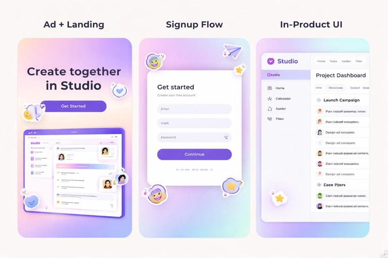
- Ad + landing: Use Studio’s accent color as the base; apply the campaign gradient as a background option and campaign badges for urgency. Parent endorsement appears in the footer and header lockup.
- Signup flow: Reduce campaign gradient to a subtle header band; keep Studio accent for primary actions; remove stickers to avoid distraction in form completion.
- In-product: Campaign appears as a dismissible banner and a themed empty state illustration for one relevant feature. No global reskin.
Designing extension rules that scale across teams
Extension fails when rules are too abstract (“keep it on brand”) or too brittle (“only use these three templates”). The scalable middle is to define decision rules and provide a small set of tested examples that demonstrate how to apply them.
Create “if/then” rules for common decisions
These rules help non-experts make consistent choices quickly.
- If the asset is a first-touch marketing piece, then include parent recognition anchors and keep overlay devices secondary.
- If the surface is task-focused UI (forms, tables), then limit brand expression to navigation, emphasis color, and microcopy tone.
- If the initiative is longer than one quarter and has its own roadmap, then treat it as a sub-brand/product variant, not a campaign overlay.
- If localization is required, then avoid layout devices that depend on fixed headline lengths (e.g., tightly fitted typographic shapes).
Use “reference implementations” instead of endless guidelines
For each extension type, create 2–3 reference implementations that teams can copy. A reference implementation is a small set of real artifacts that show the rules working together.
- Sub-brand reference: homepage hero, product overview page, email header, one app screen.
- Campaign reference: paid social set (3 sizes), landing hero + section modules, email, event slide.
- UI reference: onboarding flow, empty state, error state, settings screen.
These references should be maintained as living examples; when the system evolves, update them first so teams see the current best practice.
Quality checks for extensions (fast, repeatable reviews)
To keep extensions coherent, use lightweight checks that can be applied in reviews without re-litigating fundamentals.
Family resemblance check
- Can someone recognize the parent brand in 2 seconds?
- Are the recognition anchors present and unmodified?
- Is the variation limited to the intended levers (not accidental changes to typography, layout habits, or component shapes)?
Channel fit check
- Does the campaign overlay survive responsive cropping?
- Does the sub-brand differentiation remain visible in small formats (mobile, thumbnails)?
- Does the UI theming preserve accessibility and platform expectations?
Removal test (especially for campaigns)
- If you remove the overlay devices, does the underlying asset still look like the parent/sub-brand?
- Can the campaign be archived without leaving behind “orphan” styles that teams keep reusing?
Practical examples: extension patterns you can reuse
Pattern 1: Sub-brand via accent + imagery, not new structure
A parent brand with a calm, minimal aesthetic launches a sub-brand targeting creators. Instead of changing typography or layout habits, the sub-brand gets: (1) a vivid accent color used for highlights and primary CTAs, and (2) a photography style focused on hands-on making. The parent’s compositional clarity remains intact, so the sub-brand feels energetic but still “in the family.”
Pattern 2: Campaign via badge system + temporary background texture
A seasonal promotion needs urgency. Create a badge set (e.g., “Limited,” “New,” “Ends Friday”) with strict placement rules and a subtle texture that can sit behind content. The campaign feels distinct across ads and landing pages, but the underlying brand layout and hierarchy remain unchanged, making production fast and consistent.
Pattern 3: UI brand expression concentrated in moments
A product team wants the app to feel more branded. Rather than recoloring everything, they focus on: (1) onboarding illustrations, (2) success animations, (3) empty state messaging tone, and (4) a distinctive but accessible primary action style. Dense screens (tables, settings) remain neutral and highly usable, while key moments carry the brand personality.
Implementation notes: keeping extensions maintainable
When you extend, aim for additions that are modular and reversible. Sub-brand variants should be defined as a small set of parameters and example compositions; campaigns should be overlays that can be removed; UI theming should be a skin applied to shared components rather than a fork. If an extension requires duplicating large portions of the system, treat that as a signal to redesign the extension approach: reduce variation, strengthen anchors, or re-scope the initiative.
// A simple way to describe extension layers in documentation (conceptual, not tool-specific) Parent: anchors + shared components Sub-brand variant: accent + imagery + device + endorsement Campaign overlay: temporary motif + badge + limited accents UI skin: component theming + brand moments + mode constraints Precedence: accessibility > parent anchors > sub-brand variant > campaign overlay


