
Why collaboration with non-designers is hard (and necessary)
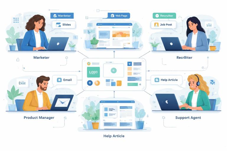
Modular brand systems succeed when they are used widely, not when they are perfectly designed in isolation. In most organizations, the majority of brand touchpoints are produced by people who are not trained designers: marketers building campaign pages, sales teams assembling decks, recruiters posting job ads, product managers writing release notes, customer support creating help-center articles, and regional teams adapting materials for local needs.
The tension is predictable: non-designers need speed, autonomy, and tools that fit their workflows; designers need coherence, quality, and predictable outcomes. If the system is too strict, people route around it (copy-paste old files, use random templates, or outsource quick fixes). If the system is too loose, the brand becomes inconsistent and the “system” turns into a folder of assets with no reliable behavior.
Collaboration without dilution means designing the usage layer: the interfaces, guardrails, and decision paths that let non-designers produce on-brand work with confidence, while keeping the underlying system stable. This chapter focuses on practical collaboration patterns, handoffs, and enablement tactics that reduce friction and prevent “brand drift” without turning designers into gatekeepers for every small request.
Define the collaboration contract: what non-designers can change vs. what they can’t
Non-designers collaborate best when the system clearly communicates which decisions are open and which are closed. This is not the same as repeating system constraints; it is about translating them into a working agreement that matches real tasks.
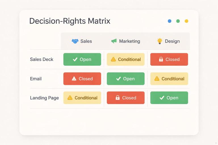
Create a “decision rights” matrix
Build a simple matrix that maps common tasks to roles and permissions. Keep it operational and scenario-based. Example categories:
- Listen to the audio with the screen off.
- Earn a certificate upon completion.
- Over 5000 courses for you to explore!

Download the app
- Open choices: safe options that can be selected freely (e.g., choosing from approved layouts, selecting a pre-defined content module, swapping imagery within guidelines).
- Conditional choices: allowed only when certain conditions are met (e.g., using a high-contrast layout only when text length is under a threshold; selecting a dense layout only for internal docs).
- Closed choices: not editable by non-designers (e.g., altering core marks, inventing new component styles, changing foundational token values).
Write the matrix in the language of deliverables, not design theory. For example: “Sales can edit headline, subhead, and stats modules in the deck template; Sales cannot add new chart styles or change typography settings.”
Turn “no” into “here’s the path”
When something is closed, provide an alternate route that still feels like progress:
- Request path: a lightweight intake form for exceptions (with required context and deadlines).
- Approved alternatives: “If you need emphasis, use Module B instead of inventing a new highlight style.”
- Escalation rules: what qualifies as a system change vs. a one-off adaptation.
This reduces the temptation to improvise and makes the system feel supportive rather than restrictive.
Design for non-designer workflows: meet them where they work
Non-designers rarely open professional design tools. They work in slide software, docs, spreadsheets, CMS editors, email builders, social schedulers, and sometimes no-code web tools. Collaboration improves when the system is expressed in those environments with the right level of control.
Choose “authoring surfaces” and standardize them
Pick a small set of primary creation environments and treat them as first-class outputs of the system. Examples:
- Slides for sales and internal comms
- Docs for policies, proposals, and long-form content
- CMS blocks for web pages and landing pages
- Email templates for lifecycle and newsletters
- Social templates for recurring formats
For each surface, define what “on-brand by default” means: which templates exist, what modules are available, and what is locked. The goal is not to replicate every design possibility; it is to cover the 80% use cases so people don’t create their own.
Use progressive disclosure: simple by default, advanced when needed
Non-designers should see only the controls they need. Too many options create accidental inconsistency. A practical approach is to offer tiers:
- Tier 1 (Everyday): minimal choices, high safety. Example: pick a layout, drop in content, choose from a small set of image treatments.
- Tier 2 (Power user): more modules and variants, still within guardrails. Example: optional sections, alternate data display modules, additional page types.
- Tier 3 (Designer-assisted): custom compositions, new modules, or exceptions.
Tiering can be implemented through separate template sets, permissioned libraries, or “advanced” pages in documentation.
Build templates as systems, not as finished designs
Non-designers often treat templates as static artifacts. To prevent dilution, templates should behave like configurable products: they should guide correct assembly and make incorrect assembly difficult.
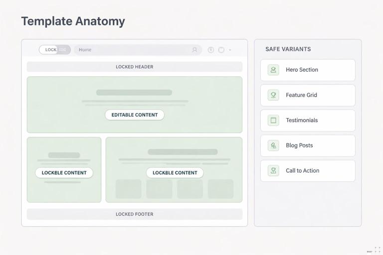
Template anatomy: locked structure + editable content zones
For each template, define:
- Locked elements: items that preserve system integrity (e.g., header structure, footer, navigation patterns, key spacing relationships, core component styling).
- Editable zones: text fields, image slots, data inputs, and module toggles.
- Safe variants: pre-approved alternate modules (e.g., “with sidebar,” “with stats row,” “with testimonial”).
Example: a one-page product announcement template might lock the overall layout and module styling, but allow swapping between “Feature list” and “Use cases” modules, and allow selecting one of three image crops.
Embed instructions inside the template
Non-designers do not read long guidelines while working. Put micro-instructions where decisions happen:
- Placeholder copy that demonstrates ideal length and tone
- Notes like “Keep headline under 8 words” or “Use 1–3 bullets”
- Image slot labels like “Use a single-subject photo; avoid busy backgrounds”
When possible, use checklists in the template itself (e.g., a “Before you publish” slide or a hidden “QA” section in a doc template).
Operationalize collaboration with a step-by-step production flow
To collaborate without dilution, define a repeatable flow that clarifies when non-designers can self-serve and when designers should be involved. The flow below is designed to reduce back-and-forth and prevent late-stage brand fixes.
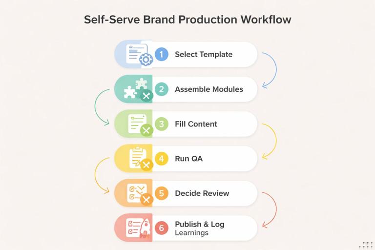
Step-by-step: a “self-serve first” workflow
- Step 1: Select the closest template
Non-designer chooses from a small set of templates organized by job-to-be-done (e.g., “Webinar promo,” “Quarterly update deck,” “Product release email”). Avoid organizing by abstract categories like “marketing” vs. “sales.”
- Step 2: Assemble using modules, not freeform layout
They add, remove, or reorder pre-built modules. If the tool allows, restrict freeform resizing and ad-hoc styling. If not, provide “approved module pages” they can duplicate.
- Step 3: Fill content using length and hierarchy cues
They replace placeholder content while following embedded constraints (headline length, bullet count, CTA format). Encourage writing first, then selecting imagery to match the message.
- Step 4: Run a lightweight brand QA checklist
A short checklist catches the most common drift points. Keep it under 10 items and tie each item to a visible cue (e.g., “All headings use the heading style, not manual formatting”).
- Step 5: Decide if designer review is required
Use triggers rather than subjective judgment. Example triggers: external paid media, executive audience, press release, new product naming, new illustration need, unusual format size, localization into a new script.
- Step 6: Publish and log learnings
When non-designers hit friction (missing module, unclear rule), they log it in a shared backlog. Designers review patterns monthly to improve templates and guidance.
This workflow shifts designers from “policing outputs” to “improving the system based on real usage.”
Create a shared language: translate design intent into non-designer decisions
Dilution often happens because non-designers don’t know what matters. They may change something that seems minor (like alignment or image treatment) but that actually carries brand meaning. The fix is not more rules; it is better translation.
Use “if/then” rules instead of abstract principles
Replace vague guidance with decision rules that map to common scenarios:
- If the message is urgent or time-sensitive, then use the “Announcement” module set rather than the “Story” module set.
- If the background image is busy, then choose the high-contrast text container variant.
- If you have more than 5 bullets, then switch to the “Two-column list” module or rewrite.
These rules help non-designers make consistent choices without needing to understand the underlying rationale.
Provide “good/better/best” examples for common deliverables
Instead of only showing perfect examples, show realistic quality levels:
- Good: acceptable, fast, template-only
- Better: improved with stronger image choice and tighter copy
- Best: designer-assisted or advanced module usage
This reduces perfection anxiety and discourages risky improvisation.
Design the feedback loop: how non-designers request help without chaos
Collaboration fails when requests arrive as scattered messages, last-minute “quick tweaks,” or vague asks like “make it pop.” A structured feedback loop protects designers’ time and keeps the system coherent.
Use a standardized intake that captures the right constraints
Create a short form (or ticket template) that requires:
- Deliverable type and channel
- Audience and goal
- Deadline and launch date
- What template/module they started from
- What is not working (with screenshot)
- Whether this is a one-off or recurring need
The key field is “recurring vs. one-off.” Recurring needs should trigger system improvements (new module, new template variant). One-offs should be handled as exceptions with minimal system impact.
Define response levels and turnaround expectations
Set clear service levels to prevent ad-hoc negotiation:
- Office hours: weekly drop-in for quick guidance and template troubleshooting
- Async review: designers review within a set window for high-impact external outputs
- Project support: scheduled design time for campaigns or launches
Non-designers collaborate better when they know what kind of help exists and how to access it.
Prevent “template drift” with controlled customization
Even with good templates, drift happens over time: people duplicate old files, modify styles, and pass them along. The result is a parallel ecosystem of “almost on-brand” artifacts.
Use a single source of truth for templates
Host templates in a central location and make it the default starting point. Then reduce incentives to use old files:
- Make templates easy to find (by use case)
- Include “last updated” metadata inside the template
- Archive or watermark deprecated templates
- Provide a migration path: “If you’re using v2, here’s how to update to v3”
Lock what must not change, and offer sanctioned alternatives
When tools allow locking, use it strategically. When they don’t, use structural techniques:
- Provide pre-built pages/sections that users duplicate rather than rebuild
- Offer a small set of alternate layouts instead of allowing freeform rearrangement
- Use style presets and discourage manual overrides
Controlled customization is not about limiting creativity; it is about channeling creativity into content and composition choices that remain within the system’s expressive range.
Teach non-designers to think in modules: practical enablement
Enablement should be short, role-specific, and tied to real tasks. Long training sessions and dense documentation are rarely retained. The goal is to build “muscle memory” for assembling on-brand outputs.
Run role-based micro-training sessions
Design a 30–45 minute session per role group (marketing, sales, recruiting, support). Each session should include:
- Where to find templates and which ones to use
- How to assemble modules (with a live build)
- The top 5 mistakes to avoid in that channel
- How to request help and what qualifies for review
Record the session and pair it with a one-page quick reference.
Create “recipes” for recurring content types
A recipe is a repeatable assembly pattern: which modules to use and in what order. Recipes reduce decision fatigue and keep outputs consistent across teams.
Example recipe: “Customer story social post”
- Module: Quote block (short)
- Module: Customer name/title line
- Module: Product benefit (1 sentence)
- Module: CTA button
- Image: single-subject or product-in-context photo
Recipes are especially useful for teams producing high volume content under time pressure.
Handle edge cases: localization, accessibility, and data-heavy content
Non-designers often encounter edge cases first. If the system doesn’t support them, they improvise, and improvisation is where dilution begins. Anticipate the most common edge cases and provide safe patterns.
Localization and text expansion
When text expands (longer words, different scripts), non-designers may shrink fonts or squeeze spacing. Instead, provide:
- Alternate modules designed for longer text (e.g., “long headline” variant)
- Guidance like “never reduce type size; switch to layout B”
- Examples of acceptable line breaks and hyphenation behavior
Accessibility constraints in everyday tools
Non-designers may inadvertently create inaccessible outputs (low contrast overlays, text baked into images, missing alt text). Provide tool-specific instructions:
- How to add alt text in the CMS or slide tool
- When to avoid text-on-image and which module to use instead
- A checklist item: “All meaningful images have alt text; decorative images are marked decorative”
Data-heavy slides and charts
Data content is a common drift source because people copy charts from spreadsheets or use default styles. Provide:
- Pre-built chart slide layouts with labeled placeholders
- Rules for maximum series count and label density
- Fallback modules: “If the chart is too dense, use a key-metrics module plus appendix chart”
Designer collaboration modes that scale
Designers cannot review everything, but they can create scalable touchpoints that keep quality high.
Office hours as a system improvement engine
Office hours should not become endless production help. Structure them:
- Time-box per person (e.g., 10 minutes)
- Require a template link and specific question
- Capture recurring issues in a backlog
Over time, the backlog should translate into better templates, clearer embedded instructions, and fewer repeated questions.
Critique frameworks for non-designers
When reviewing non-designer work, avoid subjective feedback like “make it cleaner.” Use a consistent critique rubric that non-designers can apply themselves:
- Clarity: Is the primary message obvious in 3 seconds?
- Hierarchy: Does the layout guide the eye in the intended order?
- Consistency: Are only approved modules and styles used?
- Fit: Does the template match the channel and audience?
- Accessibility: Are contrast, alt text, and readability handled?
This turns review into skill-building rather than one-off correction.
Practical artifacts to implement immediately
The following artifacts are lightweight, high-impact, and specifically aimed at collaboration without dilution. They can be created incrementally and improved based on usage.
1) A one-page “How to stay on-brand” checklist per channel
- 8–10 items max
- Written in tool language (slides, CMS, email builder)
- Includes links to the correct templates
2) A template chooser
A simple decision tree that routes people to the right starting point. Example structure:
What are you making? - External marketing asset → Choose from: campaign landing, email, social - Sales enablement → Choose from: pitch deck, one-pager, case study - Internal update → Choose from: all-hands deck, memo, KPI snapshot3) A “request an exception” form with required fields
Keep it short and force clarity. Include a field: “What would make this reusable?” to encourage system-minded requests.
4) A recurring “template drift audit”
Once per month, sample a handful of outputs from each team and categorize issues:
- Wrong template used
- Manual styling overrides
- Missing accessibility steps
- Unclear module choice
- Need for a new module/variant
Use the audit to prioritize improvements that reduce future drift rather than repeatedly fixing symptoms.


