Why error handling matters in operational dashboards
Operational workbooks fail in predictable ways: missing files, late data feeds, unexpected text in numeric fields, new categories that were not mapped, and divide-by-zero situations when volumes are temporarily zero. If these failures surface as raw Excel errors (#N/A, #VALUE!, #DIV/0!, #REF!, #NAME?), users lose trust and spend time hunting for the source. Error handling patterns are repeatable formulas and checks that (1) prevent errors where possible, (2) convert unavoidable errors into meaningful statuses, and (3) drive conditional formatting so exceptions are visible without turning the whole dashboard into a sea of red.
This chapter focuses on two complementary layers: formula-level error handling patterns and exception-driven conditional formatting. The goal is not to hide problems, but to surface them in a controlled way: show “No data yet” vs “Mapping missing” vs “Calculation invalid”, and highlight only what needs attention.
Error taxonomy: distinguish “expected gaps” from “true exceptions”
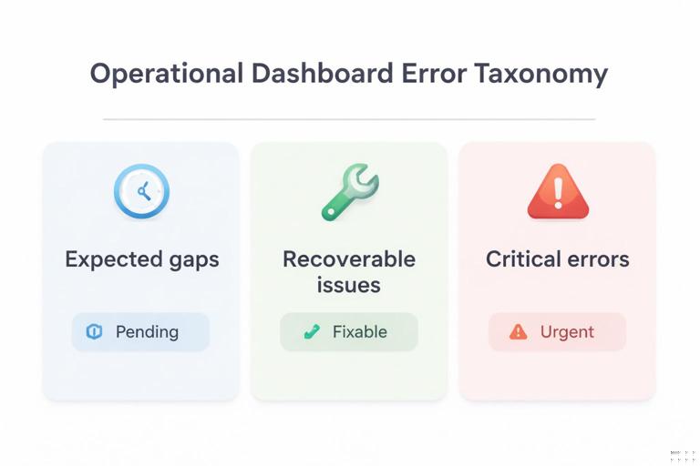
Before writing formulas, decide which situations are normal and which are exceptions. A practical taxonomy for operations:
- Expected gaps: data not yet arrived, optional fields blank, new period with no transactions. These should usually display blanks, dashes, or “Pending”, and should not trigger alarming formatting.
- Recoverable issues: a lookup key not found because a mapping table is incomplete, a numeric field imported as text, or a date parsed incorrectly. These should display a clear message and trigger a “needs attention” highlight.
- Critical errors: broken references, missing required columns, invalid model assumptions (e.g., negative inventory), or impossible states. These should be highly visible and ideally block downstream KPIs.
When you treat all errors the same (e.g., wrapping everything in IFERROR(…,0)), you lose this taxonomy and create silent failures. The patterns below keep the meaning.
Pattern 1: Use IFERROR only at the boundary, not everywhere
Problem: IFERROR is often used to “clean up” formulas, but it can mask real issues. If you wrap intermediate steps, you may convert a broken reference into a harmless-looking 0.
- Listen to the audio with the screen off.
- Earn a certificate upon completion.
- Over 5000 courses for you to explore!

Download the app
Pattern: Let intermediate calculations error naturally, then catch errors only at the final output cell where a user reads the result. At that boundary, convert errors into a status value that can be formatted and filtered.
Example: KPI that divides two measures
Assume you compute a fill rate = Shipped / Ordered. Ordered can be zero early in the day.
=LET(ordered, [@Ordered], shipped, [@Shipped], IF(ordered=0, NA(), shipped/ordered))Here, NA() is intentional: it produces #N/A, which is useful because it can be excluded from charts and can be formatted differently from other errors. If you used IFERROR(shipped/ordered,0), you would show 0% fill rate, which is misleading.
At the boundary (e.g., a dashboard card), you can convert #N/A to a friendly label while keeping other errors visible:
=LET(x, FillRateCell, IF(ISNA(x), "Pending", x))This keeps “Pending” separate from true calculation errors like #VALUE!.
Pattern 2: Prefer targeted checks over blanket IFERROR
Problem: IFERROR catches everything, including errors you did not anticipate.
Pattern: Use targeted checks such as ISNA, ISNUMBER, ISTEXT, ISBLANK, and logical guards (denominator=0, required field blank) to handle known conditions explicitly, and allow unknown errors to surface.
Example: numeric conversion guard
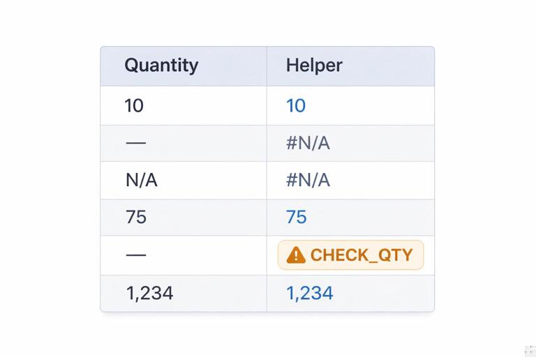
If a column sometimes arrives as text (e.g., “1,234” or “N/A”), you can validate before using it:
=LET(v, [@Qty], IF(ISNUMBER(v), v, IF(v="", NA(), "CHECK_QTY")))This produces either a number, #N/A for blank (expected gap), or a clear exception code “CHECK_QTY”. That code can be highlighted and counted.
Pattern 3: Create an “Exception Code” column separate from the KPI
Dashboards are easier to maintain when the numeric KPI remains numeric, and exceptions are tracked in a parallel column. This avoids mixing text and numbers in the same field, which breaks charts and aggregations.
Step-by-step: build KPI + exception code
Step 1: Compute the raw KPI (may error):
=LET(ordered, [@Ordered], shipped, [@Shipped], shipped/ordered)Step 2: Compute an exception code that explains why the KPI is invalid:
=LET(ordered, [@Ordered], shipped, [@Shipped], IF([@OrderID]="", "MISSING_KEY", IF(ordered=0, "NO_ORDERS", IF(OR(ISBLANK(shipped),ISBLANK(ordered)), "INCOMPLETE", IFERROR("CALC_ERROR", "")))))The last IFERROR("CALC_ERROR","") is a deliberate trick: if everything before it evaluates without error, it returns blank; if an error occurs anywhere in the expression, it returns “CALC_ERROR”. Use this sparingly and only after you have handled expected cases.
Step 3: Create a display KPI that stays numeric or blank:
=LET(k, [@FillRateRaw], code, [@ExceptionCode], IF(code<>"", NA(), k))Now charts can ignore NA(), and the exception code drives formatting and operational follow-up.
Pattern 4: Use NA() intentionally for “not applicable” and “not yet”
#N/A is not always bad. It is a powerful signal for “this value should not be plotted/aggregated.” Many Excel visuals skip #N/A automatically, while they will plot zeros.
- Use NA() for “not applicable” or “pending data”.
- Use blank for “optional and empty”.
- Use explicit codes for “needs attention”.
Example: forecast accuracy when no forecast exists
=LET(f, [@Forecast], a, [@Actual], IF(OR(f="", a=""), NA(), 1-ABS(a-f)/a))If Actual is blank, you likely want NA() rather than 0% accuracy.
Pattern 5: Use ERROR.TYPE to classify errors (when you must)
Sometimes you inherit a workbook where errors already exist and you need to classify them without rewriting everything. ERROR.TYPE returns a number for common error types.
=LET(x, A2, IFERROR(CHOOSE(ERROR.TYPE(x), "#NULL!", "#DIV/0!", "#VALUE!", "#REF!", "#NAME?", "#NUM!", "#N/A"), "OK"))This pattern is useful for diagnostics sheets and for conditional formatting rules that treat #N/A differently from #VALUE!.
Pattern 6: Build a reusable “safe divide” with LET (and a consistent policy)
Operations teams often need ratios: on-time %, defect rate, utilization, backlog coverage. Decide a consistent policy for denominator=0 and missing data, then apply it everywhere.
Example policy
- If denominator is 0 and numerator is 0: return NA() (not meaningful).
- If denominator is 0 and numerator > 0: return “CHECK_DENOM” (exception).
- If either input is blank: return NA() (pending).
- Otherwise: return numerator/denominator.
=LET(n, [@Numerator], d, [@Denominator], IF(OR(n="", d=""), NA(), IF(d=0, IF(n=0, NA(), "CHECK_DENOM"), n/d)))Notice this returns either a number, NA(), or a text exception. If you need the KPI to remain numeric, split into KPI + exception code as in Pattern 3.
Exception-driven conditional formatting: highlight what matters, not everything
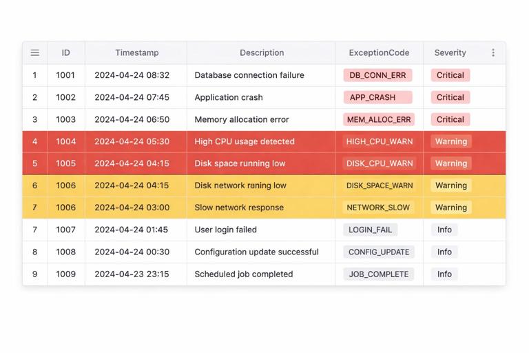
Conditional formatting becomes “exception-driven” when rules are based on explicit exception codes, thresholds, or completeness checks rather than generic “cell contains error”. This reduces noise and makes the dashboard actionable.
Design principle: format based on helper fields, not complex formulas inside rules
Conditional formatting rules are harder to audit than worksheet formulas. A robust approach is:
- Create helper columns such as ExceptionCode, DataFreshnessStatus, OutOfRangeFlag, or CompletenessScore.
- Use simple conditional formatting rules that reference those helpers.
This makes the logic visible in cells, easy to filter, and easy to test.
Step-by-step: conditional formatting driven by exception codes
Assume a table with columns: OrderID, Ordered, Shipped, FillRate (numeric or NA), ExceptionCode (blank or a code).
Step 1: Define a small exception dictionary
Create a small range (or table) listing exception codes and severity. Example codes:
- NO_ORDERS (Info)
- INCOMPLETE (Warning)
- MISSING_KEY (Critical)
- CHECK_QTY (Critical)
- CALC_ERROR (Critical)
Even if you do not build a full mapping, having a consistent list prevents “random text” exceptions.
Step 2: Add a Severity helper column
Compute severity from the code using a simple mapping approach. If you already have a two-column mapping table (Code, Severity), you can return severity; otherwise use SWITCH:
=LET(c, [@ExceptionCode], SWITCH(c, "", "OK", "NO_ORDERS", "INFO", "INCOMPLETE", "WARN", "MISSING_KEY", "CRIT", "CHECK_QTY", "CRIT", "CALC_ERROR", "CRIT", "WARN"))This keeps conditional formatting rules simple: they only check Severity.
Step 3: Apply conditional formatting to the entire row
Select the table data range (not headers). Create rules using “Use a formula to determine which cells to format”. Use structured references where possible; if Excel does not accept them in your version, use relative references anchored to the first data row.
- Critical (e.g., red fill):
=[@Severity]="CRIT"- Warning (e.g., amber fill):
=[@Severity]="WARN"- Info (e.g., light gray):
=[@Severity]="INFO"Order the rules from most severe to least severe and enable “Stop If True” so a critical row does not also get warning formatting.
Step-by-step: highlight stale data using a freshness check
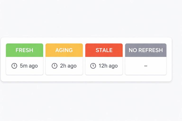
Operational dashboards often depend on daily or hourly refreshes. A common failure mode is that the data is old but the workbook still shows the last successful numbers. You can create a freshness status and format the dashboard header or KPI cards accordingly.
Step 1: Store a refresh timestamp
If you have a cell that records the last refresh time (for example, a timestamp loaded from Power Query or written by a macro), reference it as LastRefresh.
Step 2: Compute freshness status
=LET(t, LastRefresh, ageHrs, (NOW()-t)*24, IF(t="", "NO_REFRESH", IF(ageHrs>24, "STALE", IF(ageHrs>4, "AGING", "FRESH"))))Step 3: Conditional formatting for the dashboard banner
- STALE: strong highlight
- AGING: moderate highlight
- NO_REFRESH: critical highlight
=FreshnessStatusCell="STALE"This pattern prevents a common operational risk: acting on yesterday’s numbers without noticing.
Step-by-step: exception-driven formatting for thresholds with guardrails
Threshold-based formatting (e.g., “fill rate < 95%”) should not trigger when the KPI is NA() or when the row already has a critical exception. Use guardrails in the rule.
Example: highlight low fill rate only when valid
=AND([@Severity]="OK", ISNUMBER([@FillRate]), [@FillRate]<0.95)This avoids highlighting “Pending” rows and keeps attention on true performance issues.
Pattern: use a single “Attention Needed” flag to simplify formatting and filtering
For many operational trackers, users want a simple filter: show me what needs action. Create a boolean flag that rolls up multiple conditions.
=LET(sev, [@Severity], lowKPI, AND(ISNUMBER([@FillRate]), [@FillRate]<0.95), IF(OR(sev="CRIT", sev="WARN", lowKPI), TRUE, FALSE))Then conditional formatting can be as simple as:
=[@AttentionNeeded]=TRUEAnd users can filter the table on AttentionNeeded = TRUE.
Handling blanks vs zeros: formatting that respects operational meaning
In operations, blank often means “not reported yet,” while zero means “reported and zero.” Conditional formatting should reflect that distinction. Two practical rules:
- Highlight required blanks (missing data):
=AND([@Required]=TRUE, [@Value]="")- Do not highlight legitimate zeros:
=AND([@Value]=0, [@Value]<>"")In many cases, you will implement requiredness as a helper column (Required) so the formatting rule stays readable.
Exception patterns for Power Query outputs (without repeating Power Query basics)
When data is loaded from Power Query, errors can appear as:
- Missing rows (query returned nothing)
- Unexpected nulls
- Type conversion issues that become blanks or errors depending on how the query is configured
A practical pattern is to create a small “data health” block in the worksheet that checks the shape and completeness of the loaded table, then drive conditional formatting from that health status.
Example checks (worksheet formulas)
- Row count check (table has at least N rows):
=LET(n, ROWS(DataTable[#Data]), IF(n=0, "NO_ROWS", IF(n<10, "LOW_ROWS", "OK")))- Required column completeness (e.g., OrderID not blank):
=LET(col, DataTable[OrderID], blanks, COUNTBLANK(col), IF(blanks>0, "MISSING_KEYS", "OK"))Then combine them into a single health status:
=LET(a, RowCountStatus, b, KeyStatus, IF(OR(a<>"OK", b<>"OK"), "DATA_ISSUE", "HEALTHY"))Use this to format the dashboard header and to optionally suppress KPIs (return NA()) when DATA_ISSUE is present.
Building an “Exceptions panel” for fast triage
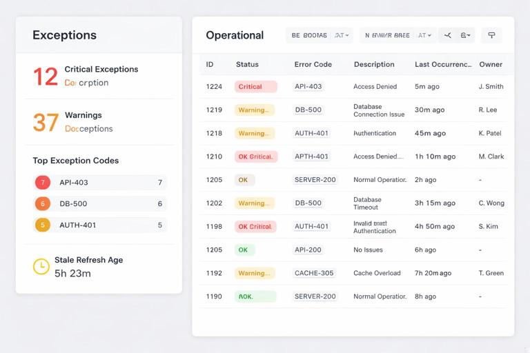
Exception-driven conditional formatting is most effective when paired with a small panel that quantifies exceptions. This turns formatting into a workflow: identify, count, fix, refresh.
Example metrics to compute
- Count of critical exceptions
- Count of warnings
- Top 3 exception codes
- Oldest stale refresh age
If you have a Severity column, counts are straightforward:
=COUNTIF(DataTable[Severity], "CRIT")=COUNTIF(DataTable[Severity], "WARN")For top codes, you can build a small pivot or use formulas, but the key design point is that exception codes are explicit values, not hidden inside IFERROR wrappers.
Common anti-patterns and how to replace them
Anti-pattern: IFERROR(…,0) everywhere
Why it fails: converts missing data and broken logic into zeros, which look valid and can be aggregated into totals.
Replace with: explicit checks + NA() for not applicable + exception codes for issues.
Anti-pattern: conditional formatting “Cell Value = #DIV/0!”
Why it fails: it highlights symptoms, not causes, and it cannot distinguish expected denominator=0 from true data problems.
Replace with: helper ExceptionCode/Severity and format based on those.
Anti-pattern: complex conditional formatting formulas that replicate business logic
Why it fails: rules are hard to audit, and users cannot see why a row is highlighted.
Replace with: put logic in worksheet helper columns, then keep formatting rules simple.
Practical checklist: implementing error handling + exception formatting in a tracker
- Create a clear list of exception codes and what they mean.
- For each KPI, decide: blank vs NA() vs exception code.
- Keep KPIs numeric; store exception explanations in separate columns.
- Add Severity and AttentionNeeded helpers.
- Apply row-level conditional formatting based on Severity, with Stop If True.
- Add freshness and data health checks that can override KPI display when data is stale or missing.
- Build a small exceptions panel with counts so issues are measurable and trackable.