
What “Visual DNA” Means in a Modular Brand System
Visual DNA is the smallest set of visual decisions that, when repeated consistently, makes a brand recognizable across many formats. In a modular brand system, Visual DNA is not “the whole identity”; it is the core pattern that survives when everything else changes: layout, channel, language, product line, or campaign theme.
Think of Visual DNA as a compact recipe. If you remove one ingredient, the dish still resembles itself; if you remove several, it becomes generic. Your goal is to identify the few ingredients that create recognition and can be expressed through reusable modules.
Visual DNA typically lives in a handful of categories:
- Form language: recurring geometry (rounded rectangles, sharp angles, circles, cut corners), corner radius rules, stroke styles, and proportions.
- Color logic: not just a palette, but how color behaves (dominant vs accent, gradients vs flat, contrast levels, background rules).
- Typography behavior: hierarchy ratios, casing rules, spacing, alignment tendencies, and how type interacts with other elements.
- Image and illustration treatment: cropping patterns, lighting, depth of field, grain, overlays, duotones, icon stroke weights, and simplification level.
- Motion and interaction cues (if applicable): easing, duration ranges, transitions, and micro-interactions that feel “on brand.”
- Composition tendencies: grid density, whitespace ratio, asymmetry vs symmetry, and how modules stack.

In practice, Visual DNA is a set of constraints and defaults. It tells designers what to do when they have to make a decision quickly, and it tells non-designers what not to do when assembling assets from a library.
Why Constraints Are Part of the DNA (Not a Separate Topic)
In modular systems, constraints are not a limitation; they are the mechanism that makes modules combinable without breaking recognition. If every module can be styled arbitrarily, the system becomes a collection of templates rather than a coherent brand language.
- Listen to the audio with the screen off.
- Earn a certificate upon completion.
- Over 5000 courses for you to explore!

Download the app
System constraints define the “playground boundaries” for:
- Consistency: assets look related even when produced by different teams.
- Scalability: new formats can be created by recombining existing modules.
- Speed: fewer decisions per asset because defaults are known.
- Quality control: easier review because violations are obvious.
A useful mental model is: Visual DNA is the recognizable signal; constraints are the rules that preserve that signal under pressure (tight timelines, localization, multiple vendors, and new channels).
Step-by-Step: Extracting Visual DNA from Existing Brand Signals
If you already have brand materials, you can extract Visual DNA by auditing what is truly consistent versus what is incidental. The output should be a short list of non-negotiables and a longer list of flexible choices.
Step 1: Collect a “stress sample” set
Gather 20–40 examples that represent real-world variation, not just hero pieces. Include at least:
- Small-format items (app icons, social avatars, favicons, small ads)
- Text-heavy items (presentations, product pages, onboarding screens)
- Image-heavy items (campaign banners, posters, social posts)
- Functional UI components (buttons, cards, alerts) if the brand touches product UI
- At least two different creators (internal team + agency, or two time periods)
Print them or place them on a single canvas so you can see patterns without scrolling.

Step 2: Mark what repeats without being mandated
Look for decisions that recur even when the format changes. These are often unconscious habits that indicate the true DNA. For each sample, annotate:
- Dominant shape motifs (e.g., pill shapes, diagonal cuts)
- Typical spacing (tight vs airy, consistent margins)
- Color dominance (which color appears most, where accents appear)
- Type hierarchy behavior (headline size relative to body, weight usage)
- Image cropping (centered faces, extreme close-ups, negative space)
Then count occurrences. If a trait appears in 70%+ of samples, it is a candidate for DNA. If it appears only in the best-looking 10%, it may be a “craft preference” rather than a system rule.
Step 3: Separate “identity” from “content”
Many teams confuse content choices (a specific photo style for one campaign) with identity choices (the way all photos are treated). Ask two questions for each candidate trait:
- Does this still work if the subject matter changes? Example: “outdoor lifestyle photography” may fail if you later need enterprise software screenshots.
- Can this be expressed as a rule? Example: “use optimistic photos” is vague; “use natural light, medium contrast, warm white balance, shallow depth of field” is actionable.
Keep traits that can survive content shifts and can be written as rules.
Step 4: Define the minimum viable DNA set (3–7 rules)
A modular system benefits from a compact DNA. Too many non-negotiables create friction; too few create drift. Aim for 3–7 core rules that can be checked quickly.
Example of a compact DNA set for a hypothetical fintech brand:
- Form language: rounded rectangles with 12px radius; no sharp corners in UI and marketing frames.
- Color logic: near-black backgrounds with one neon accent per layout; accents never exceed 15% of area.
- Typography behavior: headlines in a geometric sans, sentence case; body in a humanist sans; no more than two weights per layout.
- Composition: left-aligned grid; generous top padding; one focal element per frame.
- Image treatment: monochrome photos with accent-color overlay at 10–20% opacity.
Notice how each rule is measurable or at least testable in review.
Step 5: Identify “flex zones” explicitly
Flex zones are where teams can vary without breaking recognition. If you do not define them, people will improvise anyway, often in inconsistent ways.
Examples of flex zones:
- Secondary palette usage (where and how it can appear)
- Illustration vs photography (when each is allowed)
- Layout templates (which modules can be rearranged)
- Seasonal or campaign accents (patterns, textures, temporary motifs)
Write flex zones as permissions with boundaries, not as open-ended freedom.
Turning Visual DNA Into System Constraints
Once you have candidate DNA rules, convert them into constraints that can be applied across modules and asset types. Constraints should be specific enough to guide creation and assembly, and simple enough to remember.
Constraint Types You Should Define
- Geometric constraints: corner radius, stroke widths, icon grid, shape proportions, allowed angles.
- Typographic constraints: type scale, line-height ranges, max characters per line, casing, alignment, emphasis rules.
- Color constraints: contrast minimums, background rules, accent limits, gradient directions, allowed overlays.
- Spacing constraints: base unit, padding ranges, module gutters, safe areas for logos and key text.
- Imagery constraints: cropping ratios, subject placement, overlay strength, allowed filters, do/don’t examples.
- Component constraints: module dimensions, responsive behavior, stacking order, minimum touch sizes (if digital).
Constraints become the “contract” that every module must satisfy to remain compatible with the library.
Step-by-Step: Writing Constraints as Testable Rules
Vague rules are hard to enforce. Testable rules are easier to teach, review, and automate.
Step 1: Convert adjectives into parameters
Replace subjective descriptors with measurable ranges.
- Instead of “lots of whitespace,” define “outer margins are 8–12% of canvas width; internal padding uses 8pt increments.”
- Instead of “bold headlines,” define “H1 uses 700 weight; H2 uses 600; body uses 400; avoid 500.”
- Instead of “high contrast,” define “text contrast must meet WCAG AA for digital; in print, avoid light text below 8pt on dark backgrounds.”
Step 2: Define “must,” “should,” and “may”
Not all constraints are equal. Create a simple priority system:
- Must: non-negotiable; breaking it breaks recognition or accessibility.
- Should: default; can be broken with rationale.
- May: optional; used for variety.
This prevents the system from feeling overly rigid while protecting the core DNA.
Step 3: Add a failure mode example for each “must”
For every must-rule, describe what goes wrong when it is violated. This helps reviewers and non-designers understand the “why.”
Example:
- Must: Only one accent color per layout.
- Failure mode: Multiple accents compete, making the brand feel noisy and reducing recognition of the signature accent.
Step 4: Create a quick checklist
Turn constraints into a 10–15 item checklist that can be used in reviews. Example checklist items:
- Is the accent color used under 15% of the area?
- Are corners consistently 12px radius (or proportional equivalent)?
- Are there no more than two font weights?
- Is the layout aligned to the grid with consistent gutters?
- Does imagery follow the defined overlay and crop rules?
This checklist becomes the operational layer of Visual DNA.
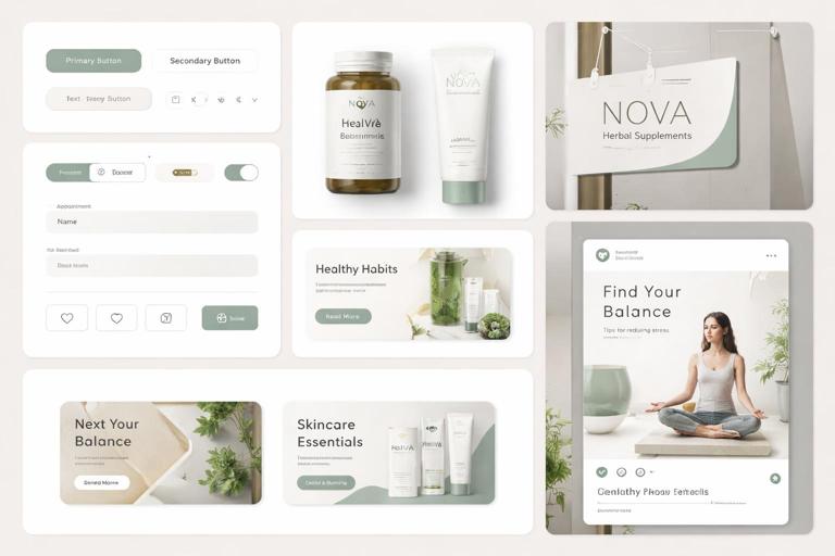
Practical Example: Defining DNA for a Hypothetical Health Brand
Imagine a health brand that needs to scale across packaging, social content, clinic signage, and a patient portal UI. The team wants the brand to feel calm, trustworthy, and modern, but those words are not constraints yet.
Draft DNA candidates
- Soft geometry (rounded corners, circular motifs)
- Muted color palette with one reassuring accent
- Clear typographic hierarchy with high legibility
- Photography with natural light and real environments
- Layouts with strong whitespace and simple information grouping
Convert to constraints
Here is how those candidates become testable constraints:
- Geometric must: All containers use 16px corner radius on 1x scale; icons are drawn on a 24px grid with 2px stroke; no sharp angles below 60 degrees.
- Color must: Backgrounds are off-white or very light neutral; text is near-black; accent color appears only on interactive elements and key highlights, max 10% of layout area.
- Typography must: Body text minimum 16px in digital; line-height 1.4–1.6; headings use sentence case; avoid all caps except short labels under 12 characters.
- Imagery should: Natural light, medium-low contrast, minimal retouching; avoid staged “stock” poses; if overlays are used, keep opacity under 12%.
- Composition should: Use a 12-column grid for wide layouts; maintain 24–40px padding in UI cards; group information into 2–4 chunks per screen.
Now the brand can scale because each module—button, card, banner, poster—can be built to satisfy these constraints.
System Constraints for Modularity: Compatibility Rules Between Modules
Modular systems fail when modules cannot be combined cleanly. Beyond style constraints, you need compatibility constraints that ensure modules “snap together.”
Define a sizing and spacing system
Choose a base unit and define how modules scale. For example, an 8pt spacing system for digital and a 4mm system for print. Then define:
- Allowed padding values (e.g., 16/24/32/48)
- Allowed corner radius values (e.g., 8/12/16) and when each is used
- Allowed border widths (e.g., 1px for UI, 2px for marketing frames)
- Gutter sizes and grid columns for common formats
This prevents “almost matching” modules that look inconsistent when placed side-by-side.
Define stacking and hierarchy rules
When modules combine, hierarchy can collapse. Define rules such as:
- Only one primary headline per frame
- CTA module must appear in the bottom third on vertical formats
- Logo module must have a minimum clear space equal to X
- Information modules must follow a consistent order (benefit → proof → CTA)
These are constraints on composition, not just styling, and they protect clarity.
Define contrast and accessibility constraints early
Even if your system spans print and digital, define minimum contrast and legibility rules as non-negotiables. This is both a usability requirement and a brand quality signal.
Examples:
- Text on colored backgrounds must meet WCAG AA in digital contexts
- Avoid placing small text over photography unless a solid or blurred overlay is applied
- Minimum font sizes for captions and legal lines per channel
These constraints reduce the need for one-off fixes later.
Step-by-Step Workshop: Defining Constraints With a Cross-Functional Team
Constraints work only if the people producing assets accept them. A short workshop can align stakeholders and reduce future exceptions.
Step 1: List the top 10 recurring asset types
Examples: social post, story, email header, landing page hero, product card, presentation slide, event banner, app onboarding screen, in-store poster, packaging label.
For each, note the typical creator (designer, marketer, product team, vendor) and the typical turnaround time.
Step 2: Identify the highest-risk decisions per asset type
Ask: where do assets most often drift off-brand? Common answers include:
- Typography hierarchy changes under time pressure
- Color accents multiply to “make it pop”
- Imagery becomes inconsistent across regions
- Spacing and alignment degrade when templates are edited
These risk areas should become “must” constraints or be supported by locked modules.
Step 3: Draft constraints in plain language first
Write each constraint as a sentence that a non-designer can understand. Example: “Use one accent color per design, and use it only for buttons and key highlights.”
Then translate it into parameters: “Accent area ≤ 10–15%; accent appears only in CTA module, links, and key metric callouts.”
Step 4: Validate constraints against edge cases
Test constraints against difficult scenarios:
- Localization with longer text
- Very small formats (mobile banners, thumbnails)
- Very large formats (billboards, stage screens)
- Low-quality printing or low-light environments
If a constraint breaks in an edge case, decide whether to create an exception rule or adjust the constraint range.
Step 5: Decide what gets locked vs what stays editable
Constraints become enforceable when they are embedded in templates and components. Decide which elements should be locked (e.g., logo clear space, grid, type scale) and which can be edited (e.g., headline text, image choice within treatment rules).
A practical approach is to lock anything that, if changed, would require design judgment to fix.
Documenting Visual DNA and Constraints as a Usable Spec
A spec should help someone make a correct asset without asking for clarification. To do that, document DNA and constraints in a format that supports fast scanning and direct application.
Use “rule cards” for each DNA element
Create a short block for each core rule:
Rule name: Single Accent Principle (MUST) Purpose: Preserve recognizability and reduce visual noise Parameters: 1 accent color per layout; accent area ≤ 15%; accent used only for CTA, links, key metric callouts Examples: Good: one neon button + one highlighted number Bad: neon button + neon icons + neon border + neon headlineRule cards are easy to reuse in onboarding, reviews, and vendor briefs.
Define constraints at multiple levels
Some constraints apply globally, others per channel. Organize them as:
- Global: core DNA rules that never change
- Channel-specific: digital UI, social, print, environmental
- Module-specific: CTA module, headline module, image module, data module
This prevents channel needs from diluting the global DNA while still allowing practical adaptation.
Include “decision trees” for common choices
When teams hesitate, they improvise. Provide simple decision logic.
If the layout is text-heavy → use solid background, no photo overlay If the layout is image-led → apply overlay 10–20% and keep text in a solid container If the message is urgent (alerts, deadlines) → allow accent color for headline underline, not full headline fillDecision trees turn constraints into an operational tool rather than a static document.
Common Pitfalls When Defining Visual DNA and Constraints
Pitfall 1: Treating the logo as the only DNA
In modular systems, the logo is often too small or absent (favicons, UI states, social thumbnails). DNA must exist in layout, color logic, and form language so recognition survives without the logo.
Pitfall 2: Over-constraining early
If you lock too many choices, teams will create exceptions constantly, and the system will fragment. Start with a minimum viable DNA set and expand constraints only when you see repeated failure modes.
Pitfall 3: Under-specifying imagery rules
Imagery is a major source of drift because it is subjective. If photography is part of your brand, define crop patterns, lighting, contrast, and overlays. Provide a small set of “approved looks” rather than a large mood board.
Pitfall 4: Constraints that ignore production reality
A rule that requires custom illustration for every post will be ignored if the team produces 30 posts per week. Constraints must align with throughput, skill levels, and tooling.
Pitfall 5: No mechanism for exceptions
Even strong systems need exceptions (legal requirements, partner co-branding, accessibility). Define how exceptions are requested and what must remain intact (e.g., typography scale and spacing system) even in exception cases.


