
What “Brand Playbook Documentation” Means in a Modular System
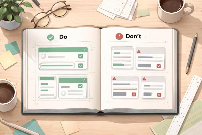
A brand playbook is the operational documentation that teaches people how to use your brand system correctly in real situations. In a modular brand system, the playbook is not a glossy manifesto; it is a set of decision rules, examples, and checks that help teams assemble consistent outputs from reusable parts. The most useful playbooks are built around “Do/Don’t” examples because they reduce ambiguity: they show what “correct” looks like, what “almost correct” looks like, and what “wrong” looks like—plus the reason why.
Think of the playbook as a bridge between the system and the work. The system defines what exists (components, patterns, tokens, assets). The playbook defines how to apply them (when to choose which pattern, what to avoid, how to review). This chapter focuses on documenting usage with Do/Don’t examples, including how to write them, how to structure them, and how to keep them current without turning the playbook into an unmaintainable encyclopedia.
Why Do/Don’t Examples Work Better Than Rules Alone
Rules are often interpreted differently by different roles. A statement like “Keep layouts clean and spacious” is subjective. A Do/Don’t pair makes it concrete: “Do: use approved spacing scale between headline and body. Don’t: compress spacing to fit extra content.” The example anchors the rule to a visible outcome and prevents “creative interpretation” that breaks consistency.
Do/Don’t examples also support faster onboarding. New team members can scan examples and immediately understand boundaries. Finally, they reduce review cycles: reviewers can point to a playbook example instead of debating taste.
Principles for Writing Effective Do/Don’t Documentation
1) Document Decisions, Not Preferences
Each Do/Don’t should be tied to a decision that affects brand recognition, usability, or production efficiency. Avoid documenting personal preferences (e.g., “I don’t like centered text”). Instead, document impact: “Don’t center long-form paragraphs because it reduces readability and scanning.”
- Listen to the audio with the screen off.
- Earn a certificate upon completion.
- Over 5000 courses for you to explore!

Download the app
2) Use a Consistent Template for Every Example
Consistency in documentation makes it searchable and scannable. Use a repeatable structure such as:
- Context: where this applies (channel, format, component).
- Do: the correct usage.
- Don’t: the incorrect usage.
- Why: the rationale in one or two sentences.
- How to fix: the simplest correction step.
- Edge cases: when an exception is allowed (if any).
This template prevents “example dumps” that show visuals but don’t teach decision-making.
3) Make the “Don’t” Realistic
A weak “Don’t” is an obviously terrible design no one would ship. A strong “Don’t” is a common mistake that looks plausible under deadline pressure: stretching a logo slightly to fit, adding an extra shadow to increase contrast, mixing two button styles on one screen, or rewriting a headline in a tone that conflicts with the brand voice. Document the mistakes people actually make.
4) Keep Each Example Single-Issue
If a “Don’t” breaks five rules at once, readers won’t know what to correct first. Create multiple examples instead. For instance, separate “Don’t change logo colors” from “Don’t place logo on low-contrast backgrounds.” Single-issue examples are easier to remember and easier to reference in reviews.
5) Tie Examples to Outcomes and Checks
Whenever possible, connect the example to a measurable check: contrast ratio, minimum size, alignment rule, or component usage requirement. Even if you don’t include the underlying system definitions here, you can still document the check behaviorally: “If the headline wraps to three lines, switch to the alternate layout pattern.”
Recommended Structure of a Playbook Section
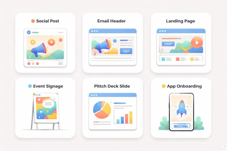
Organize the playbook by how teams work, not by how designers think. A practical structure is “by deliverable” and “by scenario,” because that’s how people search when they are building something.
Section layout that scales
- Purpose: what this deliverable is for and what success looks like.
- Required elements: what must be present (e.g., logo, legal line, CTA).
- Assembly rules: how to combine modules (e.g., which layout pattern to use in which case).
- Do/Don’t gallery: the core of the section.
- Review checklist: quick pre-flight checks.
- Common pitfalls: links to the most relevant Don’ts.
Examples of deliverable-based sections: social posts, email headers, product landing pages, event signage, pitch decks, app onboarding screens, customer support macros, partner co-marketing assets.
How to Build Do/Don’t Examples Step-by-Step
Step 1: Collect Real Artifacts and Real Mistakes
Start with what your organization already produces. Gather 20–50 recent assets across teams and channels. In a review session, tag issues that repeat. Typical categories include: inconsistent hierarchy, misaligned modules, off-tone copy, misuse of photography, inconsistent CTA treatment, accessibility misses, and “one-off” embellishments.
Prioritize the top 10 mistakes that cause the most brand drift or rework. Those become your first Do/Don’t set.
Step 2: Define the Context and Trigger
Each example should specify when it applies. “Homepage hero” is better than “web.” “Instagram story with swipe-up CTA” is better than “social.” Add a trigger that tells the reader when to use the rule:
- “When the headline exceeds 60 characters…”
- “When placing the logo over photography…”
- “When co-branding with a partner…”
- “When the CTA is secondary…”
Step 3: Create the “Do” First, Then Derive the “Don’t”
Build the correct version first, using approved modules and patterns. Then create the incorrect version by changing only one variable. This makes the contrast educational. For example, keep the same layout but change the background image to one that violates the photography criteria, or keep the same content but change the CTA style.
Step 4: Write the “Why” in Plain Language
The “Why” should be short and practical. Avoid abstract statements like “It feels off-brand.” Instead:
- “This reduces legibility on mobile.”
- “This introduces a new visual effect that isn’t supported elsewhere, making the system harder to maintain.”
- “This changes the perceived relationship between headline and CTA, lowering conversion.”
Step 5: Add a “How to Fix” Micro-Recipe
People under time pressure need a fix, not a lecture. Provide a one- to three-step correction. Example: “Switch to the alternate hero layout. Move the CTA below the subhead. Use the approved overlay treatment.”
Step 6: Add a Review Checklist Item
Turn the example into a check that can be used in QA. If the example is about logo placement, the checklist item might be: “Logo has sufficient clear space and is not placed on low-contrast areas.” This makes the playbook actionable during reviews.
Do/Don’t Examples You Should Include (with Practical Scenarios)
The following example types are broadly applicable across modular brand systems. Tailor the details to your system, but keep the pattern: context, do, don’t, why, fix.
1) Layout Assembly: Choosing the Right Pattern for Content Length
Context: Marketing landing page section with headline, subhead, and CTA.
Do: Use the “standard” section pattern when the headline fits in one to two lines and the supporting copy is short.
Don’t: Force long headlines into the standard pattern by shrinking type or tightening spacing to “make it fit.”
Why: Compressing hierarchy reduces readability and makes the brand feel inconsistent across breakpoints and devices.
How to fix: Switch to the “long-copy” section pattern (or split the message into headline + subhead). If the message is truly long, break it into two sections with a supporting module.
2) Component Consistency: Mixing Variants in the Same View
Context: Product page with multiple CTAs.
Do: Use one primary CTA style per view and reserve secondary/tertiary styles for less important actions.
Don’t: Use two different primary CTA styles (e.g., different shapes, effects, or emphasis) because “both are important.”
Why: Competing primaries confuse users and weaken the system’s predictability, increasing design debt.
How to fix: Decide the single primary action. Convert the other to secondary or move it to a less prominent placement.
3) Photography Usage: Subject Matter and Cropping Discipline
Context: Social ad using lifestyle photography.
Do: Use imagery that matches the brand’s subject matter rules (e.g., authentic environments, natural lighting, clear focal subject) and crop to preserve the focal point.
Don’t: Use overly staged stock imagery or crop in a way that cuts off key human features (e.g., awkward limb crops) just to fit a template.
Why: Inconsistent imagery is one of the fastest ways to create brand drift; poor cropping reads as low quality.
How to fix: Choose an image from the approved library or reshoot with the defined criteria. Re-crop using safe areas so the subject remains intact across placements.

4) Backgrounds and Overlays: Legibility Over Aesthetics
Context: Hero banner with text over image.
Do: Use the approved overlay treatment (e.g., gradient or scrim) when text sits on photography, and check legibility at small sizes.
Don’t: Place text directly on busy areas of an image or add unapproved effects (heavy shadows, glows) to “make it readable.”
Why: Ad-hoc effects create inconsistent styling and often fail accessibility checks in different crops.
How to fix: Reposition text into a calmer area, apply the approved overlay, or switch to a layout where text sits on a solid background module.
5) Co-Branding: Partner Logos and Visual Balance
Context: Webinar promo with your brand and a partner.
Do: Use the co-branding lockup rules: equal visual weight, consistent spacing, and a clear separator if required.
Don’t: Make the partner logo larger “to be polite,” or place it in a different corner with different alignment logic.
Why: Co-branding is a high-risk area for inconsistency; imbalance can imply the wrong relationship (sponsor vs. host) and cause legal/partner issues.
How to fix: Use the approved lockup template. If the partner demands changes, document the exception and create a sanctioned variant rather than a one-off.
6) Data Visualization: Styling and Integrity
Context: Report chart used in a deck and on a blog.
Do: Use the approved chart styles and keep data-ink clear: consistent axis labeling, readable legends, and restrained emphasis.
Don’t: Apply decorative gradients, 3D effects, or inconsistent emphasis colors to “make it pop,” or truncate axes in a misleading way.
Why: Data visuals carry trust. Decorative or misleading treatments damage credibility and create inconsistent visual language.
How to fix: Rebuild using the standard chart components. Use emphasis only for one key insight and ensure axis scales are honest and labeled.
7) Copy and Messaging: Tone Boundaries with Examples
Context: Push notification or in-app message.
Do: Use concise, helpful language that matches the brand’s tone (e.g., direct, supportive, specific).
Don’t: Use sarcasm, guilt-based urgency, or overly casual slang if it conflicts with the brand’s voice.
Why: Tone is part of brand recognition. Off-tone copy can feel untrustworthy, especially in sensitive moments (billing, errors, security).
How to fix: Rewrite using a simple pattern: what happened, what it means, what to do next. Keep punctuation and emphasis consistent with approved examples.
8) Accessibility and Inclusion: Do/Don’t as Non-Negotiables
Context: Any digital UI or marketing asset with text.
Do: Ensure text is legible, interactive elements are distinguishable, and meaning is not conveyed by color alone. Provide alt text guidance for key image types.
Don’t: Use low-contrast text, rely on color-only status indicators, or embed essential text in images without an accessible alternative.
Why: Accessibility failures exclude users and create legal and reputational risk; they also reduce overall usability.
How to fix: Adjust contrast using approved combinations, add labels/icons in addition to color, and ensure essential copy exists as real text in the layout.
How to Present Do/Don’t Examples Visually in the Playbook
Use Side-by-Side Comparisons
Place Do and Don’t next to each other with identical content where possible. This isolates the variable and teaches faster. If side-by-side isn’t possible (e.g., mobile flows), use a two-frame sequence with the same screen and a highlighted callout.
Annotate with Callouts, Not Paragraphs
Use short callouts pointing to the exact issue: “CTA style mismatch,” “Text overlaps safe area,” “Unapproved photo treatment.” Keep annotations brief and let the visuals do the work.
Show the “Fixed” Version When the Fix Isn’t Obvious
Some Don’ts are easy to correct; others require choosing a different pattern. When the fix involves a decision, include a third panel: “Don’t → Do (fixed).” This is especially helpful for content-length issues, co-branding, and complex layouts.
Operationalizing the Playbook: Making It Usable Day-to-Day
Create a “Fast Path” for Common Tasks
Many users won’t read the whole playbook. Add quick-entry pages such as “Making a social post,” “Building a one-page flyer,” or “Designing a product announcement email.” Each fast path should link to the relevant Do/Don’t examples and include a short checklist.
Embed Review Checklists into Workflow
Do/Don’t examples become more powerful when they are used in reviews. Convert the most important rules into a checklist that can be used in design critique, content review, and QA. Keep it short enough to be used (10–20 items), and link each item to a specific example page.
Define Ownership and Update Cadence
A playbook that doesn’t evolve becomes ignored. Assign an owner (or small group) responsible for:
- Collecting new mistakes and edge cases from reviews.
- Adding or revising Do/Don’t examples when new modules or patterns are introduced.
- Archiving outdated examples so teams don’t follow old guidance.
Use a lightweight cadence: monthly triage of incoming issues and quarterly updates for larger revisions.
Document Exceptions as “Sanctioned Variants,” Not One-Offs
Exceptions will happen (campaign constraints, partner requirements, regulatory needs). The playbook should include a method for handling them:
- Temporary exception: documented with scope (where it applies), duration, and approval.
- Sanctioned variant: if it repeats, formalize it as a new approved example with Do/Don’t boundaries.
This prevents “exception creep,” where one-off solutions become unofficial standards.
Writing Do/Don’t Copy That Teams Actually Use
Use Action Verbs and Specific Language
Replace vague language with specific actions. Examples:
- Instead of “Avoid clutter,” write “Limit each promo tile to one headline, one supporting line, and one CTA.”
- Instead of “Use consistent imagery,” write “Use images with a single clear subject and natural lighting; avoid heavy filters.”
Include Micro-Examples of Correct Copy
For tone and messaging, include short “Do/Don’t” lines that can be copied and adapted:
- Do: “Your payment didn’t go through. Update your card to keep your plan active.”
- Don’t: “Uh-oh! Your card failed. Fix it now or you’ll lose access!”
These examples teach tone boundaries without requiring people to interpret abstract adjectives.
Playbook Page Template (Copy-Paste Ready)
<h3>[Topic / Scenario]</h3> <p><strong>Context:</strong> [Where this applies, format, channel, component.]</p> <p><strong>Do:</strong> [Correct usage in one sentence.]</p> <p><strong>Don’t:</strong> [Common incorrect usage in one sentence.]</p> <p><strong>Why:</strong> [Short rationale tied to outcomes: recognition, usability, maintainability.]</p> <p><strong>How to fix:</strong> [1–3 steps.]</p> <ul> <li><strong>Checklist item:</strong> [A yes/no check for reviews.]</li> <li><strong>Edge case:</strong> [If applicable, define the exception and required approval.]</li> </ul>Common Failure Modes (and How Do/Don’t Examples Prevent Them)
Failure Mode: The Playbook Becomes Too Abstract
If the playbook is mostly principles, teams will interpret it differently. Do/Don’t examples anchor principles to concrete outputs and reduce subjective debate.
Failure Mode: The Playbook Becomes Too Large to Navigate
If every edge case becomes a full page, people stop searching. Keep examples focused, tag them by deliverable and scenario, and maintain a “Top 20 Do/Don’ts” index for quick access.
Failure Mode: Teams Treat the Playbook as Optional
If the playbook is not referenced in reviews, it becomes decorative. Convert key Do/Don’ts into review checklist items and require links to relevant pages in handoff or QA notes.
Failure Mode: Inconsistent Enforcement Across Teams
When different reviewers enforce different standards, teams lose trust. Do/Don’t examples create a shared reference point so feedback is consistent and easier to accept.


