
What “Asset Library Assembly” and “Component Packaging” Mean in Practice
An asset library is the operational home for everything a brand system produces: components, templates, patterns, and production-ready files that teams can pull into real work without rebuilding or reinterpreting the system each time. “Assembly” is the process of collecting, normalizing, validating, and publishing those assets so they behave consistently across tools and channels. “Component packaging” is the discipline of bundling each component (and its dependencies) into a unit that can be installed, updated, and consumed predictably—by designers in design tools and by developers in codebases.
This chapter focuses on how to turn a set of designed building blocks into a scalable library that is easy to adopt, hard to misuse, and safe to evolve. It emphasizes practical packaging decisions: what goes inside a component, how to document it at the point of use, how to ship it, and how to keep it stable as the brand grows.
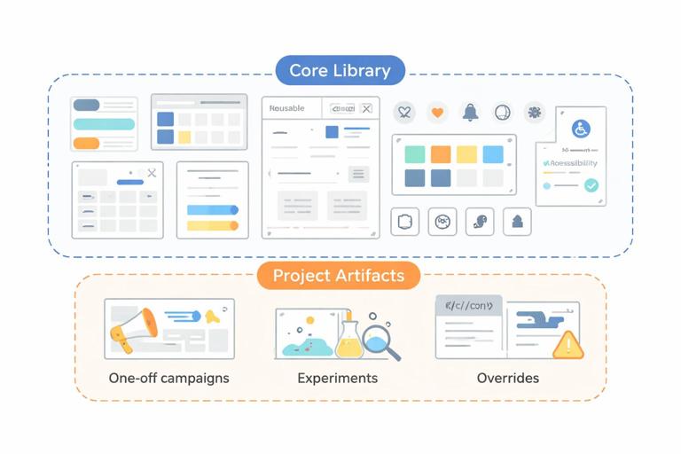
Library Scope: What Belongs in the Asset Library (and What Doesn’t)
Before assembling anything, define what the library is responsible for delivering. A common failure mode is mixing “brand system assets” with “project-specific artifacts,” which makes the library noisy and brittle.
Include
- Reusable UI components (e.g., buttons, inputs, cards, modals) with variants and states.
- Patterns and compositions (e.g., page headers, product tiles, pricing tables) that are reused across multiple surfaces.
- Templates for high-frequency outputs (e.g., social posts, presentation slides, email modules) when they are standardized and reused.
- Media assets that are canonical and shared (e.g., approved photography sets, illustration packs, icon sets, Lottie files) when they are governed centrally.
- Accessibility artifacts tied to components (e.g., focus styles, ARIA patterns, keyboard behavior notes) as part of usage guidance.
- Quality gates embedded as checklists and test expectations (visual regression baselines, lint rules, contrast checks) where applicable.
Exclude
- One-off campaign layouts that won’t be reused.
- Experimental explorations not yet validated.
- Local overrides created to patch a single product’s constraints.
- Raw working files that are not intended for consumption (e.g., messy scratch artboards).
A useful rule: if an asset cannot be installed/consumed by at least two teams or two products without modification, it likely belongs outside the core library (or in a separate “examples” or “recipes” area).
Design-to-Library Pipeline: From Source Files to Published Assets
Assembly is easier when you treat it as a pipeline with clear stages. The goal is to reduce ambiguity and prevent “it looked right in the file” surprises.
- Listen to the audio with the screen off.
- Earn a certificate upon completion.
- Over 5000 courses for you to explore!

Download the app
Stage 1: Source of Truth and Ownership
Decide where the authoritative version lives for each asset type. For example: design components may be authored in a design tool; coded components may be authored in a monorepo; icons may be authored as SVG in a dedicated repository. The library can publish from multiple sources, but each asset must have one clear owner and one authoritative source.
- Owner: the role/team accountable for correctness and updates.
- Maintainer: the person who merges changes and releases versions.
- Consumers: teams who install and use the asset.
Stage 2: Normalization
Normalization means making assets consistent so they can be combined without surprises. Examples include aligning export settings for icons, standardizing component property names, ensuring consistent padding behavior across similar components, and aligning interaction states across controls.
Practical normalization checklist for UI components:
- All interactive components expose consistent states (default, hover, pressed, disabled, focus-visible).
- All components have predictable sizing behavior (content-driven vs fixed) and documented constraints.
- All components support theming hooks (e.g., semantic color slots) rather than hard-coded values.
- All components have accessibility expectations defined (keyboard, screen reader labels, focus order).
Stage 3: Validation
Validation is where you catch issues before publication. This can be manual (review checklists) and automated (tests). The key is to validate both the component itself and its packaging.
- Visual validation: compare states/variants against references; run visual regression tests for coded components.
- Behavior validation: keyboard navigation, focus management, error messaging, loading states.
- Packaging validation: install the component package into a clean sandbox and verify it works with minimal setup.
Stage 4: Publication
Publication is the act of making assets discoverable and installable. For design assets, that may mean publishing a library file and enabling it for teams. For code, that typically means releasing a versioned package to a registry and updating documentation.
Component Packaging: What a “Well-Packaged” Component Contains
Packaging is not only about the component’s visuals. It is about the complete unit of reuse: API, behavior, dependencies, documentation, and test coverage. A well-packaged component reduces the need for tribal knowledge.
1) The Component Implementation
This is the core: the component code (or design component) that renders the UI and supports states and variants. The implementation should be minimal but complete—avoid bundling unrelated helpers unless they are genuinely shared dependencies.
2) A Stable Public API
Consumers should interact with a stable interface. In code, that means props/events/slots; in design tools, that means component properties and variant controls. The API should be designed for clarity and guardrails.
Example: packaging a “Button” component API around intent and size rather than raw styling toggles:
// Example public API (conceptual) for a Button component
<Button intent="primary" size="md" iconStart={...} loading disabled>
  Save
</Button>
This avoids exposing low-level styling switches that lead to off-brand combinations.
3) Dependencies and Peer Dependencies
Components rarely stand alone. They depend on foundational layers (theme provider, icon set, motion utilities). Packaging should make dependencies explicit and minimize duplication.
- Direct dependency: bundled or installed automatically with the component package.
- Peer dependency: required but expected to be provided by the consuming app (common for frameworks or shared runtime libraries).
Practical guidance: keep the dependency graph shallow. If a simple component pulls in a large charting library or a heavy animation runtime, adoption will suffer.
4) Usage Documentation at the Point of Use
Documentation should travel with the component. The best libraries make it hard to use a component incorrectly by embedding guidance where people make decisions.
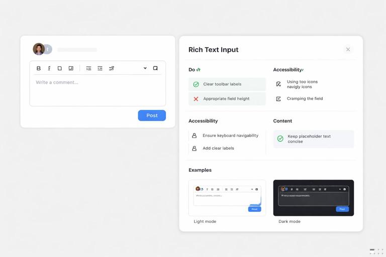
- Do/Don’t rules tied to real scenarios.
- Accessibility notes (labels, focus, keyboard behavior).
- Content guidance (recommended text length, truncation behavior).
- Examples showing common configurations.
For coded components, this is often delivered through a component explorer (e.g., story-based documentation) and README files within the package.
5) Test Assets and Quality Gates
Packaged components should include or be accompanied by tests that protect behavior and appearance. At minimum:
- Unit tests for logic (formatting, state transitions).
- Interaction tests for keyboard and focus behavior.
- Visual regression snapshots for key variants and states.
Even if tests live outside the published package, the packaging workflow should require them to pass before release.
Step-by-Step: Packaging a Component for Multi-Team Consumption
The following step-by-step is a practical workflow you can apply to each component as you move from “designed” to “shippable.” It assumes you are maintaining both design and code representations, but you can adapt it if your organization is design-only or code-only.
Step 1: Define the Component Contract
Write a short contract before packaging:
- Purpose: what problem it solves and where it should be used.
- Inputs: properties/variants (e.g., intent, size, icon placement).
- Outputs: events (e.g., onClick), emitted analytics hooks if applicable.
- States: loading, disabled, error, selected, focus-visible.
- Constraints: min/max content length, container requirements.
This contract becomes the backbone of documentation and prevents scope creep.
Step 2: Identify Dependencies and Decide the Packaging Boundary
List what the component needs to function:
- Theme access (colors, typography, spacing via semantic hooks).
- Icon rendering (if icons are supported).
- Motion utilities (if animated states exist).
- Form context (for inputs) or overlay manager (for modals).
Then decide what is inside the package vs required from the host. For example, a “Modal” might require a host-level portal root; you can package the modal component but document the required host setup.
Step 3: Build Variants and States as First-Class Citizens
Do not ship a “happy path only” component. Package the full set of supported states, and ensure each state is reachable through the public API rather than hidden behind internal hacks.
Example: a “TextField” should package error messaging and helper text behavior, not leave teams to invent their own patterns.
Step 4: Add Guardrails
Guardrails reduce off-brand outcomes:
- Restrict invalid combinations (e.g., disallow “loading + iconOnly” if it breaks layout).
- Provide sensible defaults so consumers get correct behavior with minimal configuration.
- Fail loudly in development (warnings when required labels are missing).
In code, guardrails can be implemented with runtime warnings and TypeScript types. In design tools, guardrails come from component property constraints and curated variant sets.
Step 5: Write “Recipes” for Common Use Cases
Beyond the base component, package compositional guidance. A recipe is a documented pattern that shows how components work together.
- Button + Icon + Tooltip for icon-only actions.
- TextField + HelperText + CharacterCount for constrained inputs.
- Card + Media + Actions for product tiles.
Recipes reduce the temptation for teams to create ad-hoc compositions that drift from the system.
Step 6: Create a Sandbox Consumer and Install the Package
Before release, test the component as a consumer would:
- Install into a clean sample app or blank design file.
- Verify that imports/exports are intuitive.
- Verify that required providers/wrappers are documented and minimal.
- Verify tree-shaking or bundle impact if relevant.
This step catches hidden coupling, missing assets, and unclear setup instructions.
Step 7: Release with Change Notes and Upgrade Guidance
Every release should answer: what changed, who is affected, and what to do next. Even small changes can break layouts if they alter spacing, default sizes, or state behavior.
Include:
- Added: new variants, new props, new slots.
- Changed: default behavior changes, visual adjustments.
- Deprecated: what will be removed later and alternatives.
- Breaking: required consumer changes.
Assembling the Library: Organizing Assets for Discoverability and Adoption
Once components are packaged, the library must be assembled so people can find the right thing quickly. Discoverability is a primary driver of adoption; if teams cannot find the correct component in under a minute, they will rebuild it.
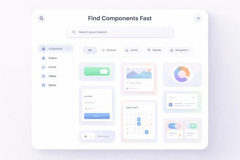
Organize by User Intent, Not by Internal Structure
Engineers may think in folders; designers may think in categories; product teams think in tasks. Organize the library navigation around what people are trying to do:
- Actions: buttons, links, menus.
- Inputs: text fields, selects, toggles, date pickers.
- Feedback: alerts, toasts, empty states, progress indicators.
- Navigation: tabs, sidebars, breadcrumbs.
- Data display: tables, lists, badges, avatars.
- Overlays: modals, drawers, tooltips.
This structure also supports cross-platform parity checks: you can see whether “Feedback” components exist for web, mobile, and email modules.
Provide a “Start Here” Path
Libraries often fail new users by presenting everything at once. Include an onboarding path that answers:
- Which package/library file should I install?
- What are the required dependencies (theme provider, fonts, icon set)?
- Which components should I use first for a typical screen?
- Where do I request additions or report issues?
Packaging Non-UI Assets: Icons, Illustrations, Motion, and Templates
Not everything is a UI component. Asset libraries often include media and templates that need their own packaging rules to remain consistent and easy to use.
Icons
For icons, packaging should ensure consistent sizing, alignment, and usage across contexts.
- Ship icons as a single installable set (design library + code package) rather than scattered exports.
- Provide a standardized icon component/wrapper in code so consumers don’t inline raw SVG inconsistently.
- Include guidance for decorative vs informative icons (when to add accessible labels).
Illustrations
Illustrations tend to drift because they are used in marketing, product, and support content with different constraints. Package them with:
- Approved formats and export sizes.
- Background handling rules (transparent vs solid).
- Safe cropping guidance and “no-edit” constraints.
Motion Assets
If you ship motion files (e.g., Lottie), package them with:
- Fallback behavior (static poster frame) for environments that can’t render motion.
- Performance guidance (file size targets, when to avoid autoplay).
- Interaction triggers (on load, on hover, on success) and how to wire them.
Templates
Templates are high leverage but easy to misuse. Package templates with:
- Locked regions vs editable regions.
- Content rules (headline length, image aspect ratios).
- Export presets (for social sizes, slide formats, email widths).
Interoperability: Keeping Design and Code Libraries in Sync Without Duplicating Work
A modular brand system often has parallel representations: a design library for rapid composition and a code library for production. The goal is not perfect one-to-one mirroring at all times, but predictable alignment on behavior, states, and constraints.
Define Parity Targets per Component
Not all components need the same parity level. Decide per component:
- Full parity: critical components used everywhere (buttons, inputs, alerts).
- Visual parity only: marketing-only patterns that won’t be coded.
- Code-first: complex components where design files provide guidance but code is authoritative (e.g., data grids).
Document the parity target in the component contract so teams know what to expect.
Use Reference Implementations
For each component, maintain a reference example that demonstrates correct usage. This can be a canonical screen snippet in design and a canonical story/demo in code. Reference implementations reduce interpretive gaps and speed up reviews.
Operationalizing Requests: Intake, Triage, and Packaging New Components
Once the library is live, requests will arrive: new variants, new components, and edge cases. The assembly process should include an intake mechanism that prevents the library from becoming a dumping ground.
Request Intake Checklist
- Reusability test: will at least two teams use it?
- Problem statement: what user or business need drives it?
- Existing alternatives: can an existing component cover it with a recipe?
- Complexity estimate: design effort, engineering effort, testing effort.
- Risk: could it introduce inconsistency or accessibility regressions?
Packaging Decision: New Component vs Extension vs Recipe
Many requests should not become new components. Use these decision rules:
- New component when the behavior and structure are distinct and recurring (e.g., “Stepper” for multi-step flows).
- Extension when it’s a new variant/state of an existing component (e.g., “Button” adds a destructive intent).
- Recipe when it’s a composition of existing components (e.g., “Search bar” = TextField + Icon + Clear action).
This keeps the library smaller and more coherent.
Release Readiness: A Practical Pre-Flight Checklist
Use a consistent pre-flight checklist before publishing any asset update. This reduces regressions and builds trust in the library.
- All variants and states are present and tested.
- Accessibility checks completed (focus, labels, contrast where relevant).
- Documentation updated with at least one common example and one edge case.
- Dependencies are correct and minimal; no accidental bundling of large libraries.
- Install test performed in a clean environment.
- Change notes written with upgrade steps if needed.
- Visual regression baselines updated and reviewed (for coded components).
When this checklist is consistently applied, the library becomes a reliable product rather than a loose collection of files.

