
What Alpine.js Is (and What It’s For in an HTMX-Oriented App)
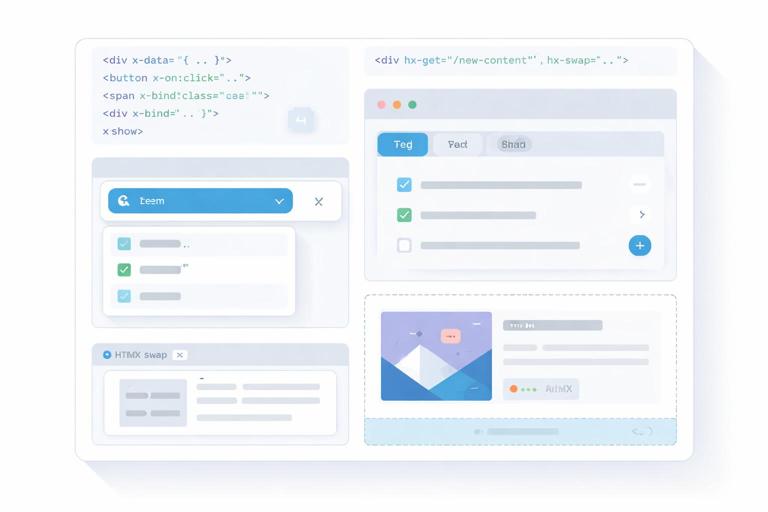
Alpine.js is a small JavaScript library that lets you add state and behavior directly in your HTML using attributes like x-data, x-bind, x-on, and x-show. In an HTMX-oriented app, Alpine is most valuable for “local” interactivity: toggling UI, managing small bits of state, coordinating micro-interactions, and adding component-like structure without adopting a full SPA framework. The key idea is to keep server-rendered HTML as the primary source of truth for data, while Alpine manages transient UI state (open/closed, selected tab, pending indicator, client-side filtering of already-loaded items, etc.).
Think of Alpine as a way to create lightweight components that live inside your server-rendered pages. You can scope state to a specific DOM subtree, react to user events, and compute derived values. When HTMX swaps fragments into the page, Alpine can initialize behavior on the new HTML automatically, as long as Alpine is loaded and the swapped content contains Alpine directives.
Core Building Block: x-data and Component Scope
Alpine components start with x-data, which defines a state object for the element and its descendants. This is the boundary of your “component.” Everything inside can reference the state properties directly. Keep the state minimal and focused on UI concerns.
<div x-data="{ open: false }"> <button type="button" x-on:click="open = !open">Toggle</button> <div x-show="open"> <p>This panel is controlled by Alpine state.</p> </div></div>Because x-data scopes state, you can have multiple instances of the same pattern on a page without collisions. This is especially useful when server templates render lists of items, each with its own local behavior (like expanding details or showing inline actions).
Binding Attributes and Classes with x-bind
Use x-bind (shorthand :) to bind element attributes to state. This is commonly used for ARIA attributes, disabled states, dynamic classes, and inline styles. Binding ARIA attributes is a practical way to keep accessibility aligned with UI state.
- Listen to the audio with the screen off.
- Earn a certificate upon completion.
- Over 5000 courses for you to explore!

Download the app
<div x-data="{ open: false }"> <button type="button" x-on:click="open = !open" :aria-expanded="open.toString()" :class="open ? 'btn btn-primary' : 'btn btn-outline'"> Details </button> <section x-show="open" :class="open ? 'panel panel-open' : 'panel'"> <p>Extra information.</p> </section></div>Tip: when binding boolean-ish attributes like aria-expanded, convert to a string to avoid inconsistent serialization. For disabled, you can bind a boolean directly: :disabled="isSaving".
Showing, Hiding, and Conditional UI: x-show, x-if, and x-cloak
x-show toggles visibility by setting display: none. It keeps the element in the DOM, which is ideal for panels, dropdowns, and sections you want to preserve (for example, keeping input values). x-if actually adds/removes the element from the DOM using a <template>, which is useful when you want a clean mount/unmount behavior.
<div x-data="{ open: false }"> <button type="button" x-on:click="open = !open">Toggle</button> <div x-show="open">This stays mounted.</div> <template x-if="open"> <div>This mounts/unmounts.</div> </template></div>Use x-cloak to prevent “flash of uninitialized content” before Alpine initializes. Add a global CSS rule like [x-cloak]{display:none !important;} and then mark elements that should remain hidden until Alpine is ready.
<style>[x-cloak]{display:none !important;}</style> <div x-data="{ open: false }"> <div x-cloak x-show="open">Hidden until Alpine loads.</div></div>Event Handling with x-on (and Practical Modifiers)
x-on (shorthand @) attaches event listeners. Alpine provides modifiers that reduce boilerplate and make intent explicit. Common ones include .prevent (prevent default), .stop (stop propagation), .debounce (delay rapid events), .throttle (limit frequency), and key modifiers like @keydown.escape.
<div x-data="{ query: '' }"> <input type="text" x-model="query" @input.debounce.300ms="/* update local UI, or trigger something */" @keydown.escape="query = ''" placeholder="Type to filter locally"> <p>You typed: <span x-text="query"></span></p></div>Modifiers are especially helpful when you combine Alpine with server-driven updates: you can debounce a local state update, show a spinner immediately, and let server responses replace parts of the page without turning everything into a client-side data store.
Two-Way Binding with x-model (and When to Use It)
x-model binds form inputs to Alpine state. It’s ideal for local-only interactions: toggling options, filtering already-rendered lists, or controlling UI that doesn’t need a server round-trip. In server-driven apps, avoid using x-model as a replacement for persisted state; treat it as a convenience for local UI state.
<div x-data="{ newsletter: false }"> <label> <input type="checkbox" x-model="newsletter"> Subscribe to newsletter </label> <p x-show="newsletter">We will send occasional updates.</p></div>You can also use x-model.number and x-model.trim to normalize input values. This keeps your UI logic predictable and reduces edge cases.
Computed Values and Getters for Derived UI State
As your components grow, you’ll want derived values: “is this form valid enough to enable the button?”, “how many items match the filter?”, “should we show the empty state?”. Alpine supports getters inside the x-data object. This is a clean way to keep templates readable while centralizing logic.
<div x-data="{ items: ['Alpha','Beta','Gamma'], q: '', get filtered() { return this.items.filter(i => i.toLowerCase().includes(this.q.toLowerCase())) } }"> <input type="text" x-model.trim="q" placeholder="Filter locally"> <p>Matches: <span x-text="filtered.length"></span></p> <ul> <template x-for="i in filtered" :key="i"> <li x-text="i"></li> </template> </ul></div>Notice the separation: the server delivered the list once, and Alpine provides a fast local filter without additional requests. This pattern is great for small datasets already present in the DOM.
Reusable Component Patterns with Alpine.data()
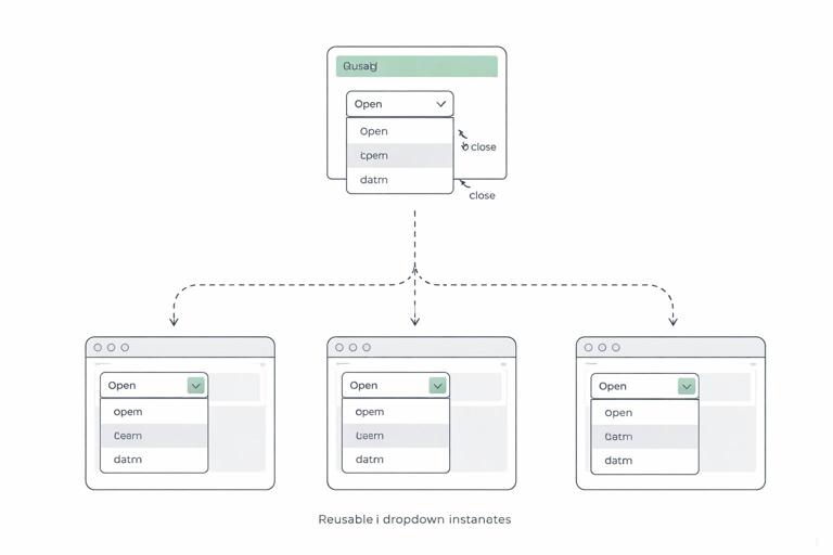
Inline x-data objects are fine for small widgets, but they can get noisy. Alpine lets you define named components via Alpine.data(). This creates a reusable pattern you can attach with x-data="componentName()". It also encourages you to keep logic in one place while still rendering HTML on the server.
<script>document.addEventListener('alpine:init', () => { Alpine.data('dropdown', () => ({ open: false, toggle() { this.open = !this.open }, close() { this.open = false } }))})</script> <div x-data="dropdown()" @keydown.escape="close()"> <button type="button" @click="toggle()" :aria-expanded="open.toString()">Menu</button> <div x-show="open" @click.outside="close()"> <a href="/profile">Profile</a> <a href="/settings">Settings</a> </div></div>This is “component thinking” without a build step: server templates produce the markup, and Alpine attaches behavior. The @click.outside modifier is a practical way to implement click-away behavior for popovers and dropdowns.
Step-by-Step: Build a Tab Component with Local State
This step-by-step example shows a common UI need: tabs. The server renders all tab panels (or at least the initial content), and Alpine manages which panel is visible. This is a good fit when tab content is already present or small enough to include in the initial HTML.
Step 1: Render semantic tab markup
Start with buttons and panels. Use ARIA attributes to communicate selection state.
<div x-data="tabs()"> <div role="tablist" aria-label="Account"> <button type="button" role="tab" :aria-selected="(active === 'profile').toString()" :class="active === 'profile' ? 'tab active' : 'tab'" @click="active = 'profile'">Profile</button> <button type="button" role="tab" :aria-selected="(active === 'security').toString()" :class="active === 'security' ? 'tab active' : 'tab'" @click="active = 'security'">Security</button> </div> <section role="tabpanel" x-show="active === 'profile'"> <p>Profile settings content rendered by the server.</p> </section> <section role="tabpanel" x-show="active === 'security'"> <p>Security settings content rendered by the server.</p> </section></div>Step 2: Define the component with a default tab
Define a reusable tabs() component. Keep it minimal: just the active key and optional helpers.
<script>document.addEventListener('alpine:init', () => { Alpine.data('tabs', () => ({ active: 'profile' }))})</script>Step 3: Add keyboard support (optional but practical)
For a better UX, support arrow keys to move between tabs. Alpine can handle this with a small method and @keydown handlers.
<div x-data="tabs()" @keydown.arrow-right.prevent="next()" @keydown.arrow-left.prevent="prev()"> <!-- tablist and panels --></div> <script>document.addEventListener('alpine:init', () => { Alpine.data('tabs', () => ({ active: 'profile', order: ['profile','security'], next() { const i = this.order.indexOf(this.active) this.active = this.order[(i + 1) % this.order.length] }, prev() { const i = this.order.indexOf(this.active) this.active = this.order[(i - 1 + this.order.length) % this.order.length] } }))})</script>This demonstrates a general Alpine principle: keep DOM markup declarative and push behavior into small methods. You get component-like ergonomics without introducing a full client-side router or state management library.
Step-by-Step: A Dismissible “Toast” Notification Pattern
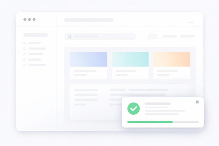
Toasts are a classic example of transient UI state. The server can render a toast message (for example, after a form submission), and Alpine can handle auto-dismiss and manual close. This keeps the server responsible for deciding what to show, while Alpine handles timing and interaction.
Step 1: Render the toast container
<div x-data="toast({ timeout: 4000 })" x-show="visible" x-transition> <div class="toast"> <p><strong>Saved.</strong> Your changes were stored.</p> <button type="button" @click="hide()" aria-label="Dismiss">×</button> </div></div>Step 2: Implement the behavior with init()
Alpine components can define an init() method that runs when the component initializes. Use it to start timers, set up listeners, or normalize initial state.
<script>document.addEventListener('alpine:init', () => { Alpine.data('toast', ({ timeout = 3000 } = {}) => ({ visible: true, timeout, timer: null, init() { this.timer = setTimeout(() => this.hide(), this.timeout) }, hide() { this.visible = false if (this.timer) clearTimeout(this.timer) } }))})</script>Because the server can render the toast conditionally, you avoid maintaining a global client-side notification store. Alpine simply enhances the rendered message with dismissal behavior.
Working with Lists: x-for, Keys, and Small Client-Side Transformations
x-for repeats markup for each item in an array. Use :key to keep DOM updates stable when items change. In an HTMX-first app, you typically use x-for for small, local lists (tags, selected filters, client-only drafts) rather than large datasets that should be paginated or filtered on the server.
<div x-data="{ tags: ['htmx','alpine'], newTag: '' }"> <form @submit.prevent="if(newTag.trim()) { tags.push(newTag.trim()); newTag=''; }"> <input type="text" x-model.trim="newTag" placeholder="Add tag"> <button type="submit">Add</button> </form> <ul> <template x-for="(t, idx) in tags" :key="t + '-' + idx"> <li> <span x-text="t"></span> <button type="button" @click="tags.splice(idx, 1)">Remove</button> </li> </template> </ul></div>This pattern is useful for building up a client-side “draft” that will later be submitted as part of a form. If you need to submit the tags, you can mirror them into hidden inputs rendered from the array, keeping the final submission server-friendly.
Alpine and HTMX Together: Coordinating Local State with Server Swaps
When HTMX swaps HTML into the page, Alpine will initialize directives in the new content. The main coordination challenge is deciding what state should survive swaps. A good rule: if state is important, it should be represented in the HTML the server returns (for example, which accordion sections are open might be encoded with classes/attributes). If state is purely transient, it can live in Alpine and be reset when content is replaced.
One practical technique is to keep Alpine components outside the region that HTMX replaces, so their state persists. Another is to store state in the URL (for example, selected tab) and let the server render accordingly. When you do want Alpine state to persist across swaps inside the same region, consider moving the state up to a parent element that is not replaced, and let swapped children consume it.
<div x-data="{ showAdvanced: false }"> <label><input type="checkbox" x-model="showAdvanced"> Show advanced</label> <div id="results"> <!-- HTMX might replace this inner div, but the checkbox state persists --> <div x-show="showAdvanced">Advanced UI controls here</div> </div></div>Custom Events as a Bridge Between HTMX Updates and Alpine Components
A clean integration pattern is to use DOM events to coordinate behavior. HTMX triggers events during its lifecycle, and Alpine can listen to events on elements or the window. Even without relying on specific HTMX event names, the general approach is: after a server-driven update, dispatch a custom event from the updated fragment (or from a stable parent), and have Alpine respond by resetting local state, focusing an input, or showing a message.
<div x-data="{ open: false }" @panel-reset.window="open = false"> <button type="button" @click="open = true">Open panel</button> <div x-show="open"> <p>Panel content</p> </div></div> <script>// Somewhere after a swap or action: window.dispatchEvent(new CustomEvent('panel-reset'))</script>This keeps responsibilities separated: the server drives content, and Alpine reacts to events to adjust UI state. You avoid tight coupling where Alpine must “know” about server endpoints or parse HTML responses.
Transitions and Micro-Interactions with x-transition
Alpine’s x-transition makes UI changes feel polished without heavy animation tooling. It works well with x-show for dropdowns, panels, and toasts. Use transitions for clarity (helping users perceive what changed), not as decoration.
<div x-data="{ open: false }"> <button type="button" @click="open = !open">Filters</button> <div x-show="open" x-transition> <p>Filter options...</p> </div></div>If you need more control, Alpine supports specifying transition classes. This is useful when you already have a design system with predefined animation utilities.
Managing Focus and Accessibility with x-ref and $nextTick
Many UI patterns require focus management: focusing the first input when a panel opens, returning focus to the trigger when it closes, or focusing a newly swapped-in element. Alpine provides x-ref to reference elements and $nextTick to run code after the DOM updates.
<div x-data="{ open: false }"> <button type="button" @click="open = true; $nextTick(() => $refs.name.focus())">Edit</button> <div x-show="open"> <label>Name</label> <input type="text" x-ref="name"> <button type="button" @click="open = false">Close</button> </div></div>This pattern is especially important when combining server-driven updates with client-side toggles: users should not “lose” their place in the interface after content changes.
Keeping Alpine Lightweight: Practical Boundaries and Anti-Patterns
Alpine is most effective when you treat it as a UI enhancement layer. A common anti-pattern is gradually turning Alpine into a full client-side application state container: storing large datasets, duplicating server validation rules, or building complex client-side routing. That usually increases complexity and makes server-driven updates harder to reason about.
Instead, use Alpine for: toggles, disclosure widgets, local drafts, client-only sorting of already-present items, keyboard shortcuts, focus management, and small derived UI state. Use server-rendered HTML for: authoritative data, permissions, validation, and anything that must be consistent across sessions and devices.
When you feel tempted to add more and more Alpine state, ask: “Could the server render this state directly into the HTML?” If yes, prefer that. If the state is truly ephemeral (like whether a dropdown is open), Alpine is the right tool.


