
Why Accessibility Matters in Installable, Offline-Capable Web Apps
An installable offline-capable web app behaves like an app: it can be launched from a home screen, run in a standalone window, and continue to work when the network is unavailable. Accessibility (often abbreviated a11y) ensures that this experience works for people using assistive technologies (screen readers, switch devices, voice control), alternative input (keyboard-only), low vision settings (zoom, high contrast), cognitive considerations (clear language, predictable flows), and situational constraints (glare, one-handed use, poor connectivity).
Offline capability introduces a special accessibility challenge: the app must communicate network state, sync state, and error recovery without relying on subtle visuals or transient toasts that are not announced. Installability introduces another: the app may look and feel “native-like,” but it must still follow web accessibility semantics and interaction patterns so assistive tech can interpret it correctly.
In practical terms, accessibility for offline-capable installable web apps means: (1) semantic UI that works with screen readers and keyboard, (2) accessible status messaging for offline/sync/install flows, (3) resilient forms and data entry that remain usable without network, (4) media and color choices that remain perceivable, and (5) testing with real assistive tech plus automated checks.
Core Principles to Apply (Without Repeating Prior Architecture Topics)
Perceivable: communicate state changes beyond visuals
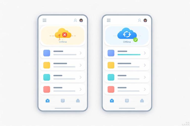
Offline, syncing, and “saved locally” are states that must be perceivable. If your UI uses icons, color, or subtle animations to indicate state, provide text equivalents and programmatic announcements. A common failure is showing “Offline” only as a red dot in the header; screen reader users may never learn why actions behave differently.
Operable: full keyboard and alternative input support
Installable experiences often use custom components (menus, dialogs, bottom sheets). If these are not built with correct focus management and keyboard behavior, the app becomes unusable. Ensure all interactive elements are reachable via Tab, have visible focus, and support expected keys (Enter/Space to activate, Escape to close dialogs, arrow keys for some composite widgets).
- Listen to the audio with the screen off.
- Earn a certificate upon completion.
- Over 5000 courses for you to explore!

Download the app
Understandable: predictable flows and clear error recovery
Offline-first apps frequently queue actions and resolve them later. Users must understand what happened: Was the action saved? Will it sync? Did it fail? Provide clear, persistent feedback and avoid jargon like “Background Sync failed.” Use actionable messages: “Saved on this device. Will upload when you’re online.”
Robust: semantics that survive different environments
Your app may run in a standalone display mode, in different browsers, and with different assistive technologies. Robustness comes from using native HTML elements where possible, correct ARIA when necessary, and avoiding patterns that confuse accessibility APIs (e.g., clickable <div> without role, name, and keyboard support).
Accessible Offline and Sync Status: Patterns That Work
Use a live region for network and sync announcements
When connectivity changes, announce it. When a queued action is saved locally or later synced, announce it. The key is to avoid spamming announcements; only announce meaningful transitions.
Step-by-step pattern:
- Create a visually subtle but accessible status area in the UI (e.g., in the header or near the main content).
- Back it with an
aria-liveregion so screen readers are notified. - Update the text content when state changes (offline/online, syncing started/completed, sync failed).
<header> <div class="app-status" aria-live="polite" aria-atomic="true" id="appStatus">Online</div></header>function setStatus(message) { const el = document.getElementById('appStatus'); if (!el) return; if (el.textContent !== message) el.textContent = message;}window.addEventListener('online', () => setStatus('Back online. Syncing…'));window.addEventListener('offline', () => setStatus('Offline. Changes will be saved on this device.'));Notes: aria-atomic="true" makes the whole message read as a unit. Prefer polite so you don’t interrupt the user mid-sentence. Use assertive only for critical alerts (e.g., data loss risk).
Prefer persistent, discoverable messaging over ephemeral toasts
Toasts are often not announced, disappear too quickly, and can be hard to reach with keyboard. If you use toasts, ensure they are either (a) mirrored in a live region, or (b) implemented as an accessible alert that remains long enough and can be dismissed.
Accessible alert example:
<div role="alert" class="alert" id="syncAlert" hidden> <p>Upload failed. Your changes are saved locally.</p> <button type="button" id="retrySync">Retry</button></div>Ensure the Retry button is focusable and that the alert is not hidden from assistive tech when shown (toggle hidden appropriately).
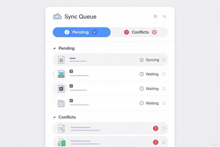
Expose queued state in the UI, not only in logs
If actions can be queued offline, represent this in a way that is perceivable and navigable. For example, a “Sync queue” page listing pending items with status text (“Pending upload”, “Conflict needs review”) is more accessible than a silent queue that only resolves later.
Keyboard and Focus Management for App-Like UI
Use native elements first
Buttons should be <button>, links should be <a>, form controls should be native inputs. Native elements come with keyboard behavior, focus, and accessibility names built in. If you style them to look custom, keep their semantics.
Avoid:
<div class="btn" onclick="save()">Save</div>Prefer:
<button type="button" class="btn" id="saveBtn">Save</button>Ensure visible focus and logical tab order
Installable apps often use heavy CSS resets that remove focus outlines. Do not remove focus indicators. If you customize them, make them clearly visible against all backgrounds.
.btn:focus-visible { outline: 3px solid #1a73e8; outline-offset: 2px;}Keep tab order aligned with visual order. Avoid positive tabindex values (e.g., tabindex="5") because they create confusing navigation. Use tabindex="0" only when you must make a non-native element focusable (and then you must implement keyboard interaction and role).
Accessible dialogs and sheets (common in standalone mode)
Offline-first apps frequently show dialogs for “You’re offline”, “Resolve conflict”, or “Install tips”. A dialog must: trap focus inside while open, restore focus to the triggering element when closed, close on Escape (unless it’s a critical blocking flow), and have an accessible name.
Step-by-step with the native <dialog> element (where supported):
- Create a
<dialog>with a heading and buttons. - Open it with
showModal(). - On close, return focus to the opener.
<button type="button" id="openOfflineHelp">Offline help</button><dialog id="offlineDialog" aria-labelledby="offlineTitle"> <h3 id="offlineTitle">Working offline</h3> <p>You can keep editing. We will upload changes when you’re online.</p> <form method="dialog"> <button value="close">OK</button> </form></dialog>const openBtn = document.getElementById('openOfflineHelp');const dlg = document.getElementById('offlineDialog');openBtn.addEventListener('click', () => { dlg.showModal();});dlg.addEventListener('close', () => { openBtn.focus();});If you implement custom dialogs (e.g., for broader support), you must implement focus trapping and role="dialog" with aria-modal="true", plus labeling. Consider using a well-tested accessible dialog component rather than building from scratch.
Forms That Remain Accessible When Offline
Labeling, instructions, and error messages
Offline-capable apps often include forms for creating content that will sync later. Forms must be accessible regardless of connectivity: every input needs a programmatic label, instructions should be associated, and errors must be announced and discoverable.
Use <label> and connect helper text with aria-describedby:
<label for="title">Title</label><input id="title" name="title" required aria-describedby="titleHelp" /><p id="titleHelp">Keep it short. You can edit later.</p>For validation errors, place an error message near the field and ensure it is announced. A practical pattern is to set aria-invalid="true" and update an error element referenced by aria-describedby.
<p id="titleError" class="error" hidden>Title is required.</p>function showTitleError() { const input = document.getElementById('title'); const err = document.getElementById('titleError'); input.setAttribute('aria-invalid', 'true'); input.setAttribute('aria-describedby', 'titleHelp titleError'); err.hidden = false; err.setAttribute('role', 'alert');}Offline submission: confirm what happened
When the user submits while offline, do not present a generic failure like “Network error.” If the app saves locally and queues the upload, confirm success in a way that is accessible:
- Keep the user’s context (don’t unexpectedly navigate away).
- Show a persistent message: “Saved on this device. Pending upload.”
- Provide a way to review pending items.
Example UI snippet:
<section aria-labelledby="saveStateTitle"> <h3 id="saveStateTitle">Save status</h3> <p id="saveState" aria-live="polite" aria-atomic="true">Not saved yet.</p> <a href="/sync-queue">View pending uploads</a></section>Conflict resolution flows must be accessible
If the app can detect conflicts (e.g., edits made offline collide with server changes), the resolution UI must be navigable and understandable. Provide:
- Clear headings describing the conflict.
- Side-by-side content with proper structure (headings, lists).
- Radio buttons or buttons with clear labels (“Keep my version”, “Use server version”, “Merge manually”).
- Keyboard focus that moves to the conflict summary when it appears.
Prefer radio groups for mutually exclusive choices:
<fieldset> <legend>Choose how to resolve this conflict</legend> <label><input type="radio" name="resolution" value="local" /> Keep my offline changes</label> <label><input type="radio" name="resolution" value="server" /> Use the online version</label> <label><input type="radio" name="resolution" value="merge" /> Merge manually</label></fieldset>Accessible Navigation in Standalone Installable Experiences
Provide a skip link and clear landmarks
In app-like layouts with persistent headers and navigation rails, keyboard and screen reader users benefit from skip links and landmarks.
<a class="skip-link" href="#main">Skip to content</a><header>...</header><nav aria-label="Primary">...</nav><main id="main">...</main>Ensure the skip link becomes visible on focus. Use aria-label on <nav> when multiple navigation regions exist.
Indicate the current page/section
For navigation items, mark the current location with aria-current="page" (or aria-current="true" for non-page contexts). This helps screen reader users understand where they are.
<a href="/inbox" aria-current="page">Inbox</a>Don’t rely on gestures alone
Some installable experiences add swipe gestures (e.g., swipe to delete). Provide an equivalent control (a Delete button) that is reachable by keyboard and screen readers. If you use a hidden action revealed on swipe, ensure it is still in the DOM and reachable, or provide an explicit “More actions” menu.
Color, Contrast, and Motion: Practical Checks for Offline UI
Contrast for status indicators
Offline and sync states are often shown with colored badges. Ensure text contrast meets WCAG requirements (commonly 4.5:1 for normal text). Also ensure the state is not conveyed by color alone: include text like “Offline” or an icon with an accessible name.
Support forced colors and high contrast modes
Some users rely on Windows High Contrast / forced colors. Test your UI with forced colors enabled and avoid CSS that breaks it (e.g., background images that hide text). Prefer system colors where appropriate and ensure focus indicators remain visible.
Respect reduced motion
Sync animations, skeleton loaders, and transitions can cause discomfort. Use prefers-reduced-motion to reduce or disable non-essential motion.
@media (prefers-reduced-motion: reduce) { * { animation-duration: 0.01ms !important; animation-iteration-count: 1 !important; transition-duration: 0.01ms !important; scroll-behavior: auto !important; }}Accessible Loading, Empty, and Offline States
Loading states must be announced and not trap users
When content loads (from local storage or after reconnect), indicate progress. If you show skeleton screens, also provide text for assistive tech such as “Loading messages…” in a live region. Avoid infinite spinners without context.
<div role="status" aria-live="polite" id="loadingStatus">Loading…</div>When loading completes, update the status to something meaningful or remove it.
Empty states should be actionable
An empty list offline can mean “no data yet” or “data not available offline.” Make the distinction explicit:
- “No saved items on this device yet.”
- “This content requires an internet connection. Try again when online.”
Provide actions: “Create your first item,” “Go to downloaded items,” or “Retry.” Ensure buttons are real buttons and that retry does not silently fail.
Offline pages and fallbacks must be accessible
If a route cannot be displayed offline, the fallback view should still have proper headings, a clear explanation, and navigation options. Avoid a single large image with “Offline” text baked in; screen readers cannot read it. Use real text and ensure the primary action is focusable.
Install-Related UI: Accessible Prompts and Settings
Accessible install prompts and “How to install” help
Some users will not see or understand browser-provided install UI. If you provide an in-app install entry point (e.g., “Install app” button), ensure it:
- Is reachable via keyboard and has a clear label.
- Explains what installation changes (“Adds an icon to your home screen; works offline”).
- Does not block core functionality if dismissed.
If you show a custom help panel for installation steps, structure it with headings and lists so it reads well with screen readers.
Permissions and settings must be navigable
Offline-capable apps often include settings like “Download for offline use,” “Auto-sync on Wi‑Fi,” or “Storage usage.” Ensure settings use native controls:
- Use checkboxes for on/off options.
- Use
<button>for actions like “Clear offline data.” - Provide descriptive text about consequences (“Clearing offline data removes downloaded items from this device”).
<label> <input type="checkbox" id="wifiOnly" /> Sync only on Wi‑Fi</label><p id="wifiOnlyHelp">Reduces mobile data usage.</p>Testing Accessibility for Offline-Capable Installable Apps
Step-by-step manual test checklist (high value)
- Keyboard-only: Navigate the entire app (including menus, dialogs, forms, and settings) using Tab/Shift+Tab, Enter/Space, Escape, and arrow keys where appropriate. Confirm you never get stuck and focus is always visible.
- Screen reader smoke test: Use at least one screen reader (NVDA/JAWS on Windows, VoiceOver on macOS/iOS, TalkBack on Android). Verify headings, landmarks, form labels, button names, and that offline/sync announcements are spoken.
- Offline transitions: Turn on airplane mode (or simulate offline) while the app is open. Confirm the app announces “Offline” and that actions provide clear feedback (“Saved locally”). Turn network back on and confirm “Back online” and sync completion/failure messaging.
- Zoom and reflow: Test at 200% zoom and narrow widths. Ensure content does not overlap, dialogs remain usable, and no horizontal scrolling is required for typical reading.
- High contrast / forced colors: Verify text remains readable, focus indicators remain visible, and status badges still convey meaning without color alone.
- Reduced motion: Enable reduced motion and confirm animations are minimized and do not hide important state changes.
Automated checks: useful but not sufficient
Automated tools can catch missing labels, low contrast, and ARIA misuse, but they cannot fully validate offline/sync UX. Use automated checks to prevent regressions, then rely on manual tests for state transitions and real interaction flows.
Common accessibility bugs specific to offline-first behavior
- Status updates only shown visually (icon/color) with no text or live announcement.
- Queued actions confirmed with a toast that is not announced and disappears before it can be read.
- Retry buttons disabled without explanation when offline (screen readers may announce “dimmed” but not why).
- Sync errors shown in a modal that steals focus but has no accessible name, or cannot be closed with keyboard.
- Content replaced after reconnect without preserving focus, causing screen reader users to lose their place.
Implementation Tips for Robust Accessible State Announcements
Announce only meaningful changes
If you update a live region too frequently (e.g., every progress tick), screen readers can become unusable. Announce milestones: “Sync started,” “3 items pending,” “Sync complete,” “Sync failed.”
Preserve focus across offline/online rerenders
When the app refreshes data after reconnect, preserve the user’s focus. If you re-render lists, store the currently focused item’s identifier and restore focus after update. At minimum, avoid forcing focus to the top of the page unless the user triggered navigation.
Use accessible names for icon buttons
Installable apps often use icon-only buttons (sync, refresh, download). Provide an accessible name via visible text or aria-label.
<button type="button" aria-label="Refresh"> <svg aria-hidden="true" focusable="false">...</svg></button>Make offline storage actions explicit
If users can download content for offline use, provide clear controls and status text: “Downloaded,” “Downloading,” “Not downloaded.” Ensure the status is programmatically determinable (text, not just an icon). If you use a toggle, ensure its state is reflected with a checkbox or switch pattern and that changes are announced.


