
Why accessibility changes with dynamic interfaces
Dynamic interfaces built with HTMX and Alpine.js often update only parts of the page: a list refreshes, a form error appears, a drawer opens, or a toast confirms an action. Visually, this feels smooth, but assistive technologies and keyboard users rely on more than visuals. They need predictable focus, meaningful announcements, and a logical tab order that still makes sense after content swaps. Accessibility here is less about adding attributes everywhere and more about managing what changes, how it is communicated, and where the user’s “cursor” (focus) should go next.
Focus management: the backbone of usable partial updates
When content changes without a full page load, the browser does not automatically move focus to the new content. That can leave keyboard users “stuck” on a control that no longer exists, or unaware that anything changed. A practical rule: if an interaction changes the user’s context (new panel, new results, new error summary), you should intentionally place focus somewhere sensible inside that new context.
Deciding where focus should go
Use a simple decision tree. If the user triggered a navigation-like change (e.g., opening a details panel that replaces the main region), move focus to the new region heading or first interactive element. If the user performed an action that results in feedback (e.g., saving), keep focus on the triggering control but announce the result in a live region. If validation fails, move focus to an error summary or the first invalid field. If a modal opens, focus must move into the modal and be trapped there until it closes.
Step-by-step: focusing newly swapped content with HTMX events
HTMX emits lifecycle events you can listen to after a swap. A common pattern is: after the fragment is inserted, find a focus target inside it (a heading, an element with tabindex="-1", or the first form field) and call focus(). The key is to focus only after the DOM is updated.
<main id="main" tabindex="-1">...</main> <!-- tabindex allows programmatic focus --> <div id="results" hx-get="/search?q=..." hx-trigger="keyup changed delay:300ms" hx-target="#results" hx-swap="innerHTML">...</div> <script> document.body.addEventListener('htmx:afterSwap', function (e) { // If the swap updated the main results region, move focus to it if (e.target && e.target.id === 'results') { const heading = e.target.querySelector('h2, h3'); if (heading) { // Make heading focusable if needed if (!heading.hasAttribute('tabindex')) heading.setAttribute('tabindex', '-1'); heading.focus(); } else { // Fallback: focus the region itself if it is focusable e.target.setAttribute('tabindex', '-1'); e.target.focus(); } } }); </script>This pattern prevents “silent” updates. It also helps screen reader users because moving focus typically causes the new content to be read. Use it selectively: focusing on every keystroke in a live search would be disruptive. In that case, keep focus in the input and use a live region to announce result counts instead.
- Listen to the audio with the screen off.
- Earn a certificate upon completion.
- Over 5000 courses for you to explore!

Download the app
Step-by-step: restoring focus after content replacement
Sometimes the element that had focus gets replaced by a swap (for example, a row in a table is re-rendered). If you do nothing, focus may jump to the top of the page or disappear. A robust approach is to store a stable identifier before the request and restore focus after the swap by matching that identifier in the new DOM.
<table id="orders">...</table> <script> let lastFocusId = null; document.body.addEventListener('htmx:beforeRequest', function () { const active = document.activeElement; if (active && active.id) lastFocusId = active.id; }); document.body.addEventListener('htmx:afterSwap', function (e) { if (e.target && e.target.id === 'orders' && lastFocusId) { const el = document.getElementById(lastFocusId); if (el) el.focus(); lastFocusId = null; } }); </script>This works best when interactive elements have stable ids (or stable data attributes you can map to ids). If the element truly no longer exists (e.g., deleted), choose a sensible fallback: the next row’s action button, the table caption, or a toast message.
ARIA fundamentals for dynamic updates (without overusing ARIA)
ARIA is most effective when it fills gaps that native HTML cannot cover. Prefer native elements first: button, a, form controls, details/summary, dialog (when available), and semantic landmarks. Use ARIA to (1) label controls, (2) describe relationships, and (3) announce dynamic changes. Avoid adding role attributes that duplicate native semantics (for example, role="button" on a button).
Labeling and describing controls that trigger updates
When a control triggers an update, its label should clearly describe the action. If the visible text is ambiguous, use aria-label or aria-describedby. For example, an icon-only “refresh” button should have an accessible name. If a filter updates results, you can describe what region changes.
<button hx-get="/orders?status=open" hx-target="#orders" aria-describedby="orders-help">Open</button> <p id="orders-help">Updates the orders table below.</p>aria-controls can also indicate which region is affected, but it does not automatically manage focus or announcements. Treat it as supplemental information, not a solution by itself.
Live regions: announcing changes without stealing focus
Live regions are ideal when the user should stay where they are (for example, typing in a search box) but still needs feedback (result count, “saved”, “error”). Use aria-live="polite" for non-urgent updates and aria-live="assertive" for urgent errors. Keep the message short and replace it rather than continuously appending.
<div aria-live="polite" aria-atomic="true" id="status"></div> <input id="search" name="q" hx-get="/search" hx-trigger="keyup changed delay:300ms" hx-target="#results" hx-include="#search" /> <script> document.body.addEventListener('htmx:afterSwap', function (e) { if (e.target && e.target.id === 'results') { const count = e.target.querySelector('[data-result-count]'); if (count) { document.getElementById('status').textContent = count.textContent + ' results.'; } } }); </script>aria-atomic="true" ensures the whole message is read when it changes. If you update multiple pieces of text inside the status region, atomic prevents partial announcements that sound confusing.
aria-busy and loading states for partial swaps
When a region is being updated, screen reader users benefit from knowing it is “busy.” You can set aria-busy="true" on the target region before the request and remove it after the swap. Pair this with a visible loading indicator for sighted users.
<section id="results" aria-busy="false">...</section> <script> document.body.addEventListener('htmx:beforeRequest', function (e) { const t = e.detail && e.detail.target; if (t && t.id === 'results') t.setAttribute('aria-busy', 'true'); }); document.body.addEventListener('htmx:afterSwap', function (e) { if (e.target && e.target.id === 'results') e.target.setAttribute('aria-busy', 'false'); }); document.body.addEventListener('htmx:responseError', function (e) { const t = e.detail && e.detail.target; if (t && t.id === 'results') t.setAttribute('aria-busy', 'false'); }); </script>aria-busy does not announce a message by itself; it signals state. Combine it with a live region if you need explicit feedback like “Loading results.”
Keyboard navigation: making dynamic UI predictable
Keyboard accessibility is not just “can I tab to it.” It is also: does the tab order match the visual order, can I operate controls with Enter/Space, can I escape overlays, and do I land somewhere sensible after an update. Dynamic interfaces can accidentally break these expectations by inserting content at the top of the DOM, hiding content without removing it from the tab order, or creating custom widgets that don’t follow standard key patterns.
Use native elements to get keyboard behavior for free
Buttons should be real button elements so Space and Enter work correctly. Links should be anchors when they navigate. Inputs should be real inputs. If you must create a custom interactive element, you need tabindex="0" plus key handlers for Enter and Space, and you must provide focus styles. In most HTMX + Alpine.js apps, you can avoid custom widgets by leaning on native HTML and styling it.
Step-by-step: roving tabindex for a keyboard-navigable list
For interactive lists (like a command palette list, a set of selectable cards, or a menu), a roving tabindex pattern keeps only one item tabbable at a time, and uses arrow keys to move within the list. Alpine.js is a good fit because it can manage the active index while keeping markup simple.
<div x-data="{ active: 0 }" role="listbox" aria-label="Search suggestions"> <template x-for="(item, i) in $refs.items.children" :key="i"></template> <ul x-ref="items" @keydown.arrow-down.prevent="active = Math.min(active + 1, $refs.items.children.length - 1); $refs.items.children[active].focus()" @keydown.arrow-up.prevent="active = Math.max(active - 1, 0); $refs.items.children[active].focus()"> <li><button :tabindex="active === 0 ? 0 : -1">First</button></li> <li><button :tabindex="active === 1 ? 0 : -1">Second</button></li> <li><button :tabindex="active === 2 ? 0 : -1">Third</button></li> </ul></div>This example shows the mechanics. In a real app, the list items would be rendered from data, and you would ensure the container has a clear label and that the active item is visually indicated. If the list is updated by HTMX, you should reset active to 0 and focus the first item only when the user explicitly moved into the list (not while typing).
Skip links and landmarks for “partial page navigation”
Dynamic updates can make pages feel like “mini navigations” without actually changing pages. Skip links and landmarks help keyboard and screen reader users jump to the main content or updated region quickly. Ensure you have a main landmark and a skip link that targets a focusable element.
<a href="#main">Skip to main content</a> <main id="main" tabindex="-1">...</main>When an HTMX request effectively changes the main content (like switching tabs that replace the main panel), you can programmatically focus #main after the swap so the skip link and the focus behavior align.
Accessible modals, drawers, and popovers in a dynamic app
Overlays are common in modern UX and are also a frequent accessibility failure point. The minimum requirements: move focus into the overlay when it opens, trap focus inside while open, restore focus to the opener when it closes, provide an accessible name (label), and allow closing with Escape. Also ensure background content is not reachable by tab while the overlay is open.
Step-by-step: focus trap and restore with Alpine.js
Alpine can manage open state and focus behavior. The key is to store the opener element, focus the first focusable element in the dialog, and on close restore focus. Use role="dialog" and aria-modal="true" and provide aria-labelledby pointing to a visible title.
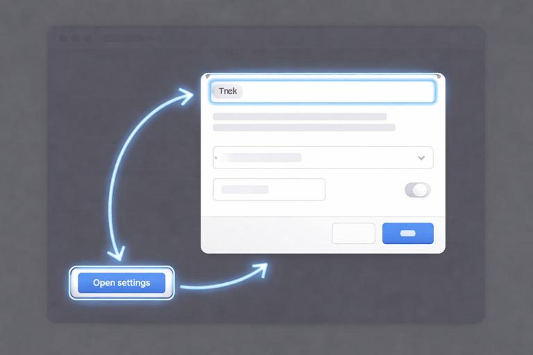
<div x-data="{ open:false, opener:null }"> <button @click="opener=$event.target; open=true; $nextTick(() => $refs.dialog.querySelector('button, [href], input, select, textarea, [tabindex]:not([tabindex=\'-1\'])')?.focus())">Open settings</button> <div x-show="open" @keydown.escape.prevent="open=false; $nextTick(() => opener && opener.focus())" role="dialog" aria-modal="true" aria-labelledby="dlg-title" x-ref="dialog"> <h2 id="dlg-title">Settings</h2> <p>Change your preferences.</p> <button @click="open=false; $nextTick(() => opener && opener.focus())">Close</button> </div></div>This is a simplified trap; a full trap cycles focus when tabbing past the last focusable element. If you implement a full trap, test it with Tab and Shift+Tab. Also ensure that when the dialog is hidden, it is not focusable; x-show toggles display, which removes it from the tab order, which is good.
When dialog content is loaded dynamically
If the dialog body is fetched and swapped in, focus should move after the swap completes, not immediately when open becomes true. Combine Alpine’s open state with an HTMX afterSwap handler that checks whether the swap target is inside the dialog, then focuses the dialog title or first field. Also ensure the dialog has an accessible name even before the content arrives (for example, a static title and a “Loading…” message).
Tabs, accordions, and disclosure patterns that stay accessible
Many interfaces use tabs or accordions to show and hide panels. The accessibility goal is that the relationship between the control and the panel is explicit, and that keyboard users can operate it. For simple show/hide, a button controlling a region with aria-expanded and aria-controls is often enough. For true “tablist” behavior, arrow keys should move between tabs, and only the active tab should be in the tab order.
Step-by-step: accessible accordion with dynamic panel content
An accordion section header should be a button. The button toggles aria-expanded and points to the panel id with aria-controls. The panel can be updated with HTMX when expanded. When the panel loads, do not steal focus; keep focus on the header button so keyboard users can continue navigating headers.
<div x-data="{ open:false }"> <h3> <button @click="open=!open" :aria-expanded="open.toString()" aria-controls="panel-a">Billing details</button> </h3> <div id="panel-a" x-show="open" hx-get="/account/billing-fragment" hx-trigger="revealed" hx-swap="innerHTML"> <p>Loading…</p> </div></div>Using hx-trigger="revealed" loads the content when the panel becomes visible. Because focus stays on the button, the user can keep moving through accordion headers. If the loaded content contains errors or requires immediate attention, then you can move focus into it, but treat that as an exception.
Validation and errors: announcing problems clearly
Dynamic validation often inserts inline error text near fields. For accessibility, errors must be programmatically associated with the field, and the user must be guided to them. Use aria-invalid="true" on invalid fields and connect the error message via aria-describedby. For multiple errors, provide an error summary at the top of the form that is focusable and contains links to fields.
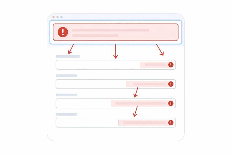
Step-by-step: inline error association after a partial update
If the server returns a fragment that includes updated form fields and error messages, ensure the markup includes stable ids for error elements and that inputs reference them. Then, after swap, focus the error summary or first invalid field.
<form id="profile" hx-post="/profile" hx-target="#profile" hx-swap="outerHTML"> <div id="error-summary" tabindex="-1" aria-live="assertive"> <!-- server renders summary when errors exist --> </div> <label for="email">Email</label> <input id="email" name="email" aria-invalid="true" aria-describedby="email-error" /> <p id="email-error">Enter a valid email address.</p> <button type="submit">Save</button></form> <script> document.body.addEventListener('htmx:afterSwap', function (e) { if (e.target && e.target.id === 'profile') { const summary = e.target.querySelector('#error-summary'); const firstInvalid = e.target.querySelector('[aria-invalid="true"]'); if (summary && summary.textContent.trim().length > 0) { summary.focus(); } else if (firstInvalid) { firstInvalid.focus(); } } }); </script>Note that aria-live on the summary can help announce that errors occurred, but focus is what makes the experience reliably discoverable across screen readers. Also ensure the error text is not only color-based; include icons or text like “Error:” if needed.
Dynamic content and reading order: avoid disorienting swaps
When you insert new content, where you insert it matters. If you prepend content at the top of a list, screen reader users may not realize new items appeared above what they were reading. If you replace a region entirely, users may lose their place. Prefer appending new items for “load more” interactions, and for replacements, provide a heading or status message that clearly indicates what changed (for example, “Search results updated”). If you must prepend, announce it explicitly in a live region and consider offering a “Jump to new items” link that moves focus to the first new item.
Step-by-step: announcing inserted items without moving focus
For a feed that updates, keep the user’s focus where it is and announce that new items are available. Provide a button to load them into view, which is easier to control than auto-inserting while the user is reading.
<div aria-live="polite" aria-atomic="true" id="feed-status"></div> <button id="show-new" hx-get="/feed/new" hx-target="#feed" hx-swap="afterbegin">Show new posts</button> <section id="feed">...</section> <script> document.body.addEventListener('htmx:afterSwap', function (e) { if (e.target && e.target.id === 'feed') { document.getElementById('feed-status').textContent = 'New posts added to the top of the feed.'; } }); </script>This keeps the experience user-driven: the user chooses when to insert new content, and the announcement confirms what happened.
Testing checklist: what to verify on every dynamic feature
For each dynamic interaction (swap, overlay, inline update), test it with only the keyboard and with a screen reader if possible. Keyboard test: can you reach the trigger, activate it with Enter/Space, and continue tabbing in a logical order? After the update, does focus remain sensible, and can you still reach everything you should? Screen reader test: is the trigger labeled, is the update announced or discoverable, and is the updated region identifiable by headings/landmarks?
- Focus: After update, focus is either preserved, moved to the new context, or intentionally left in place with a live announcement.
- Tab order: Hidden content is not tabbable; newly inserted content appears in a logical order.
- Labels: Icon buttons and controls have accessible names; relationships use aria-describedby/aria-controls appropriately.
- Announcements: Use aria-live for status, errors, and result counts when focus should not move.
- Loading: aria-busy reflects updating regions; errors clear busy state.
- Overlays: Focus moves in, is trapped, Escape closes, and focus restores to opener.
- Errors: aria-invalid and described-by are set; error summary is focusable and reachable.


