
What “Obvious Insights” Means in a Power BI Report
In an executive-ready dashboard, the best visualization is the one that makes the right interpretation feel effortless. “Obvious insights” means a viewer can answer the primary question in seconds, without decoding chart mechanics, hunting for context, or performing mental math. In Power BI, this is less about flashy visuals and more about UX decisions: choosing the right chart type for the question, controlling visual hierarchy, using consistent formatting, and designing interactions that guide attention instead of distracting it.
Obvious does not mean simplistic. It means the report removes ambiguity: the metric definition is clear, comparisons are explicit, and the visual design reduces cognitive load. A good test is the “five-second read”: if someone glances at the page for five seconds, what do they believe is happening, and is that belief correct?
Start With the Question, Then Match the Visual
Visualization choices should be driven by the analytical task. Different questions require different encodings (position, length, color, shape). Power BI gives you many options, but a small set covers most executive needs when used well.
Common business questions and the best default visuals
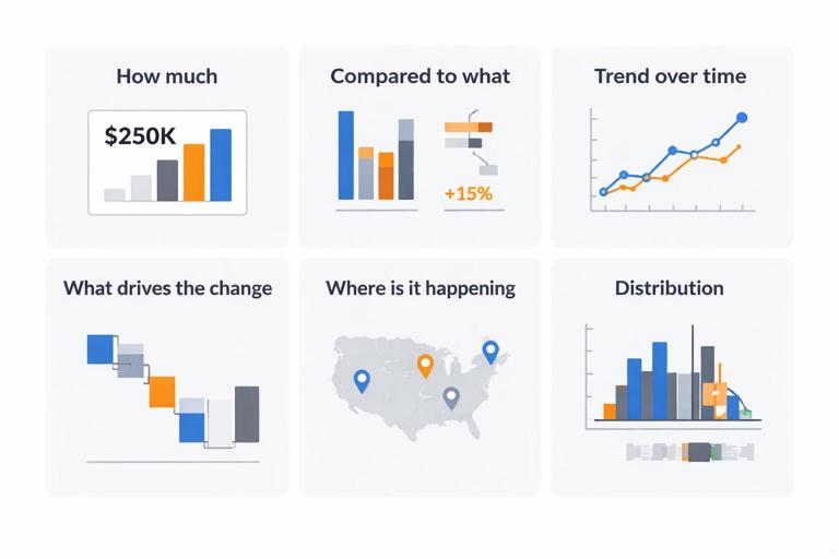
How much? Use KPI card, bar/column chart, or table with conditional formatting. Cards are best for a single number with context (target, delta).
Compared to what? Use clustered bar/column, bullet chart (custom), or variance bar. Avoid pie charts for comparisons beyond 2–3 categories.
Continue in our app.- Listen to the audio with the screen off.
- Earn a certificate upon completion.
- Over 5000 courses for you to explore!

Download the app
Trend over time? Use line chart with a limited number of series. Add reference lines for targets or prior period.
What drives the change? Use decomposition tree, waterfall, or small multiples. Keep the story constrained: show top contributors first.
Where is it happening? Use maps only when geography is essential. Prefer filled maps for region-level patterns and avoid maps for precise comparisons.
Distribution? Use histogram (custom) or box plot (custom). If you can’t explain it quickly, consider summarizing with percentiles in a table.
The key UX move is to pick a “default” visual that most viewers can read instantly. If a visual requires training, it belongs in an analyst page, not an executive page.
Visual Hierarchy: Make the Page Read in the Right Order
Executives scan. Your layout should create a clear reading path: what matters most appears first, is largest, and has the strongest contrast. Power BI pages often fail because everything looks equally important: too many cards, too many colors, too many charts competing for attention.
Practical hierarchy rules for Power BI pages
One primary message per page. Support it with 2–5 secondary visuals. If you have 12 visuals, you likely have multiple pages.
Top-left is prime real estate. Place the main KPI and the main trend or comparison there (for left-to-right reading audiences).
Use size intentionally. The most important visual should be noticeably larger than the rest.
Reduce visual noise. Turn off unnecessary gridlines, borders, and background fills. Use whitespace to separate sections.
Align to a grid. Consistent spacing and alignment makes the report feel trustworthy and easier to scan.
Step-by-step: Build a simple hierarchy layout
Step 1: Create a 12-column mental grid. In Power BI, use the built-in alignment tools (Format ribbon: Align, Distribute) and set consistent padding (e.g., 8–16 px).
Step 2: Reserve the top row for “headline” elements: 1–3 KPI cards and a short subtitle text box that states the business question (not a chart title).
Step 3: Place the main explanatory chart below or to the right of the KPIs (e.g., a trend line or variance bar).
Step 4: Add supporting breakdowns at the bottom: top categories, regions, or segments. Use the same chart type for comparable breakdowns.
Step 5: Add a small “definitions/help” area using a tooltip page or an info button, not a dense paragraph on the canvas.
Reduce Cognitive Load With Consistent Formatting
Formatting is not decoration; it is a language. Consistency allows the viewer to reuse mental patterns: if green always means favorable and red always means unfavorable, the viewer stops re-learning on every page. Inconsistent formatting forces interpretation work that competes with the insight.
Formatting standards that make insights faster
Number formats: Use compact units (K, M, B) consistently. Avoid mixing 1,200,000 and 1.2M on the same page. Set decimal places intentionally (often 0–1 for executives).
Time context: Always indicate the period (MTD, QTD, YTD) and the comparison baseline (vs target, vs prior year). Put this in a subtitle or dynamic title.
Color semantics: Reserve strong colors for meaning. Use neutral grays for context and one accent color for emphasis. Avoid rainbow palettes.
Typography: Use 1–2 font sizes for titles and 1–2 for labels. If everything is bold, nothing is emphasized.
Chart ink: Remove heavy borders, reduce gridlines, and avoid 3D effects. Let the data carry the message.
Step-by-step: Create a report theme that enforces consistency
Step 1: Define a small palette: one primary brand color, one accent color, and 2–3 neutrals. Decide your “good/bad” colors if you use them (e.g., green for above target, red for below).
Step 2: In Power BI, use a theme JSON (View > Themes > Browse for themes). Include data colors, background, and text classes.
Step 3: Apply the theme to the report and standardize visuals: titles on/off, background transparency, border off, consistent label sizes.
Step 4: Create a “formatting checklist” page (hidden) with your standards: number units, decimals, color rules, title patterns. Use it during build and review.
{ "name": "Executive Clean", "dataColors": ["#1F77B4", "#FF7F0E", "#7F7F7F", "#C7C7C7"], "background": "#FFFFFF", "foreground": "#1A1A1A", "tableAccent": "#1F77B4" }Designing KPI Cards That Don’t Mislead
KPI cards are often the first thing an executive sees, and they can either clarify or confuse. A card that shows only a number invites questions: “Is that good?” “Compared to what?” “Over what period?” Make the comparison explicit and keep the card compact.
Practical KPI card pattern
Main value: Current period metric (e.g., Revenue YTD).
Delta: Variance vs target or vs prior year (absolute and/or percent). Use conditional color on the delta, not on the whole card.
Context label: Small text for time window and filter context (e.g., “YTD through Dec 31, North America”).
Step-by-step: Build a KPI strip with clear context
Step 1: Limit to 3–5 KPIs on a page. More than that becomes a wall of numbers.
Step 2: Use consistent units across cards (all in $M, all in %, etc.).
Step 3: Add a small dynamic subtitle using a measure for the selected period and key slicers. Place it above the KPI strip or inside each card using a multi-row card.
Step 4: If you use conditional formatting, apply it to the variance indicator only. Keep the main value neutral to avoid emotional overemphasis.
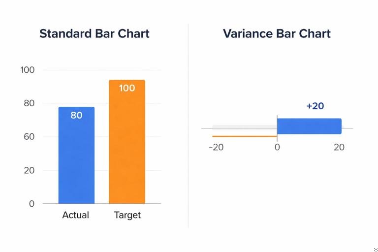
Make Comparisons Explicit: Variance-First Visuals
Executives often care more about change than absolute values. A chart that forces them to compare two bars mentally is slower than a chart that directly encodes the variance. Variance-first design means you show the difference as the primary mark and the baseline as context.
Effective variance patterns in Power BI
Waterfall: Good for explaining how components contribute to a net change. Keep categories limited and sort by contribution.
Variance bar: A bar chart of (Actual - Target) by category, with a zero line. This makes over/under performance instantly visible.
Bullet chart (custom visual): Excellent for target tracking with compact space. Use carefully and consistently.
Step-by-step: Create a variance bar that reads instantly
Step 1: Build a bar chart with Category on the axis and Variance on values.
Step 2: Add a constant line at zero (Analytics pane). Make it subtle but visible.
Step 3: Use conditional colors: one color for positive, one for negative, neutral for near-zero. Avoid gradients unless you have a clear scale.
Step 4: Sort categories by absolute variance or negative variance first, depending on the business need.
Step 5: Add a tooltip that shows Actual, Target, and Variance, so the bar remains clean while details are available on demand.
Interaction Design: Slicers, Cross-Filtering, and Drill Without Confusion
Power BI’s interactivity is powerful, but it can easily become a UX trap: users click something, the page changes, and they don’t know why. The goal is controlled interactivity: predictable filters, clear states, and obvious ways to reset.
Slicer UX principles
Prefer fewer slicers with higher value. Typically: Date, Region, Segment, Product line. Too many slicers create decision fatigue.
Use dropdown slicers for long lists. Use “Between” for dates when appropriate, but ensure the default selection is meaningful.
Show the current filter context. Use dynamic titles or a small “Current selection” text area.
Provide a reset mechanism. Use a “Reset filters” button tied to a bookmark.
Step-by-step: Add a reliable “Reset Filters” button
Step 1: Set the page to the desired default slicer selections.
Step 2: Create a bookmark (View > Bookmarks) called “Reset”. Ensure “Data” is checked so slicer states are captured.
Step 3: Insert a button (Insert > Buttons) and set Action to Bookmark, selecting “Reset”.
Step 4: Test by changing slicers and clicking the button. Confirm it restores the intended defaults.
Cross-filtering control
Not every visual should filter every other visual. When everything cross-filters, users can end up with accidental states and misinterpretations. Use “Edit interactions” to control which visuals filter, highlight, or do nothing. A common pattern is: top-level visuals filter detail visuals, but detail visuals do not filter the headline KPIs.
Step-by-step: Configure interactions for predictable exploration
Step 1: Select a visual that should act as a filter (e.g., a region bar chart).
Step 2: Go to Format > Edit interactions.
Step 3: For each target visual, choose Filter, Highlight, or None. Use None for KPI cards if you want them to remain stable.
Step 4: Exit Edit interactions and test common click paths to ensure the behavior matches user expectations.
Tooltips and Detail-on-Demand: Keep the Canvas Clean
A common dashboard failure is trying to show every detail at once. Executives need clarity first, detail second. Power BI tooltips and drill-through pages let you keep the main page simple while still providing depth for those who need it.
Tooltip design rules
Answer the next question. If the chart shows variance, the tooltip should show Actual, Target, and maybe prior period, not unrelated metrics.
Use report page tooltips for structure. A tooltip page can include a mini trend, rank, or breakdown, but keep it small and readable.
Keep formatting consistent. Tooltips should use the same number formats and color semantics as the main page.
Step-by-step: Create a report page tooltip
Step 1: Add a new page and in Page information, turn on “Tooltip”. Set Page size to Tooltip.
Step 2: Place 1–3 small visuals: a mini line trend, a small table of key contributors, and a label for context.
Step 3: On the main visual, set Tooltip to “Report page” and select your tooltip page.
Step 4: Hover test across categories to ensure the tooltip content updates correctly and remains readable.
Accessibility and Readability: Design for Real Viewing Conditions
Dashboards are often viewed on projectors, laptops in meetings, or small screens. Readability is a UX requirement, not a nice-to-have. Accessibility also improves clarity for everyone: strong contrast, legible fonts, and careful color choices reduce misreads.
Practical accessibility checks
Contrast: Ensure text and key marks meet strong contrast. Avoid light gray text on white backgrounds for anything important.
Color blindness: Don’t rely on red/green alone. Pair color with labels, icons, or position. Use patterns like “good = blue, bad = orange” if your audience struggles with red/green.
Font sizes: Titles typically 14–18+, labels 10–12+ depending on density. If you must go smaller, you have too much on the page.
Alt text: Add alt text for key visuals when reports are shared broadly. It also forces you to articulate what the visual is saying.
Chart-Specific UX Improvements That Prevent Misinterpretation
Small configuration choices can change what a viewer believes. The goal is to remove accidental ambiguity: unclear axes, misleading scales, and cluttered legends.
Bar and column charts
Start at zero for bars. Truncated axes can exaggerate differences and erode trust.
Limit categories. Show top N and group the rest as “Other” when appropriate.
Use direct labels sparingly. If labels overlap, reduce categories or rely on tooltips.
Line charts
Limit series. More than 3–5 lines becomes spaghetti. Use small multiples or a selector for the series.
Use markers only when needed. Markers can clutter; use them to highlight last value or key points.
Show reference lines. Targets, prior year, or average lines provide immediate context.
Tables and matrices
Use tables for lookup, not storytelling. If the insight is a pattern, use a chart; if the need is exact values, use a table.
Conditional formatting: Use data bars or icons to make patterns visible. Keep it subtle and consistent.
Freeze key columns: Ensure the first column is the identifier (e.g., Product) so the table remains readable when scrolled.
Step-by-Step: Refactor a “Busy” Page Into an Executive UX
This practical workflow helps you transform a cluttered report page into one where insights are obvious. You can apply it to an existing page without changing the underlying data.
Step 1: Identify the page’s single sentence
Write a one-sentence claim the page should communicate, such as: “Revenue is above target this quarter, but margin is declining due to discounting in two regions.” If you cannot write this sentence, the page is trying to do too much.
Step 2: Classify visuals into headline, explanation, and detail
Headline: 1–3 KPIs that state the outcome.
Explanation: 1–2 visuals that show why (trend, variance, drivers).
Detail: 1 visual for breakdown or a drill-through path.
Remove or move anything that doesn’t support the sentence. If a visual is “interesting” but not necessary, it belongs on an analyst page.
Step 3: Rebuild layout with hierarchy and whitespace
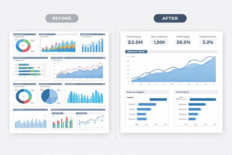
Place headline KPIs at the top, the main explanatory chart in the center, and supporting breakdowns at the bottom. Increase whitespace by reducing visual count and turning off borders and backgrounds. Align everything to a grid.
Step 4: Standardize titles and labels
Replace generic titles like “Sales by Category” with action-oriented titles that state the takeaway, such as “Category mix shifted toward lower-margin items.” If you cannot state a takeaway honestly, use a neutral title but add a subtitle with the comparison context (e.g., “vs Target, QTD”).
Step 5: Add controlled interactivity
Add only the slicers needed for executive decisions. Configure interactions so clicks don’t create confusing states. Add a reset button and a small “current selection” indicator.
Step 6: Add detail-on-demand
Move dense tables to drill-through pages. Use tooltips for supporting numbers. The main page should remain readable from a distance.
Executive UX Patterns You Can Reuse Across Pages
Reusable UX patterns reduce build time and make the report feel coherent. When every page behaves similarly, users explore confidently and spend less time learning the interface.
Pattern: The “KPI + Trend + Drivers” page
Top: KPI strip (current, variance, target).
Middle: Trend line with reference line or prior period.
Bottom: Driver breakdown (variance bar or waterfall) and a small table for top exceptions.
Pattern: The “Exception list” page
Top: Filters and a definition of what counts as an exception (e.g., variance < -5%).
Middle: Table/matrix with conditional formatting and sortable columns.
Right or tooltip: Mini trend for the selected item.
Pattern: The “Segment comparison” page
Left: Segment selector (buttons or slicer).
Center: Small multiples for consistent comparison across segments.
Bottom: Variance-first chart to highlight where the biggest gaps are.


