Why narrative structure matters for executives
What executives need from a data story: Executives rarely need more charts; they need decisions made with confidence. Narrative structure is the deliberate ordering of context, evidence, and implications so that a busy reader can answer three questions quickly: What is happening? Why is it happening? What should we do next? In Power BI, narrative structure is not a separate “writing task”; it is embedded in how you sequence pages, how you reveal detail, and how you connect metrics to actions.
Narrative structure vs. report structure: A report can be well-designed and still fail as a story if it forces the audience to assemble meaning on their own. Narrative structure adds a guided path: you start with the decision frame, then provide only the evidence required, then show options and trade-offs. Think of report structure as the layout of rooms in a building, and narrative structure as the tour guide who decides where you go first, what you notice, and what you do next.

Executive communication as a constraint: Executive communication is defined by constraints: limited time, high stakes, and competing priorities. Your narrative must be skimmable, defensible, and action-oriented. This means fewer concepts per page, explicit definitions for ambiguous terms (for example, “active customers” or “net revenue”), and a clear boundary between facts, interpretations, and recommendations.
Core narrative patterns you can apply in Power BI
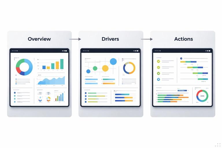
Pattern 1: Situation → Complication → Resolution (SCR): This classic structure works well for performance reviews and operational updates. Situation establishes the baseline and what “normal” looks like. Complication introduces the deviation (a gap, risk, or opportunity). Resolution proposes actions and shows expected impact. In Power BI, SCR often maps to three pages: an executive overview (Situation), a driver page (Complication), and an actions page (Resolution) with scenarios or prioritized initiatives.
Pattern 2: Question → Answer → Evidence: When the executive already has a question (for example, “Why did margin drop last month?”), lead with the answer first. Then show the evidence that supports it. This pattern reduces cognitive load because the audience knows what they are looking for. In Power BI, you can implement this by placing a short “Answer” text box or smart narrative at the top, followed by two to three visuals that validate the claim.
- Listen to the audio with the screen off.
- Earn a certificate upon completion.
- Over 5000 courses for you to explore!

Download the app
Pattern 3: Benchmark → Gap → Plan: This is effective for strategy and target-setting. Start with the benchmark (internal target, industry standard, or prior period), quantify the gap, then propose a plan with owners and timelines. In Power BI, the benchmark can be a reference line, a target card, or a small multiples view by business unit; the plan can be a table of initiatives with status indicators and drill-through to details.
Pattern 4: Funnel narrative (from broad to specific): Begin with the enterprise-level metric, then progressively narrow to region, product, channel, or customer segment. The key is to control the descent: each step should answer “what changed” before moving to “where” and “why.” In Power BI, this is supported by drill-through pages, tooltip pages, and bookmarks that reveal deeper layers without overwhelming the first view.
Building an executive narrative: a practical step-by-step
Step 1: Define the decision and the “so what”: Write a single sentence that states the decision the dashboard should enable, such as “Decide whether to increase marketing spend in Region A next quarter.” Then write the “so what” in business terms: “If we do nothing, pipeline will miss target by 8%.” This sentence becomes the anchor for page titles, callouts, and the order of your visuals.
Step 2: Identify the minimum evidence set: List the smallest set of metrics needed to justify the decision. A useful rule is “one primary metric, up to three drivers, one risk indicator.” For example: primary metric = Net Revenue; drivers = Volume, Price, Mix; risk indicator = Churn rate. Anything else becomes secondary and should be accessible via drill-through rather than placed on the main page.
Step 3: Choose a narrative pattern and map it to pages: Pick one of the patterns above and map it to a page flow. Example using SCR: Page 1 (Situation): current performance vs target; Page 2 (Complication): decomposition of variance; Page 3 (Resolution): recommended actions and expected lift. This mapping prevents the common mistake of mixing context, diagnosis, and action on the same canvas.
Step 4: Write page-level “micro-scripts”: For each page, write a 2–3 line script that you want the executive to say after viewing it. Example: “We are 5% below target, driven mainly by lower volume in two regions. Price held steady. If we address stockouts and reallocate spend, we can recover 3 points.” These micro-scripts guide what to emphasize visually and what to hide.
Step 5: Design the attention path: Executives scan. Create a consistent reading order: top-left = headline metric and status; top-right = key driver; middle = explanation visual; bottom = next action or drill-through cue. Use alignment and whitespace to make the path obvious. In Power BI, this is reinforced by consistent placement of KPI cards, slicers, and navigation buttons across pages.

Step 6: Add narrative callouts that separate fact from interpretation: Use short callouts labeled explicitly, such as “Observation,” “Interpretation,” and “Action.” This reduces debate about whether a statement is a measured fact or an inference. Keep callouts short and quantified: “Observation: Volume down 7% vs last month.” “Interpretation: Stockouts explain ~4 points of the decline.” “Action: Expedite replenishment for top 20 SKUs in Region North.”
Step 7: Validate with a “five-minute executive test”: Ask a stakeholder to spend five minutes with the report and then answer: What is the status? What changed? Why? What should we do? If they cannot answer without clicking randomly, your narrative structure needs tightening. Adjust page order, simplify visuals, and move supporting detail to drill-through.
Executive-ready language: turning analysis into decisions
Use decision verbs and ownership: Executive communication improves when you use verbs that imply action and accountability: “prioritize,” “reallocate,” “pause,” “invest,” “mitigate.” Pair them with an owner and timeframe when possible: “Reallocate 10% of spend from Channel X to Channel Y this month.” Even if Power BI is not a project management tool, your narrative can still express ownership through labels and annotations.
Quantify impact and uncertainty: Executives want magnitude. Replace “significant” with numbers and ranges: “Margin decreased by 1.2 points,” “Expected lift: 2–3%.” If uncertainty exists, state it explicitly and show sensitivity: “If conversion returns to baseline, revenue recovers by $0.8M; if not, recovery is $0.3M.” This can be supported by scenario visuals or a small table of assumptions.
Define terms that are commonly misunderstood: Words like “customer,” “active,” “retained,” “pipeline,” and “profit” often vary by team. Add a compact definition area or tooltip: “Active customer = purchased in last 90 days.” This prevents executive meetings from derailing into semantic debates.
Prefer comparisons over absolutes: Executives interpret change faster than raw values. Frame metrics as deltas vs target, vs prior period, and vs forecast. In narrative text, lead with the comparison: “We are 3% below target,” then provide the absolute: “($9.7M vs $10.0M).”
Story mechanics in Power BI: sequencing, pacing, and reveal
Page sequencing as narrative pacing: Pacing is the rate at which you introduce new ideas. A common executive-friendly pace is: Page 1 introduces one idea (status), Page 2 introduces two ideas (drivers), Page 3 introduces one idea (action plan). Avoid adding new definitions late in the story; define them early or in tooltips.
Progressive disclosure with drill-through and tooltips: Executives want the option to verify without being forced into detail. Use drill-through pages for “show me the list” questions (for example, which products drove the decline). Use tooltip pages for “explain this point” questions (for example, what happened in Week 42). The narrative benefit is that the main page stays clean while credibility remains accessible.
Bookmarks for controlled reveal during live presentations: When presenting, bookmarks let you reveal layers in a planned order: first the headline KPI, then the driver breakdown, then the segment comparison. This mimics a slide narrative while keeping the data interactive. Use a small set of bookmarks (3–5 per page) and name them with the story step, such as “01 Status,” “02 Drivers,” “03 Actions.”
Smart narrative and dynamic text for context: Dynamic text can translate filter context into readable statements: “Showing Q3 2026, Region: West, Channel: Online.” This reduces confusion when slicers change. Keep dynamic text factual and avoid over-interpretation; reserve interpretation for labeled callouts.
Handling objections and building trust in executive conversations
Pre-wire the likely questions: Executives often ask predictable questions: “Is this seasonal?”, “Is this one-off?”, “Is this data complete?”, “What’s the impact on cash?”, “What do competitors do?” You can pre-wire these by adding small, optional elements: a seasonality comparison toggle, a data freshness indicator, or a variance bridge that reconciles totals. The narrative goal is not to answer everything upfront, but to show that the report anticipates scrutiny.
Create a “defensibility layer” without clutter: A defensibility layer is a place where assumptions, exclusions, and data quality notes live. Implement it as an info button that opens a tooltip or a dedicated drill-through page. Include items like: refresh timestamp, source systems, known limitations, and definitions. This keeps the executive view clean while protecting credibility.
Use reconciliation points: If executives compare your numbers to finance or operational systems, provide a reconciliation visual or note: “This report uses invoiced revenue; finance uses recognized revenue.” Even a short statement can prevent mistrust. Place reconciliation links near the headline metric so the question is answered before it is asked.
Worked example: turning a performance dashboard into an executive narrative
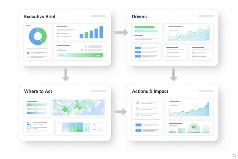
Scenario: A sales leader opens a Power BI report and sees revenue down. The current report has many visuals: revenue trend, product table, region map, pipeline chart, and a dozen slicers. The goal is to restructure it into an executive narrative that supports a decision on where to focus recovery efforts.
Step-by-step restructuring
- 1) Create an “Executive Brief” page: Place a headline KPI (Revenue vs Target) and two supporting KPIs (Volume vs Target, Average Selling Price vs Target). Add a single sentence callout labeled “Observation” with the delta. Add a small visual that shows the last 13 weeks trend with a target line.
- 2) Add a “Drivers” page using a variance bridge: Show how revenue variance decomposes into Volume, Price, and Mix. Add a segment selector (Region or Channel) but limit it to one. Include a callout labeled “Interpretation” that points to the top driver and quantifies contribution.
- 3) Add a “Where to act” page: Use a ranked list of regions or products with contribution to the gap and a simple status indicator (for example, “stockout risk,” “pipeline coverage”). Provide drill-through to a detail page that lists the underlying accounts or SKUs.
- 4) Add an “Actions & impact” page: Create three recommended actions with expected impact ranges and prerequisites. Example: “Fix stockouts in top 20 SKUs (expected +$0.4M to +$0.6M).” Include a scenario selector for conservative/base/aggressive assumptions.
- 5) Reduce slicers and standardize navigation: Keep only the slicers that change the decision (for example, time period and region). Move the rest to drill-through. Add navigation buttons: Brief → Drivers → Where → Actions.
What changed in communication: The original report asked the executive to explore. The narrative version tells them what matters first, then offers verification paths. It also separates observation from interpretation and ends each page with a clear next step: either a drill-through or an action decision.
Writing and formatting techniques for on-screen executive reading
Use headlines that state the message: Replace neutral titles like “Revenue Trend” with message titles like “Revenue is 5% below target, driven by volume.” This is a narrative device: the title becomes the first sentence of the story. Keep it short and quantified.
Limit each page to one main message: If a page contains two competing messages, executives will remember neither. If you need both, split into two pages or use bookmarks to reveal the second message after the first is understood.
Use consistent numeric formatting: Executive trust is influenced by consistency. Decide on units (K/M/B), decimal places, and sign conventions for deltas. Use parentheses for negatives if that matches finance norms. Ensure the narrative text matches the visual formatting (for example, do not say “1.2 million” if the card shows “$1.2M”).
Make time explicit: Many executive misunderstandings come from time context. Label whether a metric is MTD, QTD, rolling 12 months, or last complete month. In narrative callouts, include the time frame: “In the last 4 weeks, churn increased by 0.6 points.”
Checklist: executive communication quality gates
Message clarity: Can a reader state the main message of each page in one sentence? Does the page title already communicate that message?
Decision readiness: Is there an explicit action or decision implied by the page? Are trade-offs or constraints visible (budget, capacity, risk)?
Evidence sufficiency: Are there enough visuals to support the claim without forcing exploration? Is supporting detail available via drill-through?
Defensibility: Are definitions, refresh time, and known limitations accessible? Are reconciliation notes available where needed?
Pacing: Does the page order move from status to drivers to action? Are new concepts introduced gradually?
// Example micro-script template you can use before building a page: // 1) Observation (fact): ______________________________ // 2) Interpretation (why): ____________________________ // 3) Action (what next): ______________________________ // 4) Expected impact (range): _________________________ // 5) Confidence / caveat: _____________________________