
Why performance engineering matters in PWAs
Performance engineering is the deliberate practice of making your app feel fast and stay fast as features grow. In a PWA, performance is not only about a good first impression; it directly affects installability, engagement, and reliability on constrained devices and networks. This chapter focuses on three practical levers you can apply without changing your overall architecture: optimizing the critical rendering path (what blocks the first paint), applying lazy loading (what can wait), and optimizing media (what often dominates bytes and decode time).
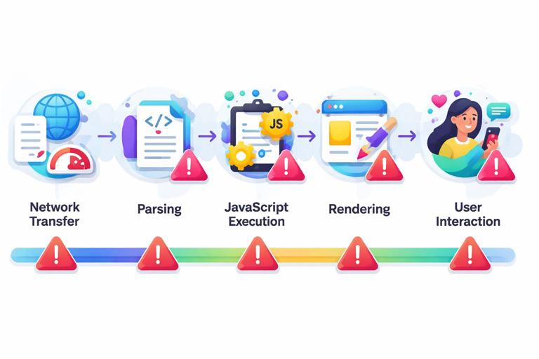
Think of performance as a pipeline: network transfer, parsing, execution, rendering, and user interaction. If any stage is overloaded, the user experiences delay. The goal is to shorten the time to first meaningful content and keep the main thread responsive during interactions.
Critical path: what it is and how to control it
The “critical path” is the minimum set of resources and work required to render the initial view. It includes HTML, critical CSS, essential JavaScript, fonts, and any data needed to show the first screen. Everything else is non-critical and should be deferred.
What blocks rendering
- Render-blocking CSS: external stylesheets block rendering until downloaded and parsed.
- Parser-blocking JavaScript: scripts in the head without
deferorasyncblock HTML parsing and delay rendering. - Font loading: custom fonts can cause invisible text (FOIT) or layout shifts when they swap in.
- Large HTML/DOM: heavy markup increases parsing and layout cost.
- Expensive JavaScript on startup: hydration, large bundles, and synchronous work can delay interactivity.
Step-by-step: map your critical path
Start by defining what “first screen” means: the primary content users expect immediately (for example, a feed header and the first few items, or a dashboard summary). Then map the dependencies needed to render it.
- Step 1: Identify the first meaningful UI. Write down the elements that must be visible within the first second or two.
- Step 2: List required assets. Which CSS rules are needed for that UI? Which JS is required for basic navigation and event handling? Which data is required to avoid a blank screen?
- Step 3: Remove non-essential work from startup. Anything not required for the first screen becomes a candidate for deferral, lazy loading, or background initialization.
- Step 4: Validate with measurement. Use DevTools Performance and Lighthouse to confirm improvements in metrics like LCP (Largest Contentful Paint), INP (Interaction to Next Paint), and CLS (Cumulative Layout Shift).
Control JavaScript execution: defer, async, and module loading
For scripts that are required but not needed before the HTML is parsed, prefer defer. For scripts that are independent and can load in parallel, consider async (but be careful: execution order is not guaranteed).
- Listen to the audio with the screen off.
- Earn a certificate upon completion.
- Over 5000 courses for you to explore!

Download the app
<!-- Good default for app bundles: preserves order, runs after parsing -->
<script src="/assets/app.js" defer></script>

<!-- Analytics or non-critical widgets: can be async if independent -->
<script src="https://example.com/analytics.js" async></script>
If you use ES modules, module scripts are deferred by default, which helps keep parsing unblocked.
<script type="module" src="/assets/app.mjs"></script>Reduce startup cost: split bundles and avoid “do everything on load”
A common performance failure mode is loading and executing the entire app up front. Even if network transfer is fast, parsing and executing a large bundle can block the main thread. The fix is to split code by route and by feature, then load only what the user needs for the current view.
At a high level:
- Route-level splitting: load code for “Settings” only when the user navigates there.
- Component-level splitting: load heavy widgets (charts, editors, maps) only when they become visible.
- Library splitting: avoid bundling large libraries into the initial chunk if they are used rarely.
Most bundlers support dynamic imports. The pattern is: render a lightweight placeholder, then import the heavy module when needed.
// Example: load a chart only when the user opens the analytics panel
async function showAnalytics() {
  const { renderChart } = await import('./analytics/chart.js');
  renderChart(document.querySelector('#chart'));
}
Critical CSS: inline what’s needed, defer the rest
Because external CSS blocks rendering, you can inline a small set of critical CSS for above-the-fold content, then load the full stylesheet afterward. Keep the inline CSS minimal to avoid bloating HTML.
<style>
  /* Critical styles for header and skeleton */
  body { margin: 0; font-family: system-ui, sans-serif; }
  .header { height: 56px; display: flex; align-items: center; padding: 0 16px; }
  .skeleton { background: #eee; border-radius: 8px; min-height: 120px; }
</style>
<link rel="preload" href="/assets/styles.css" as="style">
<link rel="stylesheet" href="/assets/styles.css" media="print" onload="this.media='all'">
The media="print" trick defers applying the stylesheet until it loads, then switches it to all. Test carefully to avoid flashes of unstyled content; in many apps, a small skeleton UI plus critical CSS is enough to keep the experience stable.
Fonts: avoid invisible text and reduce layout shifts
Fonts can delay text rendering and cause layout shifts when they swap in. Practical steps:
- Prefer system fonts for the initial UI when possible.
- If you use web fonts, use
font-display: swapso text is visible immediately. - Preload the most important font file(s) if they are truly critical.
- Subset fonts to only required glyphs and weights.
/* In your @font-face declaration */
@font-face {
  font-family: 'Inter';
  src: url('/fonts/inter-var.woff2') format('woff2');
  font-display: swap;
}
<link rel="preload" href="/fonts/inter-var.woff2" as="font" type="font/woff2" crossorigin>Preload only the font that affects above-the-fold content; preloading too many fonts can compete with other critical resources.
Lazy loading: defer what users don’t need yet
Lazy loading is the practice of delaying the loading of resources until they are needed. Done well, it reduces initial bytes, speeds up rendering, and lowers main-thread work. Done poorly, it can cause visible pop-in or delays when the user scrolls. The key is to lazy load with intent: prioritize what’s likely to be needed soon, and prefetch when you can predict user actions.
Lazy load images with native attributes
For below-the-fold images, native lazy loading is a simple win. Combine it with explicit dimensions to prevent layout shifts.
<img
  src="/images/product-480.jpg"
  srcset="/images/product-480.jpg 480w, /images/product-960.jpg 960w"
  sizes="(max-width: 600px) 480px, 960px"
  width="480"
  height="320"
  loading="lazy"
  decoding="async"
  alt="Product photo">
loading="lazy" defers loading until the image is near the viewport. decoding="async" hints that decoding should not block rendering. Always include width and height (or CSS aspect-ratio) to stabilize layout.
Lazy load iframes and embeds
Embeds (maps, videos, social widgets) are often heavy. Use loading="lazy" on iframes and consider click-to-load placeholders for very expensive embeds.
<iframe
  src="https://example.com/embed"
  loading="lazy"
  width="560"
  height="315"
  title="Embedded content"></iframe>
Step-by-step: lazy load a component with IntersectionObserver
When native lazy loading is not enough (for example, you need to load a JS module only when a section becomes visible), use IntersectionObserver.
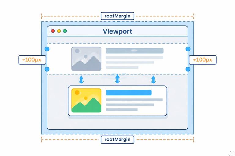
- Step 1: Render a lightweight placeholder container.
- Step 2: Observe when it approaches the viewport.
- Step 3: Import the module and render the real component.
- Step 4: Unobserve to avoid repeated work.
<div id="reviews" class="skeleton">Loading reviews…</div>
<script type="module">
  const el = document.querySelector('#reviews');
  const io = new IntersectionObserver(async (entries) => {
    if (!entries.some(e => e.isIntersecting)) return;
    io.disconnect();
    const { renderReviews } = await import('./reviews.js');
    renderReviews(el);
  }, { rootMargin: '200px' }); // start loading before it appears
  io.observe(el);
</script>
rootMargin lets you start loading early so the content is ready when the user reaches it.
Prefetch and preload: load smarter, not just later
Lazy loading reduces initial work, but you can also improve perceived speed by fetching likely-next resources during idle time.
- preload: high priority, use for critical resources needed soon (fonts, hero image).
- prefetch: low priority, use for resources likely needed for the next navigation (next route chunk).
<!-- Preload a hero image used in the first view -->
<link rel="preload" as="image" href="/images/hero-1200.avif">

<!-- Prefetch a route chunk the user is likely to visit next -->
<link rel="prefetch" href="/assets/settings.chunk.js" as="script">
Use prefetch sparingly on mobile networks. A good pattern is to prefetch only after the app is interactive and only on fast connections.
function canPrefetch() {
  const c = navigator.connection;
  if (!c) return true;
  if (c.saveData) return false;
  return ['4g'].includes(c.effectiveType);
}

if (canPrefetch()) {
  const link = document.createElement('link');
  link.rel = 'prefetch';
  link.as = 'script';
  link.href = '/assets/settings.chunk.js';
  document.head.appendChild(link);
}
Media optimization: images, video, and audio without wasted bytes
Media is frequently the largest contributor to page weight and can also be expensive to decode and render. Optimizing media is one of the highest ROI performance tasks because it improves both load time and runtime smoothness.
Images: choose the right format and deliver responsive sizes
Practical rules:
- Use modern formats (AVIF or WebP) when possible, with fallbacks if needed.
- Serve responsive sizes using
srcsetandsizes, so small screens don’t download desktop images. - Compress aggressively for photographs; use SVG for simple icons/illustrations (but avoid huge, complex SVGs).
- Always set dimensions to prevent layout shifts.
A robust pattern is the <picture> element with format negotiation:
<picture>
  <source type="image/avif" srcset="/img/card-400.avif 400w, /img/card-800.avif 800w" sizes="(max-width: 600px) 400px, 800px">
  <source type="image/webp" srcset="/img/card-400.webp 400w, /img/card-800.webp 800w" sizes="(max-width: 600px) 400px, 800px">
  <img src="/img/card-800.jpg" width="800" height="500" loading="lazy" decoding="async" alt="Card image">
</picture>
This ensures browsers pick the best supported format and the most appropriate size.
Prevent layout shifts with aspect-ratio and placeholders
Even with width/height, responsive layouts can shift if containers change size. Use CSS aspect-ratio to reserve space, and optionally use a low-quality placeholder background.
.media {
  aspect-ratio: 16 / 9;
  background: #f2f2f2;
  overflow: hidden;
}
.media img {
  width: 100%;
  height: 100%;
  object-fit: cover;
  display: block;
}
Video: avoid autoplay weight and stream efficiently
Video can overwhelm the critical path if handled like an image. Practical steps:
- Do not preload large videos by default; use
preload="metadata"ornone. - Use a poster image so the UI looks complete without downloading video bytes.
- Prefer adaptive streaming (HLS/DASH) for long videos when feasible.
- Provide multiple encodings (e.g., H.264 for compatibility, VP9/AV1 where supported) depending on your pipeline.
<video
  controls
  preload="metadata"
  poster="/video/intro-poster.webp"
  width="1280"
  height="720">
  <source src="/video/intro-720p.mp4" type="video/mp4">
  <!-- Optional additional sources for better compression on supported browsers -->
  <source src="/video/intro-720p.webm" type="video/webm">
</video>
If the video is below the fold, lazy load it by rendering a poster image and only inserting the <video> element when the user scrolls near it or taps play.
Audio: keep it lightweight and avoid blocking UI
Audio files are smaller than video but can still add up. Use modern codecs where supported (AAC/MP3 for broad compatibility; Opus in WebM for better compression). Avoid auto-downloading audio on initial load unless it is essential. For sound effects, consider small, preloaded assets only after the app is interactive.
<audio controls preload="none">
  <source src="/audio/episode-01.mp3" type="audio/mpeg">
  <source src="/audio/episode-01.opus" type="audio/ogg; codecs=opus">
</audio>
Runtime performance: keep the main thread responsive
Fast loading is only half the story. PWAs also need smooth scrolling, quick taps, and responsive UI updates. Many performance issues come from long tasks on the main thread (JavaScript that runs for tens or hundreds of milliseconds without yielding).
Step-by-step: find and fix long tasks
- Step 1: Record a Performance trace in Chrome DevTools while reproducing a slow interaction (open a menu, scroll a list, type in a search box).
- Step 2: Look for long tasks (blocks on the main thread). Identify which functions consume time.
- Step 3: Reduce work per interaction by debouncing input handlers, virtualizing long lists, and avoiding forced synchronous layout.
- Step 4: Split heavy work into smaller chunks using
requestIdleCallbackorsetTimeout, or move it to a Web Worker if it is CPU-heavy and doesn’t need DOM access.
Debounce and throttle input-driven work
Search-as-you-type and resize/scroll handlers can easily overload the main thread. Debounce to run after the user pauses, or throttle to run at a controlled rate.
function debounce(fn, delay = 200) {
  let t;
  return (...args) => {
    clearTimeout(t);
    t = setTimeout(() => fn(...args), delay);
  };
}

const onSearch = debounce(async (q) => {
  // fetch/filter results
}, 250);

document.querySelector('#search').addEventListener('input', (e) => {
  onSearch(e.target.value);
});
Avoid forced synchronous layout
Reading layout properties (like offsetHeight) after writing styles can force the browser to recalculate layout immediately, causing jank. Batch reads and writes: read all measurements first, then apply style changes.
// Bad: interleaves read/write
el.style.width = '200px';
const h = el.offsetHeight;
other.style.height = h + 'px';

// Better: read first, then write
const h2 = el.offsetHeight;
el.style.width = '200px';
other.style.height = h2 + 'px';
Use content-visibility for large pages
If you have long pages with many sections, content-visibility: auto can skip rendering work for offscreen content, improving initial render and scroll performance.
.section {
  content-visibility: auto;
  contain-intrinsic-size: 800px; /* reserve space to reduce layout jumps */
}
Practical performance checklist for this chapter’s techniques
- Ensure critical scripts are
defered (or modules) and non-critical scripts are delayed. - Split code by route and by heavy component; use dynamic imports.
- Inline minimal critical CSS; defer the full stylesheet when appropriate.
- Use
font-display: swapand preload only truly critical fonts. - Apply native lazy loading for images/iframes; use IntersectionObserver for component-level lazy loading.
- Use
preloadfor must-have assets and conditionalprefetchfor likely-next navigation. - Serve responsive images with modern formats and explicit dimensions.
- For video/audio, avoid aggressive preloading; use posters and metadata preload.
- Measure runtime responsiveness; fix long tasks with debouncing, batching DOM reads/writes, and offloading CPU work.


