Why performance and governance matter for reliable delivery
What “reliable delivery” means in Power BI
Reliable delivery means your dashboards load quickly, refresh on time, show consistent numbers, and remain stable as data volume, users, and business requirements grow. Performance is the user-facing side: how fast visuals render, how quickly filters respond, and how long refresh takes. Governance is the organizational side: who can publish what, how changes are controlled, how data access is secured, and how quality is monitored. Treat them as one system: a fast report that breaks every month is not reliable, and a perfectly governed workspace that users avoid because it is slow is also not reliable.
Where performance problems typically come from
Most performance issues come from a small set of causes: oversized models, inefficient DAX measures, too many visuals and interactions on a page, high-cardinality columns used in slicers, heavy use of bi-directional relationships, and refresh pipelines that do more work than necessary. Another common cause is “accidental complexity”: multiple datasets with overlapping logic, inconsistent refresh schedules, and unclear ownership that leads to duplicated work and unpredictable changes.
Performance fundamentals: the three places to optimize
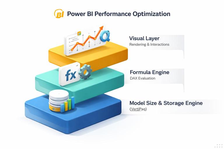
1) Model size and storage engine work
- Listen to the audio with the screen off.
- Earn a certificate upon completion.
- Over 5000 courses for you to explore!

Download the app
Power BI’s VertiPaq engine compresses data well, but compression depends on column types, cardinality, and whether you keep only what you need. A smaller model generally yields faster scans and better cache behavior. The goal is not “small at all costs” but “right-sized for the questions and refresh cadence.”
2) Formula engine work (DAX evaluation)
Measures that force row-by-row iteration over large tables, or that trigger complex context transitions repeatedly, can slow down visuals. The formula engine becomes the bottleneck when measures are written in a way that prevents efficient storage engine queries or when they perform expensive operations per cell in a matrix.
3) Visual layer work (rendering and interactions)
Even with a good model and measures, a page can feel slow if it contains many visuals, each with multiple measures, high-cardinality axes, or cross-highlighting interactions. The visual layer also includes custom visuals, which can add rendering overhead.
Step-by-step: diagnose performance with a repeatable workflow
Step 1: Start with a user scenario and a “slow page” definition
Pick one representative scenario, such as “Sales leader opens the Executive Overview page, changes Region slicer, and expects results within 2 seconds.” Write down the expected behavior and the current behavior. This prevents optimizing the wrong thing and gives you a measurable target.
Step 2: Use Performance Analyzer to find the slow visuals
In Power BI Desktop, open View > Performance analyzer, start recording, and interact with the page (load, change slicers, click a bar). Sort by duration and identify which visuals are slow. Performance Analyzer breaks time into DAX query time, visual display time, and other overhead. If DAX is dominant, focus on measures and model. If display is dominant, reduce visual complexity or change visual types.
Step 3: Inspect DAX queries and measure patterns
Copy the DAX query from Performance Analyzer for the slow visual and review which measures are being evaluated and how many groupings are involved. Look for patterns that often cause slowness: iterators over large tables (SUMX, FILTER over big fact tables), repeated CALCULATE blocks, and measures that compute the same intermediate result multiple times.
Step 4: Validate model size and cardinality
Check which columns are used in slicers, axes, and relationships. High-cardinality text columns (like transaction IDs, email addresses, or free-form descriptions) are expensive in memory and often unnecessary for slicing. If users need detail, consider a drill-through page or a dedicated detail table rather than slicing the entire report by a unique identifier.
Step 5: Re-test and document the improvement
After each change, re-run Performance Analyzer with the same scenario and compare timings. Keep a simple log: what changed, why, and what improved. This becomes part of your governance evidence and helps future maintainers avoid reintroducing slow patterns.
Model performance techniques that improve speed and stability
Right-size columns and data types
Prefer numeric surrogate keys over long text keys in relationships. Use whole number types where possible, avoid storing unnecessary precision in decimals, and remove columns that are not used in visuals, filters, drill-through, or tooltips. A practical rule: if a column is not used anywhere and not required for row-level security or incremental refresh logic, it should not be in the model.
Reduce cardinality in slicers and axes
Users love slicers, but slicers on high-cardinality fields can slow down both rendering and DAX evaluation. Replace “Customer Name” slicers with “Customer Segment,” “Top N customers,” or a search-based slicer experience if needed. For time, prefer a proper date hierarchy or month-level slicers rather than timestamp-level.
Prefer single-direction relationships unless there is a clear need
Bi-directional filtering can create ambiguous filter paths and increase query complexity. Use it only when you can justify the behavior and have tested performance. When you need “both directions” for a specific calculation, consider using DAX with TREATAS or CROSSFILTER inside a measure rather than setting the relationship to bi-directional globally.
Use aggregation tables when detail is large
If you have a very large transaction table but most executive questions are at day, month, region, and product category level, create an aggregated table at that grain and let most visuals hit the aggregate. Keep the detailed table for drill-through. This reduces storage engine scans for common queries and improves responsiveness.
Choose Import, DirectQuery, or composite models intentionally
Import is typically fastest for interactive analysis because it uses in-memory storage. DirectQuery can be appropriate when data must be near real-time or is too large to import, but it shifts performance to the source system and network. Composite models can balance both but require careful governance to avoid unpredictable performance. For reliable delivery, align the mode with refresh requirements, concurrency expectations, and source system capacity.
DAX performance patterns for executive dashboards
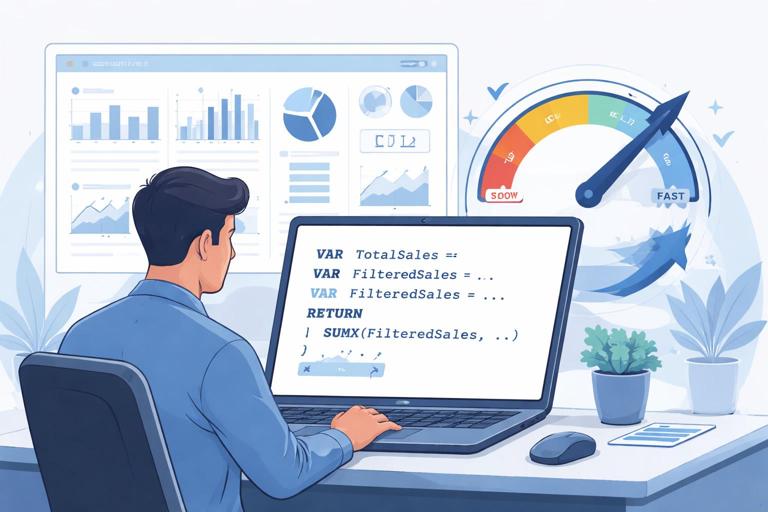
Minimize repeated work with variables
Variables (VAR) can reduce repeated evaluation and make measures easier to read. For example, if a measure calculates a filtered sales amount and then uses it in multiple branches, compute it once in a variable and reuse it.
Sales KPI = VAR BaseSales = [Total Sales] VAR Target = [Sales Target] RETURN IF(BaseSales >= Target, BaseSales, BaseSales)The example is intentionally simple: the key idea is to compute expensive intermediate results once, then reuse them.
Be cautious with iterators over large fact tables
Measures like SUMX(FactSales, FactSales[Amount] * FactSales[Rate]) can be necessary, but they can also be costly if FactSales is large and the measure is evaluated many times in a matrix. When possible, push calculations into the model as a column only if it does not explode size, or better, compute it upstream in the source or during refresh. If you must iterate, try to iterate over a smaller table (for example, a summarized table) rather than the raw fact.
Avoid FILTER(FactTable, ...) when a simple filter argument works
FILTER over a large table can force row-by-row evaluation. Often you can express the same logic with filter arguments inside CALCULATE that the engine can optimize more efficiently. For example, prefer CALCULATE([Total Sales], DimProduct[Category] = "Bikes") over CALCULATE([Total Sales], FILTER(DimProduct, DimProduct[Category] = "Bikes")).
Control evaluation granularity in matrices
Executive pages often include matrices with multiple measures. Each cell can trigger measure evaluation. Reduce the number of measures shown at once, avoid unnecessary subtotals, and consider separate views for “summary” and “detail.” If a matrix must stay, ensure measures are optimized and avoid high-cardinality row groups.
Report design choices that directly affect performance
Limit visuals per page and manage interactions
Each visual can generate one or more queries. A page with 15 visuals can easily generate dozens of queries per interaction. For executive dashboards, prioritize a small number of high-signal visuals. Turn off unnecessary visual interactions (Format > Edit interactions) so that only relevant visuals cross-filter each other.
Use bookmarks and drill-through to move complexity off the main page
Instead of loading all detail visuals on the main page, use a drill-through page for deep dives. This keeps the primary page fast and reduces the number of visuals that must refresh on every slicer change.
Be selective with custom visuals
Custom visuals can be valuable, but they may add rendering overhead and can complicate governance. For reliable delivery, standard visuals are often safer. If you use a custom visual, test it under realistic data volume and ensure it is approved within your organization’s visual certification policy.
Refresh performance and reliability: building a dependable pipeline
Refresh reliability is part performance, part operations
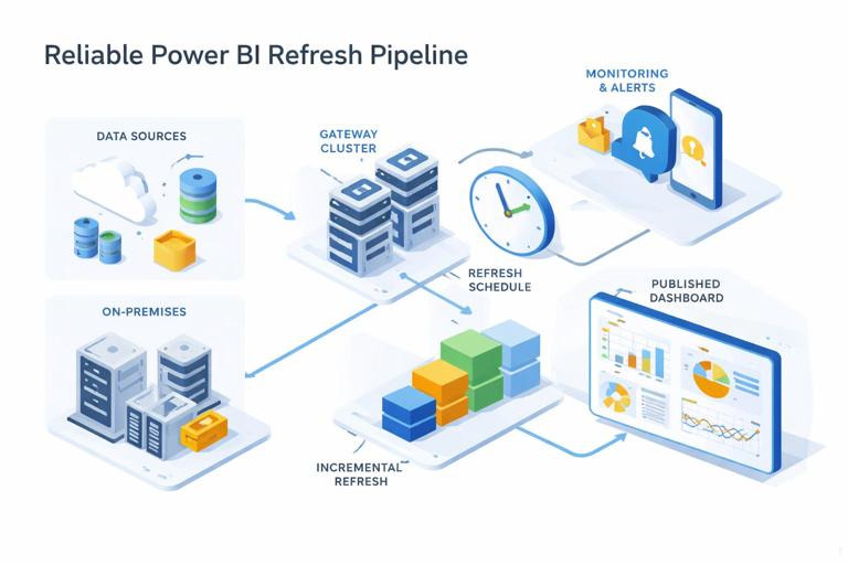
Even a fast report fails if refresh fails. Reliable delivery requires predictable refresh duration, clear ownership, and monitoring. Common failure points include gateway connectivity issues, source throttling, schema changes, and timeouts due to long-running queries.
Step-by-step: design a refresh plan
1) Define the business freshness requirement: for example, “executive dashboard updated by 7:00 AM daily.” 2) Identify the slowest sources and their maintenance windows. 3) Choose refresh frequency and time windows that avoid peak load on the source. 4) Establish a fallback plan: what users see if refresh fails (for example, a banner with last refresh time and a link to incident status). 5) Document who is on point for failures and what the escalation path is.
Incremental refresh to reduce workload
When data grows, full refresh becomes slow and risky. Incremental refresh reduces refresh time by refreshing only recent partitions while keeping historical partitions unchanged. This improves reliability because refresh is less likely to hit timeouts and reduces load on source systems. Governance should define which datasets qualify for incremental refresh and how retention is managed.
Gateway and capacity considerations
For on-premises sources, the gateway is a critical dependency. Reliable delivery includes: redundant gateway setup (cluster), monitoring gateway health, and ensuring service accounts have stable permissions. If you use Premium capacity, monitor CPU and memory to avoid throttling. If you use shared capacity, be conservative with refresh schedules and dataset sizes to reduce contention.
Governance foundations: roles, environments, and controlled change
Define ownership: product thinking for dashboards
A reliable dashboard needs an owner responsible for outcomes: performance, correctness, and change management. Define at least three roles: Business Owner (defines requirements and acceptance), Data/BI Owner (responsible for dataset and report quality), and Platform Admin (responsible for tenant settings, capacity, gateways, and security). Without clear ownership, performance fixes and governance controls decay over time.
Workspace strategy: separate development, test, and production
Use separate workspaces (or deployment pipelines) for Dev, Test, and Prod to control changes. Dev is where authors iterate. Test is where you validate refresh, security, and performance with representative data and users. Prod is stable and tightly controlled. This separation prevents “hot fixes” from breaking executive dashboards during business hours.
Step-by-step: implement controlled promotion
1) Establish naming conventions (for example, “FIN-Exec-Dev,” “FIN-Exec-Test,” “FIN-Exec-Prod”). 2) Restrict who can publish to Prod (small group). 3) Use deployment pipelines where available to promote content with traceability. 4) Require a checklist before promotion: refresh succeeds, key measures validated, performance benchmark met, security tested, and documentation updated. 5) Keep a rollback plan: retain previous versions or be able to republish the last known good artifact quickly.
Tenant settings and governance policies
Governance includes tenant-level decisions: who can create workspaces, who can share externally, whether users can publish to the web, and which visuals are allowed. For executive reporting, default to least privilege: restrict external sharing, control export permissions for sensitive data, and require endorsement processes for certified datasets.
Data access governance: security and consistency without slowing everything down
Row-level security (RLS) and performance trade-offs
RLS is essential for many organizations, but it can affect performance because filters are applied per user. Keep RLS rules as simple as possible, prefer dimension-based security tables, and avoid complex DAX in security roles. Test performance with representative users and worst-case access patterns (for example, a manager who can see many regions).
Certified datasets and shared semantic models
To reduce duplication and inconsistency, promote shared datasets (semantic models) that are certified or endorsed. Governance should define criteria: documented measures, defined refresh SLA, data lineage clarity, and performance benchmarks. This improves reliability because multiple reports rely on a single, well-managed model rather than many slightly different copies.
Monitoring and operational governance: keeping reliability over time
Monitor usage, refresh, and errors
Reliable delivery requires ongoing monitoring. Track refresh success rates, refresh duration trends, and failure reasons. Monitor report usage to identify which pages and visuals are most used and deserve the most optimization. If you have capacity metrics, watch for CPU spikes during refresh windows and interactive peaks during executive meetings.
Step-by-step: create an operational runbook
1) Define SLAs: page load target, refresh completion time, and acceptable failure rate. 2) Define alerts: refresh failure notifications, gateway offline alerts, and capacity overload alerts. 3) Define incident response: who investigates, how to communicate status, and how to restore service. 4) Define maintenance: monthly review of dataset size, unused columns, and slow measures; quarterly review of workspace permissions and sharing links. 5) Define change logging: what changed, when, and why, including measure changes and refresh schedule changes.
Quality gates: prevent regressions
Governance is strongest when it prevents problems before they reach executives. Add quality gates to your promotion checklist: a small set of “golden queries” you run in Test to ensure performance remains within thresholds, validation of key totals against a trusted source, and verification that refresh completes within the window. Over time, these gates become your reliability backbone.
Practical example: turning a slow executive page into a reliable experience
Scenario
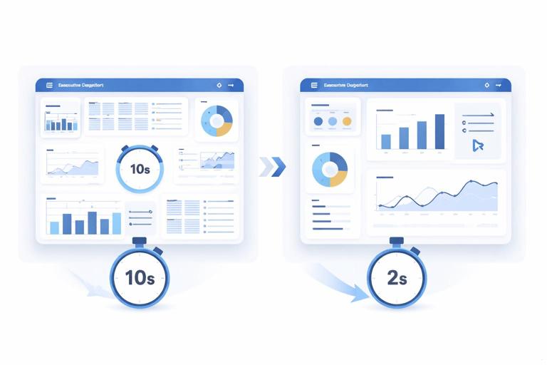
An executive overview page has 12 visuals, including a matrix by Customer Name with multiple measures, several slicers including Customer Name, and a custom visual for a KPI card. Users complain that changing Region takes 8–12 seconds, and morning refresh sometimes fails.
Step-by-step improvement plan
1) Measure baseline: use Performance Analyzer and record load and slicer change timings. Identify top 3 slow visuals. 2) Simplify slicers: replace Customer Name slicer with Customer Segment and add a drill-through page for customer detail. 3) Reduce matrix cost: move the customer matrix to the drill-through page, keep only a Top N summary on the main page. 4) Optimize interactions: disable cross-filtering from less important visuals to the main KPI visuals. 5) Review measures: refactor the slowest measures to reduce iterators and reuse intermediate results with variables. 6) Replace custom KPI visual with a standard card if display time is high. 7) Improve refresh reliability: implement incremental refresh for the large fact table and move refresh to a less congested time window; confirm gateway stability and credentials. 8) Add governance controls: promote changes through Test to Prod with a checklist and document the new performance baseline and refresh SLA.
Expected outcome
The main page becomes a fast, stable executive entry point, while detail remains available through drill-through. Refresh becomes shorter and less failure-prone, and the team has a repeatable process to prevent regressions.