What “Executive-Ready” Means in Practice
Definition and outcome. An executive-ready data story is a Power BI experience that enables a decision in minutes, not a tour of the dataset. The outcome is a dashboard or report that answers a small set of business questions with clear context, quantified impact, and a recommended action path. Executives should be able to: understand what changed, why it changed, what it means financially or operationally, and what to do next—without needing to ask for a walkthrough.
How it differs from analyst-ready reporting. Analyst-ready reports optimize for exploration, completeness, and flexibility. Executive-ready stories optimize for clarity, prioritization, and accountability. That means fewer pages, fewer visuals, and fewer interactions—each one intentional. It also means the narrative is embedded: the report itself communicates the “so what” through structure, annotations, and guided drill paths rather than relying on the presenter to explain.
Deliverable checklist. The deliverable is “executive-ready” when it includes: a single primary view that summarizes performance, a small set of supporting views that explain drivers, a consistent time frame and definitions, explicit thresholds or targets, and a clear next-step workflow (who acts, by when, and based on what trigger). The report should load quickly, behave predictably, and be robust to common executive questions such as “compared to what?” and “is this material?”
Define the Decision: From Questions to Decision Statements
Start with decision statements, not metrics. Before building visuals, translate stakeholder questions into decision statements. A question like “How are we doing?” becomes “Should we increase, maintain, or reduce investment in Channel A next quarter?” A question like “Why did revenue drop?” becomes “Which drivers explain the drop, and which levers can we pull this month to recover?” Decision statements force you to define what action is possible and what evidence is required.
Map each decision to evidence. For each decision statement, list the minimum evidence needed: the outcome metric (e.g., net revenue), the comparison baseline (e.g., vs target, vs last month, vs same period last year), the segmentation needed to act (e.g., by region, product line), and the diagnostic drivers (e.g., price, volume, mix, churn). This mapping prevents “metric sprawl” and keeps the report focused on what executives will actually use.
- Listen to the audio with the screen off.
- Earn a certificate upon completion.
- Over 5000 courses for you to explore!

Download the app
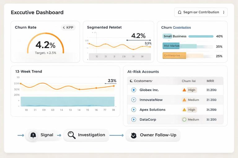
Example: decision-to-evidence map. Suppose the decision is “Do we need to intervene in customer retention this month?” Evidence might include: churn rate vs target, churn rate trend over 13 weeks, churn contribution by customer segment, top churn reasons (if available), and a list of accounts at risk above a defined threshold. The executive view shows the churn signal; the supporting views show where and why; the workflow defines who follows up.
Outcome Design: What the Executive Sees First
Design the first 30 seconds. Executives typically scan for: status (good/bad), magnitude (how big), direction (improving/worsening), and confidence (can I trust it). Your opening view should therefore include: a small set of KPIs with variance to target, a trend line for the primary KPI, and a compact “drivers” section that points to the top contributors. Avoid making the first view a dense grid or a complex decomposition that requires interaction to understand.
Use a “signal, context, action” layout. A practical layout pattern is: (1) Signal: headline KPIs and trend; (2) Context: variance breakdown and key segments; (3) Action: recommended focus areas and links to drill pages. In Power BI, this can be implemented as a landing page with buttons to driver pages, plus a small “What changed?” narrative card that updates based on filters.
Make materiality explicit. Executives care about what is material. Encode materiality with thresholds: conditional formatting on variance, bands on trends, and labels like “Above target by +2.1%” or “Below target by -$1.3M.” If you can define a “material change” rule (e.g., variance > 1% and > $250K), use it consistently so the report flags what deserves attention.
Workflow Overview: A Repeatable Build-to-Deliver Cycle
Think in workflows, not one-off reports. Executive-ready data stories are maintained artifacts. A workflow ensures the report remains accurate, relevant, and aligned with decisions as the business evolves. The workflow spans: intake, scoping, prototype, validation, performance hardening, release, and ongoing governance. Each stage has a clear output and a “definition of done.”
Stage outputs at a glance. Intake produces decision statements and stakeholders. Scoping produces a page plan and metric definitions. Prototype produces a clickable report skeleton. Validation produces reconciled numbers and sign-off. Performance hardening produces acceptable load times and stable interactions. Release produces a distribution plan and access model. Governance produces a change log and review cadence.
Step-by-Step: Intake and Scoping (Days 1–3)
Step 1: Identify the executive audience and their cadence. Determine who will use the report (CEO, CFO, VP Sales), how often (weekly business review, monthly close), and in what setting (live meeting, pre-read, mobile). Cadence affects design: weekly needs fast refresh and trend emphasis; monthly close needs reconciliation and auditability.
Step 2: Capture the “top 5 decisions.” In a short workshop, ask stakeholders to list the top decisions they make that this report should support. Convert each into a decision statement and rank them. If you end up with more than five, you likely need multiple reports or a tiered structure (executive summary plus functional deep dives).
Step 3: Define success criteria and constraints. Success criteria might include: “KPI variance visible in under 10 seconds,” “Numbers match finance close,” “Users can identify top 3 drivers without training.” Constraints include data latency, security rules, and whether the report must work on mobile. Write these down; they become acceptance tests.
Step 4: Create a page plan with roles. Draft a simple plan: Page 1 Executive Summary; Page 2 Drivers; Page 3 Segment Deep Dive; Page 4 Exceptions/Watchlist. Assign an owner for each page (business owner for meaning, analyst for logic, developer for implementation). This prevents endless iteration because accountability is explicit.
Step-by-Step: Prototype the Narrative (Days 4–7)
Step 5: Build a low-fidelity prototype first. Create a Power BI report with placeholder visuals and sample measures. The goal is to validate structure and flow, not perfect formatting. Use a consistent grid, reserve space for annotations, and ensure the first page answers the primary decision statement. Share early to confirm you are telling the right story.
Step 6: Write the narrative elements as report components. Executives should not need a presenter to interpret the page. Add narrative components such as: a dynamic subtitle (“Period: Last 4 weeks, filtered to North America”), a “Key takeaways” text box, and a “What changed?” card that references variance and top driver. Keep text short and specific; avoid generic commentary like “performance is mixed.”
Step 7: Design the drill path intentionally. Every drill should answer a predictable question: “Where is it happening?” then “What is driving it?” then “Who is affected?” Implement this with buttons or drill-through pages labeled by intent (e.g., “See drivers,” “See affected segments,” “View account list”). Avoid offering many slicers on the landing page; push exploration to secondary pages.
Step-by-Step: Validate Numbers and Definitions (Days 8–12)
Step 8: Reconcile KPIs against a trusted source. Executive trust is fragile. Reconcile the primary KPIs to the system of record (finance close, CRM totals, operations ledger). Document any differences and decide which definition wins. If reconciliation is not possible due to timing, show the data freshness and the expected delta explicitly.
Step 9: Lock metric definitions and label them. Once agreed, lock definitions and make them discoverable. In Power BI, this can be done via tooltips, a definitions page, or a small info icon that opens a tooltip with the formula description and inclusion/exclusion rules. The goal is not to teach DAX, but to prevent “we’re arguing about definitions” during executive meetings.
Step 10: Validate filters and edge cases. Test common executive interactions: changing date ranges, selecting a region, drilling into a segment. Check that totals behave as expected and that “All” states are meaningful. Validate edge cases like zero values, missing categories, and partial periods. If partial periods are common, label them clearly (e.g., “MTD through Jan 8”).
Step-by-Step: Performance and Usability Hardening (Days 13–16)
Step 11: Optimize for perceived speed. Executives judge quality partly by responsiveness. Reduce visual count on the landing page, avoid heavy custom visuals, and ensure the most important visuals render first. Use a dedicated “summary” model approach where possible: pre-aggregated tables for high-level KPIs and separate detail pages for granular exploration.
Step 12: Standardize interactions. Disable unnecessary cross-highlighting that causes confusing changes. Use consistent slicer placement and behavior across pages. Ensure buttons and drill-through actions are obvious and limited. If a user can click something, it should predictably answer a question; otherwise, remove the interaction.
Step 13: Mobile and meeting readiness checks. If the report will be used in meetings, test it on the projector resolution and in the Power BI app. Ensure text sizes are readable, colors have sufficient contrast, and the key message is visible without scrolling. If mobile use is required, create a mobile layout for the executive summary at minimum.
Step-by-Step: Release, Distribution, and Operating Rhythm (Days 17–20)
Step 14: Define access and distribution. Decide whether executives consume via an app, a shared workspace, or embedded links. Ensure row-level security aligns with what executives should see (often broad access, but sometimes restricted for HR or sensitive financial data). Provide a single canonical link to avoid version confusion.
Step 15: Establish refresh and pre-read timing. Align refresh schedules with decision cadence. For a Monday review, refresh early Monday with a buffer for failures. If the report is a pre-read, schedule refresh and send a link at a consistent time. Include a “Last refreshed” timestamp on the report so users can self-verify freshness.
Step 16: Create a lightweight operating rhythm. Set a review cadence (e.g., monthly) to confirm the report still maps to decisions and that targets remain current. Maintain a change log: what changed, why, and when. This prevents silent shifts that erode trust and helps onboard new stakeholders quickly.
Executive Story Patterns You Can Implement in Power BI
Pattern 1: One-page executive brief with guided drill. The landing page contains 3–6 KPIs, one primary trend, and a ranked list of top drivers. Buttons lead to driver pages. This pattern works well for performance management (sales, operations, customer success) where the executive needs a fast scan and a controlled path to explanation.
Pattern 2: Exception-first “watchlist” story. Instead of summarizing everything, the report highlights exceptions: regions below target, accounts at risk, products with margin erosion. The executive workflow becomes: review exceptions, assign owners, track resolution. Implement with a table or cards filtered to “only items breaching threshold,” plus drill-through to detail pages.
Pattern 3: Target-to-actual with accountability. The report pairs performance with ownership: each metric has an owner, target, and status. This is effective for OKRs and strategic initiatives. In Power BI, you can implement a matrix with conditional formatting and a drill-through to initiative details, including milestones and blockers.
Practical Example Workflow: Revenue Decline Investigation
Scenario and objective. Revenue is down versus target. The executive needs to decide whether to adjust pricing, reallocate marketing spend, or intervene in pipeline execution. The report must show the magnitude, identify the main drivers, and point to the teams or segments responsible.
Step-by-step report flow. Page 1 shows: Revenue vs target, variance in dollars and percent, trend over the last 12 weeks, and top 3 driver categories (e.g., volume, price, mix). A “What changed?” card states: “Revenue is -$1.3M (-4.2%) vs target, primarily driven by lower volume in Region West and mix shift toward lower-margin products.” Page 2 breaks down variance by region and product line, ranked by contribution. Page 3 drills into Region West with pipeline stages, win rate, and average deal size. Page 4 provides an exception list of accounts with stalled opportunities or recent churn, with drill-through to account detail.
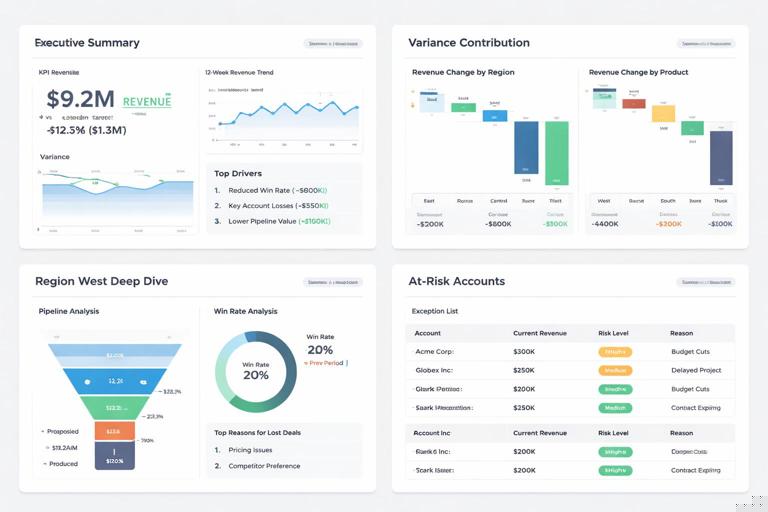
Decision triggers embedded in the report. Add explicit triggers: “If variance < -3% and pipeline coverage < 2.5x, escalate to VP Sales.” “If price realization < 98% for two consecutive weeks, review discount policy.” These triggers turn the report from descriptive to operational, making it truly executive-ready.
Quality Gates: Definition of Done for Executive-Ready Stories
Gate 1: Clarity. A first-time user can answer: “Are we on track?” and “What changed?” within one minute. If they cannot, reduce visual density, rewrite labels, or restructure the landing page.
Gate 2: Trust. Primary KPIs reconcile to the agreed source, definitions are accessible, and data freshness is visible. If trust is not established, executives will revert to spreadsheets or ask for manual updates.
Gate 3: Actionability. The report includes a clear path from signal to owner: which segment is responsible, what lever is available, and where to drill for details. If the report only describes performance without enabling action, it is not executive-ready.
Gate 4: Operability. Refresh schedules, access, and governance are in place. The report has an owner, a review cadence, and a change log. Without operability, even a well-designed story degrades quickly.
Implementation Notes: Turning Workflow into a Team Habit
Use templates and reusable components. Create a standard executive summary page template with placeholders for KPIs, trend, drivers, and narrative card. Standardize colors for status (on track, at risk, off track) and standard tooltip patterns for definitions. This reduces build time and increases consistency across reports.
Separate “executive view” from “analysis view.” If analysts need deep exploration, provide it in separate pages or separate reports. Keep the executive view stable and minimal. This separation prevents the executive experience from becoming cluttered and protects performance.
Document decisions and assumptions inside the report ecosystem. Store decision statements, metric definitions, and change logs in a shared location linked from the report (e.g., a “Report Info” page). When an executive asks “what changed in the report,” you can answer with a controlled artifact rather than informal memory.