Why matching and propensity scores matter in observational decisions
In many business settings you cannot randomize: pricing changes rolled out by region, sales outreach targeted to “high potential” accounts, fraud controls triggered by risk scores, or customer success interventions assigned by managers. You still need to make a decision: keep the policy, expand it, or replace it. Matching and propensity scores are practical tools for estimating causal effects from observational data by constructing a comparison group that looks like the treated group on observed pre-treatment characteristics.
The core idea is simple: if treated and untreated units are comparable on the variables that jointly influence treatment assignment and outcomes, then differences in outcomes can be attributed more credibly to the treatment. Matching tries to create this comparability directly by pairing similar units. Propensity scores compress many covariates into a single number: the probability of receiving treatment given observed covariates. You can then match, weight, or stratify using that score.
These methods do not “fix” missing variables. They help you remove bias due to observed covariates and make your assumptions explicit and testable through diagnostics (balance checks). In practice, they are often used as a first-line approach because they are interpretable, align with business intuition (“compare like with like”), and can be implemented with standard data tooling.

When matching is a good fit (and when it is not)
Good fit scenarios
Targeted interventions with rich pre-treatment data: e.g., a retention offer sent to customers with certain usage patterns, where you have detailed usage history.
Policy rollouts based on thresholds or scores (but not strict cutoffs): e.g., accounts above a risk score are more likely to get manual review, and you observe the score and its components.
Continue in our app.- Listen to the audio with the screen off.
- Earn a certificate upon completion.
- Over 5000 courses for you to explore!

Download the app
Sales and marketing programs: e.g., “high-touch” onboarding assigned based on firmographics and early engagement, both observed.
Warning signs
Very limited overlap: treated units look nothing like untreated units (e.g., enterprise customers always get treatment; SMB never does). Matching will discard many units or rely on extrapolation.
Treatment depends on unobserved factors that also affect outcomes (e.g., manager judgment, customer sentiment not captured in data). Matching cannot address this directly.
Post-treatment variables accidentally included: if you match on variables affected by treatment (e.g., “number of support tickets after onboarding”), you can bias the estimate.
Key concepts: matching, propensity scores, and estimands
What matching does
Matching constructs a subset of untreated units that resembles the treated units on observed covariates. The simplest form is 1-to-1 nearest-neighbor matching: for each treated unit, find the untreated unit with the most similar covariates (or most similar propensity score). Other variants include 1-to-k matching, matching with replacement, and caliper matching (only match if similarity is within a threshold).
What the propensity score is
The propensity score for unit i is e(xi) = P(T=1 | X=xi), the probability of receiving treatment given observed covariates X. A key property is that if treatment assignment is “as good as random” conditional on X, then it is also “as good as random” conditional on the propensity score. Practically, this lets you balance many covariates by balancing one score.
Choosing the estimand: ATT vs ATE
Before implementing anything, decide what effect you need for the decision.
ATT (Average Treatment effect on the Treated): “What was the effect for those who actually received the treatment?” This is common for evaluating an existing program and deciding whether to keep it.
ATE (Average Treatment Effect): “What would be the effect if everyone were treated vs not treated?” This is common for deciding whether to expand a program broadly.
Matching is often naturally aligned with ATT because it focuses on making controls comparable to treated units. Weighting can target either ATT or ATE depending on the weights.
Step-by-step workflow for propensity score matching
Step 1: Define the unit, treatment timing, and outcome window
Be explicit about the observational “experiment” you are trying to emulate. Define:
Unit: customer, account, user-session, store, etc.
Index date: when treatment starts for treated units; assign a comparable index date for controls (often via eligibility date or a pseudo-start date).
Outcome window: e.g., 30-day retention after index date, 90-day revenue, 14-day fraud loss.
Practical tip: if treatment happens at different times, avoid comparing treated outcomes after treatment to control outcomes before an equivalent time. Align time carefully to prevent “immortal time” style distortions where controls are counted during periods they could not have been treated.
Step 2: Build a pre-treatment covariate set
Include variables that influence treatment assignment and outcomes, measured before the index date. Typical categories:
Baseline outcome proxies: prior revenue, prior churn risk, historical conversion rate.
Behavioral history: usage frequency, feature adoption, support contacts (pre-treatment only).
Eligibility and constraints: plan type, region, device, account age.
Seasonality/time: month, week, cohort indicators if assignment varies over time.
Practical tip: do not include variables that are consequences of treatment. If you are unsure, treat the index date as a hard boundary: only features strictly before it are allowed.
Step 3: Estimate propensity scores
Fit a model that predicts treatment from covariates. Common choices:
Logistic regression: interpretable and often sufficient.
Gradient boosted trees / random forests: can capture nonlinearity and interactions; can improve balance but may require more careful tuning and diagnostics.
The goal is not maximum predictive accuracy; the goal is covariate balance after matching/weighting. Overfitting can create extreme propensity scores near 0 or 1, which harms overlap.
# Pseudocode outline (language-agnostic) for propensity score estimation and matching 1) Prepare dataset with columns: T (0/1), outcome Y, covariates X1..Xp, index_date 2) Split into treated and untreated pools 3) Fit model: T ~ X1 + ... + Xp 4) Predict propensity score e_hat for all units 5) Apply trimming: keep units with e_hat in [0.05, 0.95] (example) 6) Match treated to controls using nearest neighbor on e_hat with caliper 0.02 7) Check balance; iterate if needed 8) Estimate ATT as mean(Y_treated - Y_matched_control) with robust SEsStep 4: Check overlap and trim if necessary
Overlap means treated units have comparable controls with similar propensity scores. Diagnose by plotting or summarizing propensity score distributions for treated vs control groups. If there is little overlap, your estimate will be unstable and dependent on modeling choices.
Common actions:
Trimming: remove units with extreme propensity scores where no comparable counterpart exists.
Redefine the decision population: restrict to a segment where the program could plausibly be assigned both ways (e.g., mid-market accounts rather than enterprise-only treatment).
Change matching strategy: allow matching with replacement or use 1-to-k matching to improve match quality.
Step 5: Perform matching (and choose parameters deliberately)
Common matching choices and their trade-offs:
Nearest neighbor 1:1: simple and interpretable; can increase variance if many treated units are discarded or matched poorly.
1:k matching: uses more controls per treated unit, often reducing variance; may worsen match quality if k is too large.
Matching with replacement: allows the same control to be used multiple times; improves match quality when controls are scarce, but can increase variance and requires correct standard errors.
Caliper: prevents bad matches by requiring propensity scores to be within a threshold; too tight a caliper discards many treated units.
Practical rule of thumb: start with nearest-neighbor on propensity score with a modest caliper and allow replacement if overlap is limited. Then validate balance and adjust.
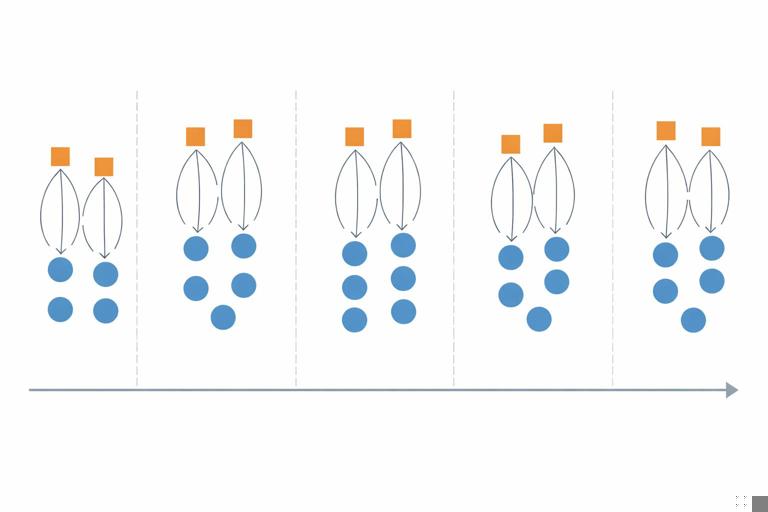
Step 6: Validate covariate balance (the most important diagnostic)
After matching, check whether treated and matched controls are similar on each covariate. Use standardized mean differences (SMD) rather than p-values (p-values depend heavily on sample size). A common heuristic is |SMD| < 0.1 for acceptable balance, but treat this as a guideline, not a guarantee.
Balance checks to run:
Mean/variance balance for continuous variables (SMD, variance ratios).
Proportion balance for binary/categorical variables.
Balance on key interactions if you suspect treatment assignment depends on combinations (e.g., “high usage AND premium plan”).
If balance is poor, iterate: adjust the propensity model (add nonlinear terms, interactions), change matching method, or reconsider covariates and population.
Step 7: Estimate the effect and uncertainty correctly
For ATT with 1:1 matching, a straightforward estimator is the average of within-pair outcome differences. For 1:k matching, weight control outcomes accordingly. Uncertainty estimation should account for the matching procedure (and replacement if used). In practice, robust variance estimators, bootstrap (with care), or analytic methods implemented in standard causal inference libraries are used.
Practical tip: report both the effect estimate and the effective sample size after matching. If you started with 200k customers but only 8k treated and 8k matched controls remain, decision-makers should know the estimate pertains to that matched population.
Alternative propensity score uses: weighting and stratification
Inverse probability weighting (IPW)
Instead of selecting matched pairs, IPW reweights observations to create a “pseudo-population” where covariates are balanced. For ATE, common weights are:
Treated: 1 / e(x)
Control: 1 / (1 - e(x))
For ATT, weights often keep treated at weight 1 and reweight controls by e(x)/(1-e(x)).
Practical considerations:
Extreme weights occur when e(x) is near 0 or 1; stabilize weights or trim to improve robustness.
Balance diagnostics still apply: check weighted SMDs.
Stratification (subclassification) on the propensity score
Stratification divides units into bins (e.g., quintiles) of propensity score and compares treated vs control outcomes within each bin, then aggregates. This is easy to explain and can be robust when matching is difficult, but it can leave residual imbalance within bins if bins are too wide.
Practical example: evaluating a retention outreach program
Scenario: A customer success team proactively calls customers predicted to churn. You want the causal effect of the call on 60-day retention and 60-day revenue. Treatment is “received a call within 7 days of being flagged.”
Step-by-step implementation
Define index date: the date the customer was flagged by the churn model. Treated customers are those called within 7 days; controls are flagged customers not called within 7 days.
Outcome window: retention status at day 60 after flag date; revenue from day 1 to day 60.
Covariates (pre-flag): prior 90-day usage, prior 90-day revenue, tenure, plan, region, number of support tickets in prior 30 days, churn score, recent NPS if collected before flag, seasonality indicators.
Propensity model: predict probability of being called using the covariates. Include operational variables that affect calling capacity (e.g., day-of-week, team assignment) if they are pre-treatment and influence assignment.
Overlap: if very high churn-score customers are always called, you may need to restrict to a score band where both called and not-called exist.
Match: nearest neighbor with caliper; allow replacement if controls are scarce in high-propensity regions.
Balance: ensure churn score, prior usage, and support tickets are balanced; these are likely strong drivers of both assignment and outcome.
Estimate ATT: effect among those called. Report retention lift (percentage points) and incremental revenue per called customer.
Decision translation: If the ATT indicates +3.2 percentage points retention and +$18 revenue per called customer, compare that to the cost per call and capacity constraints. If overlap restrictions mean the estimate applies only to mid-risk customers, do not generalize to very high-risk customers without additional analysis.

Common pitfalls and how to avoid them
1) Conditioning on post-treatment variables
Example: matching on “number of logins in the week after outreach” will bias results because outreach may change logins. Guardrail: enforce feature timestamps strictly before index date; create a “feature cutoff” table to validate.
2) Poor overlap and hidden extrapolation
If treated units have propensity scores mostly above 0.9 and controls mostly below 0.2, matching will either fail or create bad matches. Guardrail: inspect distributions early; be willing to redefine the population to where overlap exists.
3) Using the propensity model as a predictive model
High AUC does not guarantee good balance. A model can predict treatment well by exploiting quirks that do not help balance. Guardrail: optimize for balance diagnostics, not AUC.
4) Ignoring interference through shared resources
Even without repeating broader interference theory, note a practical issue: if treatment uses limited resources (e.g., support agents), outcomes for controls may be indirectly affected by treated load. Guardrail: include operational load covariates, consider segmenting by time periods with stable capacity, and interpret estimates as “effect under observed capacity conditions.”
5) Multiple versions of treatment
“Called” might include different scripts, durations, or agent skill. If these variations correlate with customer risk, your estimate mixes effects. Guardrail: define treatment precisely (e.g., “completed call > 3 minutes”), or model versions explicitly (multi-valued treatment) and match within versions when feasible.
6) Missing data and measurement differences
If key covariates are missing more often in one group, matching can create artifacts. Guardrail: include missingness indicators, use consistent imputation strategies, and check balance on missingness itself.
Design choices that improve credibility
Use “new user” or “newly eligible” designs when possible
Prefer cohorts where everyone becomes eligible at a clear time (e.g., first time flagged, first purchase, first week after signup). This reduces bias from conditioning on survival or prior exposure and makes index date alignment cleaner.
Include lagged outcomes as covariates
When outcomes have strong momentum (revenue trends, engagement trends), include pre-treatment outcome history (e.g., last 4 weeks revenue) to reduce bias. This is often one of the most effective practical steps for improving balance.
Combine matching with outcome regression (doubly robust thinking)
A common practical approach is: match (or weight) to get balance, then run a regression of outcome on treatment and covariates within the matched/weighted sample to reduce residual imbalance. This can improve precision and robustness, but it does not remove bias from unobserved confounding.
# Pseudocode for matched + regression adjustment 1) Perform propensity score matching to create matched dataset D_match 2) Fit outcome model on D_match: Y ~ T + X1 + ... + Xp 3) Use coefficient on T as adjusted effect estimate 4) Use robust standard errors clustered by matched pair (if applicable)Operational checklist for a business-ready matching analysis
Decision and estimand: Is the decision about keeping a program (ATT) or scaling to everyone (ATE)?
Index date alignment: Are control units assigned a comparable start date?
Pre-treatment covariates only: Is every feature timestamped before index date?
Overlap verified: Do propensity score distributions overlap meaningfully? Did you trim and document the resulting population?
Balance achieved: Are SMDs acceptable for all key covariates and key interactions?
Effect estimate with uncertainty: Are standard errors appropriate for the matching/weighting method?
Sensitivity thinking: Did you test alternative specifications (different calipers, 1:k, with/without replacement) and confirm results are not fragile?
Interpretation boundaries: Are you explicit about the population the estimate applies to after trimming/matching?
Hands-on parameter choices (rules of thumb)
Caliper size
A common starting point is a caliper of 0.2 times the standard deviation of the logit of the propensity score. In practice, teams often try a few values (e.g., 0.01 to 0.05 on the propensity scale) and choose the smallest caliper that preserves enough treated units while achieving balance.
How many controls per treated unit
Start with 1:1 for clarity. If variance is high and you have many controls, try 1:3 or 1:5. Always re-check balance; more controls can worsen match quality if the additional controls are less similar.
Trimming thresholds
Common trimming ranges include [0.01, 0.99] or [0.05, 0.95]. Use business context: if only 2% of units are realistically eligible for treatment, forcing overlap via aggressive trimming may change the decision population too much. Document the trade-off explicitly.
What to report to decision-makers
Matching analyses are most useful when results are presented with transparency about comparability and scope. A business-ready report typically includes:
Population definition (who is included/excluded after trimming).
Balance table showing key covariates before and after matching (SMDs).
Effect estimate in business units (e.g., incremental revenue per treated customer) and uncertainty interval.
Robustness checks (alternative matching parameters, weighting vs matching).
Operational interpretation: “Effect under observed assignment and capacity conditions,” and any constraints on generalization.