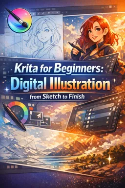
This chapter is a guided, start-to-finish build that stitches your existing skills into one repeatable workflow. You will follow a single illustration from setup to export with milestones, time-boxed checkpoints, and decision points that prevent “wandering” mid-project. The goal is not perfection; it’s a clean, consistent process you can reuse.
Project Brief (Use This Every Time)
Subject: A simple character holding an object (mug, book, plant) with a minimal background shape (window, gradient wall, or two-tone backdrop).
Why this brief works: It forces you to solve anatomy/shape, materials, lighting, and a background—without becoming a full scene.
- Canvas: Choose either Web (e.g., 3000 px wide) or Print (e.g., A4 at 300 DPI). Commit now; don’t resize later unless you must.
- Time box: 2–4 hours total for the first run. Speed builds consistency.
- Deliverable: One final image + a layered .kra file that someone else can open and understand in 30 seconds.
Recommended Layer Template (Copy/Paste Structure)
Create this structure at the start and stick to it. Name layers as you go; don’t leave “Layer 12 copy.”
00_GUIDES (group) [locked] (optional: perspective, notes, ref thumbnails) 01_SKETCH (group) - sketch_main 02_LINEART (group) - lines_clean - lines_secondary (optional) 03_COLOR (group) - flats_character - flats_object - flats_background 04_LIGHTING (group) - shadow_multiply - occlusion_multiply (optional) - light_screen/overlay - rim_light (optional) 05_TEXTURE (group) - texture_overlay - material_pass 06_POLISH (group) - color_adjustment (filter layer) - edge_control - effects (sparingly) 07_EXPORT (group) [usually empty; used for export checks]Rule: Only paint on pixel layers in SKETCH/COLOR/LIGHTING/TEXTURE/POLISH. Keep guides locked. Keep adjustments non-destructive (filter layers) where possible.
- Listen to the audio with the screen off.
- Earn a certificate upon completion.
- Over 5000 courses for you to explore!

Download the app
Milestones and Time-Boxed Checkpoints
| Phase | Time Box | Checkpoint (Pass/Fail) | If Fail, Do This |
|---|---|---|---|
| Setup + Decisions | 10 min | Canvas chosen, palette chosen, light direction chosen | Stop and decide; don’t “start painting to figure it out” |
| Sketch | 20–30 min | Clear silhouette + readable pose at thumbnail size | Simplify shapes; reduce details |
| Lineart | 20–40 min | Closed shapes where needed; line weight supports form | Fix tangents; clean overlaps; reduce scratchiness |
| Flats | 15–25 min | No gaps; each major area isolated | Re-check boundaries; correct stray pixels |
| Shading | 25–45 min | Values read in grayscale; light direction consistent | Flip canvas; check shadow placement; simplify |
| Highlights | 10–20 min | Highlights describe material, not “random shine” | Reduce highlight count; place only on planes facing light |
| Texture | 10–20 min | Texture supports form; doesn’t overpower | Lower opacity; mask texture to areas |
| Polish | 10–25 min | Edges controlled; focal point clear | Sharpen focal edges; soften secondary edges |
| Export | 5–10 min | Correct file types + sizes; no unintended borders | Re-check export settings and color profile |
Decision Point 1: Palette Selection (10 Minutes, No More)
Pick a palette before sketching details. Your palette is a constraint that speeds up every later step.
Fast Palette Options
- Option A: 3+1 palette (3 main colors + 1 accent). Example: muted teal, warm beige, dark navy + small coral accent.
- Option B: Local color first (choose realistic base colors), then push mood later with a single adjustment layer.
- Option C: Background-led (choose background colors first), then make the character contrast by value and saturation.
Checkpoint: Make a small swatch strip on a temporary layer: background, character base, shadow color idea, accent. If the character doesn’t pop against the background in value, adjust now.
Decision Point 2: Light Direction (Lock It In)
Choose one primary light direction and write it on a guide layer (e.g., “Light: top-left”). This prevents inconsistent shadows later.
- Simple choice: 3/4 top-left light (easy to read, common in illustration).
- Alternative: back/rim light (dramatic, but requires stronger value planning).
Checkpoint: Draw a small arrow on the canvas pointing from light to subject. Keep it visible until shading is complete.
Decision Point 3: Background Simplicity (Keep It Supportive)
Background should support the focal point, not compete with it. Choose one of these:
- Two-tone wall: a vertical or diagonal split behind the character.
- Soft gradient: darker behind the focal area, lighter toward edges (or vice versa).
- Single prop shape: window rectangle, plant silhouette, or simple frame.
Checkpoint: Zoom out until the image is small. If the background reads louder than the character, reduce contrast or detail.
Guided Build: Setup → Sketch → Lineart → Flats → Shading → Highlights → Texture → Polish → Export
1) Setup (10 Minutes)
- Create the layer template groups and lock
00_GUIDES. - Place your palette swatches on a temporary layer in
00_GUIDES. - Write two notes:
LIGHT: ____andFOCAL POINT: ____(e.g., “face + mug”).
Checkpoint: If you can’t state the focal point in one phrase, simplify the idea before sketching.
2) Sketch (20–30 Minutes)
Work from big shapes to small. Your goal is a readable silhouette and clear gesture, not details.
- Block the pose with simple forms (head, torso, limbs).
- Place the object (mug/book/plant) as a clear shape that supports the story.
- Indicate major folds or features only where they help form.
Checkpoint: Flip/zoom out. If the pose is unclear, fix it now—lineart won’t save it.
3) Lineart (20–40 Minutes)
Lineart is your “contract” for flats and later rendering. Keep it clean and intentional.
- Prioritize outer contour clarity and overlaps (which form is in front).
- Use thicker lines for shadow-side or foreground emphasis; thinner for interior detail.
- Close shapes where you know you’ll fill (hair mass, clothing shapes, object).
Checkpoint: Temporarily hide sketch. If the drawing reads with lineart alone, proceed.
4) Flats (15–25 Minutes)
Flats are not “coloring”; they are a selection map for fast edits later.
- Fill each major material/area on its own flat layer (skin, hair, shirt, object, background).
- Keep colors slightly muted; you can boost later.
- Make sure there are no pinholes or unfilled gaps along edges.
Checkpoint: Ctrl+click each flat layer (or use selection from layer) and confirm selections are clean and complete.
5) Shading (25–45 Minutes)
Shading should explain form with consistent light logic. Keep it simple: one main shadow family + optional occlusion.
- Start with broad shadows on a single shadow layer (e.g., Multiply) clipped to flats or masked.
- Place cast shadows (object onto hand, chin onto neck) only where contact or closeness exists.
- Add occlusion sparingly: under hairline, under collar, between fingers, where forms touch.
Checkpoint: View in grayscale (temporarily) to confirm values read. If everything is mid-gray, increase value separation: darker shadows or lighter lights, but not both everywhere.
6) Highlights (10–20 Minutes)
Highlights are material cues. Decide what is matte vs glossy.
- Place highlights on planes facing the light, not on every edge.
- Use sharper, smaller highlights for glossy materials (ceramic mug), softer for skin/clothing.
- Keep highlight intensity consistent with your light choice (strong light = stronger highlights).
Checkpoint: If highlights make the form look flatter, reduce them and re-place only on the most light-facing planes.
7) Texture (10–20 Minutes)
Texture should support form and material without turning into noise.
- Add texture where it helps: fabric grain, paper tooth, subtle skin variation, background noise.
- Mask texture away from focal facial features unless it’s intentional.
- Keep texture scale consistent (don’t mix huge grain with tiny pores unless stylized).
Checkpoint: Toggle texture group on/off. If the image looks “busier” but not “better,” reduce opacity or restrict texture to fewer areas.
8) Polish (10–25 Minutes)
Polish is controlled editing: edges, contrast, and small corrections that guide the viewer.
- Edge control: Sharpen edges at the focal point (eyes, mouth, object contact). Soften edges in secondary areas (far arm, background boundary).
- Value hierarchy: Ensure the focal area has the clearest contrast (light vs dark) without blowing out highlights.
- Color cohesion: Use one subtle global adjustment (e.g., slight warm/cool shift) rather than repainting everything.
- Cleanup: Remove stray marks, fix tangents, align small inconsistencies.
Checkpoint: Zoom out to thumbnail size. If the focal point isn’t immediate, reduce background contrast and increase focal contrast slightly (either by value or saturation, not both aggressively).
9) Export (5–10 Minutes)
Export is a verification step: correct size, correct profile, correct format. Do not flatten your working file; export a copy.
- Prepare two exports: Web (compressed, correct pixel size) and Print (high resolution, correct color profile if needed).
- Check for unintended borders, transparency issues, and color shifts.
- Save the layered file separately with clean naming (e.g.,
projectname_v03.kra).
Final Deliverable Rubric (Self-Check Before You Call It Done)
1) Clean Layer Organization
- Groups match the template (Sketch/Lineart/Color/Lighting/Texture/Polish).
- Layers are named by function (
flats_shirt,shadow_multiply), not generic. - No accidental paint on lineart layer (unless intentionally colored lineart).
2) Readable Values
- Subject separates from background at thumbnail size.
- Focal point has the clearest value contrast.
- Shadows are consistent and not “airbrushed everywhere.”
3) Consistent Lighting
- One primary light direction; cast shadows agree with it.
- Highlights appear only on light-facing planes.
- Occlusion appears only where forms touch/overlap.
4) Controlled Edges
- Hard edges used intentionally (focal point, contact points).
- Soft edges used intentionally (secondary forms, gentle transitions).
- No accidental halos from over-blending or misaligned selections.
5) Correct Exports for Web and Print
- Web export: correct pixel dimensions, acceptable compression, looks sharp at intended display size.
- Print export: correct DPI/resolution, no unintended transparency, colors not unexpectedly dull.
- Working file preserved with layers intact.
Troubleshooting: Problem → Exact Step/Tool to Revisit
| Problem You See | Likely Cause | Revisit This Step | What to Do (Specific) |
|---|---|---|---|
| Character blends into background | Values too similar; background too contrasty | Background Simplicity + Polish | Lower background contrast/saturation; add a value “halo” shape behind head/torso; increase focal value separation |
| Lighting feels inconsistent | Light direction not locked; highlights placed randomly | Light Direction + Shading/Highlights | Re-check light arrow; repaint shadow shapes to match; remove extra highlights and re-place only on light-facing planes |
| Shading looks muddy/gray | Too many mid-values; over-blending | Shading + Edge Control | Simplify to fewer shadow shapes; increase shadow depth slightly; keep transitions cleaner (harder where planes change) |
| Lineart looks scratchy or uneven | Too much micro-detail; inconsistent line weight | Lineart | Reduce interior lines; reinforce silhouette; vary line weight by depth and shadow-side |
| Flats have tiny gaps/halos | Unclosed lineart or sloppy fill boundaries | Flats | Inspect edges at 100–200%; close shapes; repaint flats edges; use selections from flats to repaint cleanly |
| Highlights make things look plastic | Highlights too strong or too wide for matte materials | Highlights | Lower opacity; soften edges; restrict highlights to small areas; match highlight sharpness to material |
| Texture overwhelms the drawing | Texture too high opacity or wrong scale | Texture | Lower opacity; mask texture away from focal features; choose a finer texture scale; keep texture mostly in midtones |
| Everything is equally sharp | No focal hierarchy; edges not controlled | Polish (Edge Control) | Sharpen only focal edges; soften background and secondary edges; reduce detail outside focal area |
| Colors look different after export | Profile mismatch; wrong export settings | Export | Confirm color profile; export with intended profile embedded; test by opening exported file in another viewer |
| Print looks too dark | Values too low; screen brightness misleads | Shading + Export | Raise midtones slightly; avoid overly dark shadows; soft-proof if available; do a small test print |
| File is messy and hard to edit | Unplanned layers; painting on wrong layers | Layer Template + Milestones | Reorganize into groups; rename layers; merge only when safe; keep adjustments separate |