Case Study Goal and Story Frame
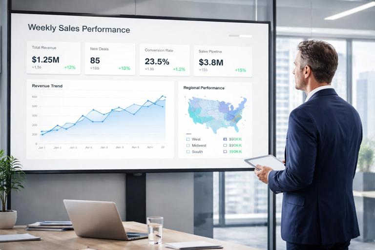
What you are building: a Sales Performance Story dashboard that helps an executive answer three questions in under a minute: Are we on track? What is driving the gap? Where should we act first? The dashboard is designed as a story, not a collection of charts: it starts with a single performance headline, then reveals drivers (product, region, channel, customer segment), and finally provides an action list (accounts or products to prioritize).
What makes it a “story dashboard”: it uses a consistent narrative flow across pages and interactions. Users move from overview to diagnosis to action without losing context. Every visual has a job: either confirm the headline, explain variance, or guide next steps. You will implement this by combining a small set of measures, a few carefully chosen visuals, and a controlled set of slicers and drill paths.
Scenario and Business Questions
Scenario: You are supporting a VP of Sales for a mid-sized company selling multiple product lines across regions and channels. The VP wants a weekly view of performance with the ability to quickly identify underperforming areas and the accounts that need attention.
Business questions the dashboard must answer:
- How much did we sell this period, and how does it compare to the same period last year?
- Are we growing because of volume, price, or mix?
- Which regions, channels, and product categories are driving the change?
- Which customers are at risk (declining trend) and which are expanding?
- What are the top opportunities to close the gap this month?
Dataset and Assumptions for the Case Study
Tables you will use (conceptual): a fact table Sales with Date, Customer, Product, Region, Channel, Quantity, Net Sales, Discount, Cost; and dimensions Date, Customer, Product, Region, Channel. You may also have a Targets table with monthly targets by Region and Product Category.
- Listen to the audio with the screen off.
- Earn a certificate upon completion.
- Over 5000 courses for you to explore!

Download the app
Grain and time: assume Sales is at transaction line level. The story dashboard will default to Month-to-Date (MTD) and allow switching to Quarter-to-Date (QTD) and Year-to-Date (YTD). The default comparison is Same Period Last Year (SPLY).
Key definitions: Net Sales is revenue after discounts; Gross Margin is Net Sales minus Cost; Margin % is Gross Margin divided by Net Sales. “On track” is evaluated against Target when available; otherwise it uses SPLY growth as a proxy.
Page Architecture: Overview, Drivers, Actions
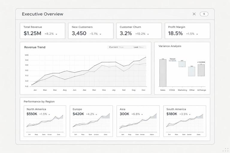
Page 1 — Executive Overview: one headline KPI strip (Net Sales, YoY %, Margin %, Target Attainment) and one main visual that explains the trend (a line chart with current vs last year). Supporting visuals are limited to two: a variance waterfall and a small multiples bar for Region performance. The goal is to answer “Are we on track?” and “Where is the gap?”
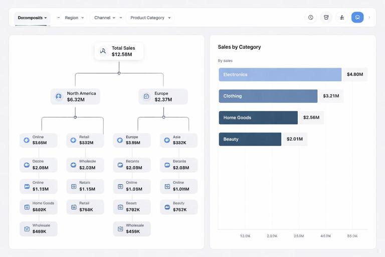
Page 2 — Drivers and Mix: decomposition and mix analysis. This page focuses on “Why did it change?” using a decomposition tree (or a set of ranked bars) and a price-volume-mix breakdown. It also includes a scatter plot for customer performance (growth vs size) to identify outliers.
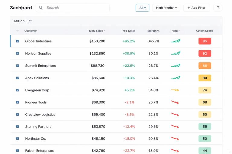
Page 3 — Action List: a prioritized table of accounts/products with contextual metrics (MTD sales, YoY delta, margin, last 4-week trend, and a suggested action tag). This page is where the VP can export a list or assign follow-ups.
Step-by-Step Build: Measures You Need for the Story
Step 1 — Create the headline measures: even though the underlying modeling and DAX basics are assumed known, you need a small set of story-focused measures that will be reused across pages. Start with Net Sales, Gross Margin, and Margin % measures, then add time-intelligence variants for current period and SPLY.
Net Sales = SUM ( Sales[NetSales] )
Gross Margin = SUM ( Sales[NetSales] ) - SUM ( Sales[Cost] )
Margin % = DIVIDE ( [Gross Margin], [Net Sales] )
Step 2 — Add period selector logic: create a disconnected table called Period with values MTD, QTD, YTD. Use it to drive a single “Selected Net Sales” measure so visuals stay consistent when the user changes period.
Selected Period = SELECTEDVALUE ( Period[Period], "MTD" )
Net Sales (Selected) =
SWITCH ( [Selected Period],
    "MTD", TOTALMTD ( [Net Sales], 'Date'[Date] ),
    "QTD", TOTALQTD ( [Net Sales], 'Date'[Date] ),
    "YTD", TOTALYTD ( [Net Sales], 'Date'[Date] )
)
Step 3 — Add comparison measures: create SPLY versions for the selected period and compute YoY delta and YoY %. These measures will power the headline, the trend chart, and the variance visuals.
Net Sales (Selected SPLY) =
VAR p = [Selected Period]
RETURN
SWITCH ( p,
    "MTD", CALCULATE ( TOTALMTD ( [Net Sales], 'Date'[Date] ), SAMEPERIODLASTYEAR ( 'Date'[Date] ) ),
    "QTD", CALCULATE ( TOTALQTD ( [Net Sales], 'Date'[Date] ), SAMEPERIODLASTYEAR ( 'Date'[Date] ) ),
    "YTD", CALCULATE ( TOTALYTD ( [Net Sales], 'Date'[Date] ), SAMEPERIODLASTYEAR ( 'Date'[Date] ) )
)

YoY Δ = [Net Sales (Selected)] - [Net Sales (Selected SPLY)]
YoY % = DIVIDE ( [YoY Δ], [Net Sales (Selected SPLY)] )
Step 4 — Add target attainment (optional but powerful): if you have Targets by month, create a measure that aligns target to the current filter context and compute attainment. If targets are monthly and you are in MTD, you can prorate by days elapsed; if you prefer simplicity, show full-month target and interpret MTD as “pace.”
Target = SUM ( Targets[TargetSales] )
Attainment % = DIVIDE ( [Net Sales (Selected)], [Target] )
Step-by-Step Build: Page 1 Executive Overview
Step 1 — Build the KPI strip: add four card visuals: Net Sales (Selected), YoY %, Margin %, and Attainment %. Use consistent number formatting (currency with K/M, percent with one decimal). Add conditional formatting to YoY % and Attainment % (green above 0% or above 100%, red below). The KPI strip is the “headline sentence” of the story.
Step 2 — Create the trend visual with context: use a line chart with Date (week or day depending on your cadence) on the axis and two measures: Net Sales (Selected) and Net Sales (Selected SPLY). If you use MTD, consider daily granularity; for QTD/YTD, weekly granularity is usually clearer. Add a shaded area or a reference line for target pace if you have targets.
Step 3 — Add a variance waterfall: the waterfall should explain the YoY Δ at a high level. A practical approach is to show variance by Product Category or Region. Use a waterfall where the start is SPLY, the steps are category deltas, and the end is current. If you prefer a simpler build, use a bar chart showing YoY Δ by category sorted descending; the narrative role is the same: “what contributed most to the change.”
Step 4 — Add a Region performance small multiple: create a bar chart of Net Sales (Selected) by Region with data labels, and add YoY % as tooltip. Alternatively, use small multiples by Region to show mini-trends. Keep it compact: the overview page should not become a diagnostic page.
Step 5 — Control the slicers: place slicers for Period (MTD/QTD/YTD) and a single “Business lens” slicer such as Channel or Product Category. Avoid adding many slicers on the overview; instead, use drill-through and the Drivers page for deeper slicing.
Step-by-Step Build: Page 2 Drivers and Mix
Step 1 — Build a driver explorer: use a decomposition tree with the analyzed value set to YoY Δ (or Net Sales (Selected) if you want absolute). Add explain-by fields in a logical order: Region, Channel, Product Category, Product, Customer Segment. The key is to predefine the order so users don’t get lost. The decomposition tree becomes your “guided diagnosis.”
Step 2 — Add a price-volume-mix view (practical approximation): a full price-volume-mix decomposition can be complex, but you can create a useful approximation with three measures: Quantity (Selected), Average Selling Price (ASP), and Mix impact by category. Start with Quantity and ASP.
Quantity = SUM ( Sales[Quantity] )
Quantity (Selected) =
SWITCH ( [Selected Period],
    "MTD", TOTALMTD ( [Quantity], 'Date'[Date] ),
    "QTD", TOTALQTD ( [Quantity], 'Date'[Date] ),
    "YTD", TOTALYTD ( [Quantity], 'Date'[Date] )
)
ASP = DIVIDE ( [Net Sales], [Quantity] )
How to visualize it: use a clustered column chart with Quantity (Selected) and a line for ASP (secondary axis) by month or week. This quickly shows whether revenue changes are driven by units or pricing. For mix, add a 100% stacked bar by Product Category showing share of Net Sales for current vs SPLY; the story becomes “we grew, but shifted toward lower-margin categories” or “mix improved.”
Step 3 — Add a customer growth vs size scatter: create a scatter plot with X = Net Sales (Selected), Y = YoY %, and details = Customer. Add a tooltip page (or tooltip fields) including Margin %, YoY Δ, and last 4-week trend. Add quadrant lines (constant lines) at YoY % = 0 and a chosen size threshold. This visual is excellent for finding “big and declining” accounts.
Step 4 — Add a “Top movers” ranked bar: create two bar charts: Top 10 positive YoY Δ customers and Top 10 negative YoY Δ customers. Use a parameter or a toggle if you want one visual that switches between them. This supports the narrative: “here are the biggest wins and losses.”
Step-by-Step Build: Page 3 Action List
Step 1 — Define what “actionable” means: an action list is not just a table of customers. It should prioritize based on impact and urgency. A simple scoring approach is to combine magnitude of decline with size and margin. For example: prioritize customers with large negative YoY Δ, high Net Sales, and acceptable margin (so effort is worthwhile).
Step 2 — Create an action score measure: normalize components so the score is stable across filters. One practical method is to use percentile ranks within the current selection. If you want a simpler approach, use weighted z-scores or scaled values. Below is a straightforward weighted score using absolute values and a cap to avoid outliers dominating.
Decline = MIN ( 0, [YoY Δ] )
Decline Abs = ABS ( [Decline] )

Action Score =
VAR size = [Net Sales (Selected)]
VAR decline = [Decline Abs]
VAR margin = [Margin %]
RETURN
0.5 * DIVIDE ( decline, decline + 1 )
+ 0.3 * DIVIDE ( size, size + 1 )
+ 0.2 * margin
Step 3 — Build the action table: use a table visual with Customer, Net Sales (Selected), YoY Δ, YoY %, Margin %, and Action Score. Sort by Action Score descending. Add conditional formatting: red for negative YoY Δ, amber for low margin, and a data bar for Action Score. Keep the number of columns tight so it reads like a task list.
Step 4 — Add a trend sparkline per customer (optional): if you want richer context, add a small line chart as a tooltip rather than embedding sparklines in the table. Create a tooltip page that shows the last 12 weeks of Net Sales and SPLY for the hovered customer. This keeps the action list clean while still providing “why” on demand.
Step 5 — Add drill-through to a Customer Detail page (optional): create a drill-through page that shows the customer’s product mix, recent orders, discount rate, and margin trend. The action list becomes a gateway: click a customer to see what changed and what to do next.
Interaction Design: Keeping the Story Coherent
Use bookmarks for “guided modes”: create two bookmarks on the Overview page: “Executive View” (minimal visuals, only KPIs and trend) and “Manager View” (adds waterfall and region breakdown). This allows different audiences to consume the same report without duplicating pages.
Control cross-highlighting: not every visual should filter every other visual. For example, on the Overview page, clicking a region bar should filter the waterfall and trend, but not rewrite the KPI strip in a confusing way unless that is the intended behavior. Use “Edit interactions” to ensure clicks support the narrative rather than create accidental states.
Use consistent tooltips as micro-narratives: create a tooltip template that always includes: current value, SPLY, YoY Δ, YoY %, and margin. When users hover anywhere, they get the same “sentence structure,” which reduces cognitive load.
Practical Formatting and Annotation for Executive Readability
Dynamic titles that state the question: instead of “Net Sales by Region,” use titles like “Which regions explain the YoY change?” and include the selected period and channel in the title. Use a title measure that concatenates slicer selections.
Title - Overview =
"Sales performance (" & [Selected Period] & ")"
Annotations that point to the driver: add a text box near the waterfall or top movers that you update during weekly reviews, such as “Largest decline: West / Retail / Category B.” If you want it dynamic, create a measure that returns the top negative contributor and display it in a card.
Number hygiene: use consistent units (K/M), avoid excessive decimals, and ensure negative values are clearly indicated. Executives often scan; inconsistent formatting breaks trust and slows interpretation.
Validation Checklist: Does the Dashboard Tell the Story?
Headline test: can a user answer “Are we on track?” from the KPI strip alone? If not, simplify KPIs or add a single “Status” indicator based on attainment or YoY %.
Driver test: can a user identify the top 2 drivers of change within 30 seconds on the Drivers page? If not, reduce the number of explain-by fields, add default sorting, or provide a “Top drivers” bar chart next to the decomposition tree.
Action test: can a user leave with a list of 10 accounts to call today, with enough context to prioritize? If not, adjust the Action Score, add a “Reason” column (e.g., “Large decline,” “Margin erosion,” “Discount spike”), or add drill-through for quick context.
Common Pitfalls and How to Fix Them
Pitfall: too many slicers on every page: this turns the story into a self-service cube. Fix it by limiting global slicers to Period and one lens, then using drill-through and the Drivers page for deeper exploration.
Pitfall: trend chart doesn’t match the KPIs: this happens when the trend uses a different date grain or ignores the period logic. Fix it by ensuring the trend uses the same “Selected” measures as the KPI strip and that the date axis is aligned with the period selection.
Pitfall: action list is noisy: if the top of the list changes wildly with small filter changes, your scoring is too sensitive. Fix it by adding minimum thresholds (e.g., only include customers with Net Sales above a cutoff) and by capping extreme values in the score.
Pitfall: users get lost after clicks: add a prominent “Reset filters” button using a bookmark, and keep a consistent navigation bar across pages so users can return to the overview quickly.