Case framing: from churn signals to retention actions
In this case study, you will build an analysis path that starts with churn signals (what changes before a customer leaves) and ends with retention actions (what to do, for whom, and when). The goal is not to “predict churn” in an academic sense, but to create an executive-ready decision loop inside Power BI: identify at-risk segments, quantify revenue exposure, surface the most likely drivers, and translate them into operational actions that can be assigned to teams.
This chapter assumes you already have a working dataset and a Power BI model. We will focus on the case logic, the measures that turn raw behavior into churn signals, and the dashboard pages that connect those signals to retention plays. You will implement a practical “signals → risk tiers → actions” framework that can work even when you do not have a machine-learning model.
Business definition: what counts as churn and what counts as risk
Churn must be defined in a way that matches how the business can act. For subscription businesses, churn is often a cancellation date or non-renewal. For transactional businesses, churn is usually inactivity beyond a threshold. In this case study, use two definitions side by side: an “observed churn” definition for historical measurement and a “risk” definition for proactive intervention.
Observed churn (historical)
Observed churn is a customer who was active in a prior period and is inactive (or canceled) in the current period. For example: “Active in the last 90 days, but no activity in the last 30 days,” or “Subscription ended and not renewed within 14 days.” This definition is used to calculate churn rate and to validate whether signals would have flagged customers before they churned.
Risk (forward-looking)
Risk is a customer who is still active but shows early warning signals. Risk is not a label like “will churn,” but a prioritization score or tier used to allocate retention effort. The risk definition should be explainable: executives and frontline teams need to understand why a customer is flagged and what action is recommended.
- Listen to the audio with the screen off.
- Earn a certificate upon completion.
- Over 5000 courses for you to explore!

Download the app
Data you need for churn signals (and how to think about it)
Churn signals typically fall into four buckets: engagement, value realization, friction, and commercial context. You do not need every bucket to start, but you do need at least one signal that changes before churn and can be influenced by an action.
- Engagement signals: recency (days since last activity), frequency (sessions per week), breadth (number of features used), depth (time spent, events per session).
- Value signals: outcomes achieved (projects completed, reports shared), adoption milestones, usage relative to plan limits.
- Friction signals: support tickets, unresolved issues, failed payments, delivery delays, product errors.
- Commercial context: contract renewal date, plan type, price changes, discount expiration, account size.
In Power BI, you will translate these into measures that can be compared over time. The key pattern is to compute a “current period” value, a “previous period” value, and a “change” or “trend” value. Many churn signals are not about absolute levels; they are about deterioration.
Step-by-step: build a churn signals layer (measures you can reuse)
This step creates a consistent set of measures for recency, frequency, and trend. The exact table names will differ, but the pattern is stable. Assume you have a Date table, a Customers table, and a fact table like FactActivity (events, sessions, orders) and optionally FactTickets (support) and FactRevenue (billing).
Step 1: define the analysis window and “as of” date
Churn analysis is sensitive to time windows. Decide on a standard window (for example, 30 days for “current,” 30 days for “previous,” and 90 days for “active base”). Use the report’s selected date context as the “as of” date so the analysis can be run historically.
As Of Date = MAX('Date'[Date])Current Window Days = 30Previous Window Days = 30If you prefer not to use constants, you can store window sizes in a disconnected parameter table, but the case study works with fixed values.
Step 2: compute recency (days since last activity)
Recency is one of the most interpretable churn signals. It is also easy to explain: “They haven’t used the product in X days.”
Last Activity Date = CALCULATE(MAX(FactActivity[ActivityDate]))Days Since Last Activity = DATEDIFF([Last Activity Date], [As Of Date], DAY)To avoid misleading results, ensure that customers with no activity return blank rather than a huge number, and handle them separately as “never activated” or “no recorded activity.”
Step 3: compute frequency in the current and previous windows
Frequency should be defined in a way that matches your business: sessions, orders, active days, or key events. Here is a sessions example using FactActivity rows as sessions.
Sessions (Current 30D) = VAR EndDate = [As Of Date] VAR StartDate = EndDate - [Current Window Days] RETURN CALCULATE(COUNTROWS(FactActivity), FactActivity[ActivityDate] > StartDate && FactActivity[ActivityDate] <= EndDate)Sessions (Prev 30D) = VAR EndDate = [As Of Date] - [Current Window Days] VAR StartDate = EndDate - [Previous Window Days] RETURN CALCULATE(COUNTROWS(FactActivity), FactActivity[ActivityDate] > StartDate && FactActivity[ActivityDate] <= EndDate)Now compute a change metric. A raw difference is easy to interpret; a percent change is useful but can explode when the previous value is small, so use both.
Sessions Change (Abs) = [Sessions (Current 30D)] - [Sessions (Prev 30D)]Sessions Change (%) = DIVIDE([Sessions Change (Abs)], [Sessions (Prev 30D)])Step 4: compute breadth (feature adoption) and deterioration
Breadth is “how many distinct features were used.” If your activity table has a FeatureName column, you can compute distinct features used in the current window and compare it to the previous window.
Features Used (Current 30D) = VAR EndDate = [As Of Date] VAR StartDate = EndDate - [Current Window Days] RETURN CALCULATE(DISTINCTCOUNT(FactActivity[FeatureName]), FactActivity[ActivityDate] > StartDate && FactActivity[ActivityDate] <= EndDate)Features Used (Prev 30D) = VAR EndDate = [As Of Date] - [Current Window Days] VAR StartDate = EndDate - [Previous Window Days] RETURN CALCULATE(DISTINCTCOUNT(FactActivity[FeatureName]), FactActivity[ActivityDate] > StartDate && FactActivity[ActivityDate] <= EndDate)Features Used Change (Abs) = [Features Used (Current 30D)] - [Features Used (Prev 30D)]Interpretation example: a customer whose sessions are stable but whose feature breadth collapses may be “going through the motions” without realizing value, which suggests a different retention action than a customer who is fully inactive.
Step 5: compute friction (support load and unresolved issues)
Friction signals are powerful because they often map directly to actions (resolve issues, proactive outreach). If you have a tickets table, compute recent ticket volume and open ticket count.
Tickets (Current 30D) = VAR EndDate = [As Of Date] VAR StartDate = EndDate - 30 RETURN CALCULATE(COUNTROWS(FactTickets), FactTickets[CreatedDate] > StartDate && FactTickets[CreatedDate] <= EndDate)Open Tickets = CALCULATE(COUNTROWS(FactTickets), FactTickets[Status] = "Open")Also consider “time to resolution” or “tickets per active user” if your data supports it, but keep the first version simple and interpretable.
Step 6: compute commercial urgency (renewal proximity)
Retention actions are time-sensitive. If you have a renewal date, compute days to renewal and flag accounts inside a window (for example, 60 days).
Days to Renewal = DATEDIFF([As Of Date], MAX(Customers[RenewalDate]), DAY)Renewal in 60D Flag = IF([Days to Renewal] >= 0 && [Days to Renewal] <= 60, 1, 0)Even without a renewal date, you can approximate urgency with “days since last payment” or “contract month number,” but the key is to include at least one time-to-deadline signal.
Step-by-step: create a simple, explainable risk score
A risk score is a way to combine multiple signals into one prioritization metric. The score should be transparent: each component is a point system or weighted rule. Avoid overly complex formulas; the goal is to drive action, not to win a modeling contest.
Step 1: define risk rules per signal
Start with 3-level thresholds per signal: low, medium, high. Use business-friendly cutoffs that you can justify. Example rules:
- Recency: 0 points if days since last activity ≤ 7; 2 points if 8–14; 4 points if ≥ 15.
- Frequency drop: 0 points if sessions change ≥ 0; 2 points if -1 to -3; 4 points if ≤ -4.
- Breadth drop: 0 points if features used change ≥ 0; 2 points if -1; 4 points if ≤ -2.
- Friction: 0 points if open tickets = 0; 2 points if 1; 4 points if ≥ 2.
- Renewal urgency: add 2 points if renewal in 60 days.
These are examples. In your organization, calibrate thresholds using historical churn: look at churned customers and see what their signals looked like 30–60 days before churn.
Step 2: implement points in DAX
Risk Points - Recency = VAR d = [Days Since Last Activity] RETURN SWITCH(TRUE(), ISBLANK(d), BLANK(), d <= 7, 0, d <= 14, 2, 4)Risk Points - Frequency Drop = VAR chg = [Sessions Change (Abs)] RETURN SWITCH(TRUE(), ISBLANK(chg), BLANK(), chg >= 0, 0, chg >= -3, 2, 4)Risk Points - Breadth Drop = VAR chg = [Features Used Change (Abs)] RETURN SWITCH(TRUE(), ISBLANK(chg), BLANK(), chg >= 0, 0, chg = -1, 2, 4)Risk Points - Friction = VAR o = [Open Tickets] RETURN SWITCH(TRUE(), ISBLANK(o), 0, o = 0, 0, o = 1, 2, 4)Risk Points - Renewal = IF([Renewal in 60D Flag] = 1, 2, 0)Now sum them into a total risk score. If some components can be blank (for example, no activity data), decide whether to treat blanks as zero or exclude the customer from scoring. For retention operations, it is usually better to score only customers with sufficient data and separately track “insufficient data” as a data quality issue.
Risk Score = [Risk Points - Recency] + [Risk Points - Frequency Drop] + [Risk Points - Breadth Drop] + [Risk Points - Friction] + [Risk Points - Renewal]Step 3: convert score to risk tiers
Tiers make the output actionable. A frontline manager can assign work based on tiers without debating the meaning of a numeric score.
Risk Tier = VAR s = [Risk Score] RETURN SWITCH(TRUE(), ISBLANK(s), "Unscored", s >= 12, "High", s >= 6, "Medium", "Low")Keep tiers stable over time. If you constantly change thresholds, trend reporting becomes confusing and teams lose trust in the system.
Step-by-step: quantify retention impact (exposure and opportunity)
Signals and tiers are not enough; executives need to know “how much is at stake” and “where to focus.” Add measures that quantify exposure (revenue at risk) and opportunity (how much you could save if actions work).
Revenue at risk
Use a revenue measure appropriate to your business: monthly recurring revenue, annual contract value, or trailing 12-month revenue. Then calculate revenue at risk by filtering to High and Medium tiers.
Revenue = SUM(FactRevenue[Amount])Revenue at Risk (High+Med) = CALCULATE([Revenue], KEEPFILTERS(VALUES(Customers[CustomerID])), Customers[Risk Tier] IN {"High","Medium"})If Risk Tier is a measure (not a column), you cannot filter it directly in CALCULATE the same way. In that case, create a calculated column for tier in the Customers table using the same logic, or create a disconnected tier table and use a measure-based filter pattern. For this case study, prefer a calculated column for tier if your model supports it, because it simplifies segmentation and drill-through.
Customer counts and rates
Executives often ask “How many customers are in each tier?” and “Is it getting better?” Create a customer count measure and a tier share measure.
Customers Count = DISTINCTCOUNT(Customers[CustomerID])Tier Share = DIVIDE([Customers Count], CALCULATE([Customers Count], ALL(Customers[Risk Tier])))Use these to show whether the High-risk population is shrinking after retention actions are deployed.
Design the report pages: signals, drivers, and actions
This case study works best as three pages that mirror how decisions are made: a triage view, a driver exploration view, and an action planning view. The pages should share the same filters (date, segment, region, plan) so users can move from overview to detail without reorienting.
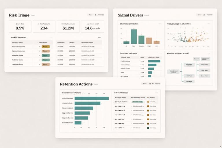
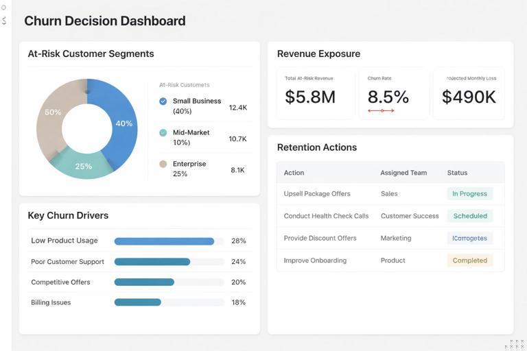
Page 1: Risk triage (who needs attention now)
Core visuals for triage:
- KPI cards: Customers High Risk, Revenue at Risk, Renewal in 60D count.
- Stacked bar: Customers by Risk Tier (with share labels).
- Trend line: High-risk customers over time (using the “as of” date context).
- Table: Top at-risk accounts with columns: Customer, Risk Tier, Risk Score, Days Since Last Activity, Sessions Change, Open Tickets, Days to Renewal, Revenue.
Interaction pattern: selecting a tier filters the table; selecting a segment (for example, plan type) updates all visuals. Add conditional formatting in the table: red for high recency, red for open tickets, and a warning color for renewal proximity. The table is where managers will start their daily work.
Page 2: Signal drivers (what is causing risk)
This page answers “Why are customers at risk?” Use visuals that show distributions and correlations without implying causation. Practical options:
- Histogram or binned bar: Days Since Last Activity distribution for High vs Medium vs Low.
- Scatter plot: Sessions Change (Abs) vs Revenue, colored by Risk Tier, to find high-value deteriorating accounts.
- Matrix: Risk Tier by Plan Type or Industry with Revenue at Risk and Customer Count.
- Decomposition tree: Revenue at Risk broken down by Region → Plan → Account Manager (if available) to locate concentrations.
To keep the story actionable, pair each driver visual with a “so what” metric. Example: next to the recency histogram, show “High-risk customers with ≥ 15 days inactivity” count and revenue. Next to the friction visual, show “High-risk customers with ≥ 2 open tickets.”
Page 3: Retention actions (what to do next)
This page translates signals into plays. Create an “Action Recommendation” classification based on the dominant signal. The simplest approach is a priority rule: if renewal is near, prioritize renewal outreach; else if open tickets exist, prioritize support resolution; else if inactivity is high, prioritize re-engagement; else if breadth dropped, prioritize enablement.
Action Recommendation = VAR Renewal = [Renewal in 60D Flag] VAR OpenT = [Open Tickets] VAR Rec = [Days Since Last Activity] VAR BreadthChg = [Features Used Change (Abs)] RETURN SWITCH(TRUE(), Renewal = 1, "Renewal outreach", OpenT >= 1, "Resolve support issues", Rec >= 15, "Re-engagement campaign", BreadthChg < 0, "Enablement / training", "Monitor")Then build visuals that operationalize the recommendations:
- Bar chart: Customers by Action Recommendation (filtered to High and Medium risk).
- Table: Account list with Action Recommendation, Owner (CSM/AM), Next step date, and key signals.
- Workload view: Customers by Owner and Action Recommendation to balance assignments.
If you have a retention actions log (calls, emails, offers), add a slicer for “Action Taken” and show conversion metrics like “returned to active” or “renewed” after action. If you do not have an actions log, you can still create a manual export workflow: the table becomes a call list that teams export weekly.
Validation: check whether signals would have warned you before churn
Before stakeholders trust the dashboard, validate that your signals behave sensibly. You are not building a formal predictive model, but you should still test whether high-risk customers historically churned more often than low-risk customers.
Backtesting with a churn cohort
Create a churned customer cohort using your observed churn definition. Then look back 30 days before churn and compute what their risk tier would have been. If the majority of churned customers were “Low risk” right before churn, your thresholds are not capturing meaningful deterioration.
Practical approach: create a report page where the user filters to churned customers and selects a date offset (for example, “as of churn date minus 30 days”). Then compare the distribution of risk tiers for churned vs retained customers. You can do this with a calculated table for churn events or with a churn flag in your customer-period table if you have one.
Sanity checks and edge cases
Common issues to check:
- New customers: they may have low usage because they are onboarding, not because they are churning. Add a “Customer Age” measure and exclude customers younger than a threshold from high-risk classification, or create a separate “Onboarding” tier.
- Seasonality: some customers have predictable low-usage periods. Segment by industry or customer type to avoid false alarms.
- Data gaps: missing activity tracking can look like inactivity. Track the percentage of customers with no activity records and treat it as a measurement issue.
- One-time spikes: a single large session count can mask a downward trend. Consider using active days instead of sessions if spikes are common.
Operationalizing retention: turning the dashboard into a weekly cadence
The dashboard becomes valuable when it is used consistently. Define a weekly cadence that aligns with how teams work: triage at-risk accounts, assign actions, and review outcomes. In Power BI, support this cadence by adding a “Week” filter, a “My Accounts” view for each owner, and a consistent definition of “newly high risk” vs “persistently high risk.”
New vs persistent risk
Teams prioritize newly deteriorating accounts differently from accounts that have been high risk for months. Create a measure that flags whether a customer entered High risk in the current window but was not High risk in the previous window.
High Risk Flag = IF([Risk Tier] = "High", 1, 0)High Risk (Prev Window) = VAR PrevAsOf = [As Of Date] - [Current Window Days] RETURN CALCULATE([High Risk Flag], 'Date'[Date] = PrevAsOf)Newly High Risk = IF([High Risk Flag] = 1 && [High Risk (Prev Window)] = 0, 1, 0)Depending on your model, you may need a customer-period table to make this robust. The intent is to separate “new alerts” from “ongoing cases,” which improves focus and reduces alert fatigue.
Retention playbook mapping
For each Action Recommendation, define a standard play with a measurable outcome:
- Renewal outreach: schedule renewal call, confirm stakeholders, propose renewal options; outcome: renewal date confirmed or renewal closed.
- Resolve support issues: escalate open tickets, assign technical owner, set SLA; outcome: tickets closed and customer confirms resolution.
- Re-engagement campaign: targeted email + call, highlight quick-win use case; outcome: activity resumes within 7 days.
- Enablement / training: invite to training, share tailored walkthrough; outcome: feature breadth increases or key milestone completed.
In the report, reflect these plays as tooltips or a side panel description so users do not have to guess what “Enablement” means. Keep the language consistent with how teams talk internally.