Case study goal and decision context
What you are building: an Operations and Stockouts Decision Dashboard that helps leaders and planners answer three recurring questions: Where are we losing sales due to stockouts? What is driving those stockouts (demand spikes, supplier delays, internal process issues)? What actions should we take this week to reduce risk and recover service levels?
Who uses it and how: operations managers use it daily to prioritize expediting and replenishment; supply planners use it weekly to adjust reorder points and safety stock; executives use it in reviews to understand service level trends and the cost of stockouts. The dashboard is designed for fast triage (what is burning now) and structured diagnosis (why it is happening).
Core decisions supported: (1) expedite or reallocate inventory, (2) adjust replenishment parameters, (3) escalate suppliers or internal bottlenecks, and (4) align sales and operations on realistic availability dates. Your visuals and metrics should map directly to these decisions, not just describe inventory.
Business definitions you must align before building
Stockout: define it explicitly. A common operational definition is “on-hand inventory is zero (or below a threshold) while there is demand.” Demand can be orders, shipments, or forecast. Choose one and document it in the report tooltip or info panel so everyone interprets the same way.
Service level: decide whether you are tracking fill rate (units shipped / units ordered), line fill rate (lines fulfilled / lines ordered), or on-time-in-full. For stockouts, unit fill rate is often the most sensitive, but line fill rate is easier for executives to grasp. You can include both if your audience needs it, but keep one as the headline KPI.
- Listen to the audio with the screen off.
- Earn a certificate upon completion.
- Over 5000 courses for you to explore!

Download the app
Lost sales vs backorders: some businesses lose demand when out of stock; others backorder. Your dashboard should separate “unfulfilled but still open” (backorder) from “unfulfilled and canceled” (lost). If you cannot measure lost sales directly, use a proxy such as “order lines canceled due to no stock” or “demand not shipped within X days.”
Lead time and variability: stockouts are rarely about average lead time; they are about variability. Capture both planned lead time and actual lead time distribution (median, 90th percentile) so the dashboard can show whether suppliers are becoming less predictable.
Data you need (and what each table is for)
To keep the case study practical, assume you have these source tables available from ERP/WMS/planning systems. You are not re-teaching preparation steps; instead, you are clarifying what each dataset contributes to the story.
Inventory snapshot
Grain: SKU × location × date (daily snapshot). Fields: OnHandQty, OnOrderQty, AllocatedQty, AvailableQty (optional), SafetyStockQty (optional). Purpose: detect when inventory hits zero and quantify exposure by location.
Demand / orders
Grain: order line (OrderID, LineID) with requested date and promised date. Fields: OrderedQty, ShippedQty, CanceledQty, BackorderedQty, Customer, Channel, Priority. Purpose: measure service level and quantify unmet demand during stockouts.
Shipments
Grain: shipment line with ship date. Fields: ShippedQty, ShipFromLocation, Carrier, ShipMethod. Purpose: connect fulfillment performance to inventory availability and identify operational constraints.
Purchase orders / inbound
Grain: PO line with expected receipt date and actual receipt date. Fields: OrderedQty, ReceivedQty, Supplier, ExpectedDate, ReceiptDate, Status. Purpose: diagnose supplier delays and inbound short shipments that cause stockouts.
Item master and location master
Fields: SKU, Category, Brand, UnitCost, UnitPrice, ABC class, ReorderPoint, MinOrderQty; Location type, region. Purpose: segmentation and cost impact (e.g., stockout cost by category).
Calendar and “as-of” date logic
Operations dashboards are sensitive to timing. Decide whether the report is “as of last refresh” or “as of end of day.” Create a clear “As of” indicator and use it consistently in measures and titles.
Step-by-step build plan (from questions to pages)
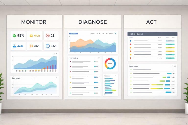
This case study uses a three-page structure that mirrors how operations teams work: (1) Monitor, (2) Diagnose, (3) Act. Each page has a primary question, a small set of KPIs, and a limited number of visuals designed for fast scanning.
Step 1: Define the primary KPIs and thresholds
Before placing visuals, define the KPIs that will appear in the header of each page. Keep them stable across filters so users build intuition. Recommended KPIs:
- Stockout SKUs (count): number of SKU-location combinations with on-hand at or below threshold and demand present.
- Stockout days: total days in the selected period where a SKU-location was stocked out.
- Unmet demand units: ordered units not shipped within the service window.
- Estimated margin at risk: unmet demand units × unit margin (or contribution proxy).
- Fill rate: shipped units / ordered units for the selected period.
- Inbound delay rate: % of PO lines received after expected date (or average days late).
Set thresholds for conditional formatting: for example, fill rate below 95% is red, 95–98% amber, above 98% green. For inbound delays, define “late” as receipt date > expected date + grace days.
Step 2: Create a stockout event logic you can explain
Users will challenge stockout counts if the logic is unclear. Use a simple, auditable rule and show it in a tooltip. Example rule:
- Stockout flag: OnHandQty <= 0 (or AvailableQty <= 0) on a given date.
- Demand present: OrderedQty > 0 (or forecast > 0) for that SKU-location-date window.
- Stockout event: consecutive stockout days grouped into an event with a start date and end date.
Even if you do not fully materialize events in a table, design visuals that communicate duration (days stocked out) and recency (currently stocked out vs resolved).
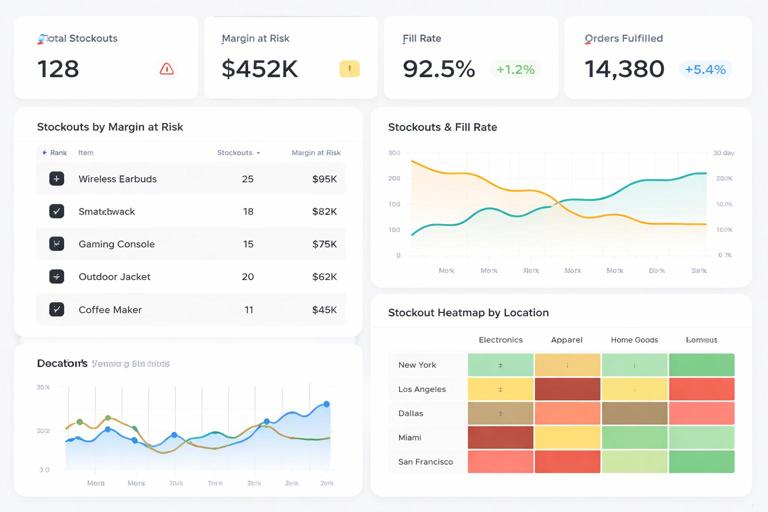
Step 3: Build Page 1 (Monitor): “Where is the risk right now?”
Purpose: a daily cockpit. It should answer in under 30 seconds: which SKUs and locations are currently stocked out or at risk, and what is the business impact.
Layout suggestion: top row KPI cards (Stockout SKUs, Unmet demand units, Margin at risk, Fill rate). Left side: a ranked table of “Top stockouts by margin at risk.” Right side: trend lines for fill rate and stockout days over time. Bottom: a map or region bar chart if geography matters, otherwise a location heatmap matrix.
Key visuals:
- Ranked table: SKU, Location, OnHand, OnOrder, NextReceiptDate, UnmetDemandUnits, MarginAtRisk, DaysStockedOut (current event). Add conditional icons for “no inbound” or “inbound late.”
- Trend: line chart for Fill rate (weekly) and a second line for Stockout SKUs count. Use dual axis only if it remains readable; otherwise separate small multiples.
- At-risk view: include a slicer or toggle for “Stocked out now” vs “At risk in next 7 days” based on projected inventory (OnHand + scheduled receipts − open demand).
Interaction design: clicking a SKU in the table should cross-filter the trend and show a tooltip with last 30 days of on-hand and receipts. Keep drill-through available to the Diagnose page.
Step 4: Build Page 2 (Diagnose): “Why are we stocking out?”
Purpose: move from symptoms to drivers. This page should help planners distinguish between demand-driven stockouts (unexpected spikes), supply-driven stockouts (late or short receipts), and internal allocation issues (inventory exists elsewhere but not where needed).
Driver framework: categorize each stockout into a primary driver using a rule-based approach that is transparent. Example categorization:
- Supplier delay: there is an open PO expected before or during the stockout window, but actual receipt is late or not received.
- Demand spike: demand in the last X days is above forecast or above trailing average by a threshold, and inbound is on time.
- Allocation / location imbalance: total network on-hand > 0 but the stocked-out location has 0 and transfer is possible.
- Parameter issue: reorder point or safety stock appears too low relative to lead time variability and demand variability.
Key visuals:
- Driver decomposition: stacked bar chart showing count of stockout events or margin at risk by driver category.
- Supplier performance: scatter plot of suppliers with x-axis “avg days late” and y-axis “margin at risk from late items,” bubble size = number of late PO lines.
- Lead time variability: box plot style approximation (if native box plot not available, use custom visual or show percentile bands) for actual lead time by supplier or SKU category.
- Network imbalance: matrix of SKU by location showing OnHand and Available; conditional formatting highlights where inventory exists vs where demand is unmet.
Diagnostic drill-through: from any SKU, provide a detail view (could be a drill-through page) with a timeline: on-hand, open orders, receipts, and stockout days. This is where planners validate the story quickly.
Step 5: Build Page 3 (Act): “What should we do next?”
Purpose: convert insight into a prioritized action list. The page should feel like a work queue, not a report. It should answer: what actions have the highest impact and what is the recommended next step for each item.
Action types:
- Expedite inbound: when a late PO is the driver and the item is high margin at risk.
- Reallocate / transfer: when network inventory exists but is in the wrong location.
- Substitute / alternate SKU: when a compatible item exists with inventory.
- Adjust parameters: when repeated stockouts occur despite on-time supply.
- Customer communication: when promised dates will slip; prioritize key accounts.
Key visuals:
- Prioritized action table: ActionType, SKU, Location, Driver, MarginAtRisk, UnmetDemandUnits, NextReceiptDate, SuggestedQtyToTransfer/Expedite, Owner, DueDate, Status.
- What-if controls: a parameter for “expedite days saved” and “transfer lead time” to estimate how much unmet demand could be recovered. Keep the what-if section compact and clearly labeled as scenario.
- Impact summary: bar chart showing “recoverable margin” by action type under the current scenario.
Operational usability: add a button to export the action table to Excel/CSV for execution systems, or integrate with Power Automate if your environment supports it. If you cannot integrate, at least provide a clean export-friendly table.
Measures and calculations specific to stockouts (examples)
Below are example measure patterns you can adapt. They are intentionally focused on stockouts and operations, not general DAX foundations.
Stockout flag and stockout days
// 1 if stocked out on the snapshot date (use AvailableQty if you track allocations) Stockout Flag = VAR qty = SUM('Inventory Snapshot'[OnHandQty]) RETURN IF(qty <= 0, 1, 0) // Stockout Days in selection Stockout Days = SUMX(VALUES('Calendar'[Date]), [Stockout Flag])Unmet demand units (service window)
Define a service window, for example “ship within 2 days of requested date.” Then measure unmet units as ordered minus shipped within that window. If you only have shipped totals, use a simplified proxy and label it clearly.
Ordered Units = SUM('Order Lines'[OrderedQty]) Shipped Units = SUM('Order Lines'[ShippedQty]) Unmet Demand Units = MAX(0, [Ordered Units] - [Shipped Units])Margin at risk
Unit Margin = AVERAGE('Item Master'[UnitPrice]) - AVERAGE('Item Master'[UnitCost]) Margin at Risk = [Unmet Demand Units] * [Unit Margin]Late inbound indicators
Late PO Lines = CALCULATE( COUNTROWS('PO Lines'), FILTER('PO Lines', 'PO Lines'[ReceiptDate] > 'PO Lines'[ExpectedDate] ) ) Late PO Rate = DIVIDE([Late PO Lines], COUNTROWS('PO Lines')) Avg Days Late = AVERAGEX( FILTER('PO Lines', NOT ISBLANK('PO Lines'[ReceiptDate]) ), DATEDIFF('PO Lines'[ExpectedDate], 'PO Lines'[ReceiptDate], DAY) )At-risk projection (next 7 days)
This is a simplified projection that works well for triage. It assumes you can estimate open demand and scheduled receipts in the next 7 days.
Projected Net Inventory (7d) = VAR onHand = SUM('Inventory Snapshot'[OnHandQty]) VAR receipts = CALCULATE(SUM('PO Lines'[OpenQty]), 'PO Lines'[ExpectedDate] <= MAX('Calendar'[Date]) + 7) VAR demand = CALCULATE(SUM('Order Lines'[OpenQty]), 'Order Lines'[RequestedDate] <= MAX('Calendar'[Date]) + 7) RETURN onHand + receipts - demand At Risk Flag (7d) = IF([Projected Net Inventory (7d)] <= 0, 1, 0)Design choices that make operations dashboards trustworthy
Show the “as-of” timestamp and data latency: stockouts are time-sensitive. Include a small card: “Data as of: [RefreshDateTime].” If some sources refresh at different times, show the oldest timestamp and label it “latest common refresh.”
Separate current state from historical analysis: users often confuse “currently stocked out” with “stocked out at any time in the period.” Provide a clear toggle or two metrics: “Stocked out now” and “Had stockout in period.”
Use consistent units and avoid mixed grains: do not mix SKU-level inventory with order-line metrics in the same visual unless you are explicit about aggregation. For example, a table can show SKU-location inventory alongside unmet demand if both are aggregated to SKU-location.
Explain proxies: if “lost sales” is estimated, label it “estimated lost sales” and provide the formula in a tooltip. Operations teams will accept proxies when they are transparent.
Practical walkthrough: building the dashboard in Power BI
Step 1: Create the report pages and navigation
Create three pages: Monitor, Diagnose, Act. Add a top navigation bar with buttons. Use a consistent filter pane strategy: keep global slicers (Date, Region, Category) in a dedicated area and avoid duplicating slicers on every page.
Step 2: Add the KPI header row
On each page, add KPI cards for the metrics relevant to that page. Use dynamic titles that reflect the current filter context, such as “Fill rate (last 4 weeks)” or “Margin at risk (selected period).” Ensure the KPI formatting is consistent across pages so users do not re-learn the interface.
Step 3: Build the Monitor page table first
Start with the ranked table because it forces you to validate the logic end-to-end. Add SKU, Location, OnHand, OnOrder, Unmet Demand Units, Margin at Risk, and a “Status” column (Stocked out now / At risk / OK). Sort by Margin at Risk descending. Add conditional formatting to highlight zero on-hand and late inbound.
Step 4: Add trend context without clutter
Add a weekly fill rate trend and a weekly stockout count trend. Keep the time grain consistent (weekly is often best for operations reviews; daily can be noisy). If users need daily, provide a tooltip page that shows daily detail when hovering over a week.
Step 5: Build the Diagnose page around the driver categories
Create a driver category field or measure-driven classification. Then build the decomposition chart (driver vs margin at risk). Add supplier scatter to quickly identify whether a few suppliers are responsible for a large share of risk. Make sure clicking a supplier filters the SKU list and shows the related late POs.
Step 6: Build the Act page as a work queue
Create an action recommendation field based on driver and thresholds. For example: if Driver = Supplier delay and MarginAtRisk > threshold, ActionType = Expedite. If Driver = Network imbalance and another location has on-hand > transfer minimum, ActionType = Transfer. Keep the rules simple and editable; the goal is prioritization, not automation perfection.
Step 7: Add drill-through and tooltips for validation
Create a drill-through page “SKU-Location Detail” with a timeline view: on-hand by day, receipts by day, and demand by day, with stockout days highlighted. Add a PO detail table and an order backlog table. This page is where planners confirm whether the classification makes sense and where they can explain the issue to stakeholders.
Common pitfalls and how to avoid them
Pitfall: counting stockouts without demand. If you flag stockouts purely on on-hand = 0, you will inflate the problem with slow-moving items. Always pair stockout with demand presence or at least show both “zero inventory” and “zero inventory with demand.”
Pitfall: double-counting unmet demand. If orders remain open across multiple days, you can accidentally count the same backlog repeatedly. Decide whether unmet demand is measured as a point-in-time backlog or as a period-based shortfall, and design measures accordingly.
Pitfall: blaming suppliers when internal constraints are the issue. Late shipments can be caused by warehouse capacity, carrier issues, or allocation rules. Include internal signals where possible (pick/pack delays, dock-to-stock time) or at least avoid overconfident labels by using “likely driver” wording.
Pitfall: action list without ownership. A work queue must include Owner and Status fields, even if they are maintained outside Power BI. If you cannot write back, include a process: export, assign in a tracker, and re-import status for visibility.