What “Delivery Templates, Checklists, and Rollout Planning” Means in a Modular Brand System
A modular brand system only becomes usable at scale when it is delivered in a way that teams can adopt quickly, apply consistently, and maintain without constant designer intervention. “Delivery templates” are the pre-built, ready-to-use files and layouts that teams start from (instead of reinventing). “Checklists” are the quality gates that prevent drift, omissions, and inconsistent execution. “Rollout planning” is the operational plan for introducing the system across channels, teams, and timelines with minimal disruption.
This chapter focuses on the practical delivery layer: what you hand off, how you verify it, and how you sequence adoption. It assumes the system itself is already defined and documented; the goal here is to make it deployable.
Delivery Templates: What to Provide and Why
Delivery templates are not “examples.” They are production-ready starting points that embed the system’s rules so users can work faster and safer. A template should reduce decisions, not add them. If a user must guess which components, spacing, or layout pattern to use, the template is incomplete.
Core template categories
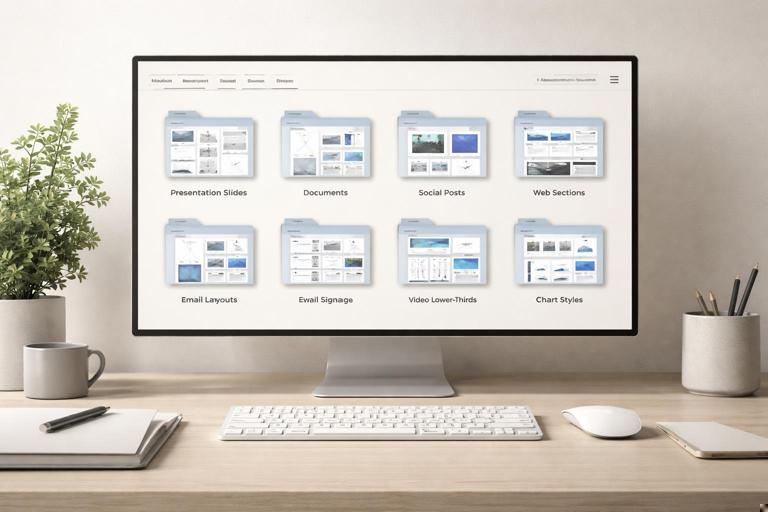
- Presentation templates: internal decks, sales decks, investor updates, training decks. Include multiple slide types (title, section divider, content, comparison, data, quote, image-led, closing slide) and variants for light/dark backgrounds if applicable.
- Document templates: proposals, reports, one-pagers, case studies, letterhead, invoices (if relevant). Include paragraph styles, table styles, callout boxes, and cover page variants.
- Social templates: post, story, carousel, video thumbnail, profile header. Include safe areas, cropping guidance, and variants for common content types (announcement, quote, product feature, event).
- Marketing web templates: landing page wireframes or page sections (hero, feature grid, testimonial band, pricing, FAQ). Provide as design files and/or CMS-friendly layout specs.
- Email templates: newsletter, product announcement, transactional (receipt, password reset), event invite. Include module blocks and guidance for image-to-text ratio and accessibility.
- Event templates: signage, badges, stage screens, handouts. Include print specs (bleed, safe margin) and scalable sizes.
- Video/motion templates: intro/outro slates, lower-thirds, title cards, end cards. Provide editable project files and export presets.
- Data visualization templates: chart styles, dashboard layouts, report charts. Include examples for common chart types and rules for labeling and annotation.
Template design principles that prevent misuse
- Lock what must not change: in tools that support it, lock background grids, master elements, and key layout frames. If locking is not possible, clearly separate “fixed” vs “editable” layers and name them accordingly.
- Make the “right” option the easiest: provide the most common layouts as the first options. Hide or remove experimental variants from the standard template set.
- Embed guidance inside the file: add non-exporting notes or a “How to use this template” page/slide with short rules and links to the source library.
- Include realistic sample content: placeholder lorem ipsum is less useful than realistic content lengths (short, medium, long) that demonstrate how the layout behaves.
- Provide responsive/cropping variants: for social and web, include multiple aspect ratios and show how imagery should crop without breaking composition.
Delivery Package Structure: A Practical “Release Bundle”
Teams adopt faster when each release arrives as a coherent bundle with clear scope and a predictable structure. Treat each delivery as a versioned release, even if you are not shipping software.
Recommended release bundle contents
- Release notes: what’s new, what changed, what’s deprecated, and what actions users must take.
- Template pack: the actual template files, organized by channel and use case.
- Asset pack: approved imagery, icons, illustration sets, motion files, and any supporting resources needed to use the templates.
- Usage quick-start: a short “start here” guide for non-designers (5–10 minutes to get productive).
- Checklist pack: preflight checklists per deliverable type (print, web, social, email, presentation).
- Request and support paths: where to ask questions, how to request new templates, how to report issues.
Example folder layout (delivery-oriented)
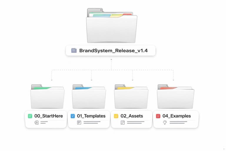
BrandSystem_Release_v1.4/ README_ReleaseNotes.html 00_StartHere/ QuickStart_NonDesigners.pdf HowTo_RequestHelp.txt 01_Templates/ Presentations/ Documents/ Social/ Email/ WebSections/ Events/ Video/ 02_Assets/ Imagery/ Icons/ Illustration/ Motion/ 03_Checklists/ Preflight_Presentation.pdf Preflight_Social.pdf Preflight_Print.pdf Preflight_Email.pdf 04_Examples/ Approved_Samples/The goal is not to mirror your internal design file structure; it’s to optimize for the end user who needs to find the right starting point quickly.
- Listen to the audio with the screen off.
- Earn a certificate upon completion.
- Over 5000 courses for you to explore!

Download the app
Checklists: Turning Brand Consistency into Repeatable QA
Checklists translate brand rules into observable checks that anyone can perform. They are especially important when work is produced by many hands (marketing, sales, HR, product, agencies). A checklist should be short enough to use under deadline pressure, but specific enough to catch common failure modes.
Checklist design: make it actionable
- Use yes/no questions rather than vague reminders. “Are headings using the correct style?” is better than “Use correct typography.”
- Group by risk: prioritize items that cause visible inconsistency or legal/compliance risk.
- Separate “must” vs “should”: must-pass items are non-negotiable; should-pass items are best practice.
- Include a “stop and escalate” rule: define when a reviewer must pause and request help (e.g., missing template, unusual format, co-branding scenario).
- Keep tool-specific checks minimal: focus on outcomes (alignment, spacing, accessibility) rather than how to click in a specific app, unless your audience is fixed.
Preflight checklist: presentations (example)
- Must: Are you using the latest master template version?
- Must: Are all slides using approved layouts (no ad-hoc text boxes outside the grid)?
- Must: Are headings and body text using the correct paragraph styles (no manual overrides)?
- Must: Are logos placed only in approved positions and sizes?
- Must: Are charts using the approved chart styles and labeling conventions?
- Must: Are images high resolution and properly licensed/approved?
- Should: Does each slide have one primary message (avoid overcrowding)?
- Should: Are contrast and font sizes readable on a projector?
Preflight checklist: social posts (example)
- Must: Is the correct aspect ratio used for the target platform?
- Must: Are safe areas respected (no critical content near edges or UI overlays)?
- Must: Is text legible on mobile (minimum size and contrast)?
- Must: Are overlays and gradients from approved styles (no custom effects)?
- Must: Is the CTA consistent with approved phrasing and placement rules?
- Should: Does the post align with the campaign’s content structure (headline, support, CTA)?
Preflight checklist: print (example)
- Must: Correct document size, bleed, and safe margins set?
- Must: Images at appropriate resolution for print?
- Must: Colors set to correct print profile and blacks handled properly?
- Must: Fonts embedded or outlined according to printer requirements?
- Must: Proofread and legal disclaimers included where required?
- Should: Paper stock and finishing notes included for vendor?
Step-by-Step: Building a Checklist System That People Actually Use
Step 1: Identify your top deliverables and failure modes
Start with the 5–10 deliverable types that generate the most volume or the most risk (e.g., social posts, sales decks, landing pages, email). For each, list the top 10 mistakes you see in the wild: inconsistent logo placement, incorrect spacing, ad-hoc colors, illegible type, broken chart styling, missing disclaimers, wrong file exports.
Step 2: Convert mistakes into checks
Rewrite each mistake as a check that can be verified quickly. Example: “Text too small on mobile” becomes “Is body text at or above the minimum size for the platform?” If you can’t define a minimum, the check becomes “Is text readable on a 6-inch screen at arm’s length?” and you add a quick test method (preview at 100% on a phone).
Step 3: Assign ownership and timing
Define who runs the checklist and when. A common pattern is: creator self-check before submitting, then reviewer check before publishing. If you rely only on a final reviewer, you create bottlenecks and late rework.
Step 4: Make the checklist accessible at the point of work
Place checklists where work happens: inside the template file (a “Preflight” page), in the project management ticket template, and in the asset library as a pinned item. If users must hunt for it, they won’t use it.
Step 5: Track recurring failures and update
Every month, capture the top repeated issues and update either the checklist (clearer checks) or the templates (prevent the issue by design). The best checklist items eventually become “designed out” through better templates.
Rollout Planning: Sequencing Adoption Without Disruption
Rollout planning is the difference between a system that exists and a system that is used. A rollout plan defines scope, timeline, training, migration approach, and success metrics. It also anticipates resistance: teams have deadlines, legacy files, and habits. Your plan should reduce switching costs.
Key rollout decisions
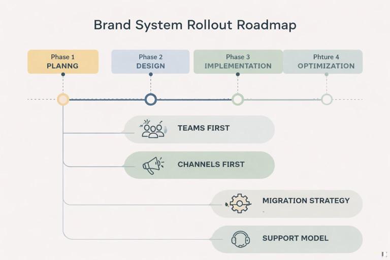
- Big bang vs phased rollout: big bang is faster but riskier; phased rollout reduces risk and allows iteration.
- Which teams first: start with teams that produce high volume and are motivated to standardize (often social, lifecycle email, sales enablement).
- Which channels first: choose channels where templates deliver immediate value and are easy to enforce (presentations and social are common early wins).
- Migration strategy: decide what gets updated, what remains as legacy, and what gets deprecated.
- Support model: define office hours, a request queue, and escalation paths for edge cases.
Step-by-Step: Creating a Rollout Plan (Practical Framework)
Step 1: Define rollout scope and success metrics
Write a one-page rollout brief that answers: which deliverables are included, which teams are in scope, and what “success” looks like in 30/60/90 days. Metrics should be observable. Examples: percentage of new decks created from the template, reduction in review cycles, fewer brand QA issues, time saved per asset.
Step 2: Build a channel-by-channel adoption map
Create a simple matrix with channels on one axis and teams on the other. Mark: current volume, risk level, and readiness. Readiness includes tool access, skill level, and whether the team already uses templates.
Channel x Team Matrix (example fields) - Volume: High/Med/Low - Risk: High/Med/Low - Readiness: High/Med/Low - Dependencies: e.g., CMS update, legal copy, vendor specsStep 3: Prepare a “minimum viable template set” for each phase
For each phase, define the smallest set of templates that unlocks real work. Avoid shipping 50 templates at once if only 10 will be used. A practical Phase 1 set might be: sales deck, internal deck, 3 social formats, newsletter email, and one landing page section kit.
Step 4: Decide migration rules (new work vs existing work)
Most organizations fail rollout by trying to retrofit everything. Use clear rules:
- New work rule: all new assets after date X must use the new templates.
- Evergreen update rule: high-visibility evergreen assets (homepage hero, key sales deck, top email flows) must be migrated by date Y.
- Legacy freeze rule: low-visibility or soon-to-expire assets remain as-is unless edited.
These rules reduce scope creep and prevent endless “back-catalog” work.
Step 5: Create training that matches roles (not a single generic session)
Training should be short, role-specific, and anchored to real tasks. Suggested modules:
- Non-designers (30–45 minutes): how to find templates, how to swap content safely, how to export correctly, how to run the checklist.
- Designers (60–90 minutes): how to extend templates, how to create new variants, how to package and submit improvements.
- Reviewers/approvers (30 minutes): how to review efficiently using the checklist, what to reject, what to escalate.
Include a practice exercise: “Create a social post from the template, export it, run preflight, submit for review.”
Step 6: Establish support and feedback loops
During rollout, questions spike. Plan support capacity:
- Office hours: scheduled times for live help.
- Intake form: template requests, bug reports, and edge cases (co-branding, unusual formats).
- Response SLAs: e.g., 2 business days for questions, 10 business days for new template requests.
- Feedback tagging: categorize issues (template gap, unclear instruction, tool limitation, user training need).
Step 7: Pilot, measure, iterate, then expand
Run a pilot with one or two teams for 2–4 weeks. Measure adoption and friction: how often templates are used, where users break them, how long approvals take. Then update templates and checklists before expanding to more teams. A pilot is not a “soft launch”; it is a structured learning phase.
Template QA and Release Management: Avoiding “Template Drift”
Once templates are in the wild, people duplicate files, modify masters, and circulate outdated versions. Template drift is inevitable unless you manage releases like a product.
Practical controls to reduce drift
- Single source of truth: publish templates in one official location and discourage sharing copies via email or chat.
- Visible version labeling: include a version number and last-updated date inside the template (in a non-exporting area if possible).
- Deprecation policy: define how long old versions remain available and how users are notified to upgrade.
- Change log discipline: every template update should have a short note explaining what changed and why.
- Backward compatibility guidance: if a change affects existing work, provide a migration note (what to update, what can remain).
Example: release notes format (copy-ready)
Release v1.4 - Date: 2026-01-10 Added: New webinar deck (16:9) with speaker intro slides Updated: Social carousel template - improved safe area guides Fixed: Email header module spacing bug Deprecated: Old 1:1 social post template v1.1 (use v1.4) Actions required: Download new social pack; do not reuse v1.1 for new postsOperational Checkpoints: What to Verify Before You Announce “It’s Live”
Before rollout, verify that the delivery is complete from a user’s perspective. These checks prevent the common scenario where teams are told to adopt the system but can’t find what they need.
Go-live readiness checklist (example)
- Templates are available in the official location with clear naming and version labels.
- Each template includes a short “how to use” section and export guidance.
- Checklists are accessible and mapped to each deliverable type.
- At least one real project has been completed end-to-end using the templates.
- Support channels are staffed and response expectations are communicated.
- Owners for template updates and approvals are assigned.
- Known gaps are documented with a timeline (so users know what’s coming).
Practical Examples: Turning Common Workflows into Template Kits
Example 1: Sales enablement kit
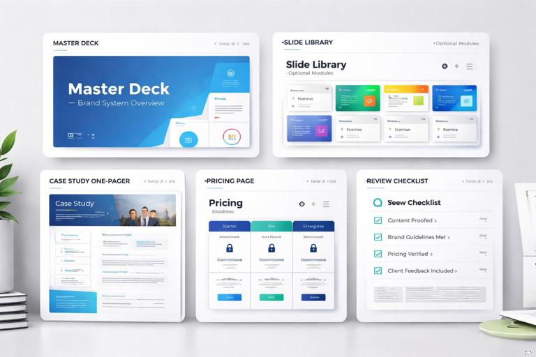
Instead of delivering a single “sales deck template,” deliver a kit that matches how sales actually works:
- Master deck template (core slides)
- Industry-specific slide library (optional modules)
- Case study one-pager template
- Pricing page layout template (with do-not-edit areas)
- Checklist for sales managers to review before sending
This reduces ad-hoc slide creation and keeps messaging and visuals consistent across regions and reps.
Example 2: Campaign rollout kit
For a campaign, teams need coordinated assets across channels. Deliver a campaign kit that includes:
- Social templates (post, story, carousel) with campaign-specific imagery slots
- Email modules (header, feature block, CTA block) aligned to the campaign
- Landing page section layouts (hero, benefits, testimonial)
- Export presets and naming guidance for handoff to media teams
- Campaign-specific checklist (e.g., required tagline, legal line, tracking parameters)
The key is that campaign kits should be assembled from your standard system, not invented as a parallel system. The delivery should feel like a “skin” applied through templates, not a new set of rules.
Common Pitfalls and How to Prevent Them
Pitfall: Too many templates, too little clarity
If users face a wall of options, they will pick randomly or revert to old files. Prevent this by curating “recommended” templates per team and providing a short decision tree.
Pitfall: Templates that look right but don’t work with real content
Templates often fail when content is longer, data is messier, or images are inconsistent. Stress-test templates with worst-case content: long headlines, multi-line labels, low-contrast photos, dense tables. Update layouts to handle reality.
Pitfall: Rollout announced before support exists
Adoption will stall if early users hit blockers and receive no help. Ensure office hours, an intake path, and a clear owner are in place before go-live.
Pitfall: Checklists treated as optional
If checklists are optional, they won’t be used. Make them part of the workflow: attach them to review steps, require a “preflight completed” checkbox in tickets, or include them in template files as a final slide/page.