Why “valid randomization” is not enough
Even when an experiment is randomized and the assignment mechanism is correct, results can still be misleading because the world around the experiment is messy. Users influence each other, behavior changes simply because something is new, and the data you rely on can be incomplete or wrong. These issues often create effects that look like real treatment impact but are actually artifacts of interference, novelty, or measurement failures.
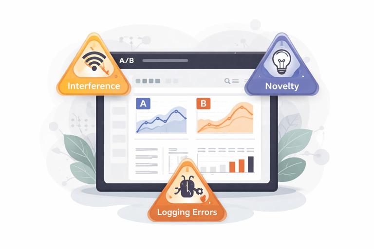
This chapter focuses on three common pitfalls that can invalidate conclusions or inflate/deflate estimated impact: (1) interference (spillovers and network effects), (2) novelty effects (temporary behavior changes), and (3) logging errors (instrumentation and data pipeline problems). For each, you’ll learn what it is, how to detect it, and practical steps to mitigate it.
Interference: when one unit’s treatment affects another unit’s outcome
What interference is (and why it breaks standard analysis)
Many experiments assume that each unit’s outcome depends only on its own treatment assignment. Interference violates that assumption: the treatment assigned to one user, store, driver, or device changes the outcomes of others. This can happen through social influence, shared resources, marketplace dynamics, or operational constraints.
Interference creates two major problems:
- Contamination: Control units are indirectly exposed to the treatment, shrinking the measured difference between groups.
- Spillover amplification: Treated units cause additional effects on others, so the measured effect may include indirect effects you did not intend to attribute to the treatment.
Interference is common in products with sharing, communication, ranking, inventory, capacity limits, or any “two-sided” interaction (buyers/sellers, riders/drivers, advertisers/users).
- Listen to the audio with the screen off.
- Earn a certificate upon completion.
- Over 5000 courses for you to explore!

Download the app
Common patterns of interference
- Social spillovers: A new sharing feature shown to treated users increases invites/messages to control users, changing their engagement.
- Marketplace equilibrium effects: A pricing change for treated riders shifts driver supply, affecting wait times for control riders.
- Resource constraints: A faster checkout for treated users increases load on fulfillment, delaying shipments for everyone else.
- Ranking and recommendation feedback: Treated users click more, which changes item popularity signals and alters recommendations shown to control users.
- Operational routing: A new dispatch algorithm for treated orders changes routes and delivery times for control orders.
How interference shows up in metrics
Interference often produces “weird” metric patterns:
- Both groups move in the same direction (e.g., control improves too), suggesting contamination or shared environment effects.
- Effects depend on density (e.g., bigger impact in cities with more treated users).
- Nonlinear scaling (e.g., impact grows disproportionately as treatment allocation increases).
- Cross-metric inconsistencies (e.g., conversion rises but revenue per visitor falls due to supply constraints).
Practical step-by-step: diagnosing interference
Step 1: Map plausible pathways of spillover
List how treated units could affect others. Keep it operational: shared inventory, shared queue, shared ranking model, shared customer support capacity, social graph edges, geographic proximity, etc. For each pathway, identify which metrics would be affected and in which direction.
Step 2: Add “exposure” features to your analysis dataset
Instead of only “assigned treatment,” compute measures of how much spillover a unit might receive. Examples:
- Fraction of a user’s friends who are treated
- Share of treated sessions in the same region/time window
- Number of treated sellers a buyer interacted with
- Local treated density within a radius
Then check whether outcomes in control units vary systematically with exposure. If control outcomes increase with treated density, you likely have spillovers.
Step 3: Run a “dose-response” check using allocation ramps
If you can ramp treatment from 0% to 10% to 25% to 50%, plot estimated effects versus allocation. Under minimal interference, the per-user effect should be relatively stable. Strong dependence on allocation suggests interference or equilibrium effects.
Step 4: Look for cross-unit correlations that shouldn’t exist
For example, if the treatment is assigned at user level, outcomes of users in the same household, company, or region may become correlated due to shared exposure. Compare intra-cluster correlations between treated and control clusters. A jump can indicate interference.
Mitigation strategies for interference
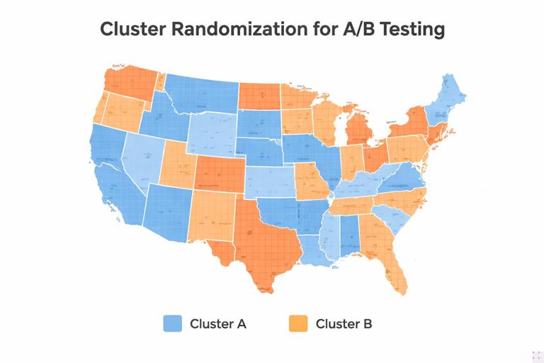
1) Cluster randomization (randomize groups, not individuals)
When spillovers occur within natural clusters (households, classrooms, stores, regions, teams), randomize at the cluster level so that interference stays mostly within clusters rather than across treatment/control. This reduces contamination but typically increases variance because you have fewer independent units.
Implementation tips:
- Choose clusters that match the spillover mechanism (e.g., geography for local supply constraints; social communities for social influence).
- Check cluster sizes; very large clusters can reduce power.
- Use analysis methods appropriate for clustered assignment (e.g., cluster-robust standard errors).
2) Two-stage or saturation designs (vary treatment intensity by cluster)
When you expect spillovers and want to measure them, assign clusters to different “saturation” levels (e.g., 0%, 25%, 50%, 75% treated within cluster). This allows you to estimate both direct effects (on treated units) and indirect effects (on untreated units in partially treated clusters).
Practical steps:
- Define clusters where spillovers are likely contained.
- Randomly assign clusters to saturation levels.
- Within each cluster, randomly treat the specified fraction.
- Estimate outcomes for treated and untreated units as a function of saturation.
3) Holdout markets / geo experiments
For strong marketplace or capacity interference, randomize by geography (cities, DMAs, regions) to isolate equilibrium effects. This is common for pricing, logistics, and ad spend changes. The trade-off is fewer units and higher sensitivity to regional shocks, so you need careful monitoring and sometimes longer durations.
4) Design “firebreaks” to reduce spillovers
Sometimes you can reduce interference by design:
- Prevent treated users from sharing treated-only content with control users (or measure and account for it).
- Use separate inventory pools or queues for treated vs control (when feasible).
- Freeze ranking models during the experiment to avoid feedback loops from treated behavior.
5) Interpret the estimand correctly: direct vs total effect
With interference, you must be explicit about what you are estimating. Are you trying to measure the effect of turning the feature on for one user while others remain unchanged (direct effect), or the effect of rolling it out broadly (total effect including spillovers)? Many business decisions care about the total rollout effect, which may be larger or smaller than the direct effect. Your design should match that decision.
Novelty effects: when behavior changes because something is new
What novelty effects are
A novelty effect is a temporary change in behavior caused by the newness of a treatment rather than its sustained value. Users may explore a new UI, click more out of curiosity, or temporarily change habits. Alternatively, a new experience can initially confuse users, depressing metrics until they adapt. In both cases, short experiments can misestimate long-run impact.
Novelty effects are especially common for:
- Major UI redesigns
- New notification strategies
- New onboarding flows
- Pricing presentation changes
- New recommendation surfaces
How novelty effects show up in data
- Early spike then decay: Engagement jumps in week 1, then trends back toward baseline.
- Early dip then recovery: Conversion drops initially, then improves as users learn.
- Heterogeneous timing: New users respond differently than existing users; heavy users adapt faster.
- Session-level inflation: More clicks per session without corresponding downstream value (e.g., purchases, retention).
Practical step-by-step: measuring and controlling novelty
Step 1: Predefine a “learning window” and a “measurement window”
Before launching, decide whether you will exclude an initial adaptation period from the primary analysis. For example, you might treat the first 3 days as learning and measure outcomes from day 4 onward. This is not always appropriate, but predefining it prevents cherry-picking.
Step 2: Use time-sliced analysis rather than a single average
Compute treatment effects by day (or week) to see dynamics. A single average can hide a spike-and-decay pattern.
For each day d in experiment window: effect_d = mean(Y | T=1, day=d) - mean(Y | T=0, day=d)Plot effect_d over time. If the curve trends toward zero or changes sign, novelty is likely.
Step 3: Segment by user tenure and exposure count
Novelty is often about first exposures. Create segments like:
- New vs existing users
- First 1–2 sessions after assignment vs later sessions
- Low-frequency vs high-frequency users
If the effect is concentrated in early exposures, it may not persist.
Step 4: Track leading indicators of habituation
Depending on the product, habituation might show up as:
- Declining interaction rate with the new element
- Stabilizing task completion time
- Reduced help-center visits after initial increase
These indicators help interpret whether the effect is “wearing off” or “users are learning.”
Step 5: Extend duration or use re-randomization cautiously
Longer experiments help separate novelty from sustained impact, but they increase exposure to seasonality and external changes. If you consider re-randomizing users (switching assignments midstream), be careful: it can introduce carryover effects where prior exposure influences later behavior. If carryover is likely, avoid cross-over designs and prefer longer parallel runs.
Mitigation strategies for novelty effects
1) Ramp gradually and monitor dynamics
Gradual rollout lets you observe whether early effects persist as more users become exposed. Combine ramping with time-sliced analysis to avoid overreacting to day-1 spikes.
2) Use “sticky assignment” and measure cumulative outcomes
Keep users in their assigned variant to observe adaptation. For retention or revenue, cumulative metrics (e.g., 14-day revenue per user) can be more informative than daily snapshots.
3) Consider “experienced-user” analysis as a secondary view
Define an “experienced” cohort (e.g., users with at least N exposures) and analyze outcomes after that threshold. Use this as supportive evidence, not as a replacement for the primary analysis, because it can change the population being compared.
4) Align decision timing with expected stabilization
If the business decision is a long-term rollout, avoid deciding based on the first few days of data for a major UX change. Pre-plan a minimum runtime that covers at least one full usage cycle (e.g., weekly behavior for consumer apps, monthly cycles for billing products).
Logging errors: when the data lies
What logging errors are
Logging errors occur when the experiment’s data collection is incorrect, incomplete, delayed, duplicated, or inconsistently defined across variants. This includes instrumentation bugs, event schema changes, client/server mismatches, attribution problems, and pipeline failures. Logging errors can create false treatment effects or mask real ones.
Unlike interference and novelty, logging errors are not “behavioral.” They are measurement problems, and they can invalidate the experiment even if the product change is harmless.
Common logging failure modes
- Missing events in one variant: A new UI forgets to fire “purchase_completed,” making conversion look worse.
- Double-counting: A retry mechanism logs the same event twice for treated users.
- Changed definitions: Treatment changes the meaning of a metric (e.g., “session” boundaries differ).
- Attribution drift: Orders are attributed to the wrong session or user due to identity stitching issues.
- Latency and backfill: Events arrive late; early reads show artificial drops.
- Sample ratio mismatch due to logging: Assignment is correct, but exposure logging is broken, so “seen treatment” is undercounted.
Practical step-by-step: a logging validation checklist
Step 1: Validate assignment counts and sample ratio early
Within the first hours/day, verify that the number of assigned units matches expectations and that the split is close to the intended allocation. If you see a large imbalance, investigate before trusting any metric movement.
Also check that assignment is stable: the same user should not flip variants across sessions unless that is explicitly intended.
Step 2: Validate exposure and eligibility
Many experiments require users to be eligible and exposed (they actually see the feature). Logging errors often happen here. Compare:
- Assigned users vs eligible users
- Eligible users vs exposed users
- Exposed users vs users with downstream events
Large unexpected drop-offs can indicate instrumentation gaps.
Step 3: Run invariant and “should-not-move” metric checks
Create a set of metrics that should not be affected by the treatment (or should be extremely stable), such as:
- Client app version distribution
- Country/region mix
- Browser/OS distribution
- Baseline account age distribution
- Events unrelated to the feature (e.g., profile view if testing checkout)
If these shift materially between variants, it may indicate logging differences, filtering bugs, or assignment/eligibility issues.
Step 4: Compare client-side and server-side sources
For key outcomes like purchases, compare client events with server-of-record data. If the treated variant shows fewer client purchase events but the server shows no change, you likely have a client logging bug. If server data changes but client does not, you may have attribution or pipeline issues.
Step 5: Audit event schemas and versioning
Confirm that both variants emit the same event names and properties with consistent types. Common issues include:
- Renamed fields in one variant
- Null values due to missing context
- Different units (ms vs s) or currency formatting
Use automated schema validation where possible, and ensure dashboards are robust to missing fields.
Step 6: Reconcile totals across independent aggregations
Compute the same metric in two ways (e.g., event-based conversion vs order-table conversion). Differences that appear only in one variant are a red flag.
conversion_event = purchasers_from_events / visitors_from_events
conversion_db    = purchasers_from_orders / visitors_from_sessions
If conversion_event differs sharply from conversion_db only for treatment, investigate logging.
Step 7: Check for delayed events and backfill behavior
Plot event arrival time distributions by variant. If treated events arrive later (e.g., due to heavier payloads or network calls), early dashboards can show artificial drops. Decide whether to use event-time rather than ingestion-time for analysis, and ensure backfills are handled consistently.
Mitigation strategies for logging errors
1) Instrumentation tests before launch
Use automated end-to-end tests that simulate user flows and assert that required events fire with correct properties. Include both variants in test coverage. For critical experiments, run a small internal dogfood test and manually inspect raw logs.
2) Guardrail dashboards for data quality
Maintain a standard “experiment health” dashboard that includes:
- Assignment counts and split
- Exposure rates
- Event volume by type
- Missing/NULL property rates
- Latency distributions
Make the experiment decision contingent on passing these checks.
3) Prefer server-of-record for primary business outcomes
For revenue, orders, refunds, and subscriptions, rely on authoritative backend tables when possible. Client events can be useful for diagnosing funnels, but they are more prone to loss and duplication.
4) Define metrics in a variant-invariant way
Ensure that the treatment does not change the definition of the metric. For example, if a UI change alters what counts as a “session,” use a sessionization method independent of the UI, or measure outcomes per user per day instead.
5) Handle bots, retries, and deduplication explicitly
Implement idempotency keys for events that can be retried. Deduplicate based on stable identifiers (order_id, event_id). Apply bot filtering consistently across variants.
Putting it together: a practical triage playbook when results look suspicious
Symptom: Control improves almost as much as treatment
- Check interference: treated density vs control outcomes; exposure features; allocation ramp behavior.
- Check logging: are control users accidentally receiving treated UI but logged as control exposure?
Symptom: Huge effect on clicks, no effect on purchases
- Check novelty: time-sliced effects; early exposure concentration.
- Check logging: click event changed or duplicated; purchase event missing in one variant.
Symptom: Effect flips sign after a few days
- Check novelty/adaptation: day-by-day effect curve; segment by tenure.
- Check delayed events: ingestion-time vs event-time; backfill differences.
Symptom: Sample ratio mismatch or sudden drops in event volume
- Check instrumentation and pipeline: assignment stability; exposure logging; schema changes; client crash rates.
- Pause or roll back if key outcome logging is compromised.
Symptom: Strong regional differences
- Check interference via geography: capacity constraints, marketplace effects.
- Check regional logging differences: app versions, network conditions, local payment methods.