What you are building in this capstone
This capstone walks through building an “Operations Control Center” workbook end to end: a single Excel file that pulls operational signals from multiple sources, normalizes them, calculates a small set of trusted KPIs, and presents an action-oriented dashboard plus a daily workflow for triage. The goal is not to create the biggest dashboard; it is to create a control center that reliably answers: (1) What is happening now? (2) What needs attention today? (3) What is likely to break next if we do nothing?
To keep the build practical, the workbook will include four layers: (a) ingestion and normalization (Power Query), (b) a curated model layer (clean tables that act as the “truth”), (c) metrics and rules (calculations and thresholds), and (d) presentation and workflow (dashboard + an exceptions queue). You will also implement a refresh-and-review routine so the workbook behaves like a lightweight operational system.
Target outcomes and scope
By the end, your workbook will support these operational use cases:
Daily status: order backlog, on-time performance, open tickets, inventory risk, and capacity utilization.
Exception triage: a prioritized list of items that violate thresholds (late orders, stockouts, overdue maintenance, SLA breaches).
Continue in our app.- Listen to the audio with the screen off.
- Earn a certificate upon completion.
- Over 5000 courses for you to explore!

Download the app
Drill-down: click from a KPI to the underlying records with consistent filters (site, product family, customer tier, work center).
Refresh discipline: one refresh action updates all sources, and a “data freshness” indicator confirms what time the data represents.
Assume you have these data sources (adapt names to your environment):
Orders export (CSV daily): OrderID, Customer, Site, SKU, Qty, DueDate, ShipDate, Status.
Inventory snapshot (CSV daily): Site, SKU, OnHand, OnOrder, SafetyStock, LastCountDate.
Work orders / maintenance log (Excel weekly): AssetID, Site, WorkType, OpenDate, DueDate, CloseDate, Priority, Status.
Tickets / customer issues (API export or CSV): TicketID, Customer, OpenDate, SLAHours, CloseDate, Category, Status.
Capacity plan (Excel maintained): Site, WorkCenter, Date, AvailableHours.
Step 1: Create the workbook skeleton and navigation
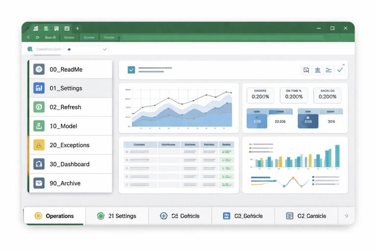
Create a new workbook and add these sheets (names matter because you will reference them in queries and visuals):
00_ReadMe (purpose, refresh steps, contacts)
01_Settings (thresholds, parameters, mappings)
02_Refresh (refresh buttons, data freshness, refresh log)
10_Model (loaded tables only; no manual edits)
20_Exceptions (exception queue and triage views)
30_Dashboard (KPIs, trends, slicers)
90_Archive (optional: snapshots or exported summaries)
On 00_ReadMe, add a short “How to use” section: refresh, check freshness, review exceptions, then review dashboard. Keep it operational: the workbook should guide behavior.
Step 2: Build Settings as the control plane
The 01_Settings sheet is where you centralize parameters that change over time without rewriting formulas or queries. Create these tables (as Excel Tables):
tblThresholds: MetricName, Site (optional), GreenMax, AmberMax, RedMin (or similar), Notes.
tblCalendar: Date, Week, Month, Quarter, IsWorkday, FiscalPeriod (if needed). If you already have a calendar approach, reuse it; here you only need a clean date spine for joins and trends.
tblMappings: MappingType, SourceValue, StandardValue. Use this for site codes, status normalization, category rollups.
tblParameters: Parameter, Value. Examples: DataFolderPath, DefaultSite, SLAWarningHours, LateGraceDays.
Design principle for the capstone: anything that might change monthly should be a setting, not hard-coded inside a query step or a chart.
Step 3: Ingest sources with Power Query and standardize fields
Create Power Query queries for each source. The key capstone skill is not “how to clean” (already covered), but how to enforce a consistent schema across sources so downstream measures are stable.
3.1 Orders query (qryOrders)
In Power Query: import the Orders CSV (or folder of daily exports). Apply these standardizations:
Ensure data types: OrderID text, Qty whole number, DueDate date, ShipDate date (nullable).
Normalize Status values using tblMappings (e.g., “Shipped”, “Complete”, “Closed” → “Closed”).
Create derived columns needed for operations: IsLate (DueDate < Today and not closed), DaysLate, IsOpen.
Add a AsOfDate column (the file date or refresh date) so you can trend snapshots.
Load the final table to the Data Model (recommended) and optionally to 10_Model as a table named tblOrders.
3.2 Inventory query (qryInventory)
Import daily inventory snapshots. Standardize:
Types: OnHand/OnOrder/SafetyStock as numbers.
Map Site and SKU formats (trim, uppercase, remove leading zeros if required).
Create ProjectedAvailable = OnHand + OnOrder - SafetyStock (or your definition).
Create RiskFlag categories (e.g., “Stockout”, “BelowSafety”, “OK”) based on ProjectedAvailable.
Add AsOfDate.
Load as tblInventory.
3.3 Maintenance / work orders query (qryWorkOrders)
Import the maintenance log workbook. Standardize:
Types: dates, Priority as text or number.
Normalize Status (Open/In Progress/Closed).
Create IsOverdue (DueDate < Today and not closed), DaysOverdue.
Add AsOfDate.
Load as tblWorkOrders.
3.4 Tickets query (qryTickets)
Import tickets. Standardize:
Compute AgeHours (Now - OpenDate), IsSLABreached (AgeHours > SLAHours and not closed).
Normalize Category to a small set using mappings.
Add AsOfDate.
Load as tblTickets.
3.5 Capacity plan query (qryCapacity)
Import the capacity plan. Standardize:
Types: Date, AvailableHours number.
Ensure Site and WorkCenter match the same naming used elsewhere.
Add AsOfDate if you version capacity plans; otherwise keep it as a forward-looking table.
Load as tblCapacity.
Step 4: Create a curated model layer (relationships and conformed dimensions)
In the Data Model (Power Pivot), create conformed dimensions so all facts slice consistently. Even if you do not build full DAX measures, relationships reduce fragile lookups and make PivotTables more reliable.
4.1 Build dimensions
Create these dimension tables (either in Power Query or as Excel tables loaded to the model):
dimDate from tblCalendar (Date as key).
dimSite: distinct list of sites from all sources (Orders, Inventory, WorkOrders, Tickets, Capacity).
dimSKU: distinct SKUs from Orders and Inventory (optional if SKU-level analysis is needed).
dimCustomer: distinct customers from Orders and Tickets (optional).
Relate each fact table to dimDate (using DueDate, OpenDate, AsOfDate depending on the analysis) and to dimSite. If you cannot relate multiple date fields cleanly, keep one primary relationship (e.g., AsOfDate) and use separate PivotTables for different date perspectives (due date vs snapshot date). The key is consistency and avoiding ambiguous relationships.
4.2 Define “grain” explicitly
Write down the grain of each table in 00_ReadMe (one row per order line, one row per SKU-site snapshot, one row per ticket, etc.). This prevents accidental double counting when building KPIs.
Step 5: Build KPI tables that are stable and auditable
Instead of embedding complex logic inside charts, create a small set of KPI summary tables that can be inspected. You can produce these summaries using PivotTables (from the model) or Power Query aggregation queries. Choose one approach and keep it consistent.
5.1 KPI summary: daily operational KPIs
Create a table (or PivotTable) called tblKPI_Daily with columns:
Date (AsOfDate)
Site
OpenOrders
LateOrders
OnTimeRate
StockoutSKUs
BelowSafetySKUs
OpenWorkOrders
OverdueWorkOrders
OpenTickets
SLABreaches
Implementation options:
PivotTable approach: Build separate PivotTables for each domain (Orders, Inventory, WorkOrders, Tickets) and then combine them into a single KPI view with consistent slicers (Site, Date). This is often fastest.
Power Query aggregation approach: Create aggregation queries (e.g., qryOrders_KPI) grouped by AsOfDate and Site, then merge them into one KPI table. This is more “pipeline-like” and reduces worksheet formulas.
Whichever you choose, ensure each KPI can be traced back to a source table and filter definition.
5.2 KPI thresholds: join to settings
Use tblThresholds to classify KPI status (Green/Amber/Red). The important capstone pattern is that thresholds are data-driven. For example, “LateOrders” might be Red if > 25 for Site A but Red if > 10 for Site B.
Create a small table tblKPI_Status with columns: Date, Site, MetricName, MetricValue, StatusColor, ThresholdUsed. This table becomes the backbone for conditional formatting and the exception queue.
Step 6: Build the Exceptions Queue (the operational heart)
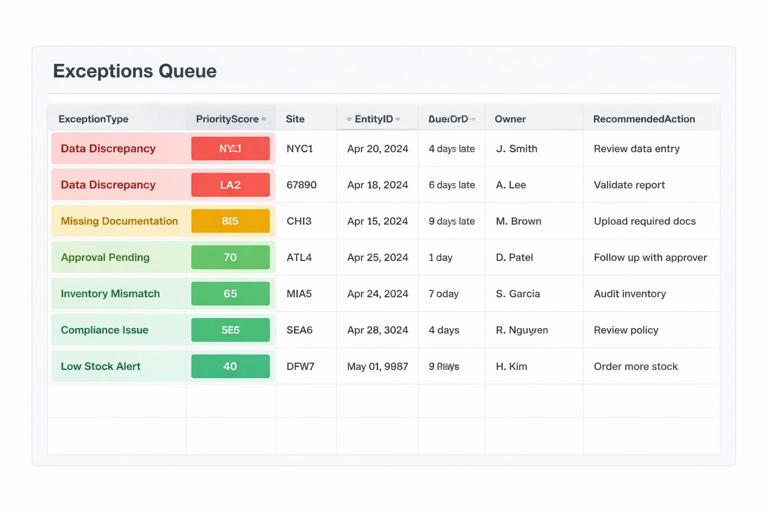
Dashboards show aggregates; operations teams need a prioritized list of what to do next. Build 20_Exceptions as a queue that merges exceptions from all domains into one standardized format.
6.1 Define a standard exception schema
Create a table structure (in Power Query is ideal) with these columns:
ExceptionType (LateOrder, Stockout, OverdueWO, SLABreach)
PriorityScore (numeric for sorting)
Site
EntityID (OrderID, SKU, WorkOrderID, TicketID)
EntityDetail (SKU + description, customer, asset name, etc.)
DueDate or TargetDate
AgeOrDaysLate
Owner (optional; can be mapped)
RecommendedAction (short text)
SourceTable and AsOfDate
Then create four Power Query queries that each output this schema and append them into one query qryExceptions_All.
6.2 Example: scoring logic for prioritization
Use a simple scoring model that operations can understand. For example:
Late orders: PriorityScore = DaysLate * 10 + (if CustomerTier = “A” then 50 else 0) + QtyWeight.
Stockouts: PriorityScore = 100 + (if SKU is critical then 50 else 0) + BackorderCountWeight.
Overdue maintenance: PriorityScore = DaysOverdue * 5 + PriorityWeight.
SLA breaches: PriorityScore = 200 + (AgeHours - SLAHours).
Keep the weights in tblParameters so you can tune them without rewriting queries.
6.3 Triage workflow columns (human-in-the-loop)
On 20_Exceptions, add a small manual table adjacent to the loaded exceptions called tblTriage with columns: EntityID, ExceptionType, TriageStatus (New/In Progress/Blocked/Done), AssignedTo, Notes, LastUpdated. The key is to keep manual edits separate from query-loaded data.
Then create a merged view (via formulas or Power Query merge) that brings triage fields onto the exception list. This turns the workbook into a lightweight work queue without corrupting the raw exception feed.
Step 7: Build the Dashboard as a control panel, not a report
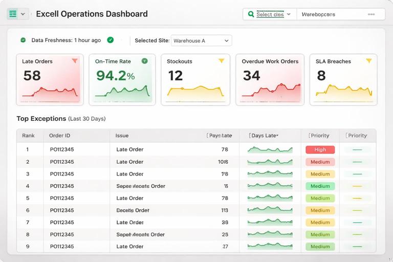
On 30_Dashboard, design for fast scanning and drill-down. Use a consistent layout:
Top row: Data freshness, selected Site, selected date range.
KPI tiles: Late Orders, On-Time Rate, Stockouts, Overdue WOs, SLA Breaches.
Trends: last 14/30 days for each KPI (small multiples or a combined chart).
Exception preview: top 10 exceptions by PriorityScore with a link to the full queue.
Implementation notes:
Use slicers for Site and Date (or AsOfDate). Ensure slicers control all PivotTables consistently (Report Connections).
Prefer a small number of visuals that directly map to decisions. If a chart does not change an action, remove it.
Use the KPI status table to drive tile coloring so the same threshold logic applies everywhere.
Step 8: Add “data freshness” and refresh logging
Operations users need confidence that the numbers are current. On 02_Refresh, create:
Freshness card: show the maximum AsOfDate per source (Orders, Inventory, WorkOrders, Tickets) and the workbook refresh timestamp.
Refresh checklist: a short list: (1) Click Refresh All, (2) Confirm freshness is today, (3) Review exceptions, (4) Export daily summary if required.
Refresh log: a table where each refresh appends a row with timestamp, user, and whether freshness checks passed.
To implement the refresh log, you can use a simple VBA macro or Office Script if your environment allows it; if not, keep it manual: a button-like cell users update. The key is the operational habit: refresh is a tracked event, not an invisible action.
Step 9: Build drill-through paths from KPIs to records
A control center must answer “what is driving this KPI?” without hunting through sheets. Implement drill-through in one of these ways:
PivotTable drill-down: double-click a PivotTable value to extract the underlying records to a new sheet (good for ad hoc investigation).
Prebuilt detail views: create dedicated detail tables on 20_Exceptions or a 25_Details sheet: Late Orders Detail, Stockout Detail, Overdue Work Orders Detail, SLA Breach Detail. Each view is filtered by slicers (Site, date) and sorted by severity.
For prebuilt views, ensure each detail table includes the minimum fields needed to act: identifier, site, due date, age/late, owner, and a short “next step” column.
Step 10: Add operational safeguards specific to this capstone
This build is end-to-end, so add safeguards that prevent common control-center failures:
10.1 Prevent silent schema drift
When a CSV export changes a column name or type, dashboards can quietly break. Add a “schema check” query per source that validates required columns exist. If your environment supports it, surface a clear error message in a “Data Health” table on 02_Refresh.
10.2 Separate “snapshot” vs “transaction” logic
Inventory and KPI tables are often snapshots; orders and tickets may be transactional. Keep AsOfDate explicit and avoid mixing “current state” and “historical state” in the same visual unless you are intentionally trending snapshots.
10.3 Lock down what should not be edited
Protect sheets that contain model tables and queries (10_Model, parts of 30_Dashboard). Leave only the triage table and settings tables editable. This reduces accidental overwrites.
Step 11: End-to-end build checklist (do this in order)
Use this checklist to execute the capstone efficiently:
1) Create sheets and add Settings tables (thresholds, mappings, parameters, calendar).
2) Build Power Query ingestion for each source and load to the Data Model.
3) Create dimensions (Date, Site, etc.) and relationships.
4) Create KPI summaries (either PivotTables or aggregated queries) and validate counts against source tables.
5) Create KPI status table by joining KPI values to thresholds.
6) Build exception queries per domain, append into a unified queue, and add PriorityScore.
7) Add triage table and merge triage fields into the exception view.
8) Build dashboard with slicers, KPI tiles, trends, and top exceptions preview.
9) Build refresh page with freshness indicators and a refresh log.
10) Test scenarios: missing file, empty extract, new site code, late data, and confirm the workbook surfaces issues rather than hiding them.
Practical example: turning raw signals into a daily operating rhythm
Here is a concrete way to use the finished workbook each morning:
Step A: Refresh on 02_Refresh. Confirm Orders and Inventory AsOfDate are today; if not, escalate to the data owner.
Step B: Exceptions first on 20_Exceptions. Sort by PriorityScore descending. Filter Site to your responsibility. Assign top items and mark TriageStatus.
Step C: Dashboard scan on 30_Dashboard. If Late Orders is red, open the Late Orders detail view and identify the top customers/SKUs driving it.
Step D: Capacity check. If backlog is rising while capacity is flat, review the next 7 days AvailableHours by work center and flag constraints.
Step E: Capture decisions in Notes fields in tblTriage (what you did, who owns it, next checkpoint).
This rhythm is what makes the workbook a “control center”: it connects refreshed data, prioritized exceptions, and accountable follow-up in one place.
Testing and validation: prove the workbook is trustworthy
Before handing off, run validation tests that mimic real operational failures:
Missing source file: remove or rename the latest Orders CSV and refresh. Confirm the refresh page clearly shows stale data and the dashboard does not silently present old numbers as current.
Schema change: rename a column in a copy of the Inventory file and refresh. Confirm your schema check flags it.
Outlier values: set OnHand negative or DueDate far in the future in a test file. Confirm exceptions and KPI logic behave predictably.
Cross-table consistency: pick one Site and manually reconcile: OpenOrders count equals the number of rows in Orders where IsOpen = true for that site and AsOfDate.
Performance: refresh time and dashboard responsiveness with realistic row counts. If slow, reduce loaded columns, aggregate earlier, and avoid volatile worksheet functions in large ranges.
Deliverables to include in the final workbook
When you finish, ensure the workbook contains these deliverables (all inside the file):
Settings tables with clear labels and notes for each threshold and mapping.
Model tables loaded from Power Query with consistent naming.
KPI summary that can be audited (not just charts).
Unified exception queue with prioritization and triage fields.
Dashboard with slicers and a top exceptions preview.
Refresh page with data freshness indicators and a refresh log.