What “Vertical-First” Really Means
Vertical-first thinking is the practice of designing every creative decision for a phone held upright, viewed at close distance, and consumed in fast, interruption-heavy contexts. It is not “take a horizontal video and crop it.” It is a planning mindset: you choose framing, blocking, text placement, pacing, and visual hierarchy assuming a tall canvas, limited attention, and a viewer who can swipe away at any moment.
On mobile, the screen is not just a display; it is the environment. The viewer’s thumb, notifications, glare, and one-handed viewing all influence what they notice. Vertical-first content treats the 9:16 frame as the native stage: subjects are sized for legibility, actions are staged along the vertical axis, and important information is placed where UI overlays and thumbs are less likely to cover it.
Core differences from “repurposed vertical”
- Native vertical: The shot is composed for height. The subject fills the frame appropriately, and the background is chosen for depth and clarity.
- Repurposed crop: The shot is composed for width. Cropping often cuts off hands, props, or context, and forces awkward headroom or cramped framing.
- Vertical-first planning: You pre-visualize where the viewer’s eyes will go in a tall frame, and you design the scene so the story reads even if the viewer watches without sound.
The Mobile Viewing Reality You Must Design For
1) The screen is small, the viewing distance is short
Small screens compress detail. Fine textures, subtle facial expressions, and small props can disappear. Vertical-first design responds by making the primary subject larger, simplifying the background, and using bolder motion cues. If a key detail is smaller than a fingertip on screen, assume many viewers will miss it.
2) Attention is fragile and constantly interrupted
Mobile viewing happens between tasks. People watch while walking, waiting, or multitasking. Your visuals must communicate quickly and redundantly: show the key object, show the action, and show the result. If the story requires careful observation of tiny changes, it will underperform unless you magnify or re-stage those changes.
3) UI overlays steal real estate
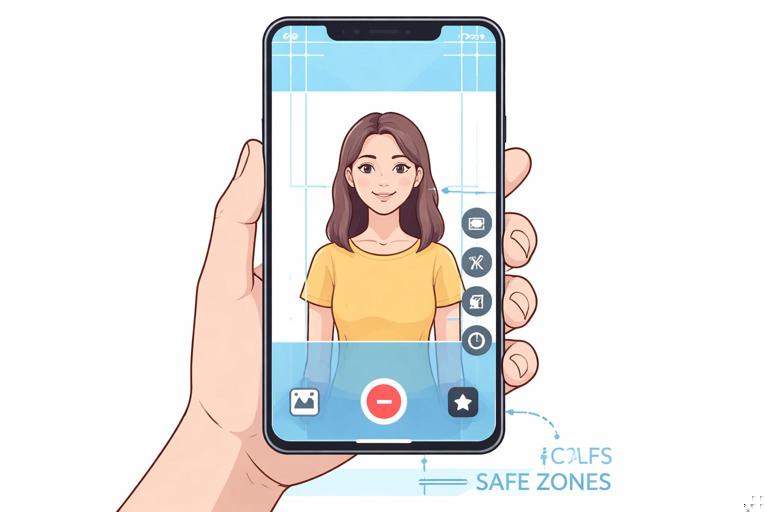
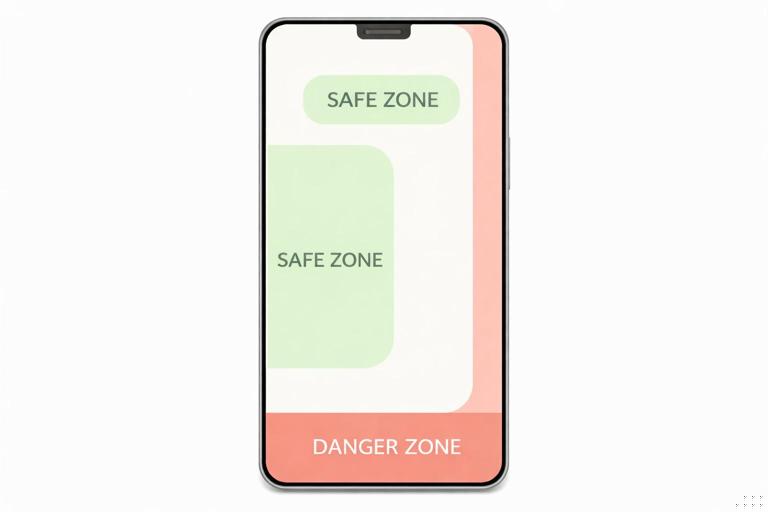
Most vertical platforms place interface elements along the right side and bottom. Vertical-first thinking means you keep critical visuals away from those zones. Even if you do not know the exact UI layout, you can assume the lower third and right edge are “high risk.”
- Listen to the audio with the screen off.
- Earn a certificate upon completion.
- Over 5000 courses for you to explore!

Download the app
4) One-handed viewing changes where eyes rest
Many viewers hold the phone in one hand and scroll with a thumb. Their gaze often sits near the center, not the corners. Vertical-first composition emphasizes a strong central subject and uses supporting elements to guide the eye up and down the frame.
Vertical Composition: Building a Tall Frame That Reads Instantly
Use the vertical axis as your storyboard
In a tall frame, you can stack information: face at the top, hands and object in the middle, result at the bottom. This is powerful for demonstrations, reactions, and transformations. Instead of cutting constantly, you can show multiple story components simultaneously.
Example: A cooking short can frame the creator’s face in the upper third (emotion and narration), the cutting board in the middle (action), and the plated result briefly lifted into the lower third (payoff). The viewer understands the scene at a glance.

Choose one primary subject per moment
Vertical frames can become cluttered because creators try to fit too much in. A practical rule: in any given beat, there should be one obvious “hero” element. If you need two, make one dominant and one supporting. If both are equal size, the viewer’s eyes bounce and comprehension slows.
Control headroom and handroom
Vertical video often fails when hands leave the frame during demonstrations or when heads are cramped against the top edge. Plan for movement: if you talk with your hands, frame wider vertically so gestures stay visible. If you lean forward, leave safe headroom. The goal is not “perfect portrait photography,” but stable readability during motion.
Background discipline
Busy backgrounds compete with your subject. On mobile, that competition is harsher because the viewer cannot comfortably scan the whole frame. Choose backgrounds with simple shapes and limited contrast. If you cannot change the location, change the angle: rotate your body, shift the camera, or move the subject away from clutter to create separation.
Framing Templates You Can Reuse
Template A: Face + Hands (talking + doing)
Use when you explain while demonstrating. Place the face in the upper third, hands and object in the middle. Keep the object large enough to identify instantly. This template works for tutorials, product demos, crafts, and repairs.
Template B: Full-body action lane
Use when movement is the story (dance, sports, physical comedy). Center the body with extra space above and below for jumps, kicks, or props. Avoid placing the subject too low; feet can be cut off by UI and by viewers’ natural center gaze.
Template C: Object hero close-up
Use when the object is the main character (food, gadgets, art). Fill the frame with the object and use hands as supporting actors. If you need your face, bring it in briefly as a reaction shot rather than keeping it small in the corner.
Template D: Two-layer depth (foreground action, background context)
Use when context matters (before/after, environment reveals). Put the action in the foreground and keep the background clean but informative. Depth helps the viewer understand scale and location without extra explanation.
Step-by-Step: Planning a Vertical-First Shoot
Step 1: Define the “one-screen summary”
Before you shoot, write a single sentence describing what the viewer should understand within the first second of seeing the frame. This is not your hook line; it is your visual clarity target.
- Good: “A person is about to remove a stain from a white shirt.”
- Weak: “A person is talking about laundry tips.”
The good version implies a visible object (shirt), a problem (stain), and an action (remove). That is vertical-first because it can be staged visually.
Step 2: Choose the framing template
Pick one of the reusable templates (Face + Hands, Full-body lane, Object hero, Two-layer depth). This prevents random framing and ensures the story components fit the tall canvas.
Step 3: Block the action vertically
Decide where each story element lives in the frame: top, middle, bottom. Then rehearse the action while watching the screen preview. If hands leave frame, adjust camera height or step back. If the object looks small, move the camera closer rather than zooming digitally.
Step 4: Establish “safe zones” for critical visuals
Assume the bottom portion and right edge may be covered by UI. Keep the most important object and any must-read visual cues near the center-left or center. If you use on-screen text, place it in the upper-middle or center-left area and avoid the bottom edge.
Step 5: Light for faces and objects, not the room
Mobile cameras compress dynamic range. If the background is bright and the subject is darker, the subject loses. Prioritize lighting the subject: face, hands, and hero object. A simple approach is to face a window or use a single soft light source slightly above eye level. Check the preview for blown highlights on shiny objects.
Step 6: Shoot “insurance” angles designed for vertical edits
Even if you plan a single-take style, capture a few extra vertical-friendly shots: a close-up of the object, a reaction shot, and a result shot. These are your rescue clips if the main take has a confusing moment.
Designing Motion for Vertical Retention
Use motion to guide the eye up and down
In vertical video, upward and downward motion reads strongly because it matches the frame’s dominant direction. Use this intentionally: lift the object into frame for reveals, slide before/after elements vertically, or move the camera slightly down to show the result.
Example: A cleaning demo can start with the dirty surface centered, then the camera tilts down to reveal the cleaned area. The motion itself becomes a visual “proof.”
Keep the subject anchored
Excessive camera shake or constant reframing makes viewers work too hard. Vertical-first shooting favors stable anchors: a face that stays near the same position, an object that remains centered, or a consistent horizon line. If you move, move with purpose (reveal, follow, emphasize), not because you are searching for the shot.
Scale changes beat subtle changes
Small differences are hard to perceive on mobile. If the story depends on noticing a change, make it bigger: zoom with your feet (move closer), bring the object toward the lens, or cut to a close-up. Vertical-first thinking asks: “Can a viewer understand this change on a small screen in half a second?”
Text and Graphics: Vertical-First Without Overcrowding
Text is a visual prop, not a transcript
On-screen text should support comprehension, not duplicate every word. Use it to label the problem, name the key step, or highlight the result. If you place too much text, it shrinks, and small text is effectively invisible on many phones.
Practical text rules for mobile legibility
- One idea per line: Break phrases into short lines so they can be large.
- High contrast: Light text on dark backing or dark text on light backing; avoid mid-tone on mid-tone.
- Keep it off the bottom edge: UI and thumbs often cover it.
- Time it to the action: Put the label on screen when the viewer needs it, then remove it.
Use “visual redundancy” instead of more text
If a step is important, show it clearly rather than explaining it with extra words. For example, instead of adding a long caption about “use a small amount,” show the amount in a spoon next to the object, held close to the lens for scale.
Audio Considerations That Affect Visual Design
Many viewers watch with low volume or muted audio. Vertical-first thinking treats visuals as the primary channel and audio as reinforcement. This changes how you shoot: you must show the key object, show the key action, and show the outcome in a way that stands alone.
Practical check: Watch your rough cut with the sound off. If you cannot understand what is happening, you need clearer staging, closer framing, or better on-screen labels.
Common Vertical-First Mistakes (and Fixes)
Mistake: The subject is too small
Symptom: The viewer sees a person in a room, but cannot identify what they are doing.
Fix: Move the camera closer, simplify the background, and let the hero object fill more of the frame. If the object is the story, prioritize it over the face.
Mistake: Cropping cuts off the important action
Symptom: Hands leave the frame, props are partially visible, or the payoff happens off-screen.
Fix: Re-block the action for vertical: rehearse with preview, adjust camera height, and leave space where motion will go.
Mistake: Too many competing elements
Symptom: Multiple objects, text blocks, and background details fight for attention.
Fix: Remove or hide non-essential items. Use one label at a time. Choose a single hero element per beat.
Mistake: The background is brighter than the subject
Symptom: The subject looks dark or flat; the viewer’s eyes drift to windows or lights.
Fix: Turn the subject toward the light source, close curtains behind, or change angle so the brightest area is not in frame.
Practical Exercises to Build Vertical-First Instincts
Exercise 1: The “center clarity” test
Record a 5-second clip of your subject doing the main action. Then crop your view mentally to the center area only (imagine the edges are hidden). Ask: does the story still read? If not, your key information is too close to the edges or too small.
Exercise 2: Three distances, same action
Film the same action in three framings: wide, medium, close. Compare which one communicates fastest without audio. Most creators discover that the close framing wins on mobile because it reduces search time for the viewer.
Exercise 3: Vertical stacking
Create a shot where the top shows your face, the middle shows the action, and the bottom shows the result (even briefly). This trains you to use the tall frame as a multi-layer storytelling space rather than a narrow crop.
Mini Case Studies: Translating Ideas into Vertical-First Shots
Case 1: Product demonstration
Goal: Show a gadget solving a problem.
- Vertical-first setup: Object hero close-up. Hands enter from the sides, not from below where UI may cover them.
- Blocking: Problem state centered, action in the middle, result lifted toward the camera for emphasis.
- Insurance shots: Close-up of the key mechanism, reaction shot, clear result shot.
Case 2: Quick makeover or transformation
Goal: Show before/after clearly.
- Vertical-first setup: Full-body lane or face-centered portrait, depending on transformation type.
- Blocking: Keep the subject in the same position for before and after so the change is obvious.
- Visual clarity: Match lighting and background between states to avoid confusing “change” caused by environment rather than transformation.
Case 3: Educational micro-demo (hands-on)
Goal: Teach a small skill in seconds.
- Vertical-first setup: Face + Hands template.
- Blocking: Hands and object occupy the center; face stays upper third for trust and guidance.
- Legibility: Use a plain surface under the object so edges and motion are easy to see.
Vertical-First Checklist You Can Use Before Recording
- Can a viewer understand the topic from the first frame without audio?
- Is the hero subject large enough to identify instantly?
- Are hands, props, and payoff actions safely inside the frame during movement?
- Is the background simpler and darker/less contrasty than the subject?
- Are critical visuals away from the bottom edge and right side?
- Does the shot use the vertical axis (stacking) when helpful?
- Do you have at least one close-up and one clear result shot as insurance?