Why mobile composition is different (and why it breaks otherwise “good” shots)
Mobile composition is not just “cinema, but taller.” A vertical frame changes how viewers scan the image, how quickly they understand spatial relationships, and how much of the screen is vulnerable to interface overlays. On a phone, the viewer’s attention is narrower and more centered; peripheral details are easier to miss, and small framing mistakes become obvious because the subject often occupies a larger percentage of the screen.
Three practical implications drive most design decisions:
- Attention is center-weighted: viewers tend to lock onto the middle third of the screen first, especially in fast-scrolling contexts.
- Headroom and footroom behave differently: too much empty space above a subject reads as “wasted” faster in vertical; too little space can feel cramped because faces are often closer.
- UI overlays steal real estate: captions, buttons, and progress bars can cover important visual information unless you design for safe zones.
Composition, framing, and safe-zone design work together: composition decides what matters, framing decides where it sits, and safe zones ensure it remains visible across platforms and devices.
Core composition tools adapted for vertical
Rule of thirds (use it, but bias toward the center)
The rule of thirds still works, but vertical video often benefits from a stronger center bias. If you place a face on the left third, you may lose it to UI elements on some apps or to cropping in reposts. A practical approach is to treat the center column as your “primary clarity zone” and the left/right thirds as “supporting context.”
Example: A creator explaining a recipe holds a bowl. Place the creator’s face near the upper-center intersection (not far left), and keep the bowl in the lower-center. Background ingredients can live in the side thirds.
- Listen to the audio with the screen off.
- Earn a certificate upon completion.
- Over 5000 courses for you to explore!

Download the app
Leading lines and vertical pathways
Vertical frames naturally emphasize up-down movement. Use leading lines that guide the eye vertically: door frames, shelves, stair rails, window edges, or even a person’s arm pointing downward to an object. This helps retention because the viewer’s gaze has a clear path and doesn’t wander.
Practical check: If you squint and the image becomes a few big shapes, do those shapes form a clear “route” from the subject’s face to the key object or action?
Layering for depth (foreground, subject, background)
Because vertical frames can feel “flat” when the background is close, layering becomes important. Add a foreground element (a plant, a door edge, a blurred object) to create depth and to frame the subject without needing wide horizontal space.
- Foreground: soft blur at the bottom edge (e.g., table corner, product box)
- Subject: face/hands in sharp focus
- Background: simplified, lower contrast, fewer competing lines
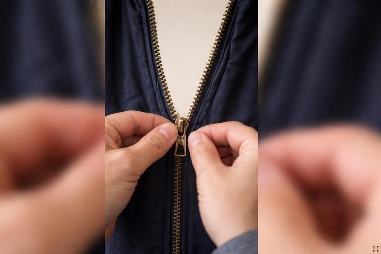
Example: In a tutorial about fixing a zipper, shoot through the hanging jacket (foreground), with hands and zipper centered (subject), and a plain wall behind (background).
Negative space (use it intentionally, not accidentally)
Negative space is valuable in vertical because it can host captions and UI without covering the subject. The key is to decide where negative space will live before you shoot.
Good negative space: a clean wall above the subject’s head where captions can sit.
Bad negative space: random empty ceiling that makes the subject look small and forces captions to overlap the face.
Framing decisions that boost clarity and retention
Choose a “hero” framing per beat
Instead of one framing for the whole short, plan a small set of framings that match the story beats. Each beat should have a “hero” subject: face, hands, product, screen, or environment. Vertical video rewards decisive framing because it reduces cognitive load.
- Beat 1 (hook): face close-up or object extreme close-up
- Beat 2 (context): medium shot showing hands + object
- Beat 3 (proof/result): close-up of result, then reaction
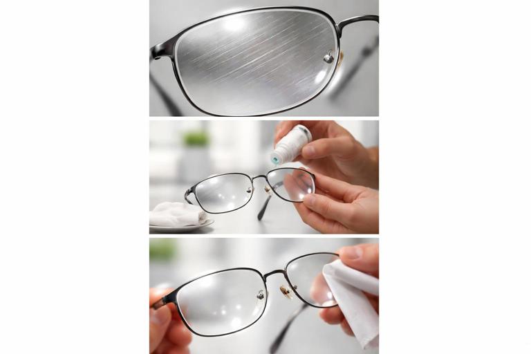
Example: “Remove scratches from glasses.” Hook: extreme close-up of scratched lens. Context: medium shot of hands applying solution. Proof: close-up of clear lens with light reflection.
Close-ups are your default, but not your only tool
Phones are small screens. If the viewer must interpret tiny details, you lose them. Close-ups make the action legible. But if everything is a close-up, the viewer can feel disoriented. Use a simple ratio: most shots close, a few medium for orientation.
- Close-up: emotion, detail, proof
- Medium: hands + object relationship
- Wide (rare): location reveal or scale, used briefly
Practical tip: If the key information is “what changed,” shoot the “before” and “after” at the same focal length and distance so the comparison reads instantly.
Headroom and chinroom (micro-adjustments matter)
In vertical, faces often sit higher in frame to leave room for hands and objects below. The risk is too much headroom, which makes the face feel distant. Aim for a tight but comfortable margin above the head, and ensure the chin is not cramped by captions or UI.
Quick guideline: If you plan captions at the bottom, raise the subject slightly and keep the lower third clear of critical facial features (mouth and chin) so speech remains readable even if captions overlap.
Nose room and look space (especially for talking heads)
If a subject looks to the side, give space in the direction of their gaze. In vertical, this space is limited, so you must be deliberate. Too little look space feels claustrophobic; too much wastes area needed for captions or product.
Example: A presenter looks toward a product held on the right. Place the presenter slightly left of center, product right of center, leaving a small buffer between product and frame edge.
Safe-zone design: making sure nothing important gets covered
What “safe zones” mean in mobile shorts
Safe zones are areas of the frame that remain visible and unobstructed by app interfaces, captions, stickers, or cropping when the video is reposted. Even if you don’t add on-screen text, platforms often add UI elements that cover edges and corners.
Think of safe zones as two layers:
- Visibility safe zone: where critical visuals (faces, hands, product labels) must remain.
- Text safe zone: where you place your own captions so they don’t collide with UI.
Because different apps place UI differently, you’re designing for “most likely overlays,” not a single perfect layout.
Practical safe-zone rules you can apply without memorizing platform specs
- Keep critical content away from the extreme bottom: bottom areas are frequently covered by captions, buttons, and progress bars.
- Keep critical content away from the right edge: many interfaces stack icons on the right side.
- Reserve a clean band for captions: decide in advance whether captions live in the upper third or middle band, then frame accordingly.
- Assume repost cropping: some reposts or previews may crop slightly; avoid placing essential details flush to the edges.
Example: If you’re demonstrating a phone screen, don’t place the screen at the far right edge. Center it or slightly left, and keep the top and bottom margins generous enough that UI won’t cover the key buttons.
Designing for captions as part of composition (not an afterthought)
Captions are not just accessibility; they are a compositional element. If you add captions later without planning, they often cover hands, tools, or facial expressions. Decide your caption strategy before shooting:
- Top captions: good when the bottom must show hands or products; watch for tight headroom.
- Mid captions: good for talking heads with clean backgrounds; risk covering the face if you don’t plan negative space.
- Bottom captions: common, but risky due to UI; use only if you keep the action higher.
Practical approach: Frame the subject so there is a “caption shelf”: a clean, low-detail area where text can sit without reducing clarity. This might be a plain wall, a blurred background, or a deliberate negative space band.
Step-by-step workflow: compose, frame, and safe-zone check before you record
Step 1: Identify the single most important visual per shot
Ask: “If the viewer only glances for half a second, what must they understand?” That answer determines what gets the safest, clearest placement.
- For a tutorial: the hands and the object interaction
- For a reaction: the face and eyes
- For a reveal: the result object
Step 2: Choose your caption placement for the whole segment
Pick one caption zone for a segment (e.g., first 10 seconds) to avoid constant re-framing. Consistency reduces viewer effort.
Decision shortcut: If your hands are the star, captions go top. If your face is the star, captions go bottom or mid with careful spacing.
Step 3: Block the subject into a “safe rectangle”
Imagine an inner rectangle that avoids the outer edges. Place the subject’s face, hands, and key objects inside it. You can do this practically by turning on grid lines in your camera app and treating the center area as protected.
On set action: Hold your phone as if you’re recording, then move the subject slightly inward until no key detail touches the edges.
Step 4: Check edge clutter and competing highlights
Edges in vertical frames are closer to the subject, so clutter competes more aggressively. Scan the border of the frame for bright windows, reflective objects, or high-contrast patterns.
- Remove or cover bright distractions
- Shift angle to hide clutter behind the subject
- Use a darker background to keep attention on the subject
Step 5: Do a “UI simulation” test
Before recording the real take, record a 3-second test clip and play it back in a way that approximates platform viewing. If possible, add a temporary caption sticker and see what it covers. The goal is to catch problems early: a mouth covered by captions, a product label hidden by icons, or hands disappearing behind the bottom overlay.
Step 6: Lock exposure and focus for stability
Composition fails if exposure pumps or focus hunts, because the viewer’s attention is pulled away. Once you have your framing, lock focus on the subject and lock exposure so the brightness doesn’t shift when hands move.
Practical note: If the key action moves toward the camera (e.g., showing a small item), consider focusing slightly forward of the face so the object remains sharp when it enters the foreground.
Common vertical framing patterns (with use cases)
Pattern 1: Centered talking head with caption shelf
Use when: you’re explaining something quickly and clarity matters more than cinematic style.
- Face centered, eyes in upper-middle
- Background clean and low detail
- Captions placed either top or mid, not covering mouth
Example setup: Stand 1–2 meters from a plain wall. Frame from mid-chest to just above head. Leave a clean band above the head for top captions or keep the lower third clear for bottom captions.
Pattern 2: Hands-and-object “workbench” frame
Use when: the action is manual (craft, cooking, repair).
- Camera angled down slightly
- Hands centered, object slightly below center
- Face optional; if included, keep it in upper third
Safe-zone note: Keep the object higher than you think so bottom UI doesn’t cover the critical moment (e.g., the exact cut, click, or reveal).
Pattern 3: Over-the-shoulder demonstration
Use when: you need to show a screen, a notebook, or a device while keeping a human presence.
- Shoulder/side of head as a framing element
- Main object centered
- Negative space reserved for captions
Example: Showing a phone setting change. Place the phone in the center, slightly tilted to avoid glare, with your shoulder creating a soft frame on the left edge.

Pattern 4: Split-level composition (face top, proof bottom)
Use when: you want simultaneous emotion and evidence.
- Face in upper half (reaction/explanation)
- Result or object in lower half (proof)
- Captions placed in the middle band if background allows
Example: Skincare demo: face top, product texture on hand bottom. Ensure the bottom object stays above the UI-heavy zone.
Framing for movement: keeping subjects inside the safe zone
Anticipate motion paths
In vertical, small movements can push hands or props into UI zones. Plan the motion path: where the hands start, where they end, and where the key moment happens.
Practical step-by-step:
- Mark the “key moment” position (e.g., where the object will be held for the reveal).
- Frame so that position sits in the center safe area.
- Rehearse the movement once while watching the screen.
- Adjust framing so the key moment never drops into the bottom overlay region.
Use “hold points” for comprehension
Retention improves when the viewer gets a brief pause to process. Design a hold point: a 0.5–1.0 second moment where the object is held steady in the clearest part of the frame.
Example: After tightening a screw, hold the tool still and tilt slightly so the viewer can see the final alignment, then continue.
Practical troubleshooting: fix composition problems fast
Problem: The subject looks small and the frame feels empty
- Move the camera closer instead of zooming digitally
- Reduce headroom; bring eyes higher but not near the top edge
- Simplify the background to make the subject pop
Problem: Captions cover the most important action
- Move the action higher in frame (raise hands/object)
- Switch captions to top for that segment
- Create negative space by stepping away from the background and using blur
Problem: Product labels or small details are unreadable
- Use a close-up “insert” shot dedicated to the label/detail
- Angle the object to reduce glare and improve contrast
- Hold the object steady in the center safe zone for a beat
Problem: The right side icons cover key visuals
- Re-center the subject and keep key objects away from the right edge
- Flip the composition: place supporting elements on the right, hero elements center-left
- Avoid placing text or critical graphics near the right margin
Mini shot-plans (composition + safe zones) you can copy
Shot-plan A: “One tip” talking head with on-screen example
- Shot 1 (hook): close-up face centered; captions top; keep mouth clear
- Shot 2 (example): over-the-shoulder showing object/screen centered; captions top
- Shot 3 (proof): close-up of result centered; no captions or minimal top caption
Shot-plan B: Hands tutorial with reaction
- Shot 1: hands + object centered; captions top; keep bottom clear
- Shot 2: split-level: face top, hands bottom; captions mid if background allows
- Shot 3: result close-up held steady in center safe zone
Shot-plan C: Before/after transformation
- Shot 1 (before): match framing you will use for after; subject centered
- Shot 2 (process): medium shot with hands; captions top
- Shot 3 (after): same framing as before; hold for comparison; keep edges clean for repost cropping