What “on-brand” text means in CapCut
On-brand text is a repeatable system: the same fonts, sizes, colors, spacing, and placement show up the same way in every video. In CapCut, you build this system using Text layers (titles, lower thirds, labels), text styling controls (font, weight, stroke, shadow, background), and templates/presets you can reuse across clips and projects.
Think in three roles that cover most edits:
- Intro hook text: 1 short line that grabs attention in the first 1–2 seconds.
- Section header: a consistent “chapter marker” for topic changes.
- Lower third: name/title or context label that sits low and stays readable.
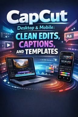
CapCut text tools you’ll use (Desktop & Mobile)
Core text layer types
- Add Text / Default text: the most flexible starting point for custom branding.
- Text templates: prebuilt animated layouts; useful as a base if you customize them.
- Background/shape: a fill or rounded rectangle behind text for contrast.
Styling controls that define your “system”
- Font + weight: choose 1–2 fonts max (e.g., one for headlines, one for labels).
- Size + line spacing: consistent hierarchy (hook > header > lower third).
- Color: primary text color + one accent color.
- Stroke/outline: improves readability on busy footage.
- Shadow: subtle separation; avoid heavy blur that looks cheap.
- Background shape: solid or semi-transparent; rounded corners often feel modern.
- Position + safe margins: consistent placement so it doesn’t jump around.
- Animation: simple in/out motion (fade, slide) that repeats consistently.
Build a simple title system (three reusable styles)
You’ll create three styles: Hook, Section Header, and Lower Third. The goal is not “fancy,” it’s repeatable.
Step 1 — Choose a baseline brand spec (quick checklist)
Before touching CapCut, decide these basics:
- Fonts: Headline font + UI/label font (or one font with two weights).
- Colors: Text (usually white), Accent (brand color), Background (black at 40–70% opacity or solid).
- Corner radius: pick one rounded value and reuse it.
- Animation style: one simple entrance and exit for all titles.
Example spec you can copy:
- Listen to the audio with the screen off.
- Earn a certificate upon completion.
- Over 5000 courses for you to explore!

Download the app
- Headline: Bold sans font, white
- Accent: teal highlight bar
- Outline: 4–6 px black stroke (or shadow if you prefer)
- Background: black 55% opacity, rounded corners
- Animation: 8–12 frame slide-in + fade, 8–12 frame fade-out
Step 2 — Create Style A: Intro Hook Text
Purpose: one punchy line that’s readable instantly.
Build it:
- Add a text layer and type a short hook (3–6 words). Example: “Stop doing this in edits”.
- Set font to your headline font and choose a bold weight.
- Increase size until it’s readable at arm’s length on a phone.
- Add stroke (outline) or a subtle shadow for separation.
- Add a background shape only if the footage is busy. Keep padding generous so letters don’t touch edges.
- Place it in the upper third or center (avoid covering faces).
- Add a simple in animation (slide/fade). Keep it under ~0.3 seconds so it feels snappy.
Practical rule: if you need two lines, shorten the words first before shrinking the font.
Step 3 — Create Style B: Section Header
Purpose: consistent “chapter marker” that can repeat 3–10 times in a video.
Build it:
- Duplicate your hook text layer (this preserves your brand choices).
- Reduce the size to a medium headline.
- Change the copy to a label format, e.g., “Step 2: Lighting” or “Mistake #1”.
- Make the background shape more compact (less padding than the hook).
- Move placement to a consistent corner (top-left is common) and keep the same margin every time.
- Use the same animation style as the hook, but slightly slower if needed for clarity.
Step 4 — Create Style C: Lower Third
Purpose: names, roles, locations, or context without distracting from the subject.
Build it:
- Add a new text layer (or duplicate the section header).
- Set size smaller than the header, but still readable on mobile.
- Use two lines max: Name (bold) and Title (regular). Example: “Amina Lee” / “Product Designer”.
- Add a background bar or rounded rectangle with 50–70% opacity for contrast.
- Place it in the lower left or lower right, above any UI overlays (keep a safe margin).
- Keep animation subtle: fade in/out or a short slide.
Tip: If your video includes on-screen buttons or app UI, raise the lower third slightly so it never collides with those elements.
Save and reuse styles quickly (so you don’t restyle every time)
Method 1 — Duplicate and replace text (fastest inside a project)
- Build one perfect version of each style (Hook/Header/Lower Third).
- Duplicate the text layer whenever you need it again.
- Only change the words; keep everything else identical.
This is the most reliable way to preserve spacing, background padding, and placement.
Method 2 — Copy/Paste attributes (when you already typed new text)
If you already created a new text layer but want it to match your style:
- Select the “correct” styled text layer.
- Copy it.
- Select the target text layer and paste/apply styling/attributes (CapCut provides a way to paste style/attributes depending on platform/version).
- Verify: font, size, stroke/shadow, background, and animation are all applied.
Workflow tip: Use this for fixing inconsistencies late in the edit—apply the same style to multiple text layers in a row.
Method 3 — Save as a reusable template/preset (best across projects)
To reuse your text system in future projects, turn each style into a reusable item:
- Create the text layer with final styling and animation.
- Save it as a template/preset (feature naming can vary by device/version).
- Name it clearly:
BRAND_Hook,BRAND_Header,BRAND_LowerThird. - Store them in a dedicated folder/collection if available.
Quality check before saving: confirm the layer is not tied to a specific clip’s timing or position that won’t generalize (e.g., avoid positioning that only works for one shot with a face in that corner).
Designing text for vertical video (9:16) without clutter
Make it readable in one glance
- Large sizes: vertical video is watched on phones; err bigger than you think.
- High contrast: white text + dark background shape is the safest default.
- Minimal words: aim for 3–7 words for hooks and headers.
- Strong hierarchy: one dominant line; secondary info smaller.
Use safe margins and consistent placement
- Keep text away from extreme edges; phones crop and UI overlays vary.
- Pick fixed anchor zones: hook (center/upper), header (top-left), lower third (bottom-left).
- Don’t let titles jump positions between cuts unless it’s a deliberate design choice.
Background shapes: padding and spacing that look professional
Most “cheap-looking” titles fail on spacing. Use these practical targets:
- Padding: enough that letters never touch the shape edge (especially descenders like g, y, p).
- Line spacing: slightly tighter for headlines, slightly looser for two-line lower thirds.
- Corner radius: consistent across all shapes (don’t mix sharp and rounded).
Using templates responsibly (avoid the generic look)
CapCut templates can save time, but they can also make your video look like everyone else’s. The fix is to treat templates as structure, not final design.
What to customize every time
- Fonts: swap to your brand fonts (or closest available).
- Colors: replace template colors with your brand palette (text + accent + background).
- Spacing: adjust padding and line spacing so it matches your system.
- Animation speed: shorten overly bouncy animations; keep motion consistent.
- Placement: align to your chosen anchor zones.
What to avoid
- Overly complex kinetic typography for informational content.
- Multiple fonts in one title card.
- Neon glows and heavy shadows that reduce legibility.
- Random template switching (each new look breaks brand consistency).
Mini-project: Build a reusable 3-style text pack and apply it to a short edit
Project goal
Create three reusable text styles (Hook, Header, Lower Third), save them for reuse, then apply them across a 20–30 second sequence with consistent placement and timing.
Assets you need
- 3–6 clips for a short sequence (any topic).
- Your brand choices: 1–2 fonts, 2–3 colors.
- Three lines of text content prepared in advance.
Step-by-step build
- Create Style A (Hook): Add hook text to the first 1–2 seconds. Make it large, high contrast, minimal words. Add simple in/out animation.
- Save Style A: Save as preset/template (or keep a “master” layer to duplicate). Name it
BRAND_Hook. - Create Style B (Header): Duplicate the hook, resize and reposition to your header anchor zone. Use label formatting (e.g., “Step 1”).
- Save Style B: Name it
BRAND_Header. - Create Style C (Lower Third): Duplicate the header, move to lower area, set two-line name/title formatting, add background bar if needed.
- Save Style C: Name it
BRAND_LowerThird. - Apply across the edit:
- Hook: use once at the start.
- Headers: add at each topic change (e.g., clip 2 and clip 4).
- Lower third: add when a person is introduced or context changes.
- Batch consistency check: Scrub through and verify: identical margins, consistent font weights, same corner radius, same animation timing, and no overlap with important visual elements.
Self-check rubric (quick pass/fail)
| Item | Pass criteria |
|---|---|
| Readability | All text readable on a phone-sized preview without squinting |
| Consistency | Same fonts/colors/spacing across all instances |
| Placement | Text stays in fixed zones; no accidental jumping |
| Template use | If a template was used, fonts/colors/spacing were customized to match the system |
| Speed | Animations feel intentional and not distracting |