Why “Small-Speaker Translation” Is a Different Target
Most vertical shorts are heard through phone speakers, cheap earbuds, or laptop speakers in noisy places. That playback chain has two defining traits: limited bass response and limited headroom. In practice, this means low frequencies (sub-bass and much of the bass) disappear, while midrange content (roughly the “speech band”) dominates. If your sound design relies on deep hits, wide stereo ambience, or subtle low-level textures, the audience may not perceive the intent at all.
“Sound design that reads on small speakers” is the craft of making the story’s audio cues unmistakable when played quietly, in mono, and in imperfect environments. The goal is not “loud”; the goal is “legible.” Legible audio has clear hierarchy (what matters is always on top), clear timing (cues land exactly when the viewer needs them), and clear frequency placement (important elements live where small speakers can reproduce them).

The three translation constraints to design for
- Bandwidth constraint: phone speakers often roll off heavily below ~150–200 Hz. Anything whose identity depends on low end will lose impact.
- Dynamic constraint: viewers listen at low volume. Large dynamic swings (quiet-to-loud) can make quiet moments unintelligible.
- Spatial constraint: many phones sum to near-mono, and viewers may cover a speaker grille. Wide stereo tricks can collapse or vanish.
Designing for these constraints changes your priorities: you build impact with midrange definition, you control dynamics aggressively, and you use stereo as a bonus—not as the only carrier of meaning.
Core Principle: Audio Hierarchy (Voice, Story Cues, Texture)
High-retention shorts usually have a single “primary” audio element at any moment. Most often it’s voice (spoken dialogue or voiceover). Everything else should either support comprehension or support emotion, but never compete for intelligibility.
A practical hierarchy model
- Tier 1: Intelligibility (voice, key dialogue, critical on-screen sound like a timer beep that changes the situation)
- Tier 2: Meaningful cues (whoosh for a reveal, impact for a cut, UI click for an action, door slam for a decision)
- Tier 3: Texture (room tone, ambience, subtle risers, music bed)
On small speakers, Tier 3 is the first thing to disappear. So you design Tier 2 to be recognizable even without bass and without stereo width, and you protect Tier 1 with EQ and dynamics.
- Listen to the audio with the screen off.
- Earn a certificate upon completion.
- Over 5000 courses for you to explore!

Download the app
Frequency Strategy: Build “Impact” Without Bass
When bass is missing, impact has to come from transient clarity and midrange harmonics. Instead of trying to force low end, you create the illusion of weight by emphasizing frequencies that small speakers can reproduce.
Where intelligibility and “readability” live
- Voice clarity: often 2–5 kHz carries consonants and articulation. Too much can sound harsh; too little becomes muffled.
- Presence and definition: 1–3 kHz helps many effects read (clicks, taps, cloth movement, small impacts).
- Perceived brightness: 6–10 kHz adds air and detail, but can exaggerate hiss and sibilance.
Design trick: add harmonics to low sounds
If you have a low thump (a drop, a punch, a heavy object), duplicate the sound and process the duplicate to generate harmonics that sit in the midrange. This makes the “thump” audible on small speakers.
Example chain for a “phone-readable thump” layer:
- Duplicate the thump audio.
- High-pass the duplicate around 120–200 Hz (remove the inaudible low end).
- Add saturation or distortion lightly to create harmonics.
- Boost a narrow band around 1–2.5 kHz if needed for definition.
- Blend under the original until the thump is recognizable even at low volume.
This approach preserves the cinematic feel on good speakers while ensuring the event still “reads” on tiny ones.
Dynamic Strategy: Make Quiet Moments Understandable
Small-speaker listening often happens in noisy environments. If your mix has big dynamic range, the viewer will miss information and swipe away. The solution is controlled dynamics: consistent loudness for voice, and effects that pop without spiking painfully.
Practical targets (not strict rules)
- Voice consistency: aim for a stable perceived level across lines, even if the actor’s performance varies.
- Effects peaks: keep them impactful but not so loud they force the viewer to lower volume.
- Music bed: supportive and steady; it should not mask consonants.
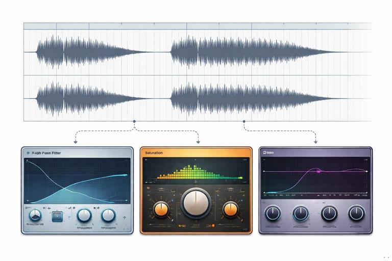
Step-by-step: a simple “shorts-ready” voice chain
This is a general workflow you can adapt in any editor or DAW:
- 1) Clean: remove obvious clicks, bumps, and long silences. Add short fades to avoid pops.
- 2) High-pass filter: roll off rumble (often 70–120 Hz depending on the voice). This frees headroom.
- 3) Corrective EQ: reduce muddiness (often 200–400 Hz) if the voice sounds boxy; reduce harshness (often 3–5 kHz) if it bites.
- 4) Compression: moderate ratio (e.g., 2:1 to 4:1) with a threshold that catches louder words. Use attack/release that preserves natural speech but reduces jumps.
- 5) De-esser: control “s” and “sh” so you can keep presence without pain on small speakers.
- 6) Limiting: a gentle limiter to prevent sudden peaks from clipping when exported.
The point is not to make the voice sound “processed”; it’s to make it consistently understandable at low volume.
Mono Compatibility: Assume Stereo Will Collapse
Many viewers effectively hear mono: one speaker blocked, phone on a table, or platform playback summing channels. If a key sound is panned hard left/right or relies on phase tricks, it may disappear or weaken.
Rules of thumb for mono-safe shorts
- Keep voice centered. If you use stereo widening on voice, check mono to ensure it doesn’t hollow out.
- Keep essential cues near center. You can still add width to non-essential textures.
- Check your mix in mono early. Don’t wait until the end; fix problems while choices are still flexible.
Step-by-step: quick mono check workflow
- 1) Add a mono-sum utility on your master bus (or export a mono reference).
- 2) Listen for disappearing elements: wide ambience, doubled effects, phasey music.
- 3) For any essential element that weakens, reduce stereo width or replace it with a more mono-friendly layer.
Mono checking is not about making everything mono; it’s about ensuring meaning survives when stereo collapses.
Timing and “Audio Punctuation” for Micro-Moments
In short-form, sound design often functions like punctuation. A tiny click can signal a decision; a whoosh can signal a transition; a short riser can signal “pay attention, something changes now.” On small speakers, these cues must be short, mid-forward, and timed precisely.
Designing cues that read instantly
- Short duration: 50–300 ms cues cut through better than long, subtle sweeps.
- Clear transient: a defined attack helps the brain register the event.
- Midrange focus: avoid cues that are mostly sub-bass or ultra-high shimmer.
Example: Instead of a long cinematic whoosh with lots of low end, use a layered whoosh: a short midrange “zip” plus a small airy tail. The “zip” carries the meaning; the tail adds polish.
Layering: Make One Sound Do One Job
On small speakers, complex sounds can blur. Layering helps when each layer has a clear role and occupies a different frequency/time space. The mistake is stacking layers that all fight in the same band.
A practical layering template
- Identity layer: the recognizable core (e.g., a click for a button, a snap for a cut).
- Body layer: gives weight (may be partially lost on phones, but helps on better speakers).
- Presence layer: adds midrange bite so it reads on small speakers.
- Tail layer: short reverb/room tail for realism (keep subtle).
Example: “Object drop” in a kitchen scene
- Identity: a sharp ceramic tick.
- Body: a low thud (kept quiet).
- Presence: a short, slightly distorted midrange knock.
- Tail: tiny room reflection (very short decay).
On a phone, the ceramic tick and midrange knock carry the event. On better speakers, the body layer adds realism.
Music on Small Speakers: Support Without Masking
Music is often the largest continuous sound in a short, which makes it the most likely to mask voice. Small speakers emphasize midrange, and many music tracks are already mid-heavy. If you simply turn music down, it may feel lifeless; if you keep it up, it masks speech. The solution is frequency carving and dynamic control.
Step-by-step: making music “voice-friendly”
- 1) Choose the right arrangement: sparse instrumentation during dense speech is easier than fighting a busy chorus.
- 2) EQ carve the speech band: gently reduce music around 2–5 kHz if it competes with consonants (use small cuts; avoid making music dull).
- 3) High-pass music if needed: remove unnecessary low end that eats headroom (even if phones can’t reproduce it, it can still trigger limiting).
- 4) Sidechain ducking: use a compressor on music keyed by voice so music dips slightly when speech happens.
- 5) Control peaks: a limiter on music bus can prevent sudden hits from competing with key lines.
Sidechain ducking should be subtle: the viewer should feel the voice is clear, not hear the music “pumping.”
Noise, Room Tone, and the “Cheap Speaker Harshness” Problem
Phone speakers can exaggerate certain harsh frequencies, making hiss, air conditioner noise, and sibilance feel louder than expected. Also, aggressive compression can raise background noise between words. The fix is a balance of cleanup and controlled ambience.
Practical cleanup workflow
- 1) Reduce constant noise: use noise reduction carefully; too much creates watery artifacts that are very noticeable on small speakers.
- 2) Gate/expander lightly: reduce noise in pauses without chopping word endings. Use gentle settings and longer releases.
- 3) Add consistent room tone: a low-level room tone bed can hide edits and prevent dead-silent gaps that make noise changes obvious.
- 4) De-ess after compression: compression can bring up “s” sounds; de-essing later often works better.
The goal is not sterile audio; it’s stable audio that doesn’t distract.
Designing “UI” and “Action” Sounds That Stay Audible
Many shorts include on-screen actions: tapping, swiping, typing, opening an app, selecting items, toggling settings, or revealing a before/after. These micro-actions benefit from crisp, readable sounds that confirm the action even if the viewer glances away.
Characteristics of a phone-readable UI sound
- Short and bright: a click with energy around 2–8 kHz.
- Not too loud: it should sit under voice but still be noticeable.
- Consistent set: similar actions should have related sounds (a “sound palette”).
Example palette:
- Tap/select: short click with a tiny high-end tick.
- Confirm/accept: slightly lower click plus a soft chime.
- Error: short buzz with midrange emphasis (not sub-bass).
- Swipe/transition: quick whoosh with a defined transient at the start.
Consistency trains the viewer’s ear. On small speakers, that training matters because subtle differences are harder to perceive.
Reverb and Space: Keep It Tight
Reverb can make audio feel cinematic, but on small speakers it can smear intelligibility and reduce perceived loudness. Use reverb as a hint of space, not a wash.
Guidelines for reverb that doesn’t blur
- Short decay: favor short rooms/plates over long halls.
- Pre-delay: a bit of pre-delay can keep the voice upfront while still adding space.
- High-pass the reverb return: remove low end from reverb to avoid mud.
- Automate by moment: more reverb in non-dialogue moments, less under speech.
If you want a “big moment,” consider using a short slapback or a brief, automated reverb swell on a single word rather than bathing the entire scene.
Step-by-Step: A Small-Speaker Mix Pass for a 30–60s Short
Use this as a repeatable checklist. It assumes you already have voice, music, and effects placed.
1) Set the anchor: voice first
- Solo voice and get it clean and consistent (EQ, compression, de-ess, limiter).
- Listen on phone speakers (or a small mono speaker) at low volume. Adjust until every word is understandable.
2) Add essential cues (Tier 2)
- Bring in key effects that carry meaning (clicks, impacts, transitions).
- For each cue, ask: “If the viewer only hears this on a phone, do they understand what happened?”
- If not, add a presence layer (midrange harmonic layer) or shorten the sound to sharpen the transient.
3) Add music as a controlled bed
- Set music level under voice.
- Apply gentle EQ carving in the speech band if needed.
- Add sidechain ducking keyed to voice for consistent intelligibility.
4) Control the master dynamics
- Use a master limiter to prevent clipping on export.
- Check that effects don’t spike so hard they force the platform’s loudness normalization to turn you down.
5) Translation checks
- Phone speaker check: low volume, device in hand, then device on a table (changes bass and clarity).
- Mono check: ensure essential cues don’t disappear.
- Noisy environment check: play with background noise (fan or street noise) to see if voice still reads.
6) Micro-automation polish
- Automate music down 1–3 dB under dense lines.
- Automate key effects up slightly at the exact frame of action.
- Automate reverb/ambience to avoid masking speech.
This pass is less about “perfect audio engineering” and more about ensuring the story’s audio signals survive real-world playback.
Common Failure Modes (and Fast Fixes)
Failure: The mix sounds fine on headphones but flat on phone speakers
- Cause: impact relies on sub-bass and stereo width.
- Fix: add midrange harmonic layers to impacts; reduce reliance on wide-only elements; check mono.
Failure: Voice is loud but still hard to understand
- Cause: masking from music/effects in the 2–5 kHz range, or too much low-mid mud.
- Fix: carve competing frequencies in music; reduce 200–400 Hz mud on voice; add gentle presence; de-ess to keep it comfortable.
Failure: Everything is loud and tiring
- Cause: over-limiting, constant high-frequency content, no dynamic contrast.
- Fix: reduce limiter intensity; soften harsh bands; create contrast with arrangement and micro-automation rather than constant level.
Failure: Effects feel disconnected or “stock”
- Cause: effects don’t match the scene’s implied space and material.
- Fix: choose effects with the right transient and texture; add a tiny, consistent room reflection; use a cohesive palette for repeated actions.
Practical Examples You Can Apply Immediately
Example 1: A reveal cut that must feel “big” on a phone
- Use a short whoosh with a strong midrange “zip” at the start.
- Layer a tiny click at the exact cut frame to sharpen timing.
- Add a brief, bright impact (not bass-heavy) to signal the reveal.
- Keep the tail under 300–500 ms so it doesn’t smear the next line.
Example 2: A “before/after” transformation with satisfying hits
- For each change, use a consistent impact family (same character, slightly varied pitch).
- Add harmonic presence so each hit reads on small speakers.
- Automate music to dip slightly on each hit, making the hit feel stronger without raising its level.
Example 3: A tutorial-style action sequence (tap, type, confirm)
- Build a UI palette: tap, swipe, confirm, error.
- Keep them short, bright, and centered.
- Use subtle variation (pitch or timbre) to avoid repetition fatigue while staying consistent.
Mini Checklist: “Does It Read on Small Speakers?”
- Can you understand every word at low volume on a phone speaker?
- Do key actions have short, mid-forward cues that are audible without bass?
- Does the mix still work in mono?
- Is music carved/ducked so it never masks consonants?
- Are harsh frequencies controlled (sibilance, hiss, brittle highs)?
- Do effects feel like a cohesive palette rather than random one-offs?