Why Templates and Visual Language Matter in Shorts
In vertical short-form, viewers decide in a fraction of a second whether a video “feels like” something they want to keep watching. Reusable templates and a consistent visual language let you control that feeling. They reduce decision fatigue during production, speed up iteration, and create instant recognition across a feed where everything competes for attention.
A template is a repeatable structure you can drop new content into (layout, typography rules, motion behaviors, color tokens, overlays, export presets). A visual language is the set of consistent design choices that make your videos look like they belong to the same “world” (type hierarchy, spacing, color system, icon style, graphic textures, transitions, and how you treat footage).
Templates are the “how.” Visual language is the “why it looks like you.” When both are aligned, you can publish faster without your videos feeling generic or inconsistent.
What “Consistent Visual Language” Actually Includes
Consistency is not about using the same layout every time. It’s about using the same rules. Your rules should be specific enough to be repeatable, but flexible enough to cover different topics and moods.
1) Typography system (not just a font)
A typography system defines roles and constraints:
- Listen to the audio with the screen off.
- Earn a certificate upon completion.
- Over 5000 courses for you to explore!

Download the app
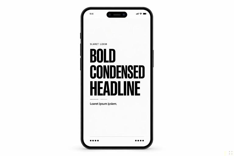
- Type roles: headline, subhead, label, data/number, disclaimer, callout, quote.
- Size relationships: e.g., headline 100%, subhead 70%, label 55%.
- Weight rules: headlines bold, labels medium, disclaimers regular.
- Case rules: headlines in sentence case, labels in ALL CAPS, or vice versa.
- Line length and wrapping: max 2 lines for headline; avoid orphan words; keep key terms on the first line.
Practical example: If your brand voice is “direct and tactical,” your typography might use a bold condensed headline with tight tracking for urgency, paired with a clean sans-serif for supporting labels.
2) Color tokens and contrast rules
Instead of “I like teal,” define tokens:
- Primary: used for key emphasis (one color).
- Secondary: used for supporting highlights (one color).
- Neutral set: white, near-black, gray for backgrounds and text.
- Status colors: optional (green for “do,” red for “don’t,” yellow for “warning”).
Then define contrast rules: text must always be readable over footage. That usually means you need either a background plate, a shadow, a stroke, or a blur panel behind text. Your “rule” might be: “Any text over video must sit on a 40–60% black gradient panel.”

3) Shape language and layout rhythm
Shape language is the set of recurring geometry choices:
- Rounded rectangles vs sharp corners
- Thick strokes vs thin strokes
- Soft shadows vs hard shadows
- Minimal lines vs sticker-like blobs
Layout rhythm is how you place elements consistently:
- Margins: a consistent padding from edges (e.g., 6–8% of frame width).
- Grid: a simple 3-column or 4-row mental grid for alignment.
- Spacing: consistent gaps between headline, label, and supporting text.
Practical example: Your “callout card” might always be a rounded rectangle with a 12px stroke and a subtle drop shadow, anchored in the lower third, aligned left.
4) Motion behavior rules
Motion is part of visual language. Two creators can use the same fonts and colors but feel totally different because of motion choices.
- Entrance style: slide-up, pop-in scale, wipe, or fade.
- Timing: fast snappy (8–12 frames) vs smooth (16–24 frames).
- Easing: linear vs ease-out vs overshoot bounce.
- Emphasis motion: underline draws on, highlight swipes, number ticks up.
Rule example: “Headlines always slide up 12% with ease-out; emphasis highlights always swipe left-to-right; no bounce.”
5) Footage treatment
Footage treatment includes consistent choices in:
- Color grade: warm vs cool, contrast level, saturation.
- Sharpening/noise: crisp digital vs slightly softened.
- Overlays: film grain, subtle texture, light leaks (use sparingly).
- Background blur panels: consistent blur radius and opacity.
Even if your videos vary by location, a consistent grade and overlay approach makes them feel like one series.
Reusable Templates: What to Template (and What Not to)
Template the parts that are repetitive and structural. Avoid templating the parts that should feel specific and human.
Template these elements
- Title card variants: 2–4 options depending on content type.
- Lower-third callouts: name tags, definitions, “Step 1/2/3,” quick labels.
- List layouts: 3-item, 5-item, “Do/Don’t,” “Before/After.”
- Data cards: numbers, timers, checklists, progress bars.
- Quote/testimonial cards: consistent styling for social proof.
- B-roll frames: picture-in-picture, split screen, “zoom window” callouts.
- End-screen utility: consistent “next video” pointer, series label, or follow cue (without relying on long outros).
Do not template these elements too rigidly
- Your actual examples: keep them specific to the topic.
- Your on-camera delivery: avoid turning everything into the same cadence.
- Your visual evidence: screenshots, demos, and proof should be tailored.
The goal is to standardize the container so the content can vary without chaos.
Step-by-Step: Build a “Template Kit” for a Shorts Series
This process creates a reusable kit you can apply across dozens of videos while keeping the feed cohesive.
Step 1: Define your series types (content containers)
Pick 3–5 repeatable formats you’ll publish often. Examples:
- Quick tutorial: “Do X in 3 steps.”
- Myth vs reality: misconception + correction + example.
- Tool breakdown: what it is + when to use + common mistake.
- Case study micro: problem + change + result.
- Checklist: “If you’re doing X, check these.”
Each format gets its own template variant, but all variants share the same visual language rules.
Step 2: Create a style spec you can follow under time pressure
Write a one-page “visual language spec” with concrete decisions. Example structure:
- Fonts: Headline = Font A Bold; Body = Font B Medium.
- Sizes: Headline 90–110; Body 52–64; Labels 44–52 (adjust to your app scale).
- Colors: Primary #____; Secondary #____; Text white; Panels black at 45%.
- Corner radius: 28 for cards; 18 for small tags.
- Stroke: 6px white for emphasis boxes.
- Shadow: soft, 20 blur, 30% opacity.
- Motion: 10–12 frame slide-up for headlines; 6–8 frame pop for tags.
Keep it short enough that you’ll actually use it.
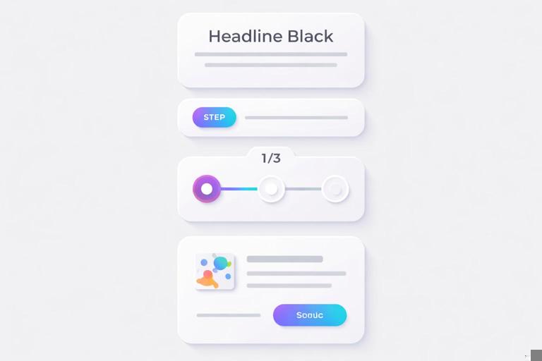
Step 3: Build core components (like LEGO bricks)
Instead of making one “master template” that’s hard to adapt, build components you can combine:
- Headline block: two-line max, with optional highlight bar.
- Step tag: “STEP 1” pill + number style.
- Definition card: term label + meaning + example line.
- Do/Don’t badge: consistent icons and colors.
- Progress indicator: 1/3, 2/3, 3/3 or a simple bar.
Practical example: A “3-step tutorial” template can be assembled from the headline block + step tag + progress indicator + lower-third callout.
Step 4: Create 4 layout presets for common situations
Most shorts need only a few layout patterns. Create presets for:
- On-camera + text: text left, subject right (or vice versa), consistent margins.
- Full-screen text moment: big headline centered with background texture.
- Demo/screen capture: phone frame or crop window + callout arrows.
- B-roll + caption panel: bottom gradient panel with 1–2 lines.
These presets prevent “reinventing the layout” every edit.
Step 5: Standardize transitions and “scene separators”
Pick 1–2 transitions and use them consistently. Also define a scene separator element:
- A quick swipe bar
- A flash of a solid color frame (very brief)
- A card flip
- A simple cut with a consistent sound cue (if you use one)
Scene separators help viewers track structure without you needing to explain it every time.
Step 6: Package your kit for speed
Organize assets so you can build a new short quickly:
- Folder structure: Templates / Components / Icons / Overlays / Grades / Exports.
- Naming: “LT_Callout_Rounded,” “Card_Definition,” “Badge_Do,” “Badge_Dont.”
- Versioning: keep a “Current” folder and an “Archive” folder to avoid confusion.
The goal is to make the “right choice” the easiest choice.
Designing for Recognition Without Looking Repetitive
A consistent visual language should create recognition, but repetition can feel stale if every video looks identical. Use a “fixed + variable” approach.
Fixed elements (always the same)
- Typography roles and hierarchy
- Core colors (primary + neutral)
- Corner radius and card style
- Motion behavior rules
- Placement logic (margins, alignment)
Variable elements (rotate intentionally)
- Accent color of the day: choose from a small palette (3–5 accents).
- Background texture: none vs subtle grain vs soft gradient.
- Icon set variant: outline vs filled (pick one per series, not per video).
- Layout preset: rotate between your 4 presets based on footage type.
Practical example: Your “Quick tutorial” series always uses the same headline style and step tags, but alternates between two accent colors and two layout presets depending on whether it’s on-camera or screen demo.
Template Patterns That Work Especially Well in Vertical Shorts
1) The “Stacked Cards” explainer
Use 2–3 cards that slide in sequentially, each containing one idea. This keeps information chunked and visually organized.
- Card 1: concept name
- Card 2: rule or step
- Card 3: example or common mistake
Template components: card style, card motion, label position, consistent spacing.
2) The “Checklist with progress”
A checklist template with a progress indicator helps viewers feel movement. Each item gets a check animation or highlight swipe.
- Use consistent icon size and alignment.
- Keep each checklist line short (one breath).
- Use the same highlight color for “active item.”
3) The “Before/After split”
Split-screen templates are powerful for showing contrast. Define a consistent split ratio, divider line style, and labels.
- Left label always “BEFORE,” right label always “AFTER.”
- Divider line thickness and color consistent.
- Same zoom level and framing rules for fairness.
4) The “Definition + example” card
For educational shorts, a definition template reduces cognitive load:
- Top: TERM (label)
- Middle: definition (1–2 lines)
- Bottom: example (1 line, prefaced by “Example:”)
This is especially reusable across many topics because the structure stays constant even as content changes.
Quality Control: A Simple Visual Consistency Checklist
Before exporting, run a fast checklist to keep your visual language intact:
- Hierarchy check: Is the most important text the biggest and boldest?
- Contrast check: Can you read every word at arm’s length?
- Alignment check: Are cards and labels aligned to the same margins?
- Color check: Did you use only your defined tokens (no random blues)?
- Motion check: Do entrances follow your timing/easing rules?
- Clutter check: Is there enough negative space around text blocks?
- Consistency check: Do badges, icons, and strokes match across scenes?
If you repeatedly fail one check (for example, contrast), update the template so the fix is automatic (e.g., always add a gradient panel behind text).
Step-by-Step: Turn One Great Video into a Reusable Template
If you already have a short that performed well and looks clean, you can reverse-engineer it into a template kit.
Step 1: Identify what made it “feel like you”
List the repeatable traits:
- Font pairing and sizes
- Card style (rounded, shadow, stroke)
- Accent color usage
- How you highlight key words
- How you label steps or sections
Step 2: Extract components into separate assets
Rebuild the elements as standalone pieces:
- Headline block as its own group
- Step tag as its own group
- Callout arrow style as its own group
- Background panel as its own group
Make sure each component can be swapped without breaking alignment.
Step 3: Normalize spacing and sizes
In the original video, spacing may have been “eyeballed.” For a reusable template, define exact spacing rules:
- Top margin for headline
- Gap between headline and subhead
- Padding inside cards
- Distance from text to edge of panel
This is where templates become faster than manual design.
Step 4: Create 3 variants from the same base
Build variants so you don’t force every idea into one layout:
- Variant A: on-camera with left text column
- Variant B: full-screen card for dense info
- Variant C: demo layout with callout arrows
All three variants should share the same typography, colors, and motion rules.
Step 5: Stress-test with new content
Drop in a different topic and see what breaks:
- Do longer words overflow?
- Do two-line headlines look cramped?
- Do certain footage backgrounds reduce readability?
Fix the template, not the one-off video. For example, if readability fails on bright footage, bake in an automatic gradient panel behind text.
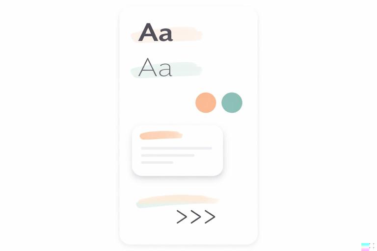
Building a “Brand Library” for Shorts
A brand library is a small set of reusable assets that keeps your output consistent even when you’re moving fast.
Core library items
- Logo/mark usage rules: if you use one at all, define size and placement (and keep it subtle).
- Icon set: 12–20 icons you reuse (check, x, arrow, warning, idea, time, money, camera, phone, etc.).
- Backgrounds: 3–5 subtle gradients or textures.
- Overlays: one grain overlay and one vignette (optional).
- Callout shapes: arrows, circles, underline strokes, highlight swipes.
- Color presets: saved swatches for primary/secondary/neutral.
Practical example: a minimal library that still feels premium
- Two fonts (headline + body)
- One primary accent color + one alternate accent
- One card style (rounded rectangle with soft shadow)
- One highlight style (marker swipe)
- One transition style (quick slide)
This small set is often enough to create a recognizable identity without overwhelming your workflow.
Common Mistakes (and How to Fix Them in the Template)
Mistake: Templates that are too rigid
If every video has the same layout regardless of content, viewers may feel fatigue. Fix: create 3–4 layout presets and rotate them intentionally while keeping the same rules.
Mistake: Inconsistent typography across scenes
Creators often change font sizes or weights to “make it fit.” Fix: define max line counts, create a smaller “headline compact” style, and adjust layout rather than shrinking text randomly.
Mistake: Random colors creeping in
One-off colors break recognition. Fix: lock a palette and create “accent slots” (Accent A, Accent B) so you can vary within boundaries.
Mistake: Over-designed graphics that slow production
If your template requires too many manual tweaks, you won’t use it. Fix: simplify components, reduce layers, and standardize animations.
Mistake: Readability depends on perfect footage
If text only works on dark backgrounds, you’ll struggle in real-world shooting. Fix: bake in a consistent gradient panel, blur plate, or solid card behind text as a default.
Maintaining Consistency Across a Team (or Future You)
If more than one person edits—or if you’re batching content weeks apart—consistency requires documentation and guardrails.
Mini style guide (what to document)
- Typography roles and examples (screenshots of correct usage)
- Color tokens and when to use each
- Layout presets with do/don’t examples
- Motion rules (timing, easing, entrance directions)
- Asset naming conventions
Guardrails that prevent drift
- Locked components: keep core elements grouped so they aren’t accidentally altered.
- Template duplication rule: always start from the template file, never from last week’s export.
- Review pass: one person checks the consistency checklist before publishing.
These systems keep your visual language stable while still allowing creative variation in the content itself.