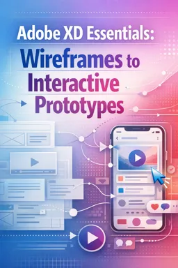
From Static Screens to Clickable Experiences
A wireframe shows what a screen contains; an interactive prototype shows how a user moves between screens. In Adobe XD, interactivity is built in Prototype mode by connecting objects (buttons, cards, icons) to destination artboards and defining triggers (what causes the interaction) and actions (what happens next). A well-structured prototype focuses on a primary user journey, then expands into secondary paths (menus, modals, edge cases) while keeping navigation predictable.
Key terms you will use in Prototype mode
- Artboard: a screen/state in your flow.
- Home artboard: the starting point when the prototype runs.
- Flow: a named, testable path through multiple artboards (useful for sharing and reviewing).
- Trigger: Tap/Click, Drag, Time, Voice (when available).
- Action: Transition, Overlay, Auto-Animate, Previous Artboard, Scroll To, etc.
- Transition: the animation style between screens (Dissolve, Push, Slide, None) and its settings (duration, easing).
- Overlay: a temporary layer on top of the current screen (menus, modals, tooltips) without leaving the underlying artboard.
1) Define a Primary User Journey (Example: Shop Checkout)
Before drawing any wires, decide the minimum set of screens needed to validate the main task. For a simple commerce journey, a practical baseline is:
- Browse (product list)
- Product Detail
- Cart
- Checkout
- Confirmation (optional, but helpful for “end of flow”)
Keep this journey linear first. You can add branches (filters, search, account, help) after the main path works end-to-end.
Prepare your artboards for prototyping
- Ensure each artboard is clearly separated and named (e.g.,
01_Browse,02_Detail,03_Cart,04_Checkout). - Identify the interactive elements on each artboard (e.g., product card, “Add to cart” button, cart icon, “Place order”).
- Decide which interactions should feel like navigation (screen-to-screen) versus in-place (overlay).
2) Set a Home Artboard and Create a Flow
Set the Home artboard
In Prototype mode, select the artboard that should start the experience (typically 01_Browse). Set it as the Home artboard so playback always begins there.
- Select the artboard.
- In Prototype mode, set it as Home (the home icon appears on the artboard).
Create and name a flow
Flows make it easier to test and share multiple journeys (for example, “Guest Checkout” vs “Logged-in Checkout”). Create a flow starting from your Home artboard and name it after the journey you are validating.
- Listen to the audio with the screen off.
- Earn a certificate upon completion.
- Over 5000 courses for you to explore!

Download the app
- In Prototype mode, create a flow starting at
01_Browse. - Name the flow something specific, such as
Primary: Browse → Checkout.
3) Connect Screens Step-by-Step (Links + Transitions)
In Adobe XD, you connect an element to another artboard by dragging a wire from the element’s handle to the destination. Each connection defines: Trigger + Action + Transition.
Step A: Browse → Detail
Goal: Tapping a product card opens the product detail screen.
- Select the product card (or a button inside it like “View”).
- Drag the prototype connector to the
02_Detailartboard. - Set Trigger:
Tap(orClickfor desktop prototypes). - Set Action:
Transition. - Choose a Transition that matches the platform feel:
PushorSlide Leftfor forward navigation.Dissolvefor a softer, less directional change.
- Set a reasonable Duration (fast enough to feel responsive, slow enough to perceive).
Step B: Detail → Cart (Add to cart)
Goal: “Add to cart” takes the user to the cart (or opens a mini-cart overlay, depending on your design). Start with the simplest: go to Cart.
- Select the
Add to cartbutton on02_Detail. - Connect it to
03_Cart. - Trigger:
Tap. - Action:
Transition. - Transition suggestion:
PushorSlide Left(consistent with forward movement).
Optional refinement: If your product detail has a back arrow, connect it to 01_Browse using a reverse motion (e.g., Slide Right) to reinforce direction.
Step C: Cart → Checkout
Goal: “Checkout” advances to the checkout screen.
- Select the
Checkoutbutton on03_Cart. - Connect to
04_Checkout. - Trigger:
Tap. - Action:
Transition. - Transition:
Slide LeftorPush.
Step D: Checkout → Confirmation (or success state)
Goal: “Place order” ends the flow with a confirmation screen/state.
- Select
Place orderon04_Checkout. - Connect to
05_Confirmation(or a success artboard/state). - Trigger:
Tap. - Action:
Transition. - Transition:
Dissolvecan work well here to feel like a state change rather than navigation.
4) Choose the Right Trigger: Tap/Click, Drag, Time, Voice
Triggers define how users activate interactions. Use them intentionally—too many trigger types can make a prototype confusing to test.
Tap/Click (most common)
Use for buttons, list items, icons, and primary navigation. Recommended for validating information architecture and task completion.
- Examples: product card opens detail, “Checkout” advances, “Back” returns.
Drag (for gestures and interactive controls)
Use Drag when the user should physically move something: drawers, carousels, sliders, swipe-to-dismiss cards.
- Example: a bottom sheet that can be dragged down to dismiss.
- Example: a side menu that slides in when dragged from the left edge.
When using Drag, ensure there is a clear visual cue (handle, edge affordance) so testers know to try it.
Time (for splash screens, auto-advance, or micro demos)
Time triggers automatically transition after a delay. Use sparingly—automatic navigation can interrupt usability testing if overused.
- Example: a splash screen that transitions to Browse after 1–2 seconds.
- Example: an onboarding carousel that auto-advances for a presentation prototype.
Voice (when applicable)
Voice triggers can simulate voice commands in prototypes when supported in your setup. Use them to validate voice-first entry points without building real integrations.
- Example: saying “Search for running shoes” navigates to a search results artboard.
Keep voice commands short and unambiguous, and provide an on-screen hint in the UI (icon or helper text) so testers know voice is available.
5) Pick Transitions That Communicate Meaning
Transitions are not decoration; they communicate structure. Choose one pattern for forward navigation and one for backward navigation, then apply consistently.
| Transition | Best for | Notes |
|---|---|---|
| Dissolve | State changes, confirmations, subtle moves | Low directional meaning; good when direction is not important. |
| Push | Hierarchical navigation (next screen) | Feels like moving deeper into a stack. |
| Slide | Directional navigation (forward/back) | Use Slide Left for forward, Slide Right for back to reinforce mental model. |
| Overlay | Menus, modals, tooltips, temporary panels | Keeps context; user returns to the same screen when dismissed. |
Consistency checklist
- Forward navigation uses one motion style (e.g., Slide Left).
- Back navigation uses the reverse (e.g., Slide Right).
- Overlays always appear/disappear in a predictable way (e.g., fade in + slide up).
6) Add Overlays for Menus and Modals
Overlays are ideal for UI that should not feel like a new page: navigation drawers, filter panels, cart previews, confirmation modals, login prompts. They let you test interactions while keeping the user anchored to the current screen.
Example A: Hamburger menu overlay
Goal: Tapping the menu icon opens a side drawer without leaving the current artboard.
- Create a separate artboard (or overlay design) for the menu drawer (e.g.,
Overlay_Menu). - In
01_Browse, select the hamburger icon. - Connect to
Overlay_Menu. - Action:
Overlay(not Transition). - Animation: choose a motion that matches the drawer (often a slide-in).
- Enable options as needed:
- Close on outside click (useful for quick dismissal).
- Background overlay (dim the page behind the menu).
Dismissal: Add a close icon inside the overlay and connect it using Previous Artboard or an overlay close behavior, so the user returns to the underlying screen.
Example B: “Added to cart” confirmation modal
Goal: After tapping “Add to cart,” show a modal with two choices: “View cart” or “Continue shopping.”
- Create an overlay artboard (e.g.,
Overlay_Added) containing the modal UI. - On
02_Detail, connectAdd to carttoOverlay_Addedwith Action:Overlay. - Inside the overlay:
- Connect
View cartto03_Cartusing a normalTransition. - Connect
Continue shoppingto close the overlay (returning to02_Detailor01_Browse, depending on your intent).
- Connect
This pattern is useful for testing decision points without forcing a single path.
7) Verify Flow Completeness with a Simple Test Script
A prototype is only as useful as its ability to be tested. Use a short script to confirm that every step has a working interaction and that the user can recover from common navigation needs (back, close, cancel).
Test script: Browse → Detail → Add to Cart → Checkout
1. Start at Home (Browse). 2. Tap a product card to open Detail. 3. On Detail, tap “Add to cart”. 4. Confirm you can reach Cart (directly or via modal choice). 5. In Cart, tap “Checkout” to open Checkout. 6. In Checkout, tap “Place order” to reach Confirmation. 7. Verify you can navigate back where appropriate (Back arrows) and dismiss overlays (tap outside or close icon).Flow completeness checklist
- No dead ends: every screen has at least one way forward or back (unless it is intentionally terminal like Confirmation).
- Overlays are dismissible: close icon and/or outside click works.
- Primary CTA works: the main button on each screen is connected.
- Navigation is consistent: forward/back transitions match your chosen pattern.
- Interactive targets are correct: the clickable area is the intended element (e.g., the whole card, not just the text label).
Quick troubleshooting tips in Prototype mode
- If a tap does nothing, confirm you connected the correct layer (not a background rectangle covering the button).
- If the wrong screen opens, check that the wire originates from the intended element and points to the correct artboard.
- If overlays feel like full navigation, ensure the Action is
Overlay, notTransition. - If testers get stuck, add a visible back control and connect it with a reverse transition.