Start by Selecting the Story Set (10–25 Images)
Editing is easiest when you treat it as finishing a small story, not “fixing” individual photos. Choose a tight set (about 10–25 images) that clearly belongs together—same place, same day, or the same narrative thread (arrival → exploration → people → details → night).
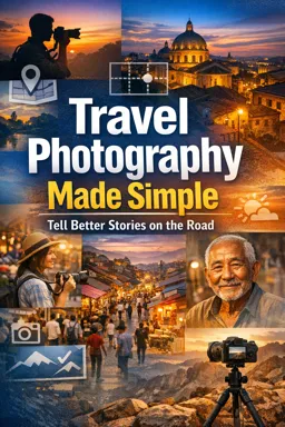
A simple selection workflow
- Step 1: Pick your anchors (3–5 images). Choose the strongest “scene-setters” and key moments. These will define the look for the rest.
- Step 2: Add supporting frames. Add portraits, details, and transitions that connect the anchors.
- Step 3: Remove near-duplicates. If two images say the same thing, keep the one with better gesture, cleaner background, or stronger light.
- Step 4: Check variety. Make sure you have a mix of wide/medium/close and a beginning/middle/end feeling.
Tip: If you can’t explain why an image is in the set in one sentence (“This shows the first impression of the city,” “This introduces the vendor,” “This shows the evening mood”), it probably doesn’t belong.
Global Edits First: Build a Clean, Natural Base
Global edits affect the whole image. Do these first so you’re not chasing problems with local tools. Aim for “believable” rather than dramatic—travel stories feel stronger when the viewer trusts the light and color.
Step-by-step global edit order (beginner-friendly)
- Set exposure (overall brightness). Adjust until the main subject reads clearly. Avoid pushing exposure so far that bright areas look flat or gray.
- Recover highlights. Pull highlights down until skies, white shirts, and sunlit walls regain detail. Stop before the image looks dull.
- Lift shadows carefully. Raise shadows to reveal information in dark areas (alleys, interiors). Stop before blacks look washed out or noisy.
- Set contrast. Add a small amount of contrast to restore depth after highlight/shadow recovery. If faces look harsh, reduce contrast slightly.
- White balance (temperature + tint). Decide the mood: warmer for inviting late-afternoon streets, cooler for rainy scenes or blue-hour. Keep skin tones believable (more on checks later).
- Presence controls (clarity/texture/dehaze) with restraint. Use lightly. Too much makes travel photos look crunchy and over-processed, especially on faces and skies.
- Vibrance/saturation. Prefer vibrance for a gentle color lift. Use saturation sparingly—over-saturation is the fastest way to make a series look inconsistent.
Practical target: “natural but intentional”
Try this quick baseline on one anchor image, then refine:
- Exposure: adjust until the subject is readable
- Highlights: down enough to bring back sky detail
- Shadows: up enough to show context
- White balance: set mood, then protect skin tones
- Vibrance: small increase if colors feel flat
Once one anchor looks right, you’ll match the rest to it.
- Listen to the audio with the screen off.
- Earn a certificate upon completion.
- Over 5000 courses for you to explore!

Download the app
Simple Local Edits: Guide Attention (Don’t Rebuild the Scene)
Local edits are for small, story-driven nudges: brighten a face, reduce a distraction, or subtly emphasize the subject. The goal is to help the viewer see what you saw—without making the edit visible.
Brighten faces and key subjects
- Use a soft brush or radial mask on the face/subject.
- Increase exposure slightly (small increments) and, if needed, lift shadows a touch.
- Avoid heavy clarity/texture on skin. If your software has “skin smoothing,” use it minimally or skip it—travel portraits should still look real.
Reduce distractions (fast, realistic fixes)
- Darken bright edges. If a bright sign or sunlit wall at the edge pulls attention, use a gradient to lower exposure/highlights.
- Desaturate small color distractions. A neon object can steal focus; reduce its saturation locally rather than changing the whole photo.
- Heal/clone only obvious, small issues. Dust spots, a tiny piece of litter, a sensor spot in the sky—yes. Removing major objects can look fake and takes time.
Local edits that often look “too much”
- Strong vignettes that darken corners noticeably
- Over-sharpening edges around people/buildings
- Heavy dehaze that turns skies gray and adds halos
Consistency Across a Series: Match Warmth, Contrast, and Saturation
A travel story feels professional when images look like they belong together. Consistency doesn’t mean every photo is identical—it means the viewer doesn’t get jolted by random shifts in color and contrast.
Choose a “series look” using your anchors
Pick one anchor as the reference (often a wide scene with people and sky). Decide:
- Warmth: slightly warm, neutral, or slightly cool?
- Contrast: punchy, medium, or soft?
- Saturation: natural, slightly boosted, or muted?
Matching technique (quick and reliable)
- Edit the reference anchor until it feels right.
- Apply similar global settings to the other anchors (copy/paste settings or sync).
- For each remaining image, adjust only what differs: exposure (because light changes), then white balance (because shade/interiors vary), then small contrast/saturation tweaks.
Watch for the three common consistency breakers
- Mixed white balance: one image is very warm, the next is very cool, with no story reason.
- Random contrast: some images are crisp and punchy, others are flat.
- Color intensity swings: one frame is neon, the next is muted.
If your story includes different lighting (midday street → indoor café → night market), keep a consistent “handwriting” (similar skin tone treatment and saturation level) while allowing mood shifts.
A Lightweight Preset Strategy (and When to Avoid Heavy Filters)
Presets can speed up editing, but they should be a starting point, not a style that overrides the scene. A good travel preset is subtle and flexible.
Create one simple “travel base” preset
Build it from an anchor image that represents your typical travel light (outdoor shade or late afternoon works well). Include only settings that are safe to reuse:
- Basic tone: small contrast, gentle highlight recovery, mild shadow lift
- Color: a consistent white balance bias (slightly warm or neutral), modest vibrance
- Optional: a tiny curve adjustment for depth
- Sharpening: mild, not aggressive
Do not include exposure (varies too much), heavy vignettes, strong dehaze, or extreme color shifts.
How to use the preset without losing realism
- Apply the preset to the whole set.
- Go image by image and correct exposure first.
- Then correct white balance for each lighting situation (sun/shade/indoor/night).
- Finally, do small local edits only where needed.
When to avoid heavy filters
- Skin tones matter: strong teal/orange or heavy matte looks can make people look unhealthy or artificial.
- Mixed lighting scenes: night markets and interiors already have complex color; heavy filters often create strange casts.
- Documentary moments: if the story relies on authenticity (local work, ceremonies, everyday life), keep edits clean and believable.
Crop and Straighten: Composition Fixes That Respect the Moment
Cropping and straightening are powerful because they improve clarity without changing reality. Use them to remove dead space, strengthen subject placement, and fix tilted horizons or leaning buildings.
Step-by-step cropping approach
- Start with the horizon/verticals. Straighten first; cropping second prevents awkward edges.
- Crop to remove distractions. Trim bright corners, empty sky, or clutter that doesn’t add story.
- Protect important context. Don’t crop so tight that the location becomes unclear (unless the image is meant to be a detail).
- Keep a consistent feel across the set. If most images are wide and airy, one extremely tight crop can feel out of place unless it’s a deliberate detail shot.
Straightening tips for travel scenes
- Seascapes and city horizons: a slightly tilted horizon feels like a mistake—fix it.
- Architecture: correct obvious leaning verticals if it helps the story, but don’t over-correct to the point buildings look stretched or unnatural.
Noise Reduction for Night and Indoor Shots (Without Plastic Texture)
Night markets, indoor cafés, and blue-hour streets often require higher ISO, which adds noise. The goal is to reduce distracting grain while keeping detail and a natural texture.
Practical noise reduction workflow
- Zoom to 100%. Judge noise at actual pixel level, not zoomed out.
- Apply noise reduction gradually. Increase until noise stops drawing attention, then stop.
- Balance with sharpening. Too much sharpening brings noise back; too much noise reduction makes surfaces look waxy.
- Prioritize faces and flat areas. Noise is most visible in skies, shadows, and skin—treat those carefully.
If an image is meant to feel gritty (rainy street at night), leaving a bit of grain can support the mood. Removing all noise can make night scenes look unnatural.
Export Settings for Sharing: Web and Print
Exporting is where good edits can be ruined by wrong size, compression, or color settings. Use different exports for web sharing versus printing.
Web export (social, messaging, portfolios)
- File type: JPEG
- Color space: sRGB (most reliable for phones and browsers)
- Long edge: 2000–3000 pixels (good balance of quality and speed)
- Quality: around 70–85 (high enough to avoid artifacts, small enough to upload quickly)
- Sharpen for screen: low to standard (avoid crunchy edges)
- Metadata: keep copyright; consider removing location data if privacy matters
Print export (lab or home printing)
- File type: JPEG (high quality) or TIFF if requested by your printer
- Resolution: 300 ppi (common print standard)
- Size: export at the intended print dimensions (e.g., 8×10, A4)
- Color: sRGB unless your print lab provides a specific profile and instructions
- Sharpen for print: standard (print can handle more sharpening than screens, but keep it natural)
Naming and versions (so you don’t overwrite)
Use a simple suffix system:
Lisbon_Story_01_web.jpg Lisbon_Story_01_print.jpgFinal Quality Check: Skin Tones, Horizon, Consistency, Narrative Flow
Before you share, do one pass through the full set in order. This is where you catch small issues that break trust or break the story.
Checklist (fast, effective)
- Skin tones: faces should not look green, gray, or overly orange. If they do, adjust white balance/tint or reduce saturation locally.
- Horizon and verticals: check wide scenes and architecture for subtle tilts.
- Consistency: compare images side-by-side. Match warmth, contrast, and saturation so the set feels unified.
- Exposure jumps: avoid one image being noticeably brighter/darker unless it’s a deliberate mood shift.
- Distractions: scan edges for bright spots, signs, or high-contrast areas pulling attention away from the subject.
- Narrative flow: does the sequence move smoothly (arrival → moments → details → transition → ending mood)? If one image interrupts the rhythm, reorder or remove it.